Paul Rand Logo Seven-Step Test
- Transfer
Do you have a strong or weak logo?
While the dancer may ask himself, “I wonder what Michael Jackson would think about my dance moves?” Or the boxer might ask himself, “I wonder what Muhammad Ali would think about my right hook?”, The designer will ask: “What is Paul Would Rand think of my logo? ”
By the end of the reading, you will know for sure whether Paul Rand approved or not approved your logo.
Paul Rand is an American art director and designer known for his corporate logos, including logos for IBM, UPS, Enron, Morningstar, Inc., Westinghouse, ABC and NeXT Steve Jobs.
In fact, when Steve Jobs hired Paul Rand to design the NeXT Computers logo, he hired him for 100,000. Jobs was unpleasantly surprised when Rand said that he would present only one option.
Steve Jobs asked him if he wanted to come up with several options, and Rand replied, “No, I will solve the problems for you, and you will pay me. You are not required to use my solution. If you need more options, contact other people. ”
Rand came up with a 100-page detailed brand brochure, including the exact angle used for the logo (28 °) and the new company name - NeXT.
The fundamental criteria for this logo test are based on what Paul Rand said while changing the world of logo design:
Paul Rand's seven-step test uses these attributes to evaluate a logo. The sequence of steps is as follows:
1. Is it different?
2. Is it visible?
3. Is it adaptive?
4. Is it memorable?
5. Is it universal?
6. Is it forever?
7. After you answered “yes” to all the questions above, ask the last question: Is it easy?
For each step, except for the last one, ratings are given on a scale of 1 to 10. For the last step, simplicity ratings are set from 1 to 15. This mathematically gives weight to what is most important in the logo. Score 75 is perfect, and everything below 60 is rejected.
The best way to see how this algorithm works is to use an example. Let's use the old Bing logo (Microsoft's Internet search engine).
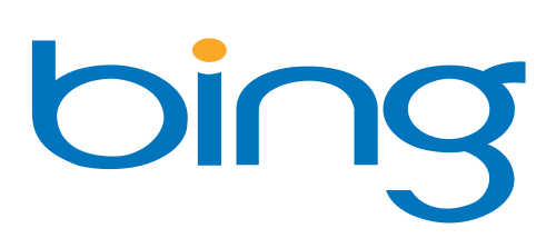
The Bing logo was discontinued and updated in September 2013 for obvious reasons. Let's apply the 7 steps to this logo to find out why.
Distinctiveness means uniqueness and difference from everything else. What stands out in the crowd and what is difficult to confuse with anything else.
In our example, the Bing logo uses a young, regular blue color - 80% of all logos are blue. Typography requires openness and breadth - this is good for a search engine, but it’s plain and flat and it won’t work if they want to stand out as a competitor to Google.
There are no art elements in addition to the inscription , therefore a lot of work is done only on words to convey meaning. But the inscription is nothing unique. Yes, wide letters use a lot of white space, but the letters seem to be merged, especially around the base “i”.
The loop “g” is suddenly cut off, and the letter seems cold and incomplete.
If the ear “g” (a small feature protruding at the top right) was thinner, then it would look like the head of a bald man with wildly sticking hair, which makes me think about age.
3/10
Visible - means visible or one that is easy to see. Due to the fact that the logo takes up a generous amount of space, its visibility is high. However, most designers begin designing the logo in black and white for optimal visibility regardless of color. But the deep yellow dot above the “i” is lost when this logo becomes black and white - the provision of personal, intimate touches of the “i” is lost. Always make sure your logo looks good in black and white.
6/10
Adaptability means the ability to serve for various applications - on a T-shirt, on a cup, on the Internet, on a truck, on a traffic sign. You get the idea.
In our example, the Bing logo is integrated into the white space enough to look identifiable almost everywhere. The only argument against it is that it will have problems with embedding in a square or in any case when vertical harmony is needed. The text is roughly scaled horizontally, leaving no alternative for getting into a square, such as favicons or a mobile app icon. It is possible that the insulation “b” will work squared, but it will also further reduce its distinctiveness, because “b” is faded.
5/10
The purpose of the logo is to be unforgettable - so that the person experiencing the need for your business, your logo immediately came to mind. You can verify this with verbal associations . Verbal associations are an exercise to identify the first word that comes to mind when you hear or see something. Try with the following logos:
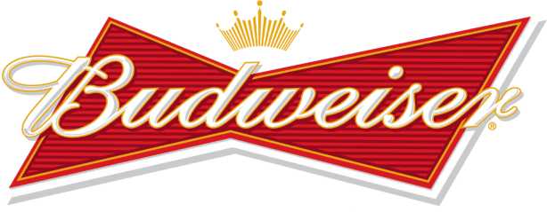
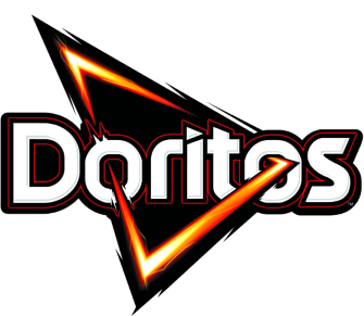
Here is what I got, respectively: beer, chips and a car. Are there logos using the words beer, chips, and car? Not. They do not need this because they are easily recognizable, memorable logos.
In our example, I do not get a “search engine” looking at the Bing logo. It's interesting to see how they fixed it with the new Bing logo, which we'll talk about in a minute.
The flatness of the Bing logo and the lack of emotion make it hard to remember.
2/10.
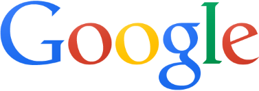
A universal logo carries the same meaning for a wide range of people. This is perhaps the hardest part in creating a logo, because all people are different. How big, global brands do it?
Google uses color.
Apple uses worldwide fruit and neutral color.
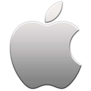
Note : The Apple logo doesn’t even need words to be identifiable, which gives amazing versatility.
As a search engine, the Bing logo was supposed to demonstrate power and complexity, but not at the cost of accessibility (everyone should feel comfortable using the search engine). Design performs accessibility through simplicity, but does not imply reliability and depth of knowledge.
4/10
The basic principles that you need to remember when creating an eternal logo are not to use “hot” colors, “luxurious” fonts or “cool” styles. Fads change like the weather, but the sun always rises and the sky is always blue. We find the strong core of our design and trim the excess jewelry. Minimalism is the art of saying more, less.
The outdated Bing logo well avoids bad taste and short-term shine, but goes too far with the circle.
6/10
Paul Rand said the logo should embody minimalism.
The first 6 steps from the test of the Paul Rand logo include creating and adding outstanding qualities to your design so that it is unique, durable, memorable, etc. But this last step is to reduce and discard unnecessary details to present a clean and playful final product.
Here are two practical steps you can take to make sure your logo is designed with simplicity:
Due to the fact that simplicity is the crown of six qualities higher, it is rated on a scale of 1 to 15 to take into account its exceptional importance. A very distinctive and beautiful logo can lose points, because it is due to simplicity. A good example of a simple logo is the Nike checkmark: A

$ 15 billion company is identified as a solid checkmark that says: victory, athletic shoes and the Greek goddess. Many consider it the greatest logo of all time.
The Bing logo is slightly behind in this area. While he loses without offering something striking or outstanding, he does provide a simple entity. But be careful: excessive simplicity can be met as thoughtless and boring!
To find a balance between an intuitively simple logo and thoughtlessly boring, analyze the history of the brand and work from there in the opposite direction. Who are the main characters? What are their strengths? What conflict did they overcome? What does a happy ending look like? Project these concepts into an image and then begin to reduce it until you reach the basic elements.
10/15
Summing up the points for the Bing logo, we get:
1. Distinctness 3
2. Visibility 6
3. Adaptability 5
4. Reminiscence 2
5. Versatility 4
6. Eternity 6
7. Simplicity (out of 15) 10
Total: 36
36 explains why Microsoft put up with with the release of it to the public - he was decent enough to work, but not strong enough to live long.
In September 2013, Microsoft introduced the new Bing logo with significant improvements.

A couple of notes about what was done correctly in this logo:
Paul Rand's logo test can be applied to any logo. You saw how it was applied to the Bing logo. Now it's your turn to try it and calculate your points. Do you have a strong logo or a weak one?
While the dancer may ask himself, “I wonder what Michael Jackson would think about my dance moves?” Or the boxer might ask himself, “I wonder what Muhammad Ali would think about my right hook?”, The designer will ask: “What is Paul Would Rand think of my logo? ”
By the end of the reading, you will know for sure whether Paul Rand approved or not approved your logo.
Legend
Paul Rand is an American art director and designer known for his corporate logos, including logos for IBM, UPS, Enron, Morningstar, Inc., Westinghouse, ABC and NeXT Steve Jobs.
In fact, when Steve Jobs hired Paul Rand to design the NeXT Computers logo, he hired him for 100,000. Jobs was unpleasantly surprised when Rand said that he would present only one option.
Steve Jobs asked him if he wanted to come up with several options, and Rand replied, “No, I will solve the problems for you, and you will pay me. You are not required to use my solution. If you need more options, contact other people. ”
Rand came up with a 100-page detailed brand brochure, including the exact angle used for the logo (28 °) and the new company name - NeXT.
The fundamental criteria for this logo test are based on what Paul Rand said while changing the world of logo design:
The main role of the logo is the identification and simplicity of its meaning. Its effectiveness depends on the distinctive features, visibility, adaptability, memorability, universality and eternity.
Paul Rand's seven-step test uses these attributes to evaluate a logo. The sequence of steps is as follows:
1. Is it different?
2. Is it visible?
3. Is it adaptive?
4. Is it memorable?
5. Is it universal?
6. Is it forever?
7. After you answered “yes” to all the questions above, ask the last question: Is it easy?
For each step, except for the last one, ratings are given on a scale of 1 to 10. For the last step, simplicity ratings are set from 1 to 15. This mathematically gives weight to what is most important in the logo. Score 75 is perfect, and everything below 60 is rejected.
Guinea pig
The best way to see how this algorithm works is to use an example. Let's use the old Bing logo (Microsoft's Internet search engine).
The Bing logo was discontinued and updated in September 2013 for obvious reasons. Let's apply the 7 steps to this logo to find out why.
1. Is it different?
Distinctiveness means uniqueness and difference from everything else. What stands out in the crowd and what is difficult to confuse with anything else.
In our example, the Bing logo uses a young, regular blue color - 80% of all logos are blue. Typography requires openness and breadth - this is good for a search engine, but it’s plain and flat and it won’t work if they want to stand out as a competitor to Google.
There are no art elements in addition to the inscription , therefore a lot of work is done only on words to convey meaning. But the inscription is nothing unique. Yes, wide letters use a lot of white space, but the letters seem to be merged, especially around the base “i”.
The loop “g” is suddenly cut off, and the letter seems cold and incomplete.
If the ear “g” (a small feature protruding at the top right) was thinner, then it would look like the head of a bald man with wildly sticking hair, which makes me think about age.
3/10
2. Is it noticeable?
Visible - means visible or one that is easy to see. Due to the fact that the logo takes up a generous amount of space, its visibility is high. However, most designers begin designing the logo in black and white for optimal visibility regardless of color. But the deep yellow dot above the “i” is lost when this logo becomes black and white - the provision of personal, intimate touches of the “i” is lost. Always make sure your logo looks good in black and white.
6/10
3. Is it adaptive?
Adaptability means the ability to serve for various applications - on a T-shirt, on a cup, on the Internet, on a truck, on a traffic sign. You get the idea.
In our example, the Bing logo is integrated into the white space enough to look identifiable almost everywhere. The only argument against it is that it will have problems with embedding in a square or in any case when vertical harmony is needed. The text is roughly scaled horizontally, leaving no alternative for getting into a square, such as favicons or a mobile app icon. It is possible that the insulation “b” will work squared, but it will also further reduce its distinctiveness, because “b” is faded.
5/10
4. Is it memorable?
The purpose of the logo is to be unforgettable - so that the person experiencing the need for your business, your logo immediately came to mind. You can verify this with verbal associations . Verbal associations are an exercise to identify the first word that comes to mind when you hear or see something. Try with the following logos:
Here is what I got, respectively: beer, chips and a car. Are there logos using the words beer, chips, and car? Not. They do not need this because they are easily recognizable, memorable logos.
In our example, I do not get a “search engine” looking at the Bing logo. It's interesting to see how they fixed it with the new Bing logo, which we'll talk about in a minute.
The flatness of the Bing logo and the lack of emotion make it hard to remember.
2/10.
5. Is it universal?
A universal logo carries the same meaning for a wide range of people. This is perhaps the hardest part in creating a logo, because all people are different. How big, global brands do it?
Google uses color.
Apple uses worldwide fruit and neutral color.
Note : The Apple logo doesn’t even need words to be identifiable, which gives amazing versatility.
As a search engine, the Bing logo was supposed to demonstrate power and complexity, but not at the cost of accessibility (everyone should feel comfortable using the search engine). Design performs accessibility through simplicity, but does not imply reliability and depth of knowledge.
4/10
6. Is it forever?
The basic principles that you need to remember when creating an eternal logo are not to use “hot” colors, “luxurious” fonts or “cool” styles. Fads change like the weather, but the sun always rises and the sky is always blue. We find the strong core of our design and trim the excess jewelry. Minimalism is the art of saying more, less.
The outdated Bing logo well avoids bad taste and short-term shine, but goes too far with the circle.
6/10
7. Question - The Holy Grail: Is it easy?
Paul Rand said the logo should embody minimalism.
“A logo cannot survive if it is not designed with utmost simplicity and restraint.”
The first 6 steps from the test of the Paul Rand logo include creating and adding outstanding qualities to your design so that it is unique, durable, memorable, etc. But this last step is to reduce and discard unnecessary details to present a clean and playful final product.
Here are two practical steps you can take to make sure your logo is designed with simplicity:
- Reduce it and then increase it sharply. The appearance and design of a strong logo will be clear and pleasant, regardless of its size.
- Draw it by hand in ten seconds with a pencil. If you can easily do this, then you have a simple logo.
Due to the fact that simplicity is the crown of six qualities higher, it is rated on a scale of 1 to 15 to take into account its exceptional importance. A very distinctive and beautiful logo can lose points, because it is due to simplicity. A good example of a simple logo is the Nike checkmark: A
$ 15 billion company is identified as a solid checkmark that says: victory, athletic shoes and the Greek goddess. Many consider it the greatest logo of all time.
The Bing logo is slightly behind in this area. While he loses without offering something striking or outstanding, he does provide a simple entity. But be careful: excessive simplicity can be met as thoughtless and boring!
To find a balance between an intuitively simple logo and thoughtlessly boring, analyze the history of the brand and work from there in the opposite direction. Who are the main characters? What are their strengths? What conflict did they overcome? What does a happy ending look like? Project these concepts into an image and then begin to reduce it until you reach the basic elements.
10/15
General
Summing up the points for the Bing logo, we get:
1. Distinctness 3
2. Visibility 6
3. Adaptability 5
4. Reminiscence 2
5. Versatility 4
6. Eternity 6
7. Simplicity (out of 15) 10
Total: 36
36 explains why Microsoft put up with with the release of it to the public - he was decent enough to work, but not strong enough to live long.
New Bing logo
In September 2013, Microsoft introduced the new Bing logo with significant improvements.
A couple of notes about what was done correctly in this logo:
- The g loop looks like a smile (something that goes beyond cultural barriers)
- Adding a strikingly bold character allows the font to relax and breathe.
- The new logo has subtleties (for example, the upper bevel “b”) based on the story with a spotlight .
Paul Rand's logo test can be applied to any logo. You saw how it was applied to the Bing logo. Now it's your turn to try it and calculate your points. Do you have a strong logo or a weak one?