3 disasters of responsive design and how to avoid them
- Transfer
Responsive design is quite in demand, as it allows you to present content for more devices without the need to develop a separate version of the site and without any negative consequences regarding other methods, such as scaling and rubber layouts.
In this article, 3 main mistakes that developers make when working with a responsive design will be highlighted and several strategies to avoid these errors will be given.
Scalable, rubber, and responsive layouts
Designers often confuse these terms and may use them incorrectly, replacing one with the other. In truth, each of these terms is a separate stage in the evolution of the template technique, which formed over time as the technology evolves.
Scalable layouts are designed to scale each element with respect to each other element. They are responsive in the sense that they scale content dynamically in response to resizing the viewport. The template itself remains static, resizing each element to maintain a uniform appearance.

Above: an example of a scalable layout at different resolutions: for the sake of uniformity, the design sacrifices readability
Rubber layouts are different, as they scale the elements of the container relative to the size of the viewport. This is achieved by using relative units of measure, such as em, to overcome the problem of text compression. Design may break if the user scales it.

Above: an example of a rubber layout at various resolutions: for readability, design sacrifices homogeneity
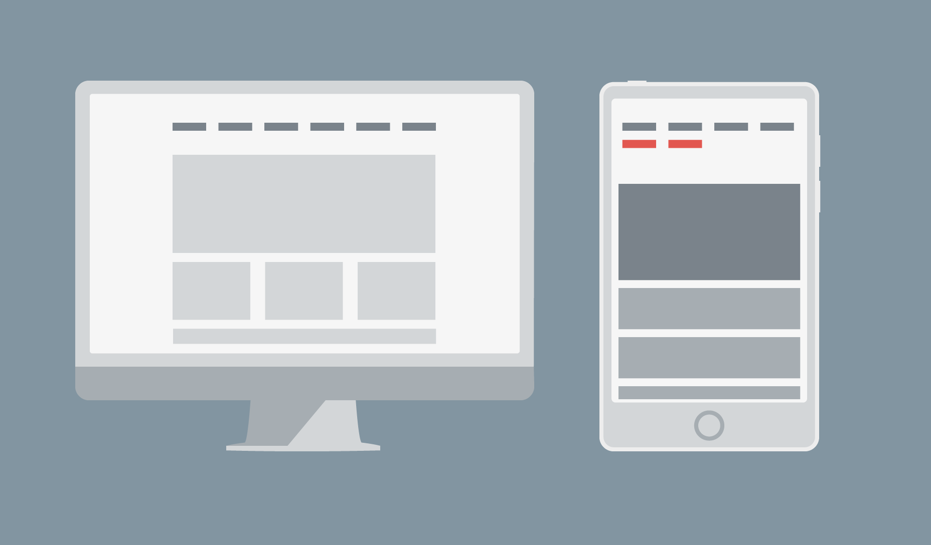
Responsive layouts don't scale anything. Instead, they change the display depending on the size of the viewport.

Above: an example of a responsive layout at various resolutions
Crash 1: Sliding Menus
If you use the navigation bar at the top of the page, a responsive design can “collapse” it for a more compact look if the page is displayed on a small screen. But this does not always work if the display area is wider than the transition point, but it is too small to display all menu items on one line. The result is a sliding menu.
There are several ways to solve this problem. The first is to reduce the number of horizontally displayed elements of the navigation panel by dividing them into categories and subcategories. Then you can use the drop-down menu items to display subcategories when selecting a category.
The second way is to reduce the value of the transition point. The actual number to use is the width at which your navigation bar stops displaying correctly, rather than the specific size of the device.
The third way is to use various menus for devices, such as the “sliding drawer”.
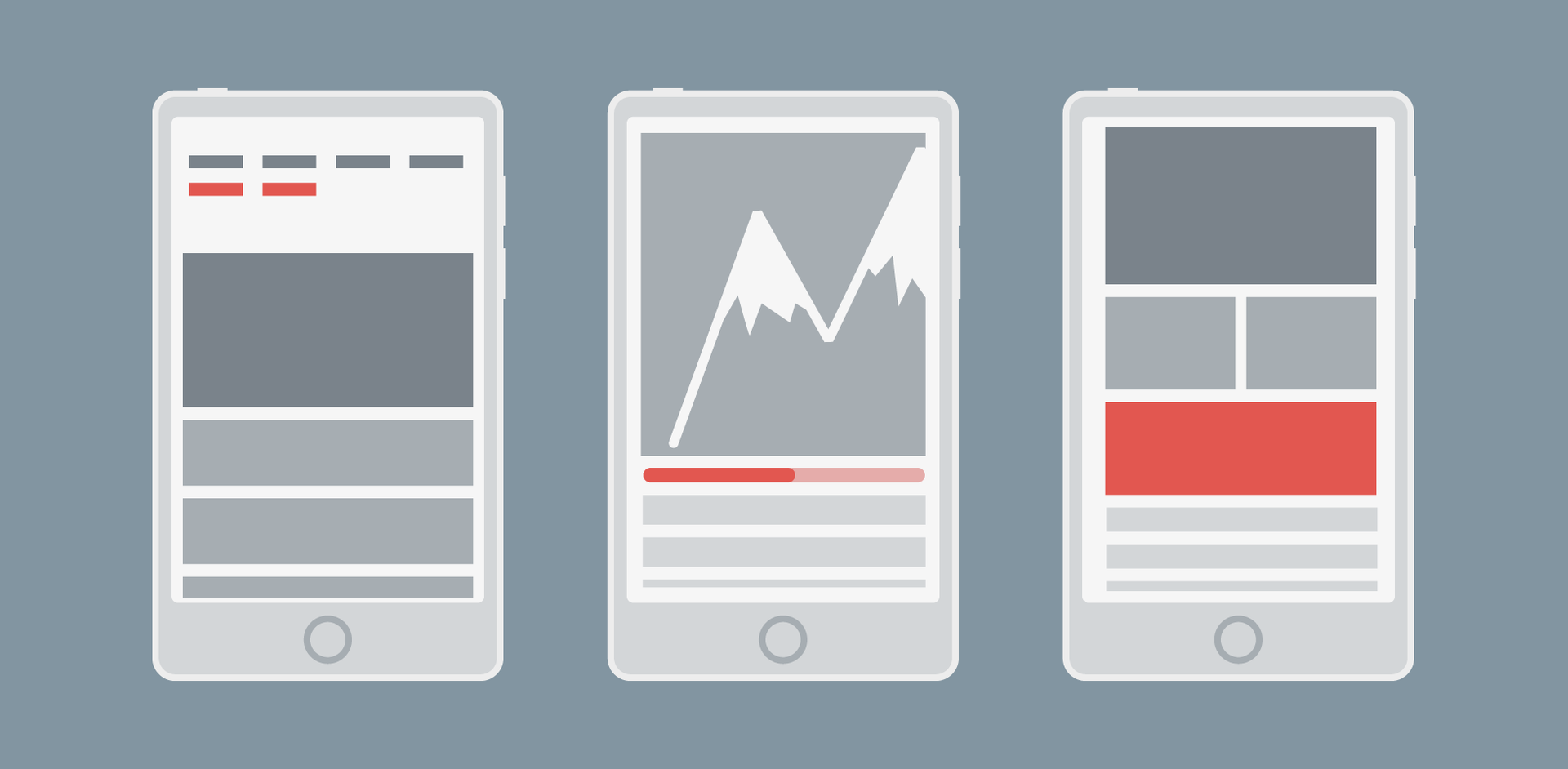
Catastrophe 2: Using Fixed Width Images
The size of the content zones is usually adjusted relative to the viewing area. Therefore, if an image with a fixed width is wider than the size of such a zone, the image is cropped.

Above: an example of a poorly matched image with a fixed width that turned out to be too large: scrollbars appeared on it, and the content turned out to be squeezed out of the screen
You can avoid this problem by using relative units of measurement to set the image width, or if you use a template that this supports (for example, Bootstrap), you can use the responsive image class (for example, class = "img-responsive").

Above: same element using responsive image class approach: scroll bar disappeared
Catastrophe 3: element distortion
This disaster is a little less known, but this is exactly what happens when your layout is displayed in a small window and the columns behave like rows. This is a problem, as content distortion inadvertently changes the hierarchy in your design.

Above: the column turned into a row, distorting the content.
The solution is obvious, although it is surprising why so many people struggle with this: just clearly set the height, width and indentation of the element. If he moves forward and blocks other elements, you can make him return to his place by moving him into the divider and setting the fields.
Planning Helps Avoid Mistakes
In this article, we discussed only the 3 most common responsive design disasters that designers face, but there are many more ways to ruin a good design. Preventing mistakes is easy. Modern browsers have built-in testing for responsive layouts, so plan your design well and test it often.
Useful Paysto solutions for Habr readers:
→ Get paid by credit card right now. Without a site, IP and LLC.
→ Accept payment from companies online. Without a site, IP and LLC.
→ Accepting payments from companies for your site. With document management and exchange of originals.
→ Automation of sales and servicing transactions with legal entities. Without an intermediary in the calculations.
→ Accept payment from companies online. Without a site, IP and LLC.
→ Accepting payments from companies for your site. With document management and exchange of originals.
→ Automation of sales and servicing transactions with legal entities. Without an intermediary in the calculations.