Apple Watch: how to make an app for a watch and not screw it up
- Tutorial
Official sales of the Apple Watch have started today. 90% of the mind-blowing application concepts for them that can be found on the Web are unrealizable - those who are familiar with Apple’s guidelines are well aware of this. That it is still possible to implement on the watch and how to do it better from the point of view of development and design - under the habracat.
Our team made one of the first in Russia © applications for hours. When a developer and a designer understand each other’s working features, the probability of occurrence of fantastic design concepts tends to zero, and the development time to a few days. We, Grigory Matvievich ( fountainhead , developer) and Ekaterina Sotova ( lost_in_purple , designer), tell you what you should pay attention to if you are creating an application for Apple Watch.
It will be about:
“Apple Watch is our most personal device,” they say at Apple. And this is true - the gadget, which is constantly on the hand of its owner, suggests new formats of user interaction that were impossible or not needed on the smartphone. Watch applications should be adapted to the context in which their owner is located. First of all, this means that only the most useful information should be displayed on the watch in a very compressed form, since a person uses it on the go. The main task of watches and good applications for them is to be unobtrusive and useful. Apple focused on tactility (the Taptic Engine provides a tactile response when notifications come in or when the watch interacts) and tried to literally “blur” the boundaries between applications and physical objects: the application background seamlessly flows into the display frame, visually merging into a single whole. The watch does not replace the application on the smartphone, but complement it. Applications on the Apple Watch should be as easy as possible for interaction. Information should be viewed simply and quickly and depend on the context in which the owner is located, while not becoming intrusive. For example, a notification is displayed in full if the user has kept a glance at it, and Glances shows the most relevant and necessary. If the scenarios of user interaction with the application on the iPhone can be measured in minutes, then the duration of interaction with the clock does not exceed, as a rule, several seconds. All this must be kept in mind when designing your applications. The watch does not replace the application on the smartphone, but complement it. Applications on the Apple Watch should be as easy as possible for interaction. Information should be viewed simply and quickly and depend on the context in which the owner is located, while not becoming intrusive. For example, a notification is displayed in full if the user has kept a glance at it, and Glances shows the most relevant and necessary. If the scenarios of user interaction with the application on the iPhone can be measured in minutes, then the duration of interaction with the clock does not exceed, as a rule, several seconds. All this must be kept in mind when designing your applications. The watch does not replace the application on the smartphone, but complement it. Applications on the Apple Watch should be as easy to interact with. Information should be viewed simply and quickly and depend on the context in which the owner is located, while not becoming intrusive. For example, a notification is displayed in full if the user has kept a glance at it, and Glances shows the most relevant and necessary. If the scenarios of user interaction with the application on the iPhone can be measured in minutes, then the duration of interaction with the clock does not exceed, as a rule, several seconds. All this must be kept in mind when designing your applications. Information should be viewed simply and quickly and depend on the context in which the owner is located, while not becoming intrusive. For example, a notification is displayed in full if the user has kept a glance at it, and Glances shows the most relevant and necessary. If the scenarios of user interaction with the application on the iPhone can be measured in minutes, then the duration of interaction with the clock does not exceed, as a rule, several seconds. All this must be kept in mind when designing your applications. Information should be viewed simply and quickly and depend on the context in which the owner is located, while not becoming intrusive. For example, a notification is displayed in full if the user has kept a glance at it, and Glances shows the most relevant and necessary. If the scenarios of user interaction with the application on the iPhone can be measured in minutes, then the duration of interaction with the clock does not exceed, as a rule, several seconds. All this must be kept in mind when designing your applications. then the duration of interaction with the watch does not exceed, as a rule, a few seconds. All this must be kept in mind when designing your applications. then the duration of interaction with the watch does not exceed, as a rule, a few seconds. All this must be kept in mind when designing your applications.
In the first version of the smartwatch, Apple allowed third-party developers to create applications that are an extension of the main application (hereinafter, the application running on the iPhone will be called the “main application” ). And the application that runs on the watch is a “WatchKit application” , or simply an “application” on the iPhone. They promise to do development exclusively for Apple Watch in the future. Now the watch’s functionality is available through the WatchKit framework and is very limited in comparison with what you could see at the presentation of the watch itself. It can be seen that developers at Apple and a few other “selected” companies have more opportunities than the rest.
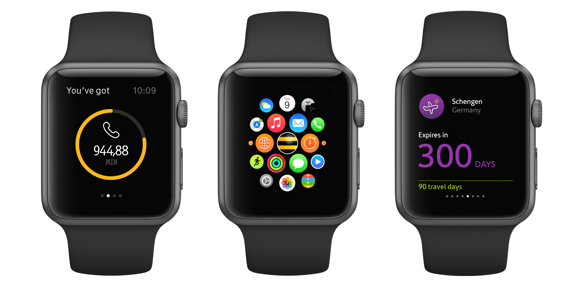
Let's see how the application is arranged on the Apple Watch. From an interface point of view, applications on the Apple Watch consist of the following parts:
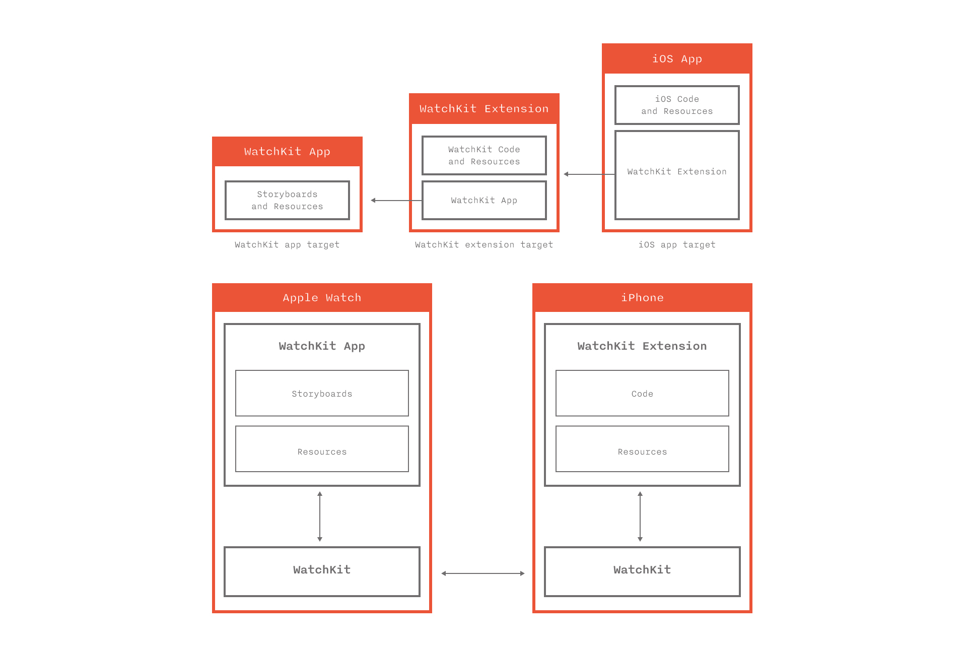
From the point of view of architecture, everything is arranged differently. Application files are divided into two parts: WatchKit App and WatchKit Extension. WatchKit App is stored directly on the watch and consists of a storyboard (interface description) and resources. WatchKit Extension is stored on the iPhone and contains code and resources. Thus, all the code is executed on the phone, and without the iPhone nearby, your application on the watch will not start. The interaction between the phone and the watch is carried out through the WatchKit framework and is hidden from the developer.
Each application screen is controlled by a controller object of the WKInterfaceController class. All controllers, including Glance and notifications, must be done on the WatchKit App Store. When the user opens the application on the watch, WatchKit finds the initial controller in the storyboard and informs on the iPhone that it is necessary to launch WatchKit Extension and create an object of the desired controller class. Similar actions will occur if the user opens Glance or receives a notification.
The controller life cycle is similar to the cycle of its older brother UIViewController. The init, awakeWithContext:, willActivate methods are used to perform the following tasks:
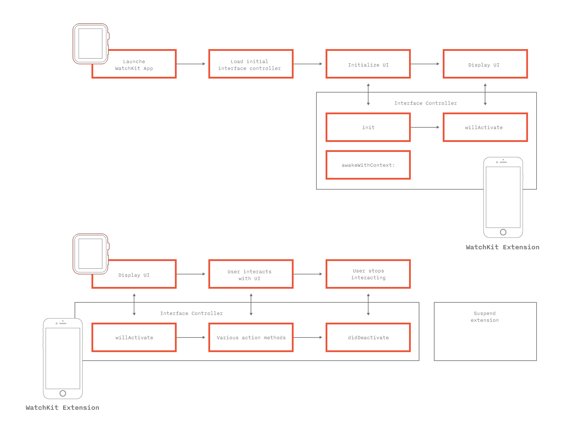
The initial controller plays a critical role. Despite the fact that in essence it is a screen controller, it has functions similar to the application delegate on the iPhone. It is always created and launched first, it handles transitions from Glance and notifications to the WatchKit application. Initialization methods for the initial controller - the first entry point into the application. This is where the application for the first time can look at what data it has and display a suitable interface. If the classes, quantity, order of internal screens can be set from the code, then you can choose which controller will be the initial one only in the storyboard during application design.
The WatchKit Extension only starts when the user interacts directly with the watch, and ends immediately when the user exits the application or simply lowers his hand. There is no concept of working in the background for a WatchKit application. However, the system can take a “screenshot” of the application. If you lower your hand or exit the application, and then after a short time run it again, you will be taken to the same screen on which you finished. Only willActivate of the corresponding controller is called.
Differences from the development of the main iOS application
Significant differencefrom the development of the main iOS application - the method of initializing the controllers init is called not by the developer, but by the system. Parameters and data are transferred from the controller to the controller through the context. Any transition from screen to screen occurs either automatically by segway, or from the code by the identifier of the controller in the storyboard. In both cases, WatchKit finds the desired screen in the storyboard, after which the WatchKit Extension creates an object of the class specified in the storyboard at the screen with the given identifier (according to this sequence), and calls the init method on it. The stack of controllers remains “under the hood” of the system. The developer does not see it and works with the code of the controllers as with abstract and isolated entities.
Another important difference- all interface elements are proxy objects that are available only for writing. You cannot tell the label what text it displays, what font and color it uses. Therefore, sometimes you have to store the state of objects in separate variables. In addition, you cannot inherit from the base class WKInterfaceObject, which complicates the design of the application and makes it impossible to create customized interface objects.
Not even the usual View hierarchy. Dynamically, you cannot create and add interface objects. The entire interface must be defined in the storyboard, that is, at the design stage of the application. Linking happens through IBOutlet. The unnecessary part of the interface is hidden. But we must try to avoid situationswhen on one screen there are two completely alternative interfaces, one of which is hidden depending on the context. But in some cases, such as in Glance, this is the only solution.
The didDeactivate method is called by the system to inform the controller that it is no longer on the screen. Moreover, it is useless to make any changes to the interface in the body of this method and after calling it - the system will ignore them. It can be very inconvenient when, upon the occurrence of an event, it is necessary, for example, to change the displayed text on the screen, which is not currently displayed. You have to somehow postpone the processing of the event until the willActivate call. Because of this, willActivate can turn into a series of checks of the conditions “and whether we need to reconfigure the interface”.
Apple advises lazy data loading where appropriate. In willActivate, you can use dispatch_async and dispatch_after on the main thread.
The main difficulty is that the main application on the iPhone and WatchKit Extension are two different isolated processes with their own sandbox. On the other hand, it is logical to assume that if the application on the watch is an addition to the main one, then it should receive data from its older brother. And here Apple offers several ways:
1. Using App Groups, which allow you to have common NSUserDefaults and save files in a shared container for a group of applications and their extensions.
This method allows you to get data almost instantly. The main application can write to the group, both in the course of its work, and in background fetch mode. There are some limitations: firstly, the main application cannot easily inform the clock that the data has been updated. Simple KVO on a common NSNotificationCenter does not work. Solution: use in conjunction with the second method or organize data transfer through one well-known pod , which archives data into files and uses the Darwin notification center; secondly, when recording files, you should pay attention to this warning from Apple.
2. Interaction with the main application on the iPhone directly.
The WKInterfaceController class has an openParentApplication: reply: method, which, when called, launches the main iPhone application in background. It invokes the delegate method application: handleWatchKitExtensionRequest: reply:, which processes the incoming request. From WatchKitExtension, a request completion block is necessarily passed, which takes an NSDictionary as the response of the main application. In addition to the completion block from WatchKit Extension, you can transfer a dictionary with any information so that the main application on the iPhone can handle different requests depending on the context.
If the main application needs to perform an asynchronous request, for example, request fresh data from the server, it is recommended to register a background task, otherwise iOS may complete it without waiting for the completion of execution. the main thinglimitation of this method : it takes time. Blocking the main thread, waiting for an answer, is naturally unacceptable, which is why the question arises: how to show old data, how to show the user something is happening, how to visually update the data, what to do if an error returns, etc. Another serious limitation : complex objects are not transferred, it is necessary to serialize them. When designing an application, it is very important to remember that data must be received from somewhere. The creators of some of the concepts of WatchKit applications clearly did not think about this. Still need to consider security issues. If the displayed data is confidential, then they cannot be stored just like that. In this matter, the main application and WatchKit application should act the same way.
3. Handoff as a way to start watching information on the watch, and continue on the phone.
Handoff is implemented very simply. NSUserActivity type names are added to the * -Info.plist of the main application. The controller method is called updateUserActivity: userInfo: webpageURL: with the parameter - the name of the required type NSUserActivity. You can pass the necessary additional information to userInfo. At this time, the icon of your application appears on the phone screen in the lower left corner and if you pull it up, the main application will start. The application delegate calls the application: willContinueUserActivity and application: continueUserActivity: restorationHandler methods, where you can process the userActivity and display the necessary information. At the same time, if the user does not get the phone out of his pocket and try to unlock it, the system itself will take care so that after some time it will invalidate the activity.
Apple Watch itself does not recognize or process NSUserActivities, except for those generated by Glance. But more on that in the next section.
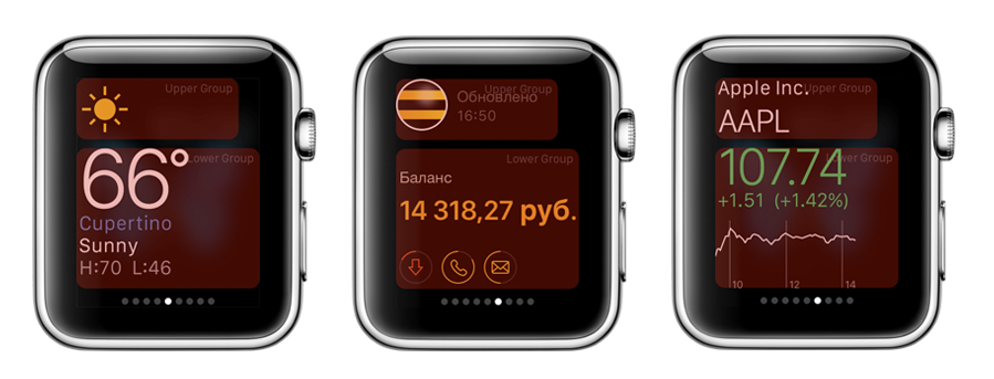
Glances is an application designed to quickly display important information, which is called directly from the clock screen by swiping from the bottom up. In fact, these are scrolling application widgets showing the most relevant information, for example, weather, stock indexes, calendar information, missed calls, fitness goals and achievements. The order of the application cards is customizable. By the way, the application may not have a display in Glance, if this is not necessary
Glans configuration - two parts, the upper one is offset from the center:
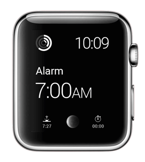
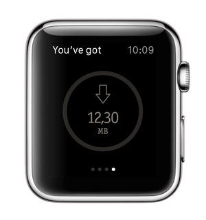
The system will provide a universal interface for your notifications, even if you do not implement any interface controller for them in the storyboard. But, of course, I want to make them beautiful and comfortable. Here it is necessary to find the right balance so that notifications do not bother the user too often, but at the same time provide them with relevant information for the current context. The wording of the notifications should be as clear and short as possible, because the watch screen is very tiny. This is especially true for the Cyrillic alphabet. Russian words are placed on the screen with great difficulty.
Notifications are shown in two stages: Short Look and Long Look. When you receive a notification, the watch vibrates gently. Raising his hand, the user sees a “short view” of the notification - ShortLook, which is immediately animated in LongLook if the user has kept a glance at it:

Long Look contains the full text of the notification, the icon and name of the application, as well as the "Skip" notification. Up to four contextual actions can be pushed right here - in the case of our application, for example, “extend the speed”. The Dismiss button is always provided by the system. Other possible buttons and their corresponding actions must be registered in the code of the main application on the iPhone through UIUserNotificationSettings for certain categories of notifications. That is, they are determined at the design stage of the application, and do not come with a push. Therefore, it is sometimes useful to create a universal category for notifications, if we want to always show a custom interface.
Button actions can have two types of activation modes: background and foreground. By clicking on the button with the foreground action, the WatchKit application opens and one of the handleActionWithIdentifier: forLocalNotification or handleActionWithIdentifier: forRemoteNotification methods is called, which receives the identifier of the selected button. By clicking on the button with the background, the action is launched in the background of the main application on the iPhone, and one of the corresponding methods of the application delegate is called.
There are two types of notification interface: static and dynamic . If you are implementing a custom interface, you must create a controller for the static type. A static type of interface is some simplified, generalized type of notification compared to a dynamic one. The system itself will determine which interface to choose, depending on the battery and user settings. Dynamic type can not be implemented.
Inside the WatchKit application on the watch, it is possible to change any font except for the title and time, as well as the context menu called through ForceTouch. Despite the fact that the San Francisco system font package does not have a Cyrillic style, everything is fine on the watch itself and in Xcode. In Glance and Notifications, you cannot use custom fonts.
Within the main application, Global tint color is set for all headers. It cannot be changed at runtime depending on the context or data, it is set at the application design stage once and performs the function of the color of the headers in the application and the name of the application in “short view” notifications. Unfortunately, you cannot change the color of PageControl either, don’t believe the concepts. Don't make your app users feel like they’re watching ads. For branding, it is better to use unobtrusive tools : color, fonts, images.
Applications support two types of navigation, which, unfortunately, cannot be combined with each other.
Hierarchical navigation is a classic application management method similar to navigation in iPhone applications using the UINavigationController, where the user “delves” into the application. This type of navigation is the most convenient and technically flexible, since it allows you to transfer information to the user in batches and have an unlimited number of nesting levels.
Page navigation(PageControl) allows the user to move between screens with a “swipe”. This navigation model is suitable for small applications, with a simple data model. When using page navigation, the content of all pages is loaded at a time, and the dynamic increase in the number of pages is not implemented without a number of tricks.

Also, in any type of navigation, a modal display of content is possible to attract the user's attention or to solve issues requiring the user to make an unambiguous decision without interacting with the main part of the application. At the same time, you can show both one window and several windows connected through Page Control. In the left corner of the modal window, the title is by default. Abusing modal mode is highly discouraged.
The transition between the screens is entirely processed by the system, and it can not be customized or additionally animated. In page navigation, screens appear on the right and left, in the hierarchical one, the next screen pops up from the right edge of the screen, like on the iPhone or iPad, and the modal screen pops up from the bottom.
Gestures
The watch screen is too small for a complete list of gestures used in iOS. Here is what is available to the user:
You cannot customize gestures.
Context menu The
context menu is invoked by a Force Touch gesture. From one to four secondary actions can be hidden in it. The screen seems to really push in, and the context menu pops up from above. It has a translucent background and from one to four buttons of a system view.
There is a misconception that there will be many beautiful animations in the Apple Watch. In fact, no, at least in third-party applications, definitely not. If there is a need for animation, forget about the software (or almost forget). You can only animate images. Frame by frame. That is, get ready to cut all the frames of the animation separately, just like for old cartoons. You cannot move objects. It is impossible to animate transitions between interface states, parallax effect, transitions between screens. Only change the frame of the image. Everything.

You can set the image for the background controller WKInterfaceController, buttons WKInterfaceButton, WKInterfaceGroup. And there is a special object for displaying WKinterfaceImage pictures.
When specifying the name of the image in the storyboard and in the parameters of the methods ending in imageNamed, the system searches for the image in the WatchKit App, that is, among those stored on the watch. Methods ending in image and imageData imply that the image is stored in the WatchKit Extension, that is, physically on the phone. Therefore, when you use them, the picture is transferred from the iPhone to the watch, which will cause some delay. Animation frames must be named with the same name plus frame number: for example, “image0@2x.png”, “image1@2x.png”, ..., “image256@2x.png”. In this case, the name of the image that you specify in the storyboard or pass in the parameter of the animation start methods will be considered “image”.
Programmatically, you can start and stop the animation of WKInterfaceImage and the background of the WKInterfaceGroup. The best place to do this is in willActivate. Moreover, if you want the animation to start after the user sees the screen, the start call can be wrapped in dispatch_async or dispatch_after. If you want the animation to run periodically, you can use NSTimer for this.
In the animation start parameters you can specify:
Despite the limited capabilities and complexity, animation is an effective way to contact the user. It not only makes the application attractive and adds personality, but also allows you to give hints, display status, motivate you to take action. And this is especially true for the Apple Watch, as it helps to save space on a small display.
The layout of applications on the watch is a bit like the html tabular layout that fetters the designer and developer. The smartphone has layers, but they are not in the watch. In hours instead of group layers. A group is a container for other interface objects. As mentioned above, background groups can be animated.
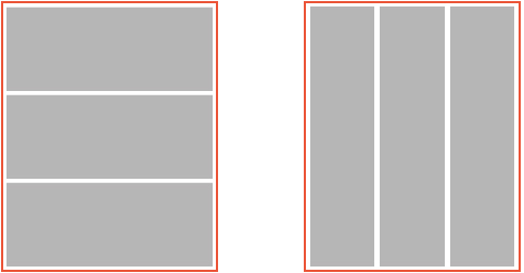
Accordingly, the containers can be next to each other, or in each other. The inner group cannot go beyond the outer. There are two types of groups.: The objects in the group are arranged one after the other vertically, and the objects in the group are arranged one after the other horizontally. Groups may contain other groups, both of a different type and of the same. The interface element cannot be set to origin, instead it is set to align both vertically and horizontally. In accordance with this alignment, the element takes the first free place in its group, the next object is located nearby and so on. Any interface elements are arranged according to these laws. This imposes great limitations on opportunities.
During program execution, you cannot dynamically add new interface objects. That is, everything should be provided for in the storyboard. Accordingly, in Glance, for several states, in fact, you have to have three interfaces simultaneously - only two of them are hidden all the time. When you run the code, depending on the data, selects the desired type of interface, and hides two. But they are there - they are created and calculated.
The framework into which the corporation has put developers in the first approach is annoying. With a deeper dive, it becomes clear that the restrictions do not so much deprive expressive means as they dictate the rules of good tone when working with microscopic screens. After all, the design of interaction, and even more so the development, is working with data and tasks, and not a game of pixels and coloring.
Of course, I would like to use more familiar and studied on iOS elements, but for the first attempt, the provided capabilities are quite enough. Obviously, in a couple of months at the annual WWDC we will see new features and new tools, but for now, you need to get a good feel for what is one of the first steps on the way to getting information in context. Fast, inconspicuous and on the run. But such information should not be much: neither visually nor informatively.
In the next article, we will talk about how we developed the application for Apple Watch - " My Beeline ."
Read also:
Material Design: to the Moon and back
Styling iOS-applications: how we stretch fonts, colors and images
Redesign of the Russian Railways application: concept
Our team made one of the first in Russia © applications for hours. When a developer and a designer understand each other’s working features, the probability of occurrence of fantastic design concepts tends to zero, and the development time to a few days. We, Grigory Matvievich ( fountainhead , developer) and Ekaterina Sotova ( lost_in_purple , designer), tell you what you should pay attention to if you are creating an application for Apple Watch.
It will be about:
- WatchKit application architecture
- Interactions with the main application on the phone
- Glances
- Notifications
- Identity of the application: fonts, icons, colors
- Navigation
- User Interactions Through Interfaces
- Images and animations
- Layout / Layout
Ideology: personalization, integrity, ease
“Apple Watch is our most personal device,” they say at Apple. And this is true - the gadget, which is constantly on the hand of its owner, suggests new formats of user interaction that were impossible or not needed on the smartphone. Watch applications should be adapted to the context in which their owner is located. First of all, this means that only the most useful information should be displayed on the watch in a very compressed form, since a person uses it on the go. The main task of watches and good applications for them is to be unobtrusive and useful. Apple focused on tactility (the Taptic Engine provides a tactile response when notifications come in or when the watch interacts) and tried to literally “blur” the boundaries between applications and physical objects: the application background seamlessly flows into the display frame, visually merging into a single whole. The watch does not replace the application on the smartphone, but complement it. Applications on the Apple Watch should be as easy as possible for interaction. Information should be viewed simply and quickly and depend on the context in which the owner is located, while not becoming intrusive. For example, a notification is displayed in full if the user has kept a glance at it, and Glances shows the most relevant and necessary. If the scenarios of user interaction with the application on the iPhone can be measured in minutes, then the duration of interaction with the clock does not exceed, as a rule, several seconds. All this must be kept in mind when designing your applications. The watch does not replace the application on the smartphone, but complement it. Applications on the Apple Watch should be as easy as possible for interaction. Information should be viewed simply and quickly and depend on the context in which the owner is located, while not becoming intrusive. For example, a notification is displayed in full if the user has kept a glance at it, and Glances shows the most relevant and necessary. If the scenarios of user interaction with the application on the iPhone can be measured in minutes, then the duration of interaction with the clock does not exceed, as a rule, several seconds. All this must be kept in mind when designing your applications. The watch does not replace the application on the smartphone, but complement it. Applications on the Apple Watch should be as easy to interact with. Information should be viewed simply and quickly and depend on the context in which the owner is located, while not becoming intrusive. For example, a notification is displayed in full if the user has kept a glance at it, and Glances shows the most relevant and necessary. If the scenarios of user interaction with the application on the iPhone can be measured in minutes, then the duration of interaction with the clock does not exceed, as a rule, several seconds. All this must be kept in mind when designing your applications. Information should be viewed simply and quickly and depend on the context in which the owner is located, while not becoming intrusive. For example, a notification is displayed in full if the user has kept a glance at it, and Glances shows the most relevant and necessary. If the scenarios of user interaction with the application on the iPhone can be measured in minutes, then the duration of interaction with the clock does not exceed, as a rule, several seconds. All this must be kept in mind when designing your applications. Information should be viewed simply and quickly and depend on the context in which the owner is located, while not becoming intrusive. For example, a notification is displayed in full if the user has kept a glance at it, and Glances shows the most relevant and necessary. If the scenarios of user interaction with the application on the iPhone can be measured in minutes, then the duration of interaction with the clock does not exceed, as a rule, several seconds. All this must be kept in mind when designing your applications. then the duration of interaction with the watch does not exceed, as a rule, a few seconds. All this must be kept in mind when designing your applications. then the duration of interaction with the watch does not exceed, as a rule, a few seconds. All this must be kept in mind when designing your applications.
1. WatchKit application architecture
In the first version of the smartwatch, Apple allowed third-party developers to create applications that are an extension of the main application (hereinafter, the application running on the iPhone will be called the “main application” ). And the application that runs on the watch is a “WatchKit application” , or simply an “application” on the iPhone. They promise to do development exclusively for Apple Watch in the future. Now the watch’s functionality is available through the WatchKit framework and is very limited in comparison with what you could see at the presentation of the watch itself. It can be seen that developers at Apple and a few other “selected” companies have more opportunities than the rest.
Let's see how the application is arranged on the Apple Watch. From an interface point of view, applications on the Apple Watch consist of the following parts:
- An application that has an icon and runs from the main screen of the clock
- Glance (preview) - an analogue of widgets on the iPhone
- Notifications
From the point of view of architecture, everything is arranged differently. Application files are divided into two parts: WatchKit App and WatchKit Extension. WatchKit App is stored directly on the watch and consists of a storyboard (interface description) and resources. WatchKit Extension is stored on the iPhone and contains code and resources. Thus, all the code is executed on the phone, and without the iPhone nearby, your application on the watch will not start. The interaction between the phone and the watch is carried out through the WatchKit framework and is hidden from the developer.
Each application screen is controlled by a controller object of the WKInterfaceController class. All controllers, including Glance and notifications, must be done on the WatchKit App Store. When the user opens the application on the watch, WatchKit finds the initial controller in the storyboard and informs on the iPhone that it is necessary to launch WatchKit Extension and create an object of the desired controller class. Similar actions will occur if the user opens Glance or receives a notification.
The controller life cycle is similar to the cycle of its older brother UIViewController. The init, awakeWithContext:, willActivate methods are used to perform the following tasks:
- Get the data to be displayed.
- Set initial values and configurations for labels, images, buttons and other interface objects.
- Hide the unnecessary part of the interface and show the necessary one.
The initial controller plays a critical role. Despite the fact that in essence it is a screen controller, it has functions similar to the application delegate on the iPhone. It is always created and launched first, it handles transitions from Glance and notifications to the WatchKit application. Initialization methods for the initial controller - the first entry point into the application. This is where the application for the first time can look at what data it has and display a suitable interface. If the classes, quantity, order of internal screens can be set from the code, then you can choose which controller will be the initial one only in the storyboard during application design.
The WatchKit Extension only starts when the user interacts directly with the watch, and ends immediately when the user exits the application or simply lowers his hand. There is no concept of working in the background for a WatchKit application. However, the system can take a “screenshot” of the application. If you lower your hand or exit the application, and then after a short time run it again, you will be taken to the same screen on which you finished. Only willActivate of the corresponding controller is called.
Differences from the development of the main iOS application
Significant differencefrom the development of the main iOS application - the method of initializing the controllers init is called not by the developer, but by the system. Parameters and data are transferred from the controller to the controller through the context. Any transition from screen to screen occurs either automatically by segway, or from the code by the identifier of the controller in the storyboard. In both cases, WatchKit finds the desired screen in the storyboard, after which the WatchKit Extension creates an object of the class specified in the storyboard at the screen with the given identifier (according to this sequence), and calls the init method on it. The stack of controllers remains “under the hood” of the system. The developer does not see it and works with the code of the controllers as with abstract and isolated entities.
Another important difference- all interface elements are proxy objects that are available only for writing. You cannot tell the label what text it displays, what font and color it uses. Therefore, sometimes you have to store the state of objects in separate variables. In addition, you cannot inherit from the base class WKInterfaceObject, which complicates the design of the application and makes it impossible to create customized interface objects.
Not even the usual View hierarchy. Dynamically, you cannot create and add interface objects. The entire interface must be defined in the storyboard, that is, at the design stage of the application. Linking happens through IBOutlet. The unnecessary part of the interface is hidden. But we must try to avoid situationswhen on one screen there are two completely alternative interfaces, one of which is hidden depending on the context. But in some cases, such as in Glance, this is the only solution.
The didDeactivate method is called by the system to inform the controller that it is no longer on the screen. Moreover, it is useless to make any changes to the interface in the body of this method and after calling it - the system will ignore them. It can be very inconvenient when, upon the occurrence of an event, it is necessary, for example, to change the displayed text on the screen, which is not currently displayed. You have to somehow postpone the processing of the event until the willActivate call. Because of this, willActivate can turn into a series of checks of the conditions “and whether we need to reconfigure the interface”.
Apple advises lazy data loading where appropriate. In willActivate, you can use dispatch_async and dispatch_after on the main thread.
2. Interaction with the main application on the phone
The main difficulty is that the main application on the iPhone and WatchKit Extension are two different isolated processes with their own sandbox. On the other hand, it is logical to assume that if the application on the watch is an addition to the main one, then it should receive data from its older brother. And here Apple offers several ways:
1. Using App Groups, which allow you to have common NSUserDefaults and save files in a shared container for a group of applications and their extensions.
This method allows you to get data almost instantly. The main application can write to the group, both in the course of its work, and in background fetch mode. There are some limitations: firstly, the main application cannot easily inform the clock that the data has been updated. Simple KVO on a common NSNotificationCenter does not work. Solution: use in conjunction with the second method or organize data transfer through one well-known pod , which archives data into files and uses the Darwin notification center; secondly, when recording files, you should pay attention to this warning from Apple.
2. Interaction with the main application on the iPhone directly.
The WKInterfaceController class has an openParentApplication: reply: method, which, when called, launches the main iPhone application in background. It invokes the delegate method application: handleWatchKitExtensionRequest: reply:, which processes the incoming request. From WatchKitExtension, a request completion block is necessarily passed, which takes an NSDictionary as the response of the main application. In addition to the completion block from WatchKit Extension, you can transfer a dictionary with any information so that the main application on the iPhone can handle different requests depending on the context.
If the main application needs to perform an asynchronous request, for example, request fresh data from the server, it is recommended to register a background task, otherwise iOS may complete it without waiting for the completion of execution. the main thinglimitation of this method : it takes time. Blocking the main thread, waiting for an answer, is naturally unacceptable, which is why the question arises: how to show old data, how to show the user something is happening, how to visually update the data, what to do if an error returns, etc. Another serious limitation : complex objects are not transferred, it is necessary to serialize them. When designing an application, it is very important to remember that data must be received from somewhere. The creators of some of the concepts of WatchKit applications clearly did not think about this. Still need to consider security issues. If the displayed data is confidential, then they cannot be stored just like that. In this matter, the main application and WatchKit application should act the same way.
3. Handoff as a way to start watching information on the watch, and continue on the phone.
Handoff is implemented very simply. NSUserActivity type names are added to the * -Info.plist of the main application. The controller method is called updateUserActivity: userInfo: webpageURL: with the parameter - the name of the required type NSUserActivity. You can pass the necessary additional information to userInfo. At this time, the icon of your application appears on the phone screen in the lower left corner and if you pull it up, the main application will start. The application delegate calls the application: willContinueUserActivity and application: continueUserActivity: restorationHandler methods, where you can process the userActivity and display the necessary information. At the same time, if the user does not get the phone out of his pocket and try to unlock it, the system itself will take care so that after some time it will invalidate the activity.
Apple Watch itself does not recognize or process NSUserActivities, except for those generated by Glance. But more on that in the next section.
To conclude the paragraph, here are a few more tips from Apple:
- Make out all the common code in the framework.
- Traffic between the iPhone and Apple Watch must be minimized.
- The “hard” work should be done by the main application on the iPhone.
3. Glances
Glances is an application designed to quickly display important information, which is called directly from the clock screen by swiping from the bottom up. In fact, these are scrolling application widgets showing the most relevant information, for example, weather, stock indexes, calendar information, missed calls, fitness goals and achievements. The order of the application cards is customizable. By the way, the application may not have a display in Glance, if this is not necessary
Features: Design
- It does not have vertical scroll.
- It does not support interactive elements: buttons, switches, sliders and menus.
- Allows you to work only with the San Francisco system font, but there are different styles: regular, semibold, medium, light, and others.
- It is built according to a special template consisting of two parts.
- Glance Background - Blurry Clock.
- Apple does not recommend the use of maps and tables, but they are not prohibited.
- The glance is not always updated before showing, sometimes the system displays a screenshot and the inscription "Last updated on ***"
Features: development
- By tap on glans, the corresponding application on the clock opens and the initial controller is loaded. Through user activity, you can process the transition from the glans and show the desired interface from the initial controller
- The base class of the glance screen controller is the standard WKInterfaceController. The glance has an absolutely identical life cycle, except that a non-trivial amount of time can elapse between the init and willActivate calls. Therefore, in willActivate, you should check the relevance of the data.
Glans configuration - two parts, the upper one is offset from the center:
4. Notifications
The system will provide a universal interface for your notifications, even if you do not implement any interface controller for them in the storyboard. But, of course, I want to make them beautiful and comfortable. Here it is necessary to find the right balance so that notifications do not bother the user too often, but at the same time provide them with relevant information for the current context. The wording of the notifications should be as clear and short as possible, because the watch screen is very tiny. This is especially true for the Cyrillic alphabet. Russian words are placed on the screen with great difficulty.
Notifications are shown in two stages: Short Look and Long Look. When you receive a notification, the watch vibrates gently. Raising his hand, the user sees a “short view” of the notification - ShortLook, which is immediately animated in LongLook if the user has kept a glance at it:
Long Look contains the full text of the notification, the icon and name of the application, as well as the "Skip" notification. Up to four contextual actions can be pushed right here - in the case of our application, for example, “extend the speed”. The Dismiss button is always provided by the system. Other possible buttons and their corresponding actions must be registered in the code of the main application on the iPhone through UIUserNotificationSettings for certain categories of notifications. That is, they are determined at the design stage of the application, and do not come with a push. Therefore, it is sometimes useful to create a universal category for notifications, if we want to always show a custom interface.
Button actions can have two types of activation modes: background and foreground. By clicking on the button with the foreground action, the WatchKit application opens and one of the handleActionWithIdentifier: forLocalNotification or handleActionWithIdentifier: forRemoteNotification methods is called, which receives the identifier of the selected button. By clicking on the button with the background, the action is launched in the background of the main application on the iPhone, and one of the corresponding methods of the application delegate is called.
Features of Layout notifications: design
- Use different styles of the system font in LongLook.
- Change the color of the plate with the name of the application in LongLook.
- Set the color of the application name through GlobalTintColor in ShortLook.
But you can’t use interactive elements - buttons, sliders and switches - in notifications.
There are two types of notification interface: static and dynamic . If you are implementing a custom interface, you must create a controller for the static type. A static type of interface is some simplified, generalized type of notification compared to a dynamic one. The system itself will determine which interface to choose, depending on the battery and user settings. Dynamic type can not be implemented.
Static Interface Features
- All images must be contained in the WatchKit App.
- The interface does not contain tables and maps.
- The entire interface is static except for one label that will display a notification message.
Dynamic Interface Features
- You can use and change labels, pictures, groups, and separators depending on the contents of the notification.
- You can add tables and maps if necessary.
5. Application Identity: Fonts, Icons, Colors
Inside the WatchKit application on the watch, it is possible to change any font except for the title and time, as well as the context menu called through ForceTouch. Despite the fact that the San Francisco system font package does not have a Cyrillic style, everything is fine on the watch itself and in Xcode. In Glance and Notifications, you cannot use custom fonts.
Within the main application, Global tint color is set for all headers. It cannot be changed at runtime depending on the context or data, it is set at the application design stage once and performs the function of the color of the headers in the application and the name of the application in “short view” notifications. Unfortunately, you cannot change the color of PageControl either, don’t believe the concepts. Don't make your app users feel like they’re watching ads. For branding, it is better to use unobtrusive tools : color, fonts, images.
Tips: Design
- Do not insert the logo everywhere, it eats up the usable screen space, while not carrying any functionality.
- Colors should be bright and contrasty for easy reading in extreme conditions like bright sun.
- Don't be limited by color to show interactivity of controls - use standard buttons or animation.
- The texts should be given special attention. They should be well read in any situation: on the go, on the run, whatever. Do not make the text too small or pale.
- It is recommended to use a black background on the watch - not pictures or bright colors. The picture on the screen has no indentation, thereby continuing the application already in the physical product - in hours. Due to the fact that there is a large black frame around the display, it seems that both the application and the physical clock themselves are a single whole.
6. Navigation
Applications support two types of navigation, which, unfortunately, cannot be combined with each other.
Hierarchical navigation is a classic application management method similar to navigation in iPhone applications using the UINavigationController, where the user “delves” into the application. This type of navigation is the most convenient and technically flexible, since it allows you to transfer information to the user in batches and have an unlimited number of nesting levels.
Page navigation(PageControl) allows the user to move between screens with a “swipe”. This navigation model is suitable for small applications, with a simple data model. When using page navigation, the content of all pages is loaded at a time, and the dynamic increase in the number of pages is not implemented without a number of tricks.
Tips: Development
- In page navigation, it is better to configure the interface in willActivate rather than init or awakeWithContext. When loading multiple screens with PageControl, all of them are created before the first one is shown. This means that all controllers will call init, awakeWithContext :, and then only the first controller will willActivate. And if you put a lot of actions in the initialization, then the user will see a long activity indicator before the first screen appears.
- If the initial controller of the storyboard is connected by page navigation, then it is impossible to transfer context between the screens, which makes you invent your own way of separating data.
- You cannot dynamically change the number of screens that are connected through Page Control. To do this, you need to “restart” the application completely (the reloadRootControllersWithNames: contexts: class WKInterfaceController method), which in the eyes of the user looks like some kind of error has occurred.
Also, in any type of navigation, a modal display of content is possible to attract the user's attention or to solve issues requiring the user to make an unambiguous decision without interacting with the main part of the application. At the same time, you can show both one window and several windows connected through Page Control. In the left corner of the modal window, the title is by default. Abusing modal mode is highly discouraged.
The transition between the screens is entirely processed by the system, and it can not be customized or additionally animated. In page navigation, screens appear on the right and left, in the hierarchical one, the next screen pops up from the right edge of the screen, like on the iPhone or iPad, and the modal screen pops up from the bottom.
7. User interaction through interfaces
Gestures
The watch screen is too small for a complete list of gestures used in iOS. Here is what is available to the user:
- Single tapas.
- Vertical scrolling for long screens.
- Swipe left and right in page navigation.
- Force Touch to open the context menu.
- Wheel Digital Crown. In Apple's Apple applications, you can use it, for example, to zoom. But for developers, only the scroll function is available: in order not to block the screen with your finger, you can simply turn the wheel.
- A gesture from the left that returns to the previous screen in hierarchical navigation.
You cannot customize gestures.
Context menu The
context menu is invoked by a Force Touch gesture. From one to four secondary actions can be hidden in it. The screen seems to really push in, and the context menu pops up from above. It has a translucent background and from one to four buttons of a system view.
Features: Design
- You can customize the context menu only with an icon, while it is impossible to change the color of the icon or the color of the circle.
- The font is also not customizable, the length of the inscription is limited to two lines.
- The user can interact with the following objects: button, switch, slider, table (row selection), context menu.
- Tap on the map opens the map application on the clock.
- While the application is running, objects can be changed in configuration (for example, text in label), you can change the width and height, as well as the hidden and alpha properties.
- Moving objects (changing origin) is difficult and it’s better not to do this.
8. Images and animations
There is a misconception that there will be many beautiful animations in the Apple Watch. In fact, no, at least in third-party applications, definitely not. If there is a need for animation, forget about the software (or almost forget). You can only animate images. Frame by frame. That is, get ready to cut all the frames of the animation separately, just like for old cartoons. You cannot move objects. It is impossible to animate transitions between interface states, parallax effect, transitions between screens. Only change the frame of the image. Everything.
You can set the image for the background controller WKInterfaceController, buttons WKInterfaceButton, WKInterfaceGroup. And there is a special object for displaying WKinterfaceImage pictures.
When specifying the name of the image in the storyboard and in the parameters of the methods ending in imageNamed, the system searches for the image in the WatchKit App, that is, among those stored on the watch. Methods ending in image and imageData imply that the image is stored in the WatchKit Extension, that is, physically on the phone. Therefore, when you use them, the picture is transferred from the iPhone to the watch, which will cause some delay. Animation frames must be named with the same name plus frame number: for example, “image0@2x.png”, “image1@2x.png”, ..., “image256@2x.png”. In this case, the name of the image that you specify in the storyboard or pass in the parameter of the animation start methods will be considered “image”.
Programmatically, you can start and stop the animation of WKInterfaceImage and the background of the WKInterfaceGroup. The best place to do this is in willActivate. Moreover, if you want the animation to start after the user sees the screen, the start call can be wrapped in dispatch_async or dispatch_after. If you want the animation to run periodically, you can use NSTimer for this.
In the animation start parameters you can specify:
- The initial frame of the animation and the number of frames, that is, for example, specify "scroll 10 frames, starting at 23"
- The time it takes the animation to go. And if you specify a negative value, then the animation will start in the opposite direction (from 32 frames to 23 for the previous example)
- The number of repetitions, where zero means "continue until they stop"
Features: development
- Due to delays in transferring images from the phone to the watch while the application is running, now the best scenario is to create an animation for all occasions at the design stage and store it in resources on the watch.
- There are already projects on github that allow you to create animation using iOS tools, convert it into a series of pictures and transfer it in real time to your watch. But for now, this does not look like an optimal scenario.
- Each application has a cache, the volume of which is 5MB. Therefore, if there is an image that we received in real time and that need to be animated on the Apple Watch more than once, you can cache it on the clock using the WKInterfaceDevice class. After that, it can be used as an image stored on a watch.
- If necessary, the schedule needs to be done in two sizes for each type of watch. In the asset, we note in Devices that the pictures are for the Apple Watch, and then when loaded into the watch, iOS will automatically download resources only for the right size.
Despite the limited capabilities and complexity, animation is an effective way to contact the user. It not only makes the application attractive and adds personality, but also allows you to give hints, display status, motivate you to take action. And this is especially true for the Apple Watch, as it helps to save space on a small display.
9. Layout / Layout
The layout of applications on the watch is a bit like the html tabular layout that fetters the designer and developer. The smartphone has layers, but they are not in the watch. In hours instead of group layers. A group is a container for other interface objects. As mentioned above, background groups can be animated.
Accordingly, the containers can be next to each other, or in each other. The inner group cannot go beyond the outer. There are two types of groups.: The objects in the group are arranged one after the other vertically, and the objects in the group are arranged one after the other horizontally. Groups may contain other groups, both of a different type and of the same. The interface element cannot be set to origin, instead it is set to align both vertically and horizontally. In accordance with this alignment, the element takes the first free place in its group, the next object is located nearby and so on. Any interface elements are arranged according to these laws. This imposes great limitations on opportunities.
During program execution, you cannot dynamically add new interface objects. That is, everything should be provided for in the storyboard. Accordingly, in Glance, for several states, in fact, you have to have three interfaces simultaneously - only two of them are hidden all the time. When you run the code, depending on the data, selects the desired type of interface, and hides two. But they are there - they are created and calculated.
Tips: Design
- Apple Watch comes in two sizes, the smaller - 38mm, and the larger - 42mm. In applications, it is better to maintain the same content for both versions.
- If possible, the graphics package should be made uniform for both sizes.
- It is recommended to align the content to the left - this will improve the appearance of the application when the screen is enlarged.
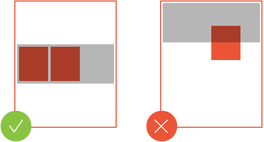
- Make buttons the entire width of the screen so that the button text is always visible in its entirety, and in no case put more than three buttons on one line.
Conclusion
The framework into which the corporation has put developers in the first approach is annoying. With a deeper dive, it becomes clear that the restrictions do not so much deprive expressive means as they dictate the rules of good tone when working with microscopic screens. After all, the design of interaction, and even more so the development, is working with data and tasks, and not a game of pixels and coloring.
Of course, I would like to use more familiar and studied on iOS elements, but for the first attempt, the provided capabilities are quite enough. Obviously, in a couple of months at the annual WWDC we will see new features and new tools, but for now, you need to get a good feel for what is one of the first steps on the way to getting information in context. Fast, inconspicuous and on the run. But such information should not be much: neither visually nor informatively.
In the next article, we will talk about how we developed the application for Apple Watch - " My Beeline ."
Read also:
Material Design: to the Moon and back
Styling iOS-applications: how we stretch fonts, colors and images
Redesign of the Russian Railways application: concept