Interesting and at the same time simple slider in pure CSS3
I won’t open America to anyone, I won’t surprise the audience with a new trick, and I won’t blow the brain to those who swim in CSS3 like a scuba diver. I'll tell you a simple way how to create a slider using simple CSS3 functions without the need for javascript.
To implement the slider, we need a fairly simple set of tags, which in turn will be responsible for the elements of the slider.
Here we see that the general “wrapper” block contains a “slider” block with 5 slides, inside which you can put any html-code that will be located on the slide. In front of the general block there are radio buttons that will later be hidden to create their own slide navigation panel for them, with which the labels in the “controls” block will help us.
Here we stop and take a little look at css. Please note that for some properties cross-browser prefixes are affixed so that all modern browsers can understand them.
With background design and general styles, everything is clear.
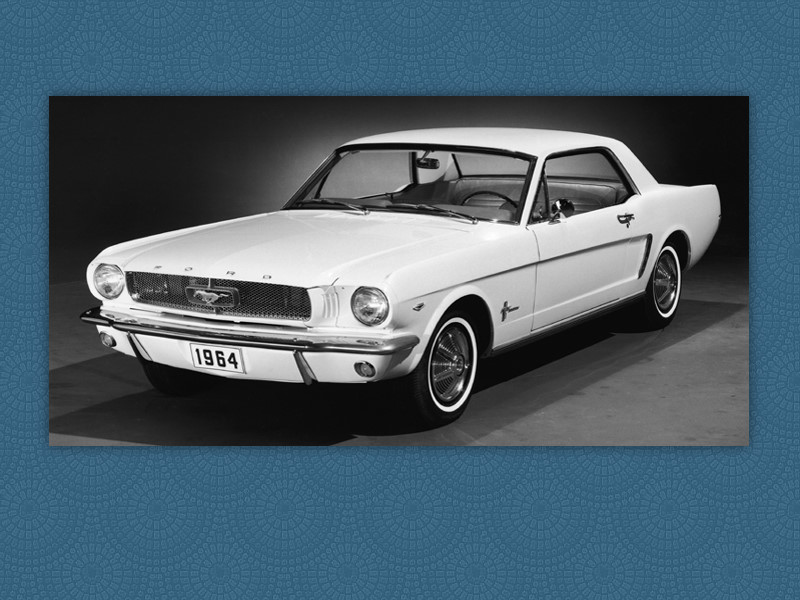
The common block and the block with the slider are the same size to perfectly control the position of the slider on the page. While there are no slides, we temporarily painted the slider in light gray.
Radio buttons are hidden. We will need them later.
The result at the moment is:

Here we will prescribe the general styles for the slides and each slide separately:
For all slides, we indicated absolute positioning so that we can play with the effects of appearance. The dimensions of the slides are taken from the size of the slider itself, so that you do not have to register them in several places.
Since the radio buttons are hidden and we need them as switches, we arrange the prepared labels:
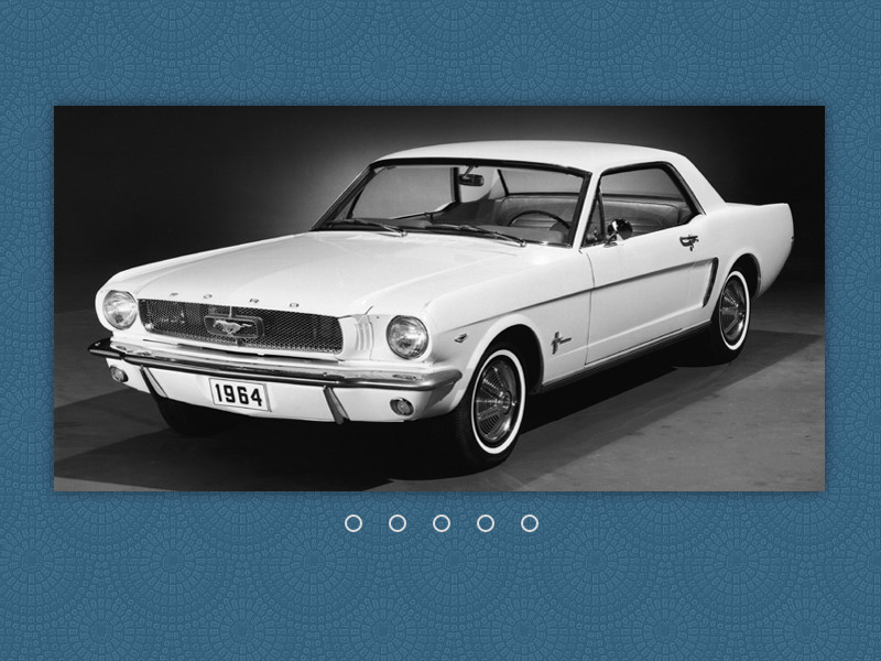
We make navigation classic. Each button represents a region in the form of a circle, inside of which, with an active slide, the empty region is partially colored. In the meantime, we have the following result:
It's time to teach the slider to switch slides by clicking on a specific button:
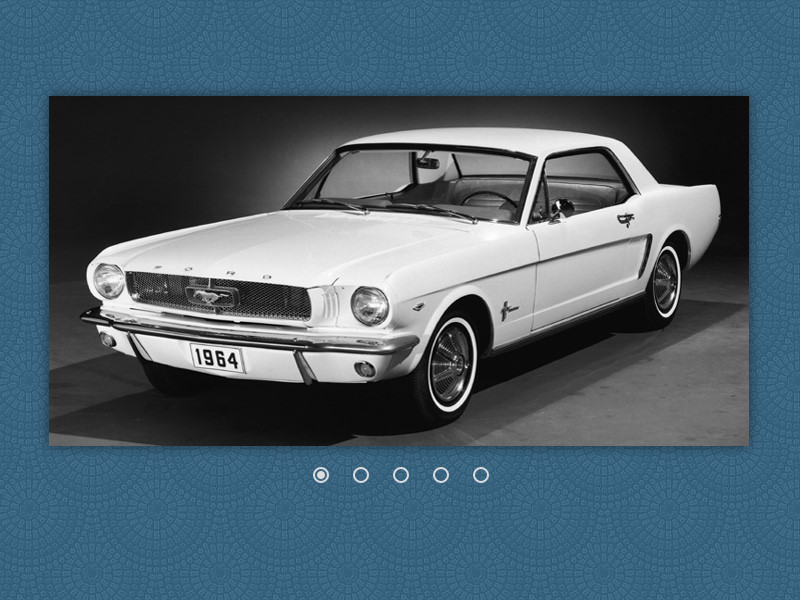
In the designed navigation buttons, add smooth coloring inside them. We also add the conditions under which the active button and the button that the cursor is over will smoothly color. Our own radio buttons are ready:
Well, now we make the slides finally switch:
In the general style of the slides, we add properties in which all the slides become invisible and go to the background. We also added a slight increase in the slides, while they are invisible to give an interesting appearance in the slider.
Next, we attribute the condition under which, depending on the active navigation button, the necessary slide appears in the slider window.
The result can be seen here: a slider demo .
Slider does not require js. Although he doesn’t know how to switch himself, it will be easy for anyone who knows the basics of CSS, transition and transform to come up with their own effects for switching slides.
PS The slider from Sorax, which I redid in my own way, was taken as the basis.
1. Layout the base
To implement the slider, we need a fairly simple set of tags, which in turn will be responsible for the elements of the slider.
Here we see that the general “wrapper” block contains a “slider” block with 5 slides, inside which you can put any html-code that will be located on the slide. In front of the general block there are radio buttons that will later be hidden to create their own slide navigation panel for them, with which the labels in the “controls” block will help us.
2. We make out a slider
Here we stop and take a little look at css. Please note that for some properties cross-browser prefixes are affixed so that all modern browsers can understand them.
* {
	margin: 0;
	padding: 0;
	-webkit-box-sizing: border-box;
	-moz-box-sizing: border-box;
	-o-box-sizing: border-box;
	box-sizing: border-box;
}
body {
	background-image: url(http://habrastorage.org/files/996/d76/d04/996d76d0410d422fa54cc433ce7ead2a.png);
}
With background design and general styles, everything is clear.
.wrapper {
	height: 350px;
	margin: 100px auto 0;
	position: relative;
	width: 700px;
}
.slider {
	background-color: #ddd;
	height: inherit;
	overflow: hidden;
	position: relative;
	width: inherit;
	-webkit-box-shadow: 0 0 20px rgba(0, 0, 0, .5);
	-moz-box-shadow: 0 0 20px rgba(0, 0, 0, .5);
	-o-box-shadow: 0 0 20px rgba(0, 0, 0, .5);
	box-shadow: 0 0 20px rgba(0, 0, 0, .5);
}
The common block and the block with the slider are the same size to perfectly control the position of the slider on the page. While there are no slides, we temporarily painted the slider in light gray.
.wrapper > input {
	display: none;
}
Radio buttons are hidden. We will need them later.
The result at the moment is:
3. Making out the slides
Here we will prescribe the general styles for the slides and each slide separately:
.slides {
	height: inherit;
	position: absolute;
	width: inherit;
}
.slide1 { background-image: url(http://habrastorage.org/files/3f2/628/bd5/3f2628bd58c8452db516195cb0c9bfc9.jpg); }
.slide2 { background-image: url(http://habrastorage.org/files/3e1/95d/c7f/3e195dc7f5a64469807f49a14f97ba0e.jpg); }
.slide3 { background-image: url(http://habrastorage.org/files/663/6b1/d4f/6636b1d4f8e643d29eab8c192fc1cea3.jpg); }
.slide4 { background-image: url(http://habrastorage.org/files/e59/424/c04/e59424c046be4dab897d84ab015c87ea.jpg); }
.slide5 { background-image: url(http://habrastorage.org/files/53c/ff6/c1c/53cff6c1caf842368c70b8ef892d8402.jpg); }
For all slides, we indicated absolute positioning so that we can play with the effects of appearance. The dimensions of the slides are taken from the size of the slider itself, so that you do not have to register them in several places.
4. Do the slide navigation
Since the radio buttons are hidden and we need them as switches, we arrange the prepared labels:
.wrapper .controls {
	left: 50%;
	margin-left: -98px;
	position: absolute;
}
.wrapper label {
	cursor: pointer;
	display: inline-block;
	height: 8px;
	margin: 25px 12px 0 16px;
	position: relative;
	width: 8px;
	-webkit-border-radius: 50%;
	-moz-border-radius: 50%;
	-o-border-radius: 50%;
	border-radius: 50%;
}
.wrapper label:after {
	border: 2px solid #ddd;
	content: " ";
	display: block;
	height: 12px;
	left: -4px;
	position: absolute;
	top: -4px;
	width: 12px;
	-webkit-border-radius: 50%;
	-moz-border-radius: 50%;
	-o-border-radius: 50%;
	border-radius: 50%;
}
We make navigation classic. Each button represents a region in the form of a circle, inside of which, with an active slide, the empty region is partially colored. In the meantime, we have the following result:
5. We teach buttons to be pressed
It's time to teach the slider to switch slides by clicking on a specific button:
.wrapper label {
	cursor: pointer;
	display: inline-block;
	height: 8px;
	margin: 25px 12px 0 16px;
	position: relative;
	width: 8px;
	-webkit-border-radius: 50%;
	-moz-border-radius: 50%;
	-o-border-radius: 50%;
	border-radius: 50%;
	-webkit-transition: background ease-in-out .5s;
	-moz-transition: background ease-in-out .5s;
	-o-transition: background ease-in-out .5s;
	transition: background ease-in-out .5s;
}
.wrapper label:hover,
#slide1:checked ~ .controls label:nth-of-type(1),
#slide2:checked ~ .controls label:nth-of-type(2),
#slide3:checked ~ .controls label:nth-of-type(3),
#slide4:checked ~ .controls label:nth-of-type(4),
#slide5:checked ~ .controls label:nth-of-type(5) {
	background: #ddd;
}
In the designed navigation buttons, add smooth coloring inside them. We also add the conditions under which the active button and the button that the cursor is over will smoothly color. Our own radio buttons are ready:
6. We revive the slider
Well, now we make the slides finally switch:
.slides {
	height: inherit;
	opacity: 0;
	position: absolute;
	width: inherit;
	z-index: 0;
	-webkit-transform: scale(1.5);
	-moz-transform: scale(1.5);
	-o-transform: scale(1.5);
	transform: scale(1.5);
	-webkit-transition: transform ease-in-out .5s, opacity ease-in-out .5s;
	-moz-transition: transform ease-in-out .5s, opacity ease-in-out .5s;
	-o-transition: transform ease-in-out .5s, opacity ease-in-out .5s;
	transition: transform ease-in-out .5s, opacity ease-in-out .5s;
}
#slide1:checked ~ .slider > .slide1,
#slide2:checked ~ .slider > .slide2,
#slide3:checked ~ .slider > .slide3,
#slide4:checked ~ .slider > .slide4,
#slide5:checked ~ .slider > .slide5 {
	opacity: 1;
	z-index: 1;
	-webkit-transform: scale(1);
	-moz-transform: scale(1);
	-o-transform: scale(1);
	transform: scale(1);
}
In the general style of the slides, we add properties in which all the slides become invisible and go to the background. We also added a slight increase in the slides, while they are invisible to give an interesting appearance in the slider.
Next, we attribute the condition under which, depending on the active navigation button, the necessary slide appears in the slider window.
The result can be seen here: a slider demo .
Total
Slider does not require js. Although he doesn’t know how to switch himself, it will be easy for anyone who knows the basics of CSS, transition and transform to come up with their own effects for switching slides.
PS The slider from Sorax, which I redid in my own way, was taken as the basis.