Audit of commuter train station information board
My ability to criticize everything that catches my eye has long outgrown the scale of proofreading texts. And if I do not apply this talent to perfect the Universe, then I run the risk of growing old with an absolute grind.

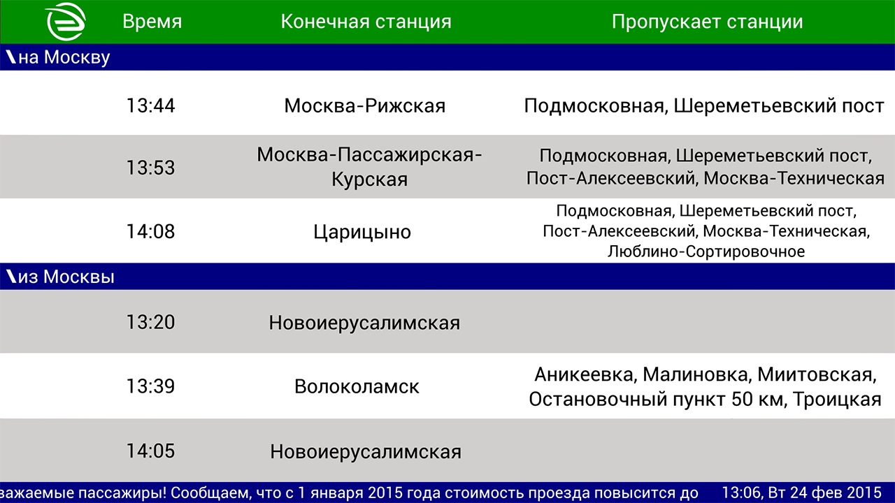
The most effective way of becoming in the profession I see practice. Therefore, I looked around a bit and chose an object for criticism - fresh bulletin boards on the platforms of electric trains in Moscow and Moscow Region. In the composition, they look like this:

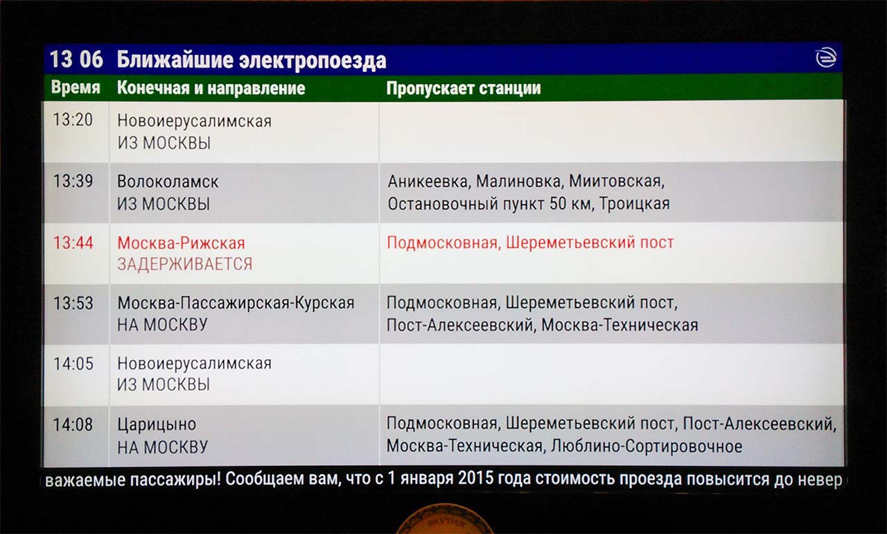
And this is the contents of the screen upon closer examination:

In general, the appearance of a display on an ordinary station is a pleasant surprise. Previously, they met me only at major train stations and airports. However, execution, as is the case with new products, is far from perfect.
I think you can easily find other problems on this screen. This is normal, because there can be no limit to perfection, and I am writing only the first article about interfaces.
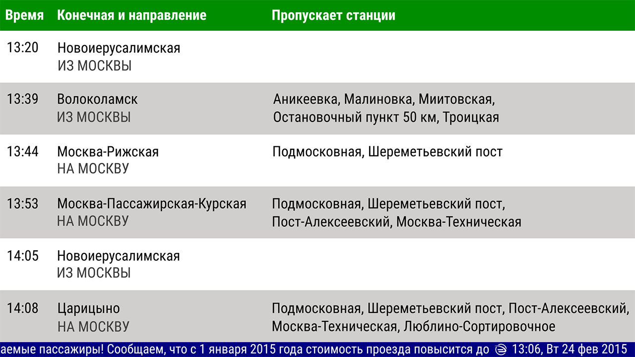
Meanwhile, a day passed and I mastered Inkscape.
- Delete the column with “Scheduled time”
- Change the name of the “Stops” column
- Uncheck the box “Test broadcast”
- Get rid of the upper case
It’s better.
The names of the end stations are now more often placed in one row, and the running line can be trusted, because it is no longer a test one (in all other cases, you just need to turn it off). In the third column, the extra words “except” and “everywhere” have disappeared. The letters on the scoreboard are no longer CALLING.
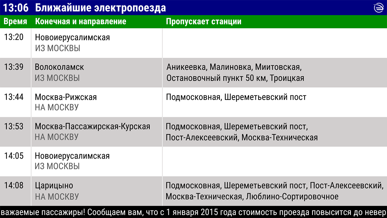
- Sort trains by arrival time
- Find a place for "to Moscow" / "from Moscow" in a new layout
- Get rid of crowding in the third column
- Make text convenient for fluent reading using alignment
Already good.
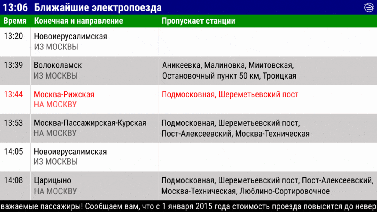
- Put the watch in the heading
- Come up with the heading
Now everything is in place.
By combining the “Departure time” and “Scheduled time” columns into one, I deprived the scoreboard of the ability to display late information. Undoubtedly, this functionality is better to keep. And here is my solution:
The solution is a compromise, because a flickering inscription is more difficult to notice than a static one. And the word "delayed" appears where the direction of the train should be, and not its status. However, I am counting on the fact that color coding will help passengers to keep a glance at the labels and consider information about the delay.
Perhaps this is all.
In this form, I send this text to the feedback service of the CPPK company and look forward to your comments and advice.
The most effective way of becoming in the profession I see practice. Therefore, I looked around a bit and chose an object for criticism - fresh bulletin boards on the platforms of electric trains in Moscow and Moscow Region. In the composition, they look like this:
And this is the contents of the screen upon closer examination:
In general, the appearance of a display on an ordinary station is a pleasant surprise. Previously, they met me only at major train stations and airports. However, execution, as is the case with new products, is far from perfect.
Space is not used rationally
- Under the inscriptions “To Moscow”, “From Moscow” there is an unused zone.
- In the last two columns, the text is piled together.
- The columns “Departure time” and “Scheduled time” are duplicates.
- The clock stuck to the running line (213 hours 6 minutes).
Content is largely illogical
- Sorting flights
Passengers traveling to the Moscow Region first look at the time in the first line of the board, then consider the waiting time in their minds, and then they understand from the name of the terminal station that the train does not suit them, as it moves in the opposite direction. They perform the same sequence of actions for the second and third row. Only during the transition to the fourth they understand that there is no such usual sorting by time here, and begin to look for another pattern. - Clock in the basement
This indicates their secondary status, although the passenger needs the clock literally right away to calculate the gap between the current time and the arrival time of the train. - Date, month, year, day of the week
For a screen that can display train schedules no more than 2 hours in advance, this information is redundant. - Stops-non-stops
The last column of the board is called “Stops”, and its contents indicate the stations where, on the contrary, there are no stops. - Paradox of the creeping line
At the beginning of the creeping line there is a note “Test translation”. Does this mean that information that cannot be trusted is written on the ticker? And if she cannot be trusted, then why is she broadcasting and for whom? - Solid upper case
This graphic technique is used to highlight information. When the capsloc typed all the text, the reception does not work.
I think you can easily find other problems on this screen. This is normal, because there can be no limit to perfection, and I am writing only the first article about interfaces.
Meanwhile, a day passed and I mastered Inkscape.
Redundancy
- Delete the column with “Scheduled time”
- Change the name of the “Stops” column
- Uncheck the box “Test broadcast”
- Get rid of the upper case
It’s better.
The names of the end stations are now more often placed in one row, and the running line can be trusted, because it is no longer a test one (in all other cases, you just need to turn it off). In the third column, the extra words “except” and “everywhere” have disappeared. The letters on the scoreboard are no longer CALLING.
Structure
- Sort trains by arrival time
- Find a place for "to Moscow" / "from Moscow" in a new layout
- Get rid of crowding in the third column
- Make text convenient for fluent reading using alignment
Already good.
- It was possible to achieve the same size in the name of all stations with the help of the space freed up on the left and a sealed headset.
- The direction of movement is now indicated under each train. Together with sorting by arrival time, this should reduce the time that a passenger spends searching for the desired train.
- The third column finally got a well-deserved 60% horizontally and does not spill beyond two lines. For this, I had to sacrifice the quality of the heading in the second column and shorten “End Station” to just “End”.
Clock and ticker
- Put the watch in the heading
- Come up with the heading
Now everything is in place.
- The clock is visible and is on a par with the minute of departure. It became convenient to glance up and down, comparing time.
- A creeping line is highlighted as a standalone element. The black backing, combined with the black housing of the LCD panel, will make it possible to perceive the running line as an independent interface element, and not a continuation of the flight table.
- The carrier’s logo is muted and removed to the far corner so as not to distract attention.
Justice
By combining the “Departure time” and “Scheduled time” columns into one, I deprived the scoreboard of the ability to display late information. Undoubtedly, this functionality is better to keep. And here is my solution:
The solution is a compromise, because a flickering inscription is more difficult to notice than a static one. And the word "delayed" appears where the direction of the train should be, and not its status. However, I am counting on the fact that color coding will help passengers to keep a glance at the labels and consider information about the delay.
Test on a similar sized screen
Perhaps this is all.
In this form, I send this text to the feedback service of the CPPK company and look forward to your comments and advice.
Open questions
- Is it necessary to force people to independently calculate the waiting time, if you can read and show it automatically, as in a popular mobile application?
- Was the technical task allowed to display on the scoreboard not six, but fewer flights? Fewer rows would increase the size or change the function of the third column (display stops, not exceptions).
- Why mark the station with the long phrase “Stop Point 50 km” if the station sign contains the shorter name “Platform 50 km”, and people even know this station as “50 km”?
- How justified is the use of traditional “to Moscow” and “from Moscow”, if you can use phrases that will be easier to distinguish from each other without reading (for example, “to Moscow” and “to the region”).