 February 27, 2015 at 16:28
6 principles of visual hierarchy
- Transfer
To learn design, we enrolled in the Design 101 course from trydesignlab.com . The first lessons were devoted to visual hierarchy. We have translated one of the best articles on this topic from 99designs.com .

Translation from the site for start-up entrepreneurs “ I love SP ”
First, there were stone tablets, papyrus and paper. Then came computers and tablets. Despite the development of technology, the task of the designer remains a clear and clear organization of information. But how is this best done ?
This issue is especially relevant now, when the variety of devices makes the designer think of several pages at the same time. Faced with massive information and a short attention span, designers have developed 6 principles to direct the user's eyes to the most important.
These 6 principles of visual hierarchy will help you design from brochures to applications, guaranteeing your users a positive experience from consuming content.

Clay tablet and iPad
In all cultures, people read information from top to bottom and in most cultures, from left to right. This is useful to know when creating a design, but in fact the task is much more complicated.
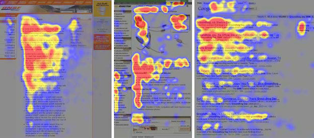
Recent studies have shown that before starting to read, people scan the page to see if it is interesting to them or not. Scan patterns usually take one of two forms, the letters “F” or “Z”.
Letter F PatternApplies to traditional pages with lots of text, such as articles or blog posts. The user scans the page from top to bottom on the left side. If he finds interesting keywords in headings on the left or at the beginning of sentences, he continues reading from left to right. As a result, the shape resembles the letter “F” (or “E”, or something with even more horizontal lines, but the term with the letter “F” is already well established).
How can this be applied? Put important information on the left side, use short highlighted headings, bulletins and other elements to attract attention and share information.
Hot Map by Nielsen Norman Group
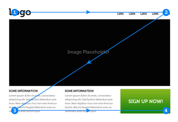
Letter Z Patternapplies in all other cases, in advertising or sites where the information is not necessarily represented in large blocks of text. The user scans the top of the screen, where important information is usually located. Then his gaze moves diagonally to the opposite corner, and he scans the bottom of the screen.
Source: tuts +
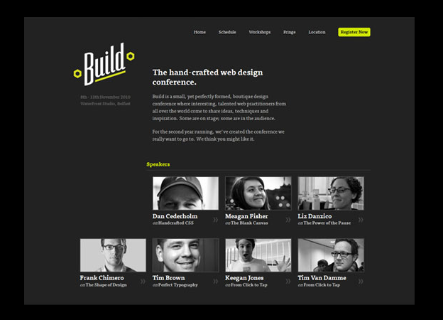
Designers usually create pages that are fully consistent with this behavior, placing the most important information in the corners, and everything else is along the top and bottom of the screen and along the diagonal that connects them. On the 2010 Build Conference website (bottom), important elements include the logo (top left corner), the Register Now button (top right corner) and the list of speakers (bottom). All these elements are strategically located at key points of the letter "Z".
Build Website
This principle is quite simple: first people read large text. If in the example below you paid attention to the word "performance" instead of "cracking", then you should contact a specialist in perception psychology. You can certainly make good money by passing tests as a person with a very rare anomaly. Rebecca Foster

Poster
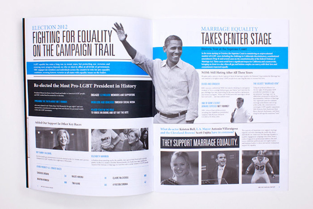
This principle is so strong that it prevails over the top-down rule. In the previous example, the word “cracking” overpowers “time to act” due to its size and location on the left (here the rule “from left to right” comes to the rescue). But in the example below, we read the text “Fighting for Equality on the Campaign Trail”, in large print, to the text also located to the left directly above it, “Election 2012”.
Annual reportColumn Five
“Election 2012” is a common theme, and the designer decided that the title of the article was of more interest to the reader, and therefore increased its size.
Another way to get attention is to give the content enough space for it to breathe. If there is a lot of negative space around the button or a large lead in the text, then these elements will be noticed first.
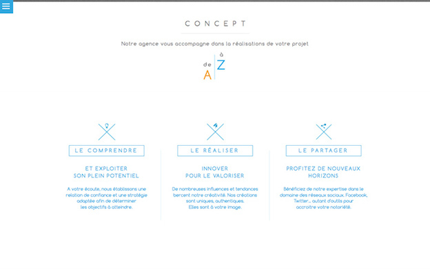
As you can see in the example below, space can be an elegant alternative or complement to the use of size. The main phrase "Notre agence vous accompagne ..." is typed in small print, but surrounded by a large amount of space, which signals its importance. The phrases below, “Le Compendre”, “Le Réaliser” and “Le Partager”, are framed, which further highlights them on a white background. Draw to Click
Website
When we talk about density in terms of visual hierarchy, we mean the general arrangement of space, text, and other details on the page. The following example illustrates this principle well:
Bright Pink poster (via Smashing Magazine )
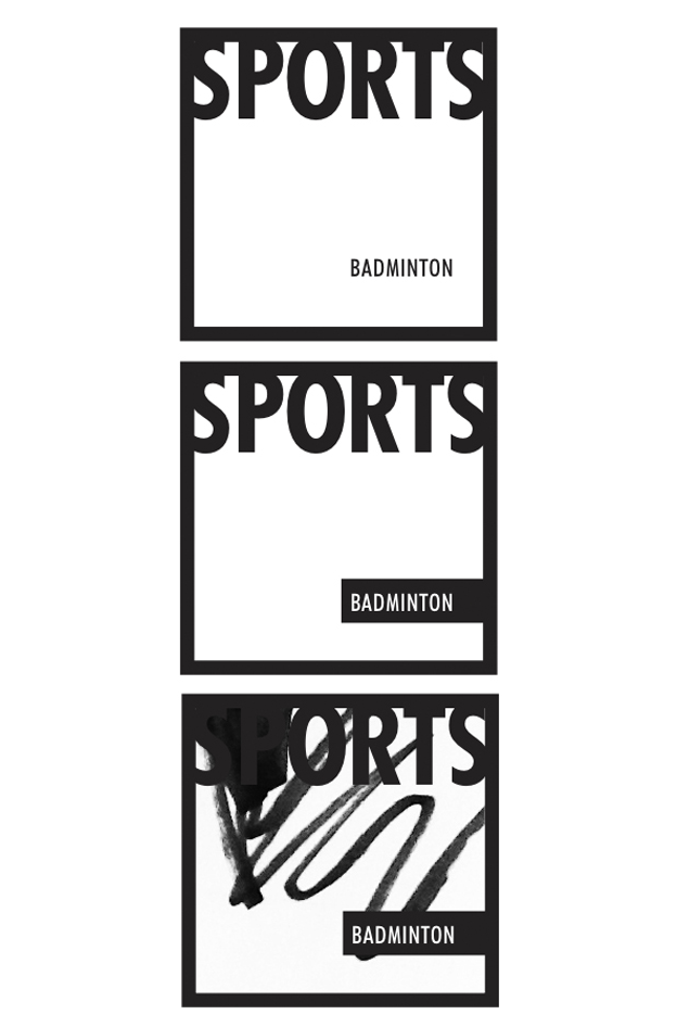
In the first picture, the word “sports” is stronger in visual hierarchy than “badminton,” because it is taller, larger, and highlighted by bold. In the second picture, these words become approximately equal in meaning, thanks to the black rectangle that makes badminton stand out. In the third picture, the scribbles cover the word “Sports”, but not “badminton”, which leads to the opposite result and makes “badminton” higher in hierarchy. Such a turn is difficult to predict, so designers are trying to stick to an integrated approach in the use of space.
The choice of font significantly affects the visual hierarchy . The main characteristics of a font are saturation, that is, the thickness of the strokes that make up the letters, and the style, with or without serifs. Other characteristics, such as italics, also matter.
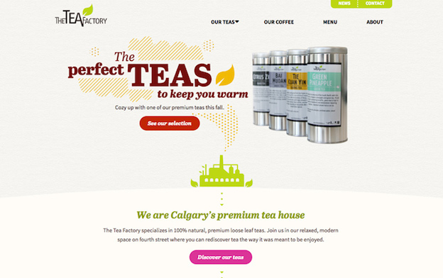
See how typography affects hierarchy and word order on The Tea Factory. The main emphasis is on the phrase “the perfect teas to keep you warm”. But the difference in the font style, the use of italics inside the phrase, in addition to the way the words are arranged, make the text more dynamic. The call to action, “See our selection”, differs from the main text in size and surrounding space. The Tea Factory
Branding
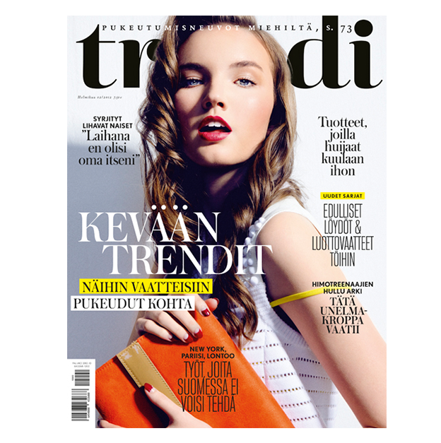
In some cases, it is necessary to present different information as equally important. If you type it with a font of the same size and style, you can achieve equivalence, but the design will become monotonous. This can be avoided with a combination of fonts, as on the cover of Trendi magazine. All five phrases at the edges of the page are equal in visual hierarchy, but differ due to two well-combined fonts - with serifs in bold and without serifs, but thin and high. Trendi
Magazine Cover (via The Kasper Stromman Design Blog )
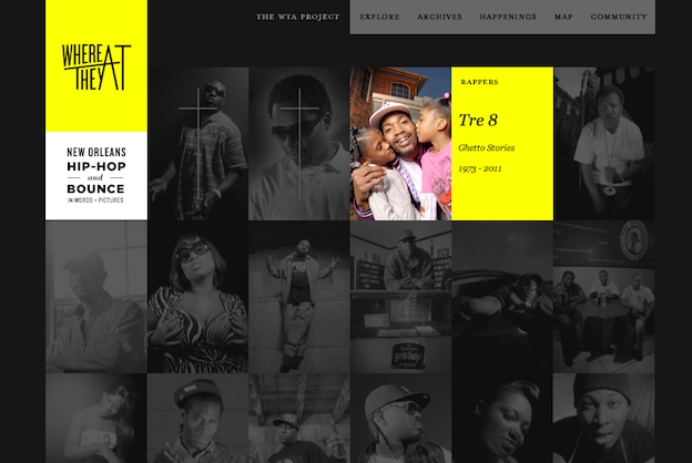
This principle is also simple: bright colors stand out against the background of muted or gray tones , while light shades look more “distant” and are lower in the visual hierarchy than dark and saturated. On the Where They At website, contrast is created by yellow and a color photograph on a black and white grid for the best effect.
The Where They At
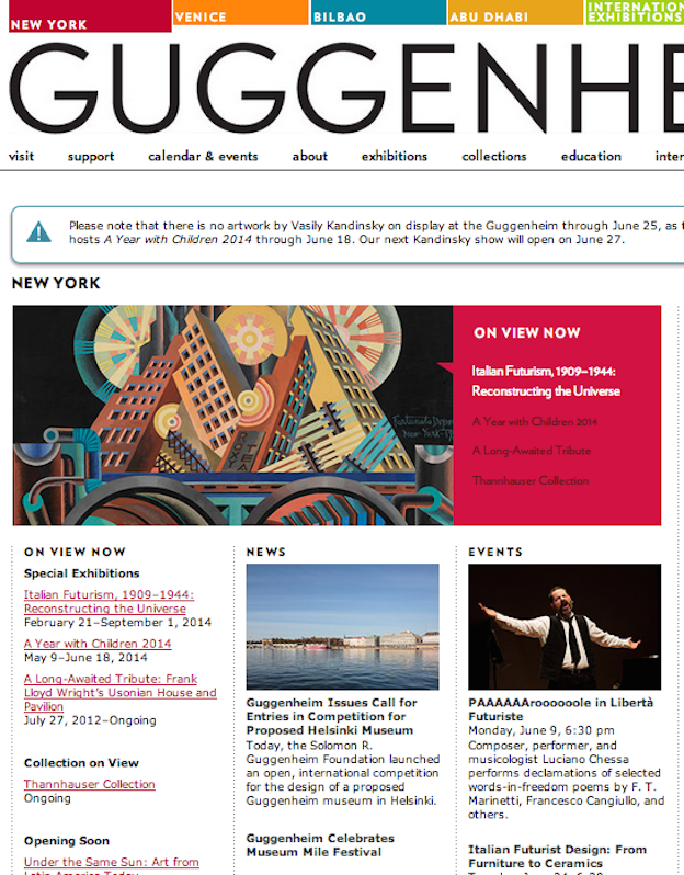
Guggenheim website uses color on its website to highlight important information about the location of the museum, ongoing exhibitions and special projects. Guggenheim
Website
The Whitney Museum website, on the other hand, uses a single font, style, and black color, but establishes a hierarchy using shades of gray. The phrase “Cory Arcangel on Pop Culture” is lower in visual hierarchy than “New on Whitney Stories”, due to its location and lighter shade, which stands out less on a white background. Whitney Museum

Website
Color is especially important in mobile design when a small screen limits the ability to use other principles of the visual hierarchy, such as size and space. In the Grainger Industrial Supply application, the “proceed to checkout” button is red, which distinguishes it from the rest of the elements on the page. And the “Narrow Your Search Results” button, on the contrary, is gray and is on the same level with elements such as search and product links.

Grainger App Design (via codrops )
The page layout is usually created using a grid of vertical and horizontal lines, which simplifies the perception of information. In such a system, another way appears to establish a hierarchy - to break the grid. Text placed along a curve or diagonally will automatically stand out from the rest of the elements located on the grid and attract attention. This principle is effectively used in advertising, as on this poster from Frost Design.
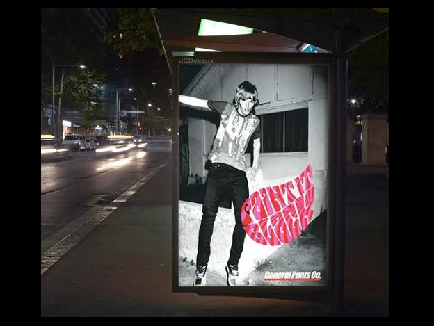
Poster General Pants Co. (via Frost * collective )
* * *
If you want to improve your design skills, subscribe to our VK page . We publish there information about each lesson on trydesignlab.com under the tag # design101 @ iloveip .
PS. If there are comments on the translation, write in the comments.
Translation from the site for start-up entrepreneurs “ I love SP ”
First, there were stone tablets, papyrus and paper. Then came computers and tablets. Despite the development of technology, the task of the designer remains a clear and clear organization of information. But how is this best done ?
This issue is especially relevant now, when the variety of devices makes the designer think of several pages at the same time. Faced with massive information and a short attention span, designers have developed 6 principles to direct the user's eyes to the most important.
These 6 principles of visual hierarchy will help you design from brochures to applications, guaranteeing your users a positive experience from consuming content.
Clay tablet and iPad
1) Page scan patterns
In all cultures, people read information from top to bottom and in most cultures, from left to right. This is useful to know when creating a design, but in fact the task is much more complicated.
Recent studies have shown that before starting to read, people scan the page to see if it is interesting to them or not. Scan patterns usually take one of two forms, the letters “F” or “Z”.
Letter F PatternApplies to traditional pages with lots of text, such as articles or blog posts. The user scans the page from top to bottom on the left side. If he finds interesting keywords in headings on the left or at the beginning of sentences, he continues reading from left to right. As a result, the shape resembles the letter “F” (or “E”, or something with even more horizontal lines, but the term with the letter “F” is already well established).
How can this be applied? Put important information on the left side, use short highlighted headings, bulletins and other elements to attract attention and share information.
Hot Map by Nielsen Norman Group
Letter Z Patternapplies in all other cases, in advertising or sites where the information is not necessarily represented in large blocks of text. The user scans the top of the screen, where important information is usually located. Then his gaze moves diagonally to the opposite corner, and he scans the bottom of the screen.
Source: tuts +
Designers usually create pages that are fully consistent with this behavior, placing the most important information in the corners, and everything else is along the top and bottom of the screen and along the diagonal that connects them. On the 2010 Build Conference website (bottom), important elements include the logo (top left corner), the Register Now button (top right corner) and the list of speakers (bottom). All these elements are strategically located at key points of the letter "Z".
Build Website
size 2
This principle is quite simple: first people read large text. If in the example below you paid attention to the word "performance" instead of "cracking", then you should contact a specialist in perception psychology. You can certainly make good money by passing tests as a person with a very rare anomaly. Rebecca Foster
Poster
This principle is so strong that it prevails over the top-down rule. In the previous example, the word “cracking” overpowers “time to act” due to its size and location on the left (here the rule “from left to right” comes to the rescue). But in the example below, we read the text “Fighting for Equality on the Campaign Trail”, in large print, to the text also located to the left directly above it, “Election 2012”.
Annual reportColumn Five
“Election 2012” is a common theme, and the designer decided that the title of the article was of more interest to the reader, and therefore increased its size.
3) Space and density
Another way to get attention is to give the content enough space for it to breathe. If there is a lot of negative space around the button or a large lead in the text, then these elements will be noticed first.
As you can see in the example below, space can be an elegant alternative or complement to the use of size. The main phrase "Notre agence vous accompagne ..." is typed in small print, but surrounded by a large amount of space, which signals its importance. The phrases below, “Le Compendre”, “Le Réaliser” and “Le Partager”, are framed, which further highlights them on a white background. Draw to Click
Website
When we talk about density in terms of visual hierarchy, we mean the general arrangement of space, text, and other details on the page. The following example illustrates this principle well:
Bright Pink poster (via Smashing Magazine )
In the first picture, the word “sports” is stronger in visual hierarchy than “badminton,” because it is taller, larger, and highlighted by bold. In the second picture, these words become approximately equal in meaning, thanks to the black rectangle that makes badminton stand out. In the third picture, the scribbles cover the word “Sports”, but not “badminton”, which leads to the opposite result and makes “badminton” higher in hierarchy. Such a turn is difficult to predict, so designers are trying to stick to an integrated approach in the use of space.
4) Font style and combination
The choice of font significantly affects the visual hierarchy . The main characteristics of a font are saturation, that is, the thickness of the strokes that make up the letters, and the style, with or without serifs. Other characteristics, such as italics, also matter.
See how typography affects hierarchy and word order on The Tea Factory. The main emphasis is on the phrase “the perfect teas to keep you warm”. But the difference in the font style, the use of italics inside the phrase, in addition to the way the words are arranged, make the text more dynamic. The call to action, “See our selection”, differs from the main text in size and surrounding space. The Tea Factory
Branding
In some cases, it is necessary to present different information as equally important. If you type it with a font of the same size and style, you can achieve equivalence, but the design will become monotonous. This can be avoided with a combination of fonts, as on the cover of Trendi magazine. All five phrases at the edges of the page are equal in visual hierarchy, but differ due to two well-combined fonts - with serifs in bold and without serifs, but thin and high. Trendi
Magazine Cover (via The Kasper Stromman Design Blog )
5) Color and tint
This principle is also simple: bright colors stand out against the background of muted or gray tones , while light shades look more “distant” and are lower in the visual hierarchy than dark and saturated. On the Where They At website, contrast is created by yellow and a color photograph on a black and white grid for the best effect.
The Where They At
Guggenheim website uses color on its website to highlight important information about the location of the museum, ongoing exhibitions and special projects. Guggenheim
Website
The Whitney Museum website, on the other hand, uses a single font, style, and black color, but establishes a hierarchy using shades of gray. The phrase “Cory Arcangel on Pop Culture” is lower in visual hierarchy than “New on Whitney Stories”, due to its location and lighter shade, which stands out less on a white background. Whitney Museum
Website
Color is especially important in mobile design when a small screen limits the ability to use other principles of the visual hierarchy, such as size and space. In the Grainger Industrial Supply application, the “proceed to checkout” button is red, which distinguishes it from the rest of the elements on the page. And the “Narrow Your Search Results” button, on the contrary, is gray and is on the same level with elements such as search and product links.
Grainger App Design (via codrops )
6) Direction
The page layout is usually created using a grid of vertical and horizontal lines, which simplifies the perception of information. In such a system, another way appears to establish a hierarchy - to break the grid. Text placed along a curve or diagonally will automatically stand out from the rest of the elements located on the grid and attract attention. This principle is effectively used in advertising, as on this poster from Frost Design.
Poster General Pants Co. (via Frost * collective )
* * *
If you want to improve your design skills, subscribe to our VK page . We publish there information about each lesson on trydesignlab.com under the tag # design101 @ iloveip .
PS. If there are comments on the translation, write in the comments.