 February 17, 2015 at 11:33
Design Unification: Mail.Ru Group framework for mobile web
For companies with a large product portfolio, over time, the question arises of simplifying work on them. There are about 40 of them in Mail.Ru Group, not counting the mobile and tablet versions, as well as the huge gaming direction. Our Post and Portal division deals with almost half of these forty. That, along with accompanying applications, mobile sites and promotional resources - for a hundred projects. Now we are conducting their phased updating and unification around several guidelines. Using one of them as an example, I’ll talk about how to rebuild a design process from the classic “prototype → layout → layout → code” for each screen to a more efficient and modern one based on frameworks .
Article written for Smashing Magazine .
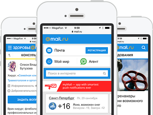
In mid-2012, we restarted Mobile News - the first project on a new design and technical platform, something similar to Twitter Bootstrap . Now a dozen services are already working on it and a couple more will restart soon.

Why is this approach good?
All in all, this is a key part of our UX strategy. But the most important thing is that the framework has also become technical unification. We made many approaches to the "shell" - wrote specifications, assembled a single source, made libraries of elements, etc. But all this quickly faded, because it was in a cozy designer world and was poorly in demand by developers. And we all know how often design is "twisted" on the way from layouts to implementation. But if you make the code correct and redistributed once, then there are much more reasons for confidence in the quality of the design that works in a real product. Therefore, one of the main criteria for the success of any unification projects is their transfer to the level of specific implementation.
The general principle of operation of the first version of the framework looks like this:
A large canvas with source codes of all interface blocks and standard screens in PSD. And also a library in Adobe InDesign, which is as close as possible to the design layouts in the visual part. When we start a new project, we design all the necessary screens in InDesign. This prototype is easily referenced and works great on the device if you export it to PDF. If some blocks are unique to the new project and they were not yet in the UI Kit, we draw them in Photoshop and, after coordination, add them to the InDesign library.

All new blocks fall into a single code base . From the ready-made components, the layout of all screens is assembled in the form of a prototype. Some of them are fully standardized - for example, comments or photo galleries. Designers check the assembly before running, if necessary - modify the layouts and logic of the interface. Indeed, in a working bunch there are always inconsistencies regarding the initial vision.
To display the site page in the user's browser, a template engine is used . It collects the final layout on the fly from separately laid out blocks, graphics, styles and scripts. For all types of pages, the rules for their assembly are determined - i.e. set of blocks and their sequence. Moreover, the template and data for rendering a specific URL are separated and loaded in parallel. For example, if a user has already opened a news feed, he will cache the page layout and next time only the content will be pumped.

If we find a new solution for an old block or component (for example, a new type of photo gallery), it changes in layouts, prototype and code base. After that, each project updates it from a common repository, almost like applications from the AppStore. In this case, the designer needs to check only one implementation in a single code base instead of tracking each of the services. And you can be sure of the quality of the implemented design.

In the near future, we plan to review the first stage - designers will switch from working with layouts and prototypes in Photoshop and InDesign to assembling new pages from code. But for this it is important to go through the entire process of creating and implementing the framework:
Now we are simultaneously running the third and fourth stage of implementation of the framework. But we felt the advantages of working with him at the very beginning - the development of the platform is easy, the amount of unnecessary work has decreased to a minimum. Looking back, we would probably be able to make the process of creating and implementing the framework more correct and shorter. But I will tell you about our correct and erroneous decisions in detail so that you can go this way faster.
It all started with the home page for mobile in early 2012. A general approach to design was defined - cards for highlighting blocks with different information, the general style of the heading and headings, controls, etc. Everyone liked these solutions and we decided to transfer the concept to the News. At the same time, the main one - albeit a long but one-page one, but in the content project there is much more information and a more complicated structure. Fortunately, News is the easiest of them, there are no service sections except basic search and comments, only text and media content.

It was necessary to think over the principles of navigation, ways of presenting content and materials on the topic, layout of standard pages. Moreover, they must take into account future mobile versions for other content projects that should be created on the basis of this guideline. Fortunately, we have already managed to make a mobile poster with a rather complex structure and a mass of services. Interface solutions were different from what we need for the News, but the flow of information and part of the navigation patterns came in handy.

Usability testing was carried out for the mobile Poster, from which we made many useful conclusions both for the development of the product itself and for the presentation of content projects on mobile in general. For example, duplication of the search at the bottom of the page turned out to be in demand. And in the slider slots, the last element should lead to a list of all objects. In addition, the approach to splitting blocks without using cards showed a number of problems - it is difficult to work with long pages, the content of which is often too heterogeneous. I refused cards in iOS7 and I'm sure that this interferes with working with complex screens - it is more difficult to understand the principle of grouping elements.

We put together the first prototype in InDesign, which in many respects resembles the design in visual style, but does not repeat it in detail. It raised the first questions on the use of patterns. For example, should I save traffic or show an illustration for each material in the lists? Or what to do with cards in controversial situations - news with accompanying materials? It was also important to remember that some users go to content projects using the link from the main page to specific material, and some go to them from the main page of the project. Where in this case should the “Back” button in the interface lead?

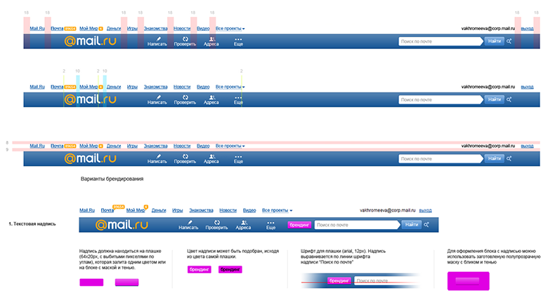
After the key pages were shown in the design layouts, the designer suggested collecting them in one file to simplify further work. It should have turned out to be a simple UI Kit, allowing you to quickly finish the rest of the project screens. But we decided to go further and assemble the guideline in addition to it - other designers had to connect to the task, and the developers had to refer to something when building the project. We described it in Confluence with this structure:
To break in the guideline, we also drawn Horoscopes on its basis. With the exception of minor issues, the style worked - adaptation was quick and easy. Such a run-in is very important - before throwing everything into a dozen projects, you need a pilot. It will allow you to detect problems in the concept before you have to redo too much.

Discussing the idea of unification with developers and managers, we remembered that we already have a similar mechanism for technical unification - for example, this is how portal navigation and the blue header work. And much more is being done for Mail, port-wide authorization pop-ups and other parts of the interface. Although the technology required serious refinement - the whole products on it have not yet been launched.
The developers left to examine the task in detail and see if there are ready-made solutions and products. As a general ideology, BEM (block-element-modifier) from Yandex was perfect . For unification, it is important that the same interface blocks are used on as many pages as possible. And without the need to double-check each time whether everything is good on each of them. BEM guarantees the independence of the design of a particular block from what is happening around it. This is a methodology to simplify the work with which Yandex created the open source toolkit bem-tools - by the way, our developers even sent several patches to the project repository. Previously, the beginnings of this methodology were called “absolutely independent blocks”, but now this approach is actively penetrated in the West - for example, frameworksInuit CSS and TopCoat . Smashing Magazine has published an excellent detailed article on BEM from a former Yandex developer.

But the BEM template engine turned out to be insufficiently productive, and it was not very suitable for the task. Therefore, we used JavaScript-based technologies that we already used, using Node.js to execute code on the server. Thanks to this, both the server and the user have the same page template, which is displayed exactly the same. Data is transmitted separately from it. And when the template is cached in the browser after the first download, only content is transferred to the user, which greatly reduces the amount of traffic and download speed.
The developers returned to us after a couple of weeks with a prototype - the approach worked! The framework was tested and expanded, so that everything was ready for large-scale deployment. For 2.5 months we were able to redraw 12 projects - we have not set such speed records yet. The guideline has grown significantly and described the construction of a common style and many specific blocks - a lot of navigation solutions, lists, different types of cards, ways of presenting content, forms, pop-ups, diagrams specific to specific solution projects. Both the library in InDesign and the UI Kit in Photoshop have grown.
However, supporting three libraries at once (code, InDesign, Photoshop) is unprofitable, and not particularly convenient. Therefore, we found a way to make the guideline automated. This is a “living guideline”, i.e. a generated page in which real pieces of code from the UI Kit are substituted for pictures. A description is added there for each of them. In this form, it is much easier to check the quality of the implementation - already implemented blocks are visible in the guideline, not their source images, which may be incorrectly layout along the way from the layouts. While this document exists in the form of a prototype, after restarting all the projects in the framework, we will finish it. By the way, using this automated guideline you can assemble prototypes from pieces of ready-made code, bypassing InDesign - this is another way to get closer to the final implementation.

So in the end it will turn out better than Bootstrap. After all, it is essentially a set of ready-made styles and scripts, as well as layout examples. And when updating the framework it is not so easy to transfer the changes to your project - you may have to adjust the layout to the new rules. In our case, the project receives a set of ready-to-use blocks that will be updated in the project when changes are made to the framework. In addition, Bootstrap does not adhere to the model of independent blocks, which leads to conflicts - for example, in the combination of Bootstrap and jQuery UI, they will interrupt each other's styles. True, he also solves slightly different tasks - a quick start of the project on ready-made elements. Although this is a problem of ours, and of any custom solution, it takes more time to create it.
And a few numbers about how our workflow has changed thanks to the framework:
It is not always simple and easy; there are problems. But the overall exhaust is excellent.
Initially, it was planned that the UI Kit will support 3 categories of phones - modern smartphones (Android, iPhone, Windows Phone), old smartphones (Bada, Symbian) and push-button phones. In addition, for older browsers on Android, including the standard one before Chrome, a slightly simplified version was shown - they did not pull many of the visual effects we needed. At first, this intermediate version had more noticeable differences, but we decided to simplify it so as not to support another version of the UI Kit, and later completely abandoned it. While we were launching the version for modern smartphones, the share of old platforms and push-button phones has greatly decreased and in the future will become very scanty. We planned to do automatic design degradation in order not to support three guidelines at once. But it seems that this will not be required.


This unification has a drawback - the complete uniformity of the design leads to a lack of identity in the projects. Our experience shows that in the perception of users a specialized product (for example, a weather forecasting service) often provokes more confidence than its analogue in a large portal. And visual highlighting of the service from the general mass can help in this situation . Although it is not so noticeable on the mobile web, despite its active growth. But at the beginning of work on the UI Kit, we tried out several ways to stylize projects and will return to the question later.

Some of the readers will probably have a question - why didn’t we use adaptive design so that the large version would automatically appear on mobile in a suitable form? This is a long and long argument, where each of the opinions has its own arguments for and against. In our case, it was important to launch modern mobile versions as quickly as possible, and the right adaptive approach would require us to first unify the versions for the big web. We are engaged in this task and have already launched a couple of projects on a similar engine. But it is more complex and larger, so that would not allow to do everything in a reasonable amount of time. Smashing Magazine has recently released an excellent article on the subject .
In any case, we try to make the mobile version not simplified - they contain all the content and most services from the main version. Although for an increasing number of users there is no concept of a “main version”, for them what they see on their phone is the main and only version of the product.
Unification can begin on two sides. First create a guideline and then apply it to existing products. Or, successfully update the design of one of them and choose it as a reference, then creating a guideline based on his motives. Both approaches have pros and cons, for us the second turned out to be closer. In this case, we scale the already proven design, optimized using analytics and user research. There is a risk that not all were provided for in design decisions and individual patterns will have to be adjusted, but product efficiency is more important.
And finally, we were finally able to make unified icons - they are displayed when the site is installed on the phone’s start screen. We fought over this for a very long time - all over the world only Yandex and partly Google on Android could solve the problem, for the rest everything is limited to the logo in the corner of the icon.

Now we are preparing to test the ease of updating the UI Kit in practice - we plan to modernize the visual style, because it has been more than two years since it appeared in the reference project. And this is another risk that you need to take when introducing the guideline - you have to crush the temptations to make it inconsistent with the modernization of individual parts. Yes, for a while, services may look a little stale. But after the launch of a single platform, updating the design will be an order of magnitude easier. This will allow you to get away from major redesigns every few years to constantly maintain the relevance of the interface. Restarts take a lot of energy and lose thousands of small developments screwed to the design for a long time of its development.

And the next trend after flat design will be easy and fast to catch :) Of course, the pursuit of trends is not the most laudable undertaking. However, quite sharp breaks in the visual paradigm periodically happen in our industry, as was the case last year with the release of iOS7, and companies must respond quickly to them.
Initially, it was just necessary to update the design of content projects on mobile and make them similar. The idea of complete unification, including the technical part, was born in the course of work and communication with developers. Make friends with them :) And do not wait for instructions from above - move the company forward yourself. Many thanks to the entire design team (Konstantin Zubanov, Gevorg Glechyan, Alexander Kirov, Eugene Belyaev, Artem Gladkov, Pavel Skripkin) and the developers (Dmitry Belyaev, Arstan Toregozhin, Andrey Kusimov, Boris Rebrov, Pavel Rybin, Pavel Vdovtsev), thanks to which all this It happened. In particular, Anton Eprev, who laid the foundation for a technological solution.

In the development of guidelines, you need some authoritarianism, which will help not to miss unsystematic solutions. If possible, you should always use ready-made patterns. If something new is introduced, you need to try to bring already completed projects to this solution or understand where it will come in handy in the future. Only then will the UI Kit not spill over and the consistency of the product portfolio will continue. This means that the convenience of developing these products, their comfort for the user and the positive effect for the entire brand will be preserved.
Article written for Smashing Magazine .
In mid-2012, we restarted Mobile News - the first project on a new design and technical platform, something similar to Twitter Bootstrap . Now a dozen services are already working on it and a couple more will restart soon.

Why is this approach good?
- Unified visual style and principles of the interface , as well as its information architecture. This is convenient for the user - a group of similar products works equally clear and familiar. And also good for the brand - the entire line of services looks holistic.
- Simplification of the launch of new products and the redesign of existing ones . The framework has most of the necessary blocks and components for all occasions, which allows you to quickly assemble a new interface.
- Controlling a large pool of projects becomes easier when they are designed in the same way. Instead of hundreds of individual projects, you follow a couple of guidelines.
- Modern design process . Instead of the classic chain “prototype → layout → layout → code” for each screen that generates a bunch of unnecessary artifacts - go to the assembly of the design directly in the code.
- The cumulative effect of successful product solutions . For example, by raising the viewing depth on one of the services, it is easy to apply these improvements to the others.
- The transition from major redesigns every few years to the constant maintenance of the relevance of the interface . Restarts take a lot of energy and lose thousands of small developments screwed to the design for a long time of its development.
All in all, this is a key part of our UX strategy. But the most important thing is that the framework has also become technical unification. We made many approaches to the "shell" - wrote specifications, assembled a single source, made libraries of elements, etc. But all this quickly faded, because it was in a cozy designer world and was poorly in demand by developers. And we all know how often design is "twisted" on the way from layouts to implementation. But if you make the code correct and redistributed once, then there are much more reasons for confidence in the quality of the design that works in a real product. Therefore, one of the main criteria for the success of any unification projects is their transfer to the level of specific implementation.
How does the framework work and work?
The general principle of operation of the first version of the framework looks like this:
A large canvas with source codes of all interface blocks and standard screens in PSD. And also a library in Adobe InDesign, which is as close as possible to the design layouts in the visual part. When we start a new project, we design all the necessary screens in InDesign. This prototype is easily referenced and works great on the device if you export it to PDF. If some blocks are unique to the new project and they were not yet in the UI Kit, we draw them in Photoshop and, after coordination, add them to the InDesign library.
All new blocks fall into a single code base . From the ready-made components, the layout of all screens is assembled in the form of a prototype. Some of them are fully standardized - for example, comments or photo galleries. Designers check the assembly before running, if necessary - modify the layouts and logic of the interface. Indeed, in a working bunch there are always inconsistencies regarding the initial vision.
  touch.news/
    blocks/
      logotype/
        logotype.png
    bundles/
      article
    /* Собираются из blocks и toolkit. Включает псевдо-бандл common.css */
    toolkit/
      blocks/
        logotype/
          logotype.xml
        section/
          header/
To display the site page in the user's browser, a template engine is used . It collects the final layout on the fly from separately laid out blocks, graphics, styles and scripts. For all types of pages, the rules for their assembly are determined - i.e. set of blocks and their sequence. Moreover, the template and data for rendering a specific URL are separated and loaded in parallel. For example, if a user has already opened a news feed, he will cache the page layout and next time only the content will be pumped.
If we find a new solution for an old block or component (for example, a new type of photo gallery), it changes in layouts, prototype and code base. After that, each project updates it from a common repository, almost like applications from the AppStore. In this case, the designer needs to check only one implementation in a single code base instead of tracking each of the services. And you can be sure of the quality of the implemented design.
In the near future, we plan to review the first stage - designers will switch from working with layouts and prototypes in Photoshop and InDesign to assembling new pages from code. But for this it is important to go through the entire process of creating and implementing the framework:
- Creation of model design and platform . It is necessary to find a suitable and scalable interface solution for our products, determine the style and implement the technical part of the framework.
- Transfer all products to the platform . UI Kit and a single code base are actively expanding due to new solutions, and the back-end of services is brought into line with the requirements of the framework.
- Simplification of the design process . The technical solution has already been tested and the main tasks have been solved, so you can refuse to create many artifacts and collect new screens from ready-made blocks in a single code base.
- Design refactoring . The launch of a dozen products takes quite an impressive amount of time, during which problems in the real life of services are identified. Yes, and design trends are changing.
Now we are simultaneously running the third and fourth stage of implementation of the framework. But we felt the advantages of working with him at the very beginning - the development of the platform is easy, the amount of unnecessary work has decreased to a minimum. Looking back, we would probably be able to make the process of creating and implementing the framework more correct and shorter. But I will tell you about our correct and erroneous decisions in detail so that you can go this way faster.
Background, Part 1: Design
It all started with the home page for mobile in early 2012. A general approach to design was defined - cards for highlighting blocks with different information, the general style of the heading and headings, controls, etc. Everyone liked these solutions and we decided to transfer the concept to the News. At the same time, the main one - albeit a long but one-page one, but in the content project there is much more information and a more complicated structure. Fortunately, News is the easiest of them, there are no service sections except basic search and comments, only text and media content.
The first mobile version of the Mail.Ru Group product appeared in 2004 - it was Mail.

It was necessary to think over the principles of navigation, ways of presenting content and materials on the topic, layout of standard pages. Moreover, they must take into account future mobile versions for other content projects that should be created on the basis of this guideline. Fortunately, we have already managed to make a mobile poster with a rather complex structure and a mass of services. Interface solutions were different from what we need for the News, but the flow of information and part of the navigation patterns came in handy.
Usability testing was carried out for the mobile Poster, from which we made many useful conclusions both for the development of the product itself and for the presentation of content projects on mobile in general. For example, duplication of the search at the bottom of the page turned out to be in demand. And in the slider slots, the last element should lead to a list of all objects. In addition, the approach to splitting blocks without using cards showed a number of problems - it is difficult to work with long pages, the content of which is often too heterogeneous. I refused cards in iOS7 and I'm sure that this interferes with working with complex screens - it is more difficult to understand the principle of grouping elements.
We put together the first prototype in InDesign, which in many respects resembles the design in visual style, but does not repeat it in detail. It raised the first questions on the use of patterns. For example, should I save traffic or show an illustration for each material in the lists? Or what to do with cards in controversial situations - news with accompanying materials? It was also important to remember that some users go to content projects using the link from the main page to specific material, and some go to them from the main page of the project. Where in this case should the “Back” button in the interface lead?
After the key pages were shown in the design layouts, the designer suggested collecting them in one file to simplify further work. It should have turned out to be a simple UI Kit, allowing you to quickly finish the rest of the project screens. But we decided to go further and assemble the guideline in addition to it - other designers had to connect to the task, and the developers had to refer to something when building the project. We described it in Confluence with this structure:
Обзор
Визуальный стиль
  Сетка
  Цветовая палитра
  Типографика
  Иконки
Взаимодействие
  Навигация
  Жесты
  Выбор
  Прокрутка
  Уведомления
Типовые элементы
  Структура экрана
    Шапка
    Название страницы
    Поиск
    …
    Подвал
  Элементы управления
    Ввод данных
      Поле ввода
      Текстовое поле
      Выпадающий список
      Дата
      Чекбокс
      Радио-кнопка
      …
    Кнопки
    …
  Навигация
    Вкладки
    Слайдер
    Ссылки
    Алфавитный указатель
    …
  Диалоги и окна
    Попап
    Просмотр фото
    Загрузка фото
    Календарь
    …
  Список
    Статьи
    События
    Матчи
    Результаты поиска
    …
  Виджеты
    Погода
    Валюты
    Гороскоп
    …
  Медиа
    Фото
    Видео
    …
Типовые экраны
  Авторизация
  Регистрация
  Настройки
  Помощь
  …
Реклама
  Баннеры
  Внутреннее промо
  …
To break in the guideline, we also drawn Horoscopes on its basis. With the exception of minor issues, the style worked - adaptation was quick and easy. Such a run-in is very important - before throwing everything into a dozen projects, you need a pilot. It will allow you to detect problems in the concept before you have to redo too much.
Background, Part 2: Technology
Discussing the idea of unification with developers and managers, we remembered that we already have a similar mechanism for technical unification - for example, this is how portal navigation and the blue header work. And much more is being done for Mail, port-wide authorization pop-ups and other parts of the interface. Although the technology required serious refinement - the whole products on it have not yet been launched.
The developers left to examine the task in detail and see if there are ready-made solutions and products. As a general ideology, BEM (block-element-modifier) from Yandex was perfect . For unification, it is important that the same interface blocks are used on as many pages as possible. And without the need to double-check each time whether everything is good on each of them. BEM guarantees the independence of the design of a particular block from what is happening around it. This is a methodology to simplify the work with which Yandex created the open source toolkit bem-tools - by the way, our developers even sent several patches to the project repository. Previously, the beginnings of this methodology were called “absolutely independent blocks”, but now this approach is actively penetrated in the West - for example, frameworksInuit CSS and TopCoat . Smashing Magazine has published an excellent detailed article on BEM from a former Yandex developer.
But the BEM template engine turned out to be insufficiently productive, and it was not very suitable for the task. Therefore, we used JavaScript-based technologies that we already used, using Node.js to execute code on the server. Thanks to this, both the server and the user have the same page template, which is displayed exactly the same. Data is transmitted separately from it. And when the template is cached in the browser after the first download, only content is transferred to the user, which greatly reduces the amount of traffic and download speed.
I describe the technical in general terms, since the purpose of this article is to talk about the design process as a whole. In the third part, it will be described in detail.
The developers returned to us after a couple of weeks with a prototype - the approach worked! The framework was tested and expanded, so that everything was ready for large-scale deployment. For 2.5 months we were able to redraw 12 projects - we have not set such speed records yet. The guideline has grown significantly and described the construction of a common style and many specific blocks - a lot of navigation solutions, lists, different types of cards, ways of presenting content, forms, pop-ups, diagrams specific to specific solution projects. Both the library in InDesign and the UI Kit in Photoshop have grown.
However, supporting three libraries at once (code, InDesign, Photoshop) is unprofitable, and not particularly convenient. Therefore, we found a way to make the guideline automated. This is a “living guideline”, i.e. a generated page in which real pieces of code from the UI Kit are substituted for pictures. A description is added there for each of them. In this form, it is much easier to check the quality of the implementation - already implemented blocks are visible in the guideline, not their source images, which may be incorrectly layout along the way from the layouts. While this document exists in the form of a prototype, after restarting all the projects in the framework, we will finish it. By the way, using this automated guideline you can assemble prototypes from pieces of ready-made code, bypassing InDesign - this is another way to get closer to the final implementation.
So in the end it will turn out better than Bootstrap. After all, it is essentially a set of ready-made styles and scripts, as well as layout examples. And when updating the framework it is not so easy to transfer the changes to your project - you may have to adjust the layout to the new rules. In our case, the project receives a set of ready-to-use blocks that will be updated in the project when changes are made to the framework. In addition, Bootstrap does not adhere to the model of independent blocks, which leads to conflicts - for example, in the combination of Bootstrap and jQuery UI, they will interrupt each other's styles. True, he also solves slightly different tasks - a quick start of the project on ready-made elements. Although this is a problem of ours, and of any custom solution, it takes more time to create it.
And a few numbers about how our workflow has changed thanks to the framework:
- Design and interface design speed has increased . If earlier we completely traced most of the screens in InDesign and Photoshop for each project, now often a sketch on a marker board or paper, as well as several prefabricated layouts with the visual design of new blocks are often enough. It used to take about a month, now - in most cases about a week.
- The launch of new projects was accelerated and the addition of functions to existing ones was simplified . No need to re-layout and think over the structure of the database, ready-made interface blocks can be immediately included in a new service. Even if you need some small additions specific to the project, it’s inexpensive if the block was well thought out during creation. As a result, the launch of a new service usually fits in a month, although earlier it was possible to spend a few.
- Simplified design coordination with top management . In many ways, any guideline solves it, but being fixed in the code, it gives more confidence in the final quality. We hold fewer meetings for this and make fewer changes based on their outcome.
- The number of layout errors has decreased . If earlier the design review of the implemented design could include more than fifty bugs, now it’s around a dozen. On the other hand, a new problem arose - before rolling out the updated block, you need to check if it broke on all projects.
- More stringent requirements for front-end specialists. The focus of expertise has changed - before all the calculations were done on the back-end side, the front simply inserted it into the template. So everything that could slow down, all inefficient sorting algorithms, etc. - It was on the conscience of the developers. Now the development produces only data, and the template is actually JS-code, where auxiliary functions can affect the speed of the entire page. Roughly speaking, if earlier the probability of layout brakes gave 2% of the risk, now it is at 70%. In addition, when creating a new block, you have to immediately lay the possibility of its functional growth in the future, so that you do not have to redo it globally later. So in general, the entry threshold rises.
- Interchangeability of personnel and ease of reallocation of resources . The typesetter from project A can intercept the work from project B - the principles of work, as well as the code and data standards are the same everywhere. Unified data requirements also make it possible to formulate a task for their preparation once, then the task is set in the same form for all projects. In addition, the parallel connection of several layout designers to the work on the same project has become significantly easier and more expedient.
- Due to all this, the team remains small and focused . The entire line was updated by 2 UX designers, 2 visual designers, 6 front-end specialists and 3 back-end developers. Despite the fact that they were engaged in other tasks.
- Design experiments were simplified , and implementation of improvements became faster. It was our little design dream - to learn to implement ideas faster than our competitors.
- Maintaining the relevance of the design has evolved from expensive pleasure once every few years into a simple routine task. Now we are updating the style of projects and, on average, updating each of them takes a couple of days.
- Since the launch of the framework, the share of mobile among users of content projects has grown from 1-2% to 7-12%. Some products have grown to 15-20%! Of course, the reason here is not so much in the approach to development - any option would make it possible in such a fast-growing market. But with the help of the framework, we were able to launch mobile versions with great speed.
- Large versions of content projects will be restarted on the same engine, which will reduce the cost of their development. I will talk about this in one of the following parts of the article.
It is not always simple and easy; there are problems. But the overall exhaust is excellent.
Future UI Kit
Initially, it was planned that the UI Kit will support 3 categories of phones - modern smartphones (Android, iPhone, Windows Phone), old smartphones (Bada, Symbian) and push-button phones. In addition, for older browsers on Android, including the standard one before Chrome, a slightly simplified version was shown - they did not pull many of the visual effects we needed. At first, this intermediate version had more noticeable differences, but we decided to simplify it so as not to support another version of the UI Kit, and later completely abandoned it. While we were launching the version for modern smartphones, the share of old platforms and push-button phones has greatly decreased and in the future will become very scanty. We planned to do automatic design degradation in order not to support three guidelines at once. But it seems that this will not be required.
This unification has a drawback - the complete uniformity of the design leads to a lack of identity in the projects. Our experience shows that in the perception of users a specialized product (for example, a weather forecasting service) often provokes more confidence than its analogue in a large portal. And visual highlighting of the service from the general mass can help in this situation . Although it is not so noticeable on the mobile web, despite its active growth. But at the beginning of work on the UI Kit, we tried out several ways to stylize projects and will return to the question later.
Some of the readers will probably have a question - why didn’t we use adaptive design so that the large version would automatically appear on mobile in a suitable form? This is a long and long argument, where each of the opinions has its own arguments for and against. In our case, it was important to launch modern mobile versions as quickly as possible, and the right adaptive approach would require us to first unify the versions for the big web. We are engaged in this task and have already launched a couple of projects on a similar engine. But it is more complex and larger, so that would not allow to do everything in a reasonable amount of time. Smashing Magazine has recently released an excellent article on the subject .
In any case, we try to make the mobile version not simplified - they contain all the content and most services from the main version. Although for an increasing number of users there is no concept of a “main version”, for them what they see on their phone is the main and only version of the product.
Unification can begin on two sides. First create a guideline and then apply it to existing products. Or, successfully update the design of one of them and choose it as a reference, then creating a guideline based on his motives. Both approaches have pros and cons, for us the second turned out to be closer. In this case, we scale the already proven design, optimized using analytics and user research. There is a risk that not all were provided for in design decisions and individual patterns will have to be adjusted, but product efficiency is more important.
And finally, we were finally able to make unified icons - they are displayed when the site is installed on the phone’s start screen. We fought over this for a very long time - all over the world only Yandex and partly Google on Android could solve the problem, for the rest everything is limited to the logo in the corner of the icon.
Now we are preparing to test the ease of updating the UI Kit in practice - we plan to modernize the visual style, because it has been more than two years since it appeared in the reference project. And this is another risk that you need to take when introducing the guideline - you have to crush the temptations to make it inconsistent with the modernization of individual parts. Yes, for a while, services may look a little stale. But after the launch of a single platform, updating the design will be an order of magnitude easier. This will allow you to get away from major redesigns every few years to constantly maintain the relevance of the interface. Restarts take a lot of energy and lose thousands of small developments screwed to the design for a long time of its development.
And the next trend after flat design will be easy and fast to catch :) Of course, the pursuit of trends is not the most laudable undertaking. However, quite sharp breaks in the visual paradigm periodically happen in our industry, as was the case last year with the release of iOS7, and companies must respond quickly to them.
conclusions
Initially, it was just necessary to update the design of content projects on mobile and make them similar. The idea of complete unification, including the technical part, was born in the course of work and communication with developers. Make friends with them :) And do not wait for instructions from above - move the company forward yourself. Many thanks to the entire design team (Konstantin Zubanov, Gevorg Glechyan, Alexander Kirov, Eugene Belyaev, Artem Gladkov, Pavel Skripkin) and the developers (Dmitry Belyaev, Arstan Toregozhin, Andrey Kusimov, Boris Rebrov, Pavel Rybin, Pavel Vdovtsev), thanks to which all this It happened. In particular, Anton Eprev, who laid the foundation for a technological solution.
In the development of guidelines, you need some authoritarianism, which will help not to miss unsystematic solutions. If possible, you should always use ready-made patterns. If something new is introduced, you need to try to bring already completed projects to this solution or understand where it will come in handy in the future. Only then will the UI Kit not spill over and the consistency of the product portfolio will continue. This means that the convenience of developing these products, their comfort for the user and the positive effect for the entire brand will be preserved.
Presentation at http://www.slideshare.net/jvetrau/wud2013-yvetrovmail-rumobileuikit is not available.