Pandemics modeling using the Wolfram Language (Mathematica 10) using Ebola
- Transfer

Translation of Vitaliy Kaurov's post " Modeling a Pandemic like Ebola with the Wolfram Language ".
I express my gratitude for the translation assistance to the VKontakte community members of the Russian-speaking Wolfram Mathematica support : Eve Frumen, Kurban Magomedov , Gleb Mikhnovets , Andrey Krotkikh .
Download the translation in the form of a Mathematica document, which contains all the code used in the article, here (archive, ~ 100 MB).
Data is crucial for an impartial view of the future, but data alone is not a forecast. Scientific models are needed to predict the development of pandemics, terrorist attacks, natural disasters, market falls, and other complex phenomena in our world. One tool to combat the current horrific outbreak of Ebola is to create a computer model of the potential spread of the virus. Understanding where and how quickly an outbreak can occur, government structures will be able to organize effective preventative measures to reduce transmission rates and ultimately stop the epidemic. Our goal now: to demonstrate the construction of a mathematical model that describes the global spread of a pandemic based on real data. The model is applicable to any epidemic, but we will occasionally mention and use the current Ebola outbreak data as an example. The results should not be regarded as realistic quantification of the current Ebola pandemic.
I asked Dr. Marco Thiel to show us all the science of pandemic computing , who has already posted a description of the different patterns of Ebola spread in the Wolfram Community forum (where readers can take part in the discussion). We worked together on a software implementation of the global pandemic spread model below. This task has become much easier, thanks to new tools recently added to the Wolfram Language ( Mathematica 10 system ). Marco is an applied mathematician specializing in theoretical physics and dynamical systems. His research work was featured on BBC Newsand, due to its applied mathematical nature, it affects very different areas: from the stability of the solar system to the mating patterns of firefly beetles, forensic mathematics and many other areas. Working with such a wide range of real-world tasks, Marco, his colleagues and students from the University of Aberdeen have made Wolfram technology a part of their lives. For example, the bulk of the program for this blog was written by India Bruckner, a very talented schoolgirl from Aberdeen St. Margarita for girls, with whom Marco worked on a summer project.
According to The New York Times, the current outbreak of Ebola was "the most merciless, eclipsing outbreak of 1976, when the virus was discovered." According to data from October 27, 2014, at least 18 people have received or are currently receiving treatment in Europe and America, mainly medical workers and humanitarian workers who caught the Ebola virus in West Africa and returned home for treatment. According to a report by the United States Centers for Disease Control and Prevention (CDC) released in September, in the worst case, the number of Ebola patients will exceed one million people in four months.There are no drugs or vaccines against the virus approved by the Food and Drug Administration (FDA) yet, which leads to death in 60-90% of cases and the spread of the disease through contact with various body fluids of infected people. The following shows what the situation in the pandemic hotbed in West Africa looks like now, according to The New York Times .
In [2]: =
Out [2] =

Vitaliy: Marco, do you think mathematical modeling can help stop pandemics?
Marco: A recent outbreak of Ebola virus disease,(BVE) shows how quickly diseases can be transmitted between people. The threat, of course, is not limited to BVVE. There are a large number of infectious agents, such as various types of influenza (H5N1, H7N9, etc.) that can cause a pandemic. In view of this, the mathematical modeling of transmission routes (diseases) becomes even more significant. Medical officials must decide how to counter the threat. There are a large number of scientific articles on this subject, such as the recent publication of Dirk Brockmann in Science, available here . Professor Brockmann also made some videos to illustrate the studies. The video is available on YouTube ( part 1 , part 2 , part 3) It would be interesting to repeat some of the results from this article and generally explore the issue using Mathematica .
Vitaliy: How to build a model describing the spread of the disease?
Marco: Detailed models, such as GLEAMviz, are available online and can be used by anyone interested in the problem. The mentioned model, like other similar ones, has 3 levels: (1) an epidemic model that describes the transmission of the disease in a hypothetical homogeneous population; (2) population data, such as distribution and population density; (3) a level describing population migration. I used a similar model, relying on powerful Mathematica algorithms: Built-in databases and extensive data import capabilities. In addition, Mathematica imaging algorithms allow the development of a new model for the spread of diseases. The advantages of self-modeling are full control over the program and its change in accordance with our requirements. Wolfram curated data, available in Mathematica , is a very convenient starting point for modeling and can be supplemented with data imported from external sources. This is one of the incarnations of Conrad Wolfram's ideas about the general availability of computed data . Using current Mathematica tools ,we will be able to imagine the opportunities that will open to us after all state / public data has become computable.
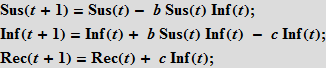
There are various types of epidemiological models. Further, we will mainly use the so-called SIR model (from the English Susceptible Infected Recovered). The population is modeled by individuals of three types (three “boxes”): healthy individuals at risk or susceptible individuals (Susceptible), who can catch the disease through contact with already infected (Infected); individuals who recovered and ceased to spread the disease (Recovered).

To simulate a flash using the Wolfram Language, we need equations that describe the number of people in each of these categories as a function of time. We will first use the equations with discrete time. Assuming that there are only three non-interacting categories of individuals, we can write the following:
In [3]: =
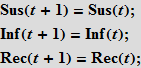
These equations mean that the number (in percentage terms) of susceptibles / infected / recovered (Susceptibles / Infected / Recovered) in time t + 1 is equal to the same number at time t . Assume that accidental contact of an infected individual with a susceptible leads to a new infection with probability b; the probability of contact is proportional to the number of susceptible individuals (Sus), as well as to the number of already infected (Inf). This assumption means that people leave the “box” of the susceptible and go into the “box” (category) of infected people.
In [6]: =
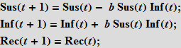
Further, we assume that people recover with probability c ; recovery is proportional to the number of sick people; so, the more sick, the more recovered.
In [9]: =
We will also need initial data on the number (in percent) of people in each category. Note that the terms on the right-hand side of the system, which characterize the interaction between the categories, always add up to zero, so the total population size does not change. If we take the initial values so that their sum is equal to one, then the size of the population will always be equal to one. This is an important distinguishing feature of the model. Each person must be assigned to one of the three “boxes”; we will carefully monitor the preservation of this property for the SIR model on graphs, which we will describe below! At the same time, there is a certain freedom in the interpretation of these three “boxes”. So, in our last example, we will consider deaths. It seems logical to assume that the dead "leave" our population. To keep the size of the population constant, which is important in our view, we use a simple technique: we will consider the last group of recovered (Rec) as a set containing people who have really had the disease and died. It is reasonable to assume that neither the dead nor recovered can infect the rest of the population, i.e. they are inert to our model. Our simple assumption will be that a certain fixed percentage of people from the Rec group suffered the disease (survived), and the rest will be considered dead. Thus, we include the dead in our model, so that they do not leave the group, and we do not consider the birth of new people. This ensures that the population size is constant. we will consider the last group of recovered (Rec) as a set containing people who really had the disease and died. It is reasonable to assume that neither the dead nor recovered can infect the rest of the population, i.e. they are inert to our model. Our simple assumption will be that a certain fixed percentage of people from the Rec group suffered the disease (survived), and the rest will be considered dead. Thus, we include the dead in our model, so that they do not leave the group, and we do not consider the birth of new people. This ensures that the population size is constant. we will consider the last group of recovered (Rec) as a set containing people who really had the disease and died. It is reasonable to assume that neither the dead nor recovered can infect the rest of the population, i.e. they are inert to our model. Our simple assumption will be that a certain fixed percentage of people from the Rec group suffered the disease (survived), and the rest will be considered dead. Thus, we include the dead in our model, so that they do not leave the group, and we do not consider the birth of new people. This ensures that the population size is constant. they are inert to our model. Our simple assumption will be that a certain fixed percentage of people from the Rec group suffered the disease (survived), and the rest will be considered dead. Thus, we include the dead in our model, so that they do not leave the group, and we do not consider the birth of new people. This ensures that the population size is constant. they are inert to our model. Our simple assumption will be that a certain fixed percentage of people from the Rec group suffered the disease (survived), and the rest will be considered dead. Thus, we include the dead in our model, so that they do not leave the group, and we do not consider the birth of new people. This ensures that the population size is constant.
Here is the simplest implementation of the SIR model that allows you to change parameters:
In [12]: =
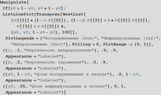
Out [12] =
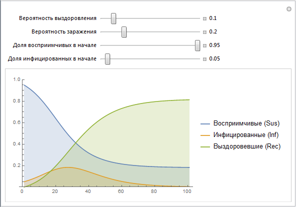
We use the vectors of values Sus, Inf, Rec, which are constructed recursively. Later we will create a simpler implementation of this design. Note that the parameters b and c contain many effects that are not directly modeled at this stage. For example, the probability of infection b really describes the risk of infection, but at the same time it depends on the behavior of people (a large number of mass events, public places, etc., can increase the likelihood of infection, as is often the case, say, in educational institutions) , population density (high population density may lead to a greater likelihood of infection). The probability of recovery c depends on such things as: the quality of health care, the availability of doctors and so on. Later we will try to model some of the above factors.
Although the SIR model is probably not the most suitable for describing the outbreak of Ebola, nevertheless, this model is not so far from the truth. People become infected through bodily contact; the category of survivors can be considered from the percentage of survivors and deceased people, if we assume that re-infection is unlikely. In different countries and under different circumstances, the proportion of recovered / dead varies greatly - we will model some of this later.
A more systematic way to study the SIR model is to study the so-called model parameter space. Depending on the parameters, we can visualize many different characteristics, for example, the greatest number of cases, the total number of cases during the outbreak of the virus. The axes of the chart below show the likelihood of infection and recovery, with the color on the chart characterizing the percentage of infected people.
In [13]: =
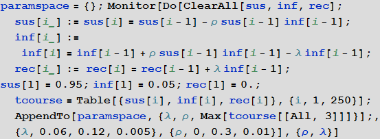
In [14]: =
Out [14] =
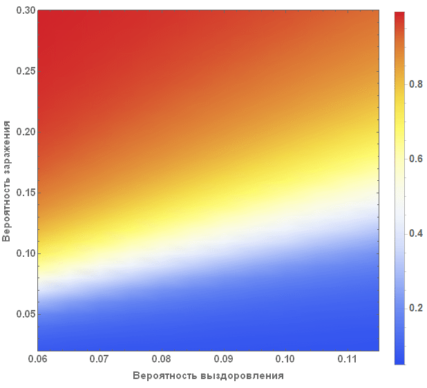
The diagram clearly shows that with small values of the probability of recovery and large values of the probability of infection, more than 90% of people are sick, while in the opposite situation, they are infected about 5% of people, which corresponds to their initial number.
Vitaliy:To move from pure mathematics to modeling processes occurring in the real world, we need data, say about populations of people and their geographical location. How can we get this data?
Marco: We will combine several different subpopulations together (for example, airport, city, country, etc.) and study the spread of the disease between them. Each of these subpopulations can be modeled as a SIR model. When we begin to unite the subpopulations, their individual sizes will play a key role. Population data, like many other types of data, is built directly into Mathematica , which makes it fairly easy to use in our model.
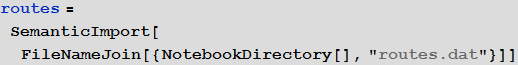
We will use the built-in data to improve the quality of our model and bring it to its logical conclusion, but in the beginning we can use an international airport network to simulate the disease transmission process. For this we need a list of all airports and airways. On openflights.org you can find all the information you need. I saved it in the “airports.dat” and “routes.dat.” Files.
Vitaliy: We could use the semantic data import functionality to work with external data. The SemanticImport function can import a file semantically by providing a Dataset object as its output . Dataset and Association- are new features that make it possible to create structured databases in Mathematica . Dataset can represent not only rectangular multidimensional data arrays, but also trees of any kind that correspond to data with an arbitrary hierarchy. Dataset makes it very easy to access any data in the database and process it, so we will actively use it. A small part of the data in the airports.dat file has been removed for more accurate work of semantic import functions. All files are attached at the beginning of this article, together with the Mathematica document .
Marco: Yes, indeed, the SemanticImport function is very powerful. In my first modeling attempt, I used Import functionsand Intrepreter , both also very powerful. Then I had to do a big “data cleaning” - which, in general, is a standard multi-step procedure that you have to perform if you are dealing with external non-computable information. But thanks to using the SemanticImport function, I was able to make the program code shorter and more readable.
In [15]: =

Out [15] =
In [16]: =
Out [16] =
Vitaliy: The objects obtained after working the function, circled by an orange frame, objects with a light orange background are the so-called Entity , which appeared in Mathematica 10. They represent These are essentially the keys for centralized access to Wolfram | Alpha databases.
In [17]: =
Out [17] =
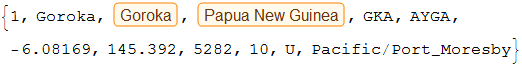
So, we see that the SemanticImport function automatically classified the third and fourth columns of data as cities and countries, presenting them as Entity objects.
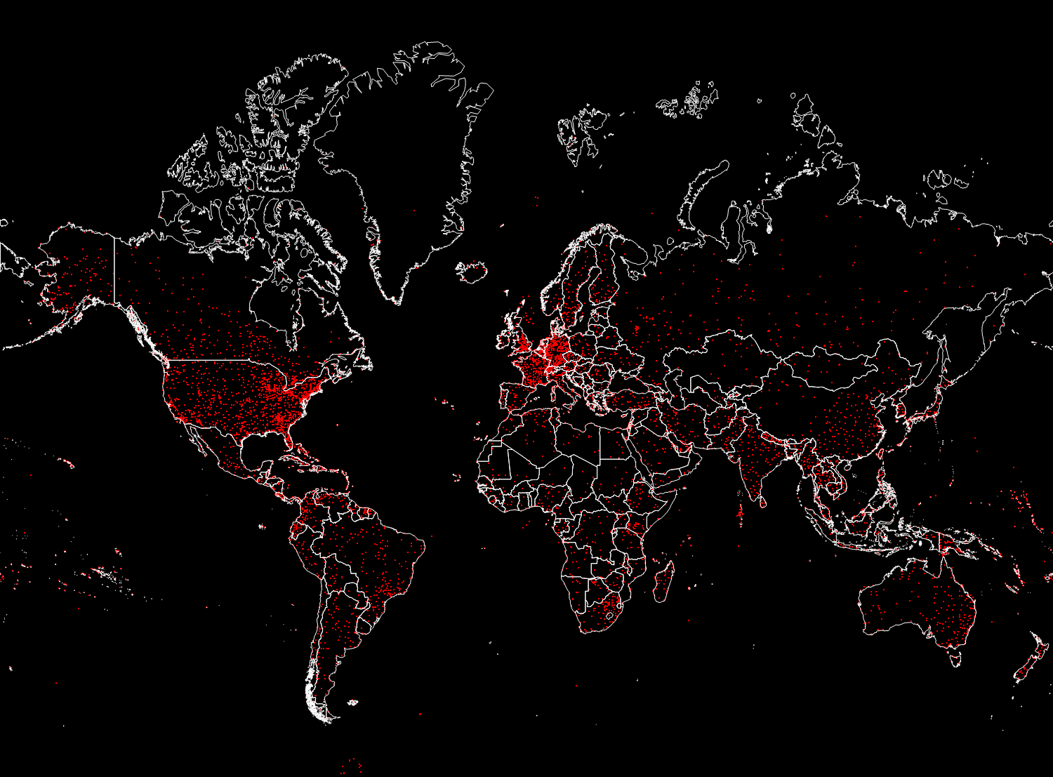
Marco: Now we can display all the airports in the world.
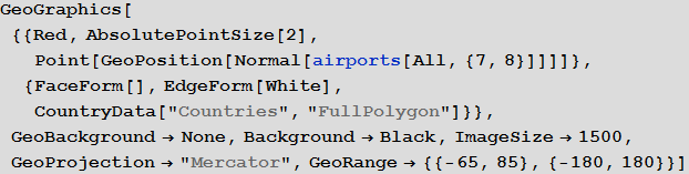
Vitaliy: Indeed, with the new features provided by the geo-computing sublanguage functions, in particular, using the GeoGraphics function and its many options, such as GeoBackground , GeoProjection and GeoRange , we can create an image that makes it easy to display a large array of data.
In [18]: =
Out [18] =
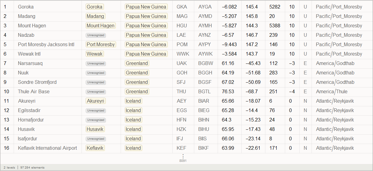
Fifth column in the airports databaserepresents this three-letter identifier IATA (International Air Transport Association). We will need these identifiers to specify routes between airports, which are stored in the second database. Not all entries in the airports database have them, say, below you can see the values of the last 100 database entries from the corresponding column.
In [19]: =
Out [19] =
Some of them are incorrect due to the fact that they contain numbers. We will clear our data by deleting entries with an invalid or missing IATA identifier. Below you can see the number of records in the source database.
In [20]: =
Out [20] =
Now we will clear the database and overwrite it. The number below shows, again, the number of records, but already in the updated database.
In [21]: =

Out [22] =
Marco: Now we will create a list of rules connecting the identifiers of airports and their geo-coordinates.
In [23]: =
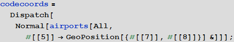
Vitaliy: We used the Dispatch function , which creates an optimized representation of the list of replacement rules, which does not affect the results, but allows you to work with long lists much faster.
Marco: Now we can analyze the connections between the airports. The number below shows their total number.
In [24]: =
Out [25] =
Not every IATA identifier has geo-coordinates, so we’ll clear the list of connections between airports by deleting links without information about the geo-coordinates of airports.
In [26]: =
Out [27] =
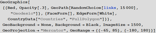
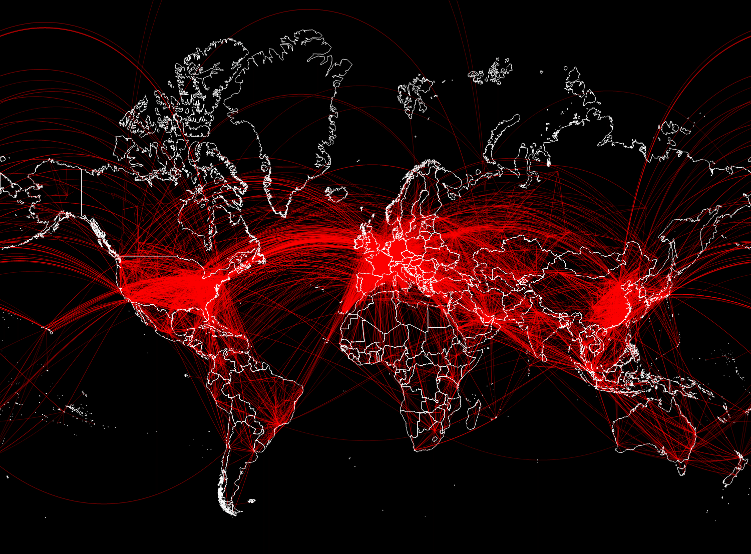
A total of 67,210 connections was obtained. In the figure below, we will display only 15,000 randomly selected from them, so that you can not make out the main directions of flights.
In [28]: =
Out [28] =
Vitaliy: Now that we have the data, how to integrate it into mathematical models?
Marco: We need to describe the ways the population moves. We will use the global air transport network to build the first pandemic model. We will consider flights as links between different areas. These areas can be considered as “population pools” of the respective airports.
Vitaly: You can use the Graph functionfor fast and efficient graph creation. There are many different connections between the same airports, so the resulting graph will be a multigraph, in the latest version of Wolfram Language just added functionality to work with them. To simplify the initial model, we will take into account only the fact of communication between two airports, creating one edge of the graph, if there is at least one route connecting two vertices. Later, in an improved model, we will already use multigraphs.
In [29]: =
In the graph obtained, the vertices correspond to airports with different IATA identifiers.
From the result of calculating the code below, it can be seen that there are several connected components in this graph, and only the first of the components has a significant size. We will remove components with a small number of vertices, since they do not greatly affect the dynamics in general.
In [30]: =
Out [30] =
In [31]: =
In [32]: =
Out [32] =

We construct an adjacency matrix for our graph.
In [33]: =
Out [34] =
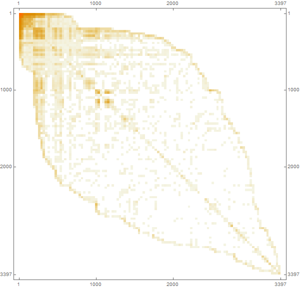
Marco: A matrix element with indices (i, j) will be zero if airports i and j are not connected, otherwise unit. The combined matrix is automatically converted to a SparseArray sparse array representation formfor more efficient computing and memory usage. We can also use the “population size” as a characteristic of each airport, which will essentially correspond to the capacity of the airport’s population pool. Then we will try to make more reasonable assumptions regarding the population, but now, for the sake of simplification, we consider it the same for each individual airport.
In [35]: =
Now we have a rather difficult step. We need to determine the parameters used in our model. The problem is that each of them “parameterizes” many effects and situations. For our model, we need:
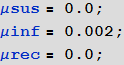
• The probability of infection. This is a factor that determines in our model how likely it is that contact leads to infection. This factor, of course, depends on many things: population density, local human behavior, health education, and so on. To run our model, we will choose the following value of this probability for all airports:
In [37]: =
• Probability of recovery . It will very much depend on the type of disease and the quality of the health system. It will also depend on whether everyone has access to health insurance. In countries where only a fraction of the population has access to high-quality care, diseases tend to spread faster. For our initial model, we will set the following value for all airports:
In [38]: =
Using these two parameters, we essentially defined the epidemic model. But we still need one more parameter.
• migration rate. This is a proportionality coefficient that describes the tendency of a certain population (in the airport population pool) to travel. In this model, we took it constant, but it of course also depends on the financial situation in a particular country and other factors. It describes, roughly speaking, the percentage of people in a country or region who travel. We do not use a multi-agent model that describes the individual movement of people. We use the compartmental population model, in which, in essence, we describe simply the percentage of the population that travels. We (at least at the end of the post, where modeling will be performed taking into account the characteristics of countries) will also take into account the different sizes of populations, the structure of the multigraph, as well as the number of flights between countries. Using the matrix of connections (it is also the matrix of adjacency of the graph), we will not consider the migration of individuals between different airports. We will first use the general migration coefficient (the same for all), which we will set as follows:
In [39]: =
Another rather important assumption is that we will use - at the beginning - the same migration coefficient for all three categories: susceptible, infected, and recovered. In fact, those infected, especially in the infectious phase, when they already begin to show symptoms of the disease, will migrate differently. In addition, the mobility of the population will vary in different countries, while it certainly will also depend on the distance that people need to overcome. We will choose more realistic options later.
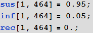
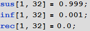
Now we initialize our model assuming that in the beginning in all cities there are only those susceptible to infection and no infected or recovered:
In [40]: =
Now we must introduce 5% of those infected into the population pool of the airport from which the spread of the disease will begin.
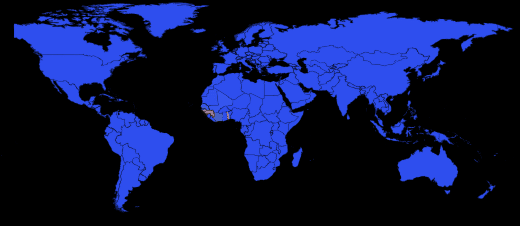
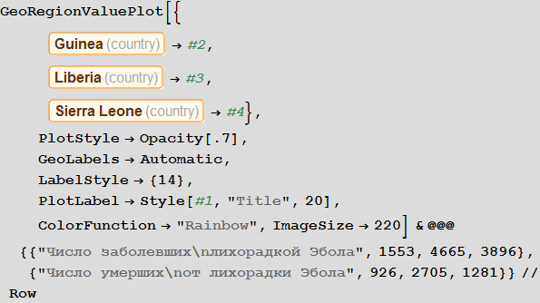
Vitaly: The outbreak began in Guinea in December 2013, and then the virus spread to Liberia and Sierra Leone. According to The New York Times , the first person infected outside of West Africa was a nurse from Spain who fell ill in September during the treatment of a missionary infected in Sierra Leone. After that, she was transferred to a hospital in Madrid. The following is a list of airports in Guinea:
In [41]: =
Out [41] =
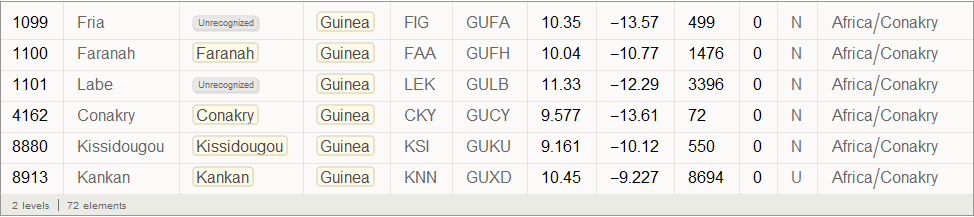
Find the graph top index corresponding to Conakry International Airport (its code CKY), which is located in the largest city and capital of Guinea:
In [42]: =
Out [ 42] =
In [43]: =
Marco: Before we write down the SIR model equations with the members responsible for the relations between the regions, we introduce two objects, the first is the total number of (potential) passengers at each airport:
In [46]: =
Second object - we will create, based on the link matrix, a much smaller list that will contain for each airport only a list of airports associated with it:
In [47]: =
This list is very useful because the link matrix is extremely sparse, so the sumind list will significantly speed up calculations. Now we can write the equations of the SIR model:
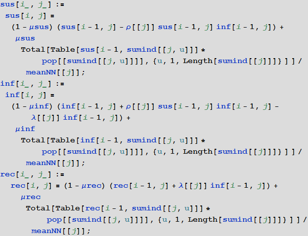
In [48]: =
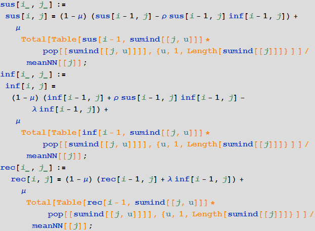
Members in charge of communication between areas are highlighted in orange. Essentially, we calculate the weighted average number of people for each population pool based on all neighboring airports. There are many other recording options for these members.
Now we start the iterative modeling process based on these recurrence equations and see how long it takes:
In [50]: =
Out [50] =
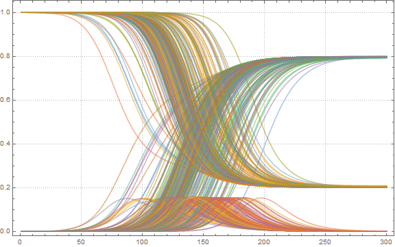
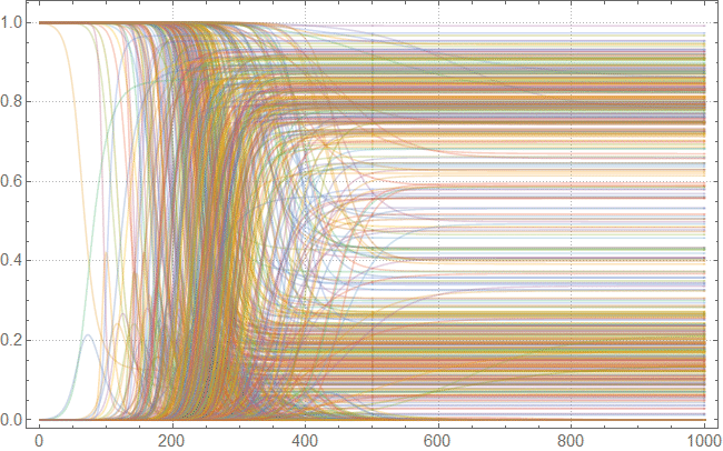
To get a first idea of the solution, we can build S , I and R curves for some 200 airports:
In [51]: =
Out [51] =
Now we find the maximum proportion of sick people among all airports:
In [52]: =
Out [52] =
Let's create a list of the coordinates of the airports, arranged according to their indices in the graph:
In [53]: =
Now you can look at what the infection map looks like for several time instants:
In [54]: =
Out [54] // TableForm =
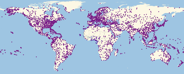
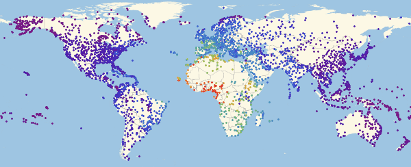
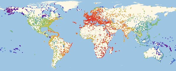


Here and lower in similar visualizations, color means the proportion of infected ones (an increase in the proportion occurs when switching from purple to red).
In [55]: =
Out [55] =
Note that there are three main regions: Europe, which is the first to be infected, then America and Asia. This type of spread of the disease is associated with the structure of the graph. We can try to visualize this using the Graph function.
Vitaliy:Graph function clustering algorithms will help us find out which continents are contributing to the spread of the pandemic through air travel. To get a list of continents (see below), use the new Entities sublanguage. To do this, we will use the local input form, which can be obtained using the keyboard shortcut CTRL + SHIFT + =, then enter the query “continents” into it
In [56]: =
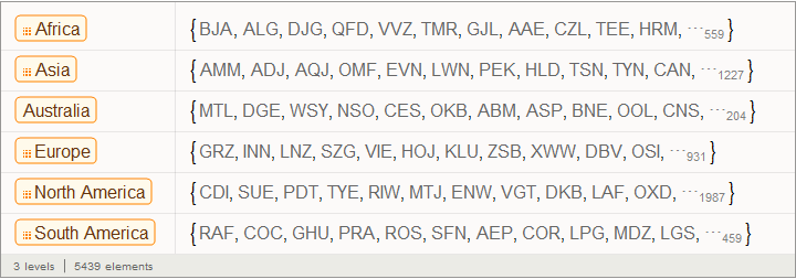
We will not consider Antarctica, therefore, we will exclude it from this list, and then we will build a database that will store information about whether an airport identifier belongs to a particular continent:
In [57]: =
In [ 58]: =
Out [58] =
The function below allows you to answer the question of which continent the airport identifier belongs to:
In [59]: =
We apply this function to some identifiers:
In [61]: =
Out [61] =
There is a large number of closely connected vertex families (airports) (graph communities), which in this case are quite different in number:
In [62]: =
Out [63] =
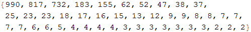
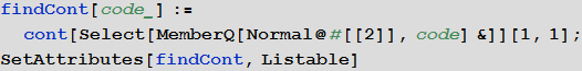
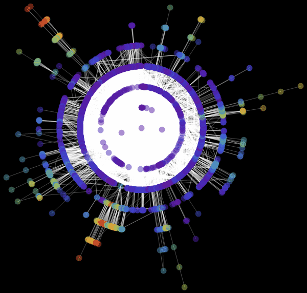
Familiesvertices of a graph is a group of vertices that is closely connected within itself by a large number of flights connecting them, while families of vertices are interconnected by separate, sometimes solitary, flights. In order not to overfill our drawing of the graph with a large number of uninformative signatures, we will mark only those families whose number of vertices is more than 60. Create the labels for the families:
In [64]: =
Out [64] =
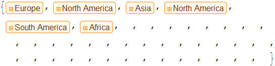
Now we can visualize the structure of the graph and see how major centers transport to smaller ones. In this particular figure, colors do not indicate the level of infection, but serve only for color differentiation of families:
In [65]: =
Out [65] =
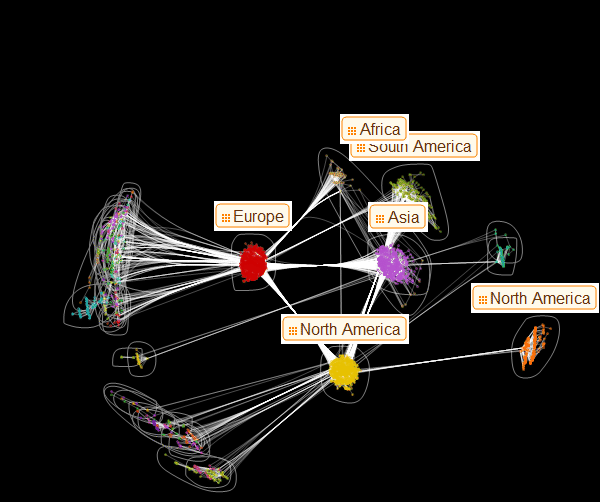
Marco:From this representation of the graph, the presence of three dominant vertex families becomes apparent. From this drawing it also becomes clear which of these main families serves as the source of infection of the smaller ones. This may help in deciding on preventive measures to spread the epidemic. Now we can create a graph that looks like one of the ones presented in the article by Dirk Brockman:
In [66]: =
In [67]: =
In [68]: =

Out [68] // TableForm =
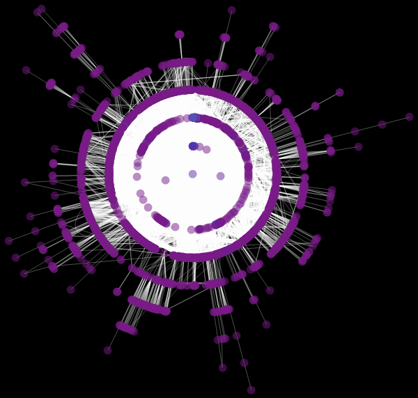
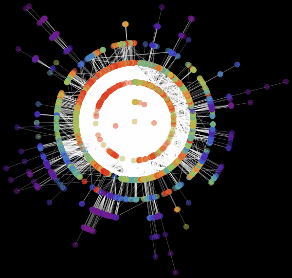
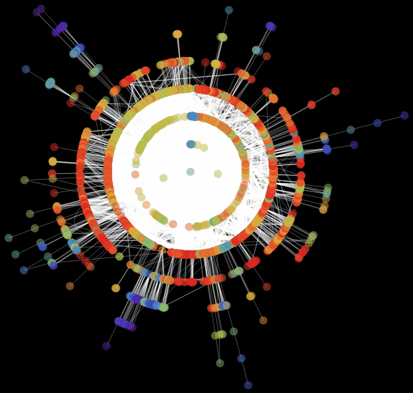

Vitaliy: We used the value “ RadialEmbedding "for the GraphLayout option(radial location of the graph vertices) and set the value of the “RootVertex” suboption (root vertex) equal to “FNA”, that is, the identifier of the airport from which the epidemic began. I see that a pandemic is spreading from this peak through the layers from the center to the periphery. Marco, could you explain what this means?
Marco:In the center of our graph visualization, we see the airport corresponding to the onset of the outbreak. The layer around it is all those airports that can be reached by direct flight, they are the first victims of a spreading epidemic. The next layer is a set of airports that can be reached with one change, it is clear that they will be infected in the second step of spreading the disease, etc. This visualization demonstrates that the network structure, and not the distance, is important.
Vitaliy: How can I make this model a little more realistic?
Marco:We examined some simple special cases of the model, which first describes the outbreak using the SIR model at the local level and then combines many similar local SIR models based on the connections of a certain transport path graph. However, there are still many problems that can be posed. Here are their wordings:
1. The probability of transmission depends on many factors, for example, the health care system and population density in the region.
2. The likelihood of recovery will also depend on many factors, such as the health system.
3.Not all possible paths (roads / flight paths) will be chosen with equal probability. Published articles indicate that there is a certain dependence: the greater the distance to the place, the less likely that someone will go there.
4. Migration / speed of movement will be different for each of the groups of susceptible, infected and recovered; let's say infected people are unlikely to travel.
In addition, we may need to incorporate into the model various attempts by governments to control the outbreak. So, let's try to solve some of these issues by creating a new Ebola pandemic model. If we tried to take into account all cities and all airports of the World in the model, then this would clearly be too difficult for a regular laptop. Based on the above sections, it is generally clear how the model can be expanded in this direction, but I would like to draw attention to some additional approaches that may be useful.
Our model will work with all (at least with the vast majority) countries around the world. The connections between them will be modeled based on the corresponding connections between the airports. Let's start by collecting some additional data for our model.
We clear the variables and, as before, import the data on airports and flights:
In [69]: =
In [70]: =
The SemanticImport function immediately determines the country to which this or that airport belongs. We can easily build a list of replacement rules like “airport identifier”> “country”:
In [71]: =
Now we will create a graph using the Graph function. Since we want to study the relationships between countries, we will replace the airport identifiers with the corresponding country names:
In [72]: =
Vitaliy:You say that now the edges of the graph correspond to the connections between countries, and not airports?
Marco: The ribs actually set, as before, flights. They, as before, connect airports to each other, but now we want to model relations between countries. Therefore, we, simply put, are replacing all airports located in one country - with one peak corresponding to this country. In fact, we solve the well-known mathematical problem of contracting edges of a graph .
It turns out, as before, that data for some airports are not available, while most of the missing data relates to extremely small airports. We will delete all airports whose country of location we do not know:
In [73]: =
Last but not least, we will construct the adjacency matrix (matrix of relations) of our graph:
In [74]: =
We will also create a list of all the countries that participate in our model:
In [75]: =
Obviously, the higher the population density , the higher the proportion of cases. Of course, this is an assumption, since it is important to consider the places of local increased population. If the country is very large, but everyone lives in cities, the real population density is much higher.
To consider the population, we need information on its size and density in all countries:
In [76]: =
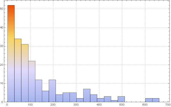
Now we need to build a simple “model” describing how population density can affect (in part) the number of cases. In the first model, we took the value of the probability of infection equal to ρ = 0.2. And this gave quite “good” results, in the sense that the expected pattern of the spread of the disease was observed. We want to expand the model, but without drastically changing parameter ranges. So, “acceptable” - as a first approximation - will choose the values of the parameters that are in the same range. In fact, we observe that the key parameters are λ and ρ (the probabilities of recovery and infection, respectively) Thus, we want to start with approximately the same values as in the first simulation.
To change the probability parameter of infection taking into account the population density, we first consider the histogram of the population density distribution:
In [77]: =
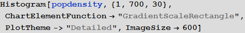
Out [77] =
We can also calculate the average population density:
In [78]: =
Out [78] =
We assume that that the likelihood of infection increases with population density. For the "average population density" we assume the probability of infection is equal to 0.2. We make a rough assumption that the relationship between these values is expressed in the graph below:
In [79]: =
Out [79] =
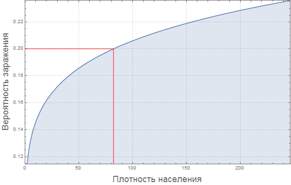
Calculate the proportion of infected for each country:
In [80]: =
Of course, this “model” of the relationship between the proportion of infected and population density is very damp. Perhaps the reader will find a way to improve it?
Vitaliy: It would be interesting to know some patterns based on real information about how the probability of infection varies depending on population density. It would be nice to make this regularity a variable condition, so that readers can try their versions and observe the changes in the simulation. Perhaps the percolation phenomenon should be taken into account when there is a sharp increase in the proportion of patients, if the population density reaches critical values. Some “damping effect” due to urban infrastructure is also possible. But these are just my assumptions. Could you express your opinion on this matter?
Marco: If there are many people in a confined space, then the likelihood of infection should be monotonously increasing. Also, I think it is important to note that the probability of infection does not grow linearly, and its derivative decreases (the function goes to a "plateau"). The probability of infection should depend on the distance to the nearest neighbor, so it can grow as a square root of population density, which will give us an exponent of 0.5. But if the movement of individual people will already be limited by their neighbors, then the growth rate of this function will be less, which means we will get an indicator degree less than 0.5. It's my personal opinion. Article " The scaling of contact rates with population density for the infectious disease models"by Hu et al., 2013, shows that our assumptions are true, at least for this crude model.
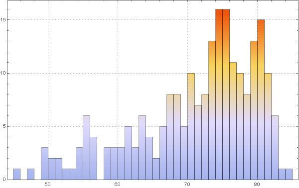
To assess the likelihood of recovery, we will make another bold assumption. Suppose that the health system is better in countries where life expectancy is higher . to build this sub-model, we use data on life expectancy, built-in of Mathematica .
with in [82]: =
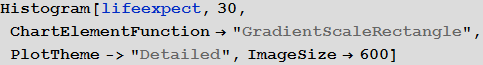
Visualize the distribution of life expectancy of the countries in this histogram:
with in [83]: =
Out [83] =
Please note that for several countries information is not available, so let's take the value of life expectancy in them for the standard 70 years. This will not affect the results in any way, since these countries (island states and Antarctica) essentially do not play a role in our model.
We calculate the average value of the expected average life expectancy:
In [84]: =
Out [84] =
Now, as mentioned above, we formulate our assumption that life expectancy is an approximate indicator of the quality of the health system, which, in turn, is an approximate indicator of the likelihood of recovery. Again, this is a very rough assumption, because the situation in relatively rich countries such as Spain and the USA shows that the probability of recovery may not be higher in countries with high incomes:
In [85]: =

Out [85] =
As in case with the probability of infection, we calculate the probability of recovery for each country:
In [86]: =
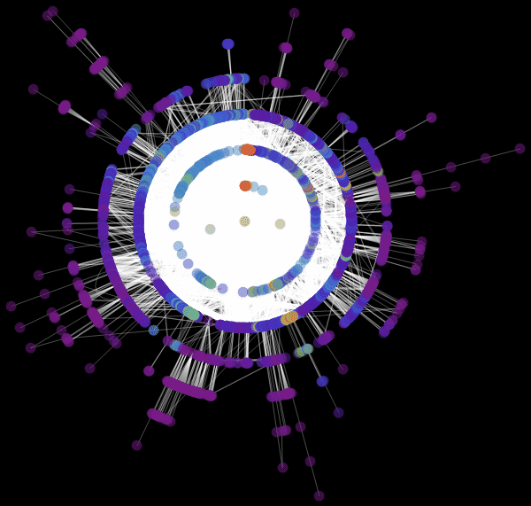
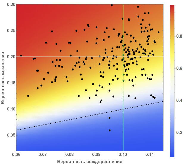
We can also visualize what all this means for all countries. In the figure below, the average values are indicated by white and green lines, and an equal amount of the proportion of diseased and cured is marked by a black dashed line. The background color shows the proportion of people who suffered from the virus during the outbreak, according to information taken from the SIR model (see the beginning of the article).
In [88]: =
Out [88] =
Vitaliy:The standard modeling process includes the repeated launch of the simulation in order to better understand the behavior of the system, as well as the influence of parameter values on it. The values adopted in our case will lead to a result that looks consistent with sound logic, as if we were faced with a severe but treatable pandemic. Countries with weak economies will suffer more damage, and those with high economies will suffer less. What is important here is, in my opinion, how this contrast affects the topology of migration, demography, and other life factors. Also, it should be expected that complex components and non-linearity can lead to non-intuitive options, causing more damage to the strong and less damage to the weak.
Marco, could you tell us more about the graph obtained above?
Marco:The graph describes two main parameters of our model: the probability of infection and recovery. Each dot denotes a country, if you hover over it, a signature appears with its name. White and green lines indicate average values of parameters. They divide the chart into four zones. Top left square (high probability of infection / low probability of recovery) - countries with the least favorable conditions. It includes countries such as Sierra Leone, Nigeria and Bangladesh. In the lower right square are the countries with the best prospects for suppressing the disease: USA, Canada and Sweden. The black dotted line indicates a critical line: above it are countries in which the probability of infection is greater than the probability of recovery. In these countries, an outbreak of infection is very likely. Below the line, the probability of recovery is more than the probability of infection, and, accordingly, there are chances that the disease will be suppressed. Please note that these are only “basic parameters” of the model and we have not yet considered the influence of the graph of relations between countries. Also, note that countries below the dotted line can stop the spread of the disease. If there are a lot of such countries, this, again, can reduce the number of infections.
Vitaliy: As we noted above, our simulation considers the worst case scenarios so that we can more clearly see the various effects of the pandemic. For this reason, we moved the system higher and most of the points were above the black dashed line. Readers can consider more realistic options for options on their own.
Marco:To highlight another drawback of our first models, suppose that infected, recovered, and at risk of infection travel at different speeds. There is one more point to which you need to pay attention. If we set the value of the migration / movement coefficient too high, then the differences in the regions will simply average! In reality, the percentage of people traveling will be relatively low during the time considered by the simulation, almost equal to zero. To see the spread of the disease, we set rather high values for the speed of movement of the infected; We will ignore the movement of healthy and recovered. This is not a critical assumption, because they still do not contribute to the spread of the virus.
In [89]: =
We’ll clear the variables to make sure that we start the simulation from scratch.
In [92]: =
As before, we initialize our model assuming that in the beginning in all cities there are only those susceptible to infection and no infected or recovered:
In [93]: =
The outbreak began in Sierra Leone (Guinea), therefore find which vertex of the graph corresponds to this country:
In [95]: =
Out [95] =
Next, we set a small initial share of infected people in it:
In [96]: =
Then, as before, create recurrence relations that will give us a solution :
In [99]: =
In [101]: =
Now we can start the iterative process:
In [103]: =
Out [103] =
This is the first test, let's see if the simulation works - we will depict the time dependencies of the shares of the recovered, infected and susceptible for all countries:
In [104]: =
Out [104] =
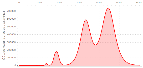
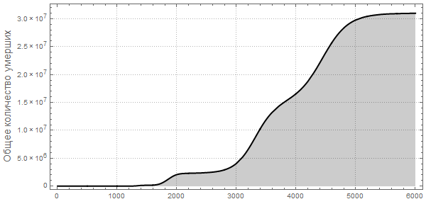
Note that after the simulation, most lines have found stable values. This means that the flash is silent. Here is a summary of the total number of infected and dead throughout the outbreak:
In [105]: =
Out [107] =

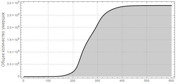
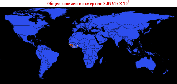
Now we can visualize the global spread of Ebola by looking at the situation in the World at different points in time. The number below shows the maximum proportion of deaths among all countries.
In [108]: =
Out [108] =
In [109]: =
Out [109] // TableForm =
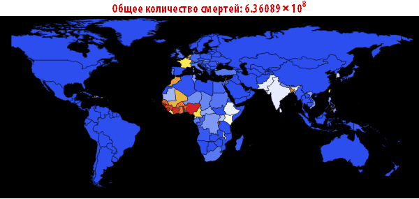
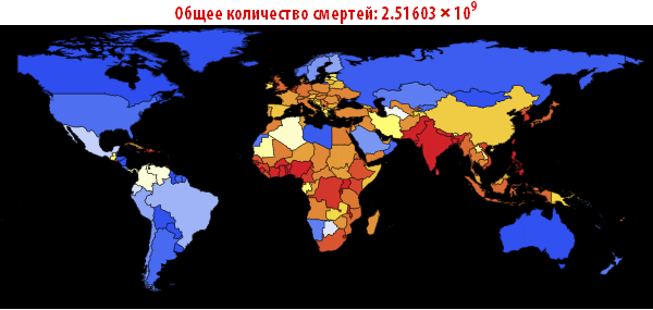
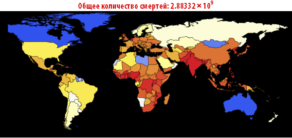

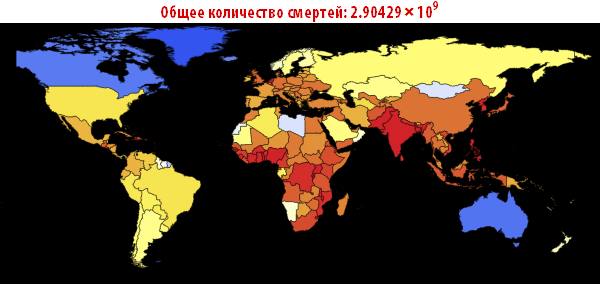
Please note that the death toll is extremely high in all of our simulations. About three billion dead - such an outbreak can become absolutely destructive. It is very likely that such a pandemic is much, much larger than all that we have seen before. The reason for this may be the choice of parameters; the ratio of the probability of infection to the probability of recovery may be different. On the other hand, we simulated an outbreak of a disease in which systems are relatively “inert”. This means that they do not take effective countermeasures. If we modeled this, then we would need to reduce the likelihood of infection over time, due to the actions of governments.
Now this, of course, is just a conceptual model. The reader can change certain of its parameters, for example, close airports and see what effect it will have. He can change the likelihood of infection and recovery and see how this will affect the result. There are many parameters with which you can experiment (say, if the ratio of the probability of infection to the probability of recovery is very high, then this scenario will require careful study, which may be necessary if the Ebola virus mutates and becomes, for example, transmitted by airborne droplets ) We have yet (so far) not selected parameters so that they optimally describe the current outbreak of the disease.
Vitaliy:I have run the model many times with different parameter values. For example, if we take a situation opposite to that considered above, setting the probability of recovery is greater than the probability of infection, and the initial number of infected people is very small:
In [110]: =

Then we will get a much smaller number of infected and sick people:
Also, pay attention to the different nature of the maxima telling us that pandemics can be repeated with more damaging power. Such repeated flashes are described in The New York Times under “ How does the current flash compare with previous ones?” »Also, the forecast of the US Centers for Disease Control and Prevention (CDC) and the current stage of the pandemic have almost exponential growth, coinciding with the very first (left) peaks in the graphs.
Can we calibrate our model in accordance with real data, for example, on a timeline or on the absolute number of infected and recovered?
Marco: There are many articles that examine the effect of, let's say, population density on the likelihood of infection, such as the article by Hu et al . We can use this work or observational data to refine our own model. Mathematicaoffers excellent tools for matching parametric curves (or, models) with the data. This will help improve our model. Regarding the timeline, we must emphasize that we did not enter time at each step of the iteration. Nevertheless, we can use observational data, for example, for the current outbreak and try to choose the parameters,,,, and,, so that the number of deaths / infections and their change in time is correctly described by our model.
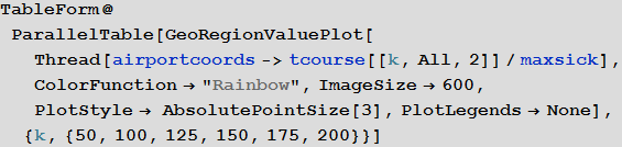
Vitaliy: A picture on graphs obtained using the ListLinePlot and GeoRegionValuePlot functions,differs from those obtained using the simplified source model with which we started. Now we see that in some countries there is an outbreak of the disease, while others seem to be resistant to it. For me it looks more realistic. Can you comment on this and possibly compare the results with those from Dick Brockmann?
Marco:The most important point is this: high levels of migration in the first models lead to mixing of populations and, as a result, in all populations the ratio of the number of people from the three categories becomes the same. As in the article by Dirk Brockmann, we see that traffic flows (graph) play an important role in the spread of the disease. The distance on the graph is very important. This is especially important, as countries where the level of convalescent exceeds the level of infected people, in fact, stopped the spread of the disease.
Vitaliy: Marco, thank you for the impressive information and the time spent. Do you have an understanding of how the model can be improved in the future, or maybe you want to say something to our readers in conclusion?
Marco:It’s quite simple to suggest more ideas for improving the model: we can include more information about movements - streets / cars, ships, railway networks, etc. all this affects the movement of the population. We could use cellular data or something similar to better simulate the actual movements of people. Also, the SIR model does not take into account the incubation period, i.e., the time until the onset of the first symptoms of the disease. In our model, the population is described by “boxes”; the number of infected, etc. is set as a percentage. This gives a “good” approximation if the number of cases is large enough (also how to set the concentration in absolute terms makes sense if there are many molecules), but at the beginning of the outbreak, when there are few infected, models of other types, such as a multicomponent modelmay be more realistic. The model we presented can only be considered as a first step; additional factors can be included and their significance examined. Through trial and error, we can try to describe real flashes better and better. But we should be careful: the more factors we include in the model, the more parameters we get. This will lead to additional problems when we need to evaluate the parameters.
We may have noticed that the calculation does not correctly reflect cases in the USA and Europe. Now we know about 18 people specially brought here. They are not part of the natural spread of the disease. We also speak of “percentages or a certain amount of percentages” of a population; we do not discuss isolated cases. From the point of view of epidemiology, nothing related to Ebola is happening in the USA or Spain. The situation in Sierra Leone and other African countries is really more suited to our model.
Our model does not take into account the specifics of the Ebola epidemic. Many assumptions are made, and we select the parameters so that the spread of the epidemic is easy to see, but the model shows only the possible distribution order: first the countries of West / Central Africa, then Europe, and then the USA. This is justified and confirmed by other much more complex models. Of course, there are many other factors, so the spread between neighboring countries in Africa does not occur through air travel, but with the help of local transport, people cross borders on foot or by car. Our model, of course, is only of high quality and takes into account only one type of transport, namely, air travel, which does not describe the whole picture, but shows huge differences between countries. Ultimately, we can expect a much lower percentage of deaths in Europe and the USA, than in the African countries that started it all. The model shows that the highest probability of spread is between neighboring African countries, as other larger models predict. Also, certain European countries, such as Germany / UK / France, etc., are more at risk than others due to air traffic. The United States seems to be even less at risk than European countries, so a significant number of cases will appear later. All this is qualitatively quite true. The disease will not reach Australia and Greenland soon or never at all, which again is consistent with our model (at least if ρ ~ λ ~ 1). Also, certain European countries, such as Germany / UK / France, etc., are more at risk than others due to air traffic. The United States seems to be even less at risk than European countries, so a significant number of cases will appear later. All this is qualitatively quite true. The disease will not reach Australia and Greenland soon or never at all, which again is consistent with our model (at least if ρ ~ λ ~ 1). Also, certain European countries, such as Germany / UK / France, etc., are more at risk than others due to air traffic. The United States seems to be even less at risk than European countries, so a significant number of cases will appear later. All this is qualitatively quite true. The disease will not reach Australia and Greenland soon or never at all, which again is consistent with our model (at least if ρ ~ λ ~ 1).
In this regard, I will assume that the choice of ρ = 1 or less than λ is more consistent with reality. This will limit the spread to a number of African countries and countries with low likelihood of disease in Europe and the United States. Although the “global average” probability of infection may be lower than the probability of recovery, in at least some countries, due to population density and poor quality of health care, the local value of the probability of infection may be higher than the probability of recovery. Also, the number of infected will be obviously less than our model predicts, since we do not take into account the allocations of governments and the World Health Organization (WHO). This is easy to model, reducing the likelihood of infection over time: more in the "rich" countries, less in the "poor".
The forecast should be considered in terms of probabilities or risks that some countries will face a greater natural outbreak, as our model does not take into account individual cases or cases of intentional transfer of patients to hospitals. This means that the probability of contracting Ebola for a nurse is higher than for an ordinary citizen, and of course, we do not take this into account. Also, the exact spread of the epidemic depends on many “random” factors that cannot be reasonably taken into account in our or other models. You can enter the randomness factor and run the model a sufficient number of times to make a conclusion about possible scenarios or probabilities. In this sense, our model performs very well.
The qualitative nature of the model allows us to consider several scenarios: What if the ratio of the probability of infection to the probability of recovery changes? What if mobility of the population increases, i.e., μ changes? What if we also consider local transportation? We did not try to select parameters / graph, etc., to accurately describe the outbreak of Ebola; on the contrary, we offer a basic model for describing different scenarios and understanding the main parameters included in this type of model.
Vitaly: I once again thank Marko and our readers for participating in the interview.
Resources for learning Wolfram Language (Mathematica) in Russian: http://habrahabr.ru/post/244451