Dark Times Come: HabraDarkAge Theme
 It's night. It's time for the presentation of the dark theme of Habr styles. Dark times have come for ZenComment
styles . In the age of dominance of laptops, smartphones and tablets, the color in which you display the website background is of great importance for the battery. If you do not use a CRT monitor, the brightness of the LED screen affects energy consumption. White business dudes start to eat a resource - and lose. With limited technical knowledge, the white-collar workers, one by one, start to turn off the screens in the dark, in the stuck train, when the real geeks, making fun of their attempts to turn on the phone, read the last article from Habr for 20 minutes longer, calmly waiting for rescuers than everyone else . Unless, of course, they at one time established the dark theme of user styles ...
Therefore, dark themes are deservedly popular. There have been several of them in recent years, but not all of them have survived to synchronization and harmony with the current version of the site. Even the end of August this year for the styles of “New Habr: night mode” did not become a moment of truth: in September, perestroika (of the site), geektimes, and other layers of the ever-current world struck.
Habradarkage
Therefore, to synchronize a dark theme with reality, an extension of styles was released: HabraDarkAge . It was based on the very styles of " New Habr: night mode " as the most developed in terms of "usability of shadows." Judging by Github, it was created by 4 authors, with modifications for 3 months. But there were so many changes in the style code that there was no question of the usual pull request. The styles were placed in their address on the hosting and on the github . You can install from any of these sites, but the first one still knows how to control the synchronization of styles and shows a download counter.
(A small educational program for installing user styles: in Firefox you need to install the Stylish extension , for Chrome - the same, for the old Opera it is put as a file .)
There was a proposal to the author of the “Night Mode” ( issue ) to synchronize our codes, but apparently, really, he does not have time now. For a week, no progress in his repo was observed. For me, on the contrary, over the past week there have been some developments in code and documentation (the last link contains many screenshots of a dark topic).
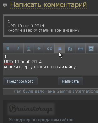 The scripts began to support the "microhabr" ("mobile version": a useless thing, but it didn’t take much effort). The main thing is that the styles fixed the site’s bug, consisting of the impossibility of navigating it in low windows, less than 530 pixels: the menu “flies up”, i.e. if there is a scroll page - it is not visible. And some amenities have been added in the form of balanced muted colors that are too bright in this dark design, which the Night Fashion didn’t get around to fixing. Checkboxes, comment or article preview frames, comment icons, and the like.
 Separately, it should be mentioned that the styles are applicable not only to Geektimes (which is logical), but also to saved copies of pages in Google’s cache. For example, at http://webcache.googleusercontent.com/search?q=cache:http://geektimes.ru/ при установленных стилях увидим тоже тёмную тему. И даже будет работать меню. Особенно полезно это применять для просмотра удалённых страниц. Вот пример, который вскоре пропадёт из кеша, но пока работает: http://webcache.googleusercontent.com/search?q=cache:http://habrahabr.ru/post/241533/ (это — страница за 27 октября, не заблуждайтесь от даты «вчера»). Такой же фокус применён и в стилях ZenComment + скрипте HabrAjax, который ссылки на кеш Гугла на странице закрытой публикации предоставляет автоматически (так).
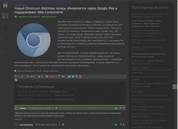
The site format in HabraDarkAge styles follows the format of the source site to a large extent. This is just a familiar copy in the dark version, with a few minor improvements. For example, in the captions to the article - the fonts are slightly larger, the click area covers the surrounding elements, so as not to aim precisely at the author’s name or the number of comments. The Giktaym headline is not striking and does not take up space at the top of the page. It is simply superimposed on the page and reminds of itself with a barely noticeable shadow. The height of the input fields can be changed manually. Avatars - less noticeable, but when you hover over the title - they double. The page number buttons are larger and are on the left, always in sight. The footer is denser. That's basically it.
Further, it is expected that HabrAjax will get into these styles ., will master its automation of small improvements that are inaccessible to styles. Script settings will learn how to manage styles and enable them according to requirements. And in style more and more ZenComment functions will penetrate. (Several of them are already there right now: an invisible top menu, large buttons for page numbers.) For example, ZenComment always has a visible menu for wide screens. In the meantime, HabrAjax scripts are incompatible with the dark theme, because they always “believed” that the background of the page is white and the theme is light. Therefore, they have many improvements with light backgrounds of elements sewn into them.
Styles, most likely, will require not only planned improvements. For example, literally now I discovered an element of auto-tagging that is hiding from modernization when preparing an article. Styles were quickly updated. (There is still something to do with div.footer_panel: before, and body: after - I don’t think that was a good solution).
Therefore, improvements that can be expressed in pull requests to the code on Github are welcome.
But the main thing is that these are styles that are familiar to everyone. It is only necessary that a person be interested in possible cases in the subway and prepare to read Habr there in advance. Well, and in combination, they are useful for evening reading on dark winter evenings. Unlike ZenComment.
What is ZenComment doing at this time ?
The trendy left panel was not an authority on ZenComment styles. On the contrary, the philosophy of these styles was and remains the principle of “read, not scroll”, and powerful square buttons reduced the reading area, and therefore, increased the length of the scrollbar. Yin and Yang between the air voids of the site and the length of the tunnel to the end of the article, overcome by scrolling - there is the same balance that we now have between the whiteness of the screen and the battery life. ZenComment accepted this reality of the balance of life and death - and plunged into dark times.
If you just take and mix both styles, and even apply HabrAjax scripts (however, you can also do without them), you will see that there are many white spots - blocks in which light colors were pre-registered. Therefore, simply following the recommendation to establish one and the other will not work. A number of improvements are needed. They are the ones who will make the ZenComment style changes to DarkAge styles. As a result, in plans , ZenComment styles will exist in 2 incarnations: ZenComment and DarkAge.
By joint refinements of this style - many called for them to start by putting it on Github. Spreading is. But it should be noted that they are structured much worse than the same DarkAge now. First you need to refine the structure, then - in the plans - to build source codes for generating "deployments" in different places - just styles, a dark version just styles, custom assembly (so that not all "features" are applied), an option inside scripts (like, for example, already available in HabrAjax, if you enable the “ZenComment built-in styles” setting there. That is, in addition to improvements to the elements, some system work is needed.
Then the geeks in the subway car will get even more advantages over white-collar workers: they will not only shine less by the screen, but also scroll less, read more. The output to the end of the tunnel in each article will be reduced, and it will not be so dazzlingly white as for everyone.