Worst chart ever
- Transfer
Hello!
And here we are launching another stream of the JavaScript Developer course and, on the recommendation of the teachers , we are preparing interesting materials for reading. Today we will look at one interesting note about data output visualization.
Go.
Pie chart is the worst form of information transfer ever invented in the entire history of data visualization.
Of course, there are more uncomfortable methods. But none of them is as popular and as trustworthy as a pie chart.
Let me explain what's wrong with her and why you need to stop using her as soon as possible.
First, let's talk about why we generally use diagrams:
I will show how the pie chart fails on all these criteria. The “task” of the pie chart is to show the relationship between the parts and the whole.

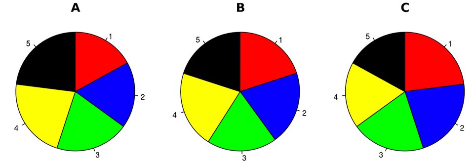
Let's see how badly she copes with the only task for which she is supposedly created. Look at these three pie charts. Suppose they reflect the distribution of votes in local elections between five candidates in three different observation intervals A, B, and C:
Open source / Wikipedia
So, what can we learn from this information? Since these are the shares of votes that each candidate received, it should be easy for the reader to understand what is happening in the race. But it is not. Does candidate 5 show better results than candidate 3? Who showed the best result in time A and B - candidate 2 or candidate 4? Who has the greatest momentum in the race?
So if the task is to make the information easier to understand, how much did these diagrams help you? Indeed, if I just gave you a table with the values of the votes, would it not be easier for perception of information?
But for now, let's look at the same information, presented in the form of a histogram:
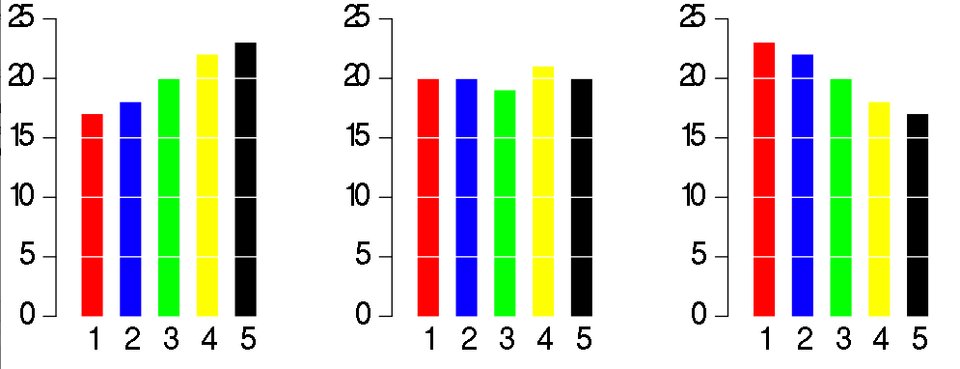
Now it’s much clearer. At first glance, we can understand what exactly is happening with each of the candidates in each time interval of the race. This histogram highlights the parts of a whole much clearer than a pie chart, despite the fact that this is its main task.
Let us now look at another drawback of the pie chart, which is connected with the fact that people do not really understand circles.
Below is a pie chart with the distribution of parties to the European Parliament:
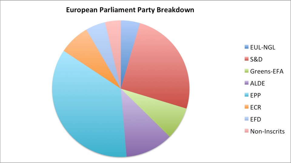
The main question is - can we compare the proportions in order to identify differences in the sizes of all parts of the diagram? If the only thing we are trying to find out is that EPP is more than S & D, then what is the point in the diagram? I could figure it out just by looking at two numbers. No, the diagram is only useful if we can compare all its elements with each other.
Below are the individual shares, for comparison, taken out of context. Look at them, and consider whether you can arrange them in order from largest to smallest.
People generally do not know how to compare the proportion of the circle when it comes to size.
That is why you could consider trigonometry and radians much more complicated than ordinary rectangle geometry.
This is not bad, but it is worth bearing in mind when trying to formulate information in the most comprehensive and accessible way. Here is the same data, but in the form of a bar chart:
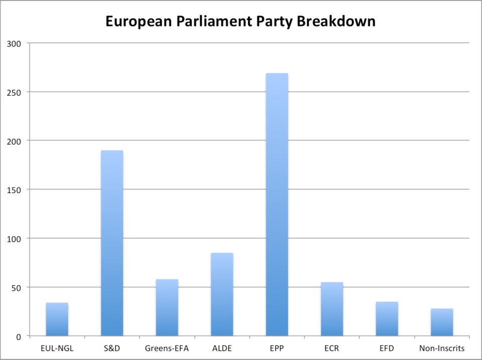
Note that you can compare each batch with any other batch.
Just compare the lengths of the rectangles to see what is going on.
With a lot of desire, you could replace the left axis with percentages to find out distributions inside parliament. Now you can see how many places are allotted to each of the parties - such information was not originally presented on a pie chart.
And now, let's see how pie charts can be easily manipulated.
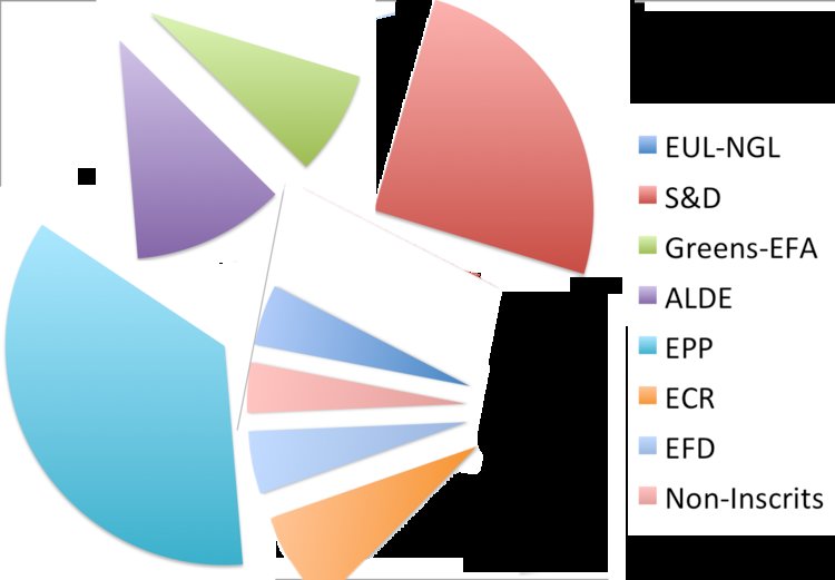
Here is the same data as above, but now as a 3D Pie Chart:
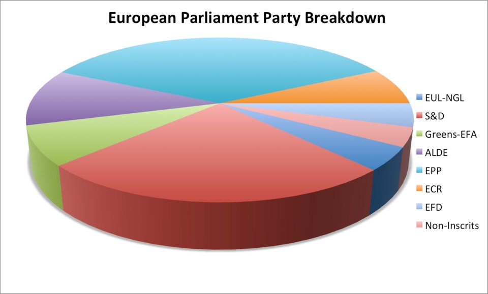
People use it all the time, because a three-dimensional pie chart located at an angle is a great way to fool you. Take a look at the chart, the S & D — the red party — looks roughly equal to the EPP batch of blue-green. But this impression is created only because I distorted the perspective, creating the impression that red is big.
It's so simple that even a little embarrassing that Excel allows you to do this.
Below is another example of the lack of a pie chart. In fact, 10% of men reading this article will not even understand what is being said.

Red-green color blindness in men
The most elegant diagrams do not require labeling data. To convey the idea, extraneous numbers are not required. And if required, you use the wrong chart.
So, we draw conclusions:
Before proceeding to the final criticism of the pie charts, let's see what they are all the same good. The only situation in which pie charts are good is a comparison of 2-3 observations with a very different amount of information.
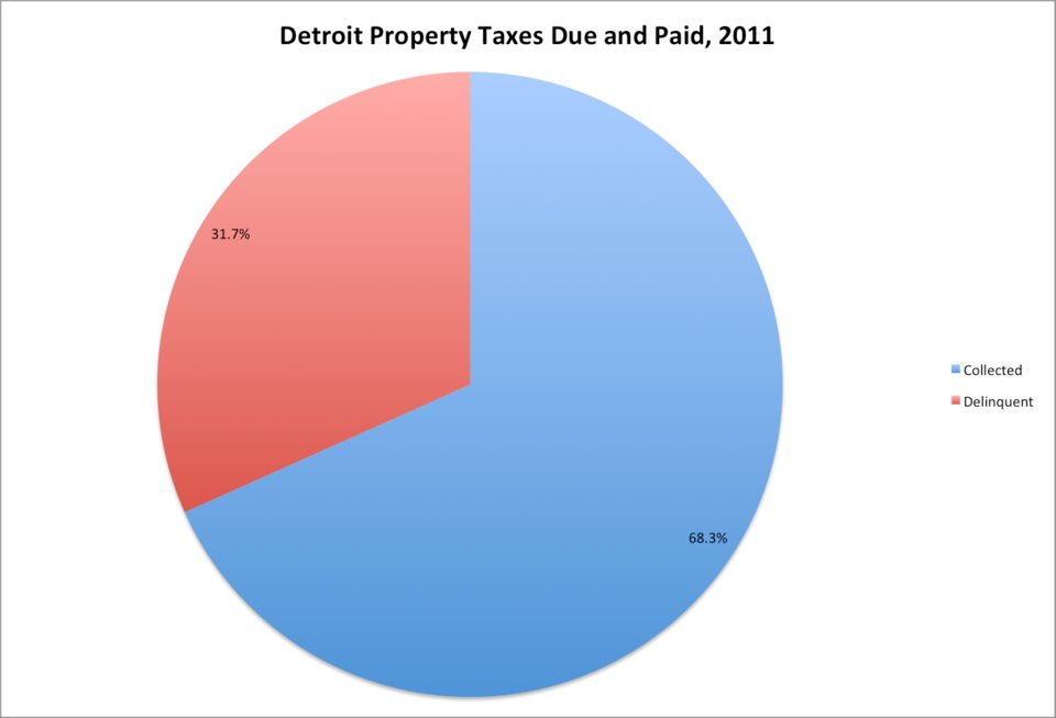
Business Insider, data from Detroit
Paid and unpaid property taxes in Detroit, 2011
That's all.
That is, if you think about it, the only thing they are good at, the only way to use it is to show people what the stakes look like. The only task of the diagram above is to show what 32 of 100 looks like.
Last week I commentedThat pie chart is Nickelback from the world of data visualization. This lunge has spread widely. But I came to the conclusion that there is an even more appropriate metaphor. Pie charts - Aquaman from the world of data visualization.
Aquaman is good only in one. Even so, other DC superheroes can often do the work of Aquaman better than himself. Superman will hold his breath under water, Batman just has a submarine. If an oil tanker sinks, who will you call? Aquaman? Or Superman? You start to wonder why Aquamana was invited at all.

And when there is a real chance for Aquaman or a pie chart to be useful - maybe you need to talk to the fish or explain what 32% looks like in a circle - there is a doubt if it is necessary at all. Just stop using pie charts. They are useless, they are easy to mess with, and they cannot cope with the only task of the diagrams - to make the information visually vivid. Pie charts are Aquaman.
So what to use?
As Edward Tufte tweeted, the data scientist who wrote in detail about the failure of the pie chart:
And here we are launching another stream of the JavaScript Developer course and, on the recommendation of the teachers , we are preparing interesting materials for reading. Today we will look at one interesting note about data output visualization.
Go.
Pie chart is the worst form of information transfer ever invented in the entire history of data visualization.
Of course, there are more uncomfortable methods. But none of them is as popular and as trustworthy as a pie chart.
Let me explain what's wrong with her and why you need to stop using her as soon as possible.
First, let's talk about why we generally use diagrams:
- Diagrams - a way to take some information and make it more understandable.
- In general, the task of diagrams is to simplify the comparison of different data sets.
- The more information a diagram can convey without increasing complexity, the better.
I will show how the pie chart fails on all these criteria. The “task” of the pie chart is to show the relationship between the parts and the whole.
Let's see how badly she copes with the only task for which she is supposedly created. Look at these three pie charts. Suppose they reflect the distribution of votes in local elections between five candidates in three different observation intervals A, B, and C:
Open source / Wikipedia
So, what can we learn from this information? Since these are the shares of votes that each candidate received, it should be easy for the reader to understand what is happening in the race. But it is not. Does candidate 5 show better results than candidate 3? Who showed the best result in time A and B - candidate 2 or candidate 4? Who has the greatest momentum in the race?
So if the task is to make the information easier to understand, how much did these diagrams help you? Indeed, if I just gave you a table with the values of the votes, would it not be easier for perception of information?
But for now, let's look at the same information, presented in the form of a histogram:
Now it’s much clearer. At first glance, we can understand what exactly is happening with each of the candidates in each time interval of the race. This histogram highlights the parts of a whole much clearer than a pie chart, despite the fact that this is its main task.
Let us now look at another drawback of the pie chart, which is connected with the fact that people do not really understand circles.
Below is a pie chart with the distribution of parties to the European Parliament:
The main question is - can we compare the proportions in order to identify differences in the sizes of all parts of the diagram? If the only thing we are trying to find out is that EPP is more than S & D, then what is the point in the diagram? I could figure it out just by looking at two numbers. No, the diagram is only useful if we can compare all its elements with each other.
Below are the individual shares, for comparison, taken out of context. Look at them, and consider whether you can arrange them in order from largest to smallest.
People generally do not know how to compare the proportion of the circle when it comes to size.
That is why you could consider trigonometry and radians much more complicated than ordinary rectangle geometry.
This is not bad, but it is worth bearing in mind when trying to formulate information in the most comprehensive and accessible way. Here is the same data, but in the form of a bar chart:
Note that you can compare each batch with any other batch.
Just compare the lengths of the rectangles to see what is going on.
With a lot of desire, you could replace the left axis with percentages to find out distributions inside parliament. Now you can see how many places are allotted to each of the parties - such information was not originally presented on a pie chart.
And now, let's see how pie charts can be easily manipulated.
Here is the same data as above, but now as a 3D Pie Chart:
People use it all the time, because a three-dimensional pie chart located at an angle is a great way to fool you. Take a look at the chart, the S & D — the red party — looks roughly equal to the EPP batch of blue-green. But this impression is created only because I distorted the perspective, creating the impression that red is big.
It's so simple that even a little embarrassing that Excel allows you to do this.
Below is another example of the lack of a pie chart. In fact, 10% of men reading this article will not even understand what is being said.
Red-green color blindness in men
The most elegant diagrams do not require labeling data. To convey the idea, extraneous numbers are not required. And if required, you use the wrong chart.
So, we draw conclusions:
- If there are shares of similar sizes in the information provided, the pie chart is an inappropriate choice.
- If there are several observations (3 or more), the pie chart is an inappropriate choice.
- The pie chart can be easily abused.
- Pie chart is not an appropriate choice if you need to label each percentage.
Before proceeding to the final criticism of the pie charts, let's see what they are all the same good. The only situation in which pie charts are good is a comparison of 2-3 observations with a very different amount of information.
Business Insider, data from Detroit
Paid and unpaid property taxes in Detroit, 2011
That's all.
That is, if you think about it, the only thing they are good at, the only way to use it is to show people what the stakes look like. The only task of the diagram above is to show what 32 of 100 looks like.
Last week I commentedThat pie chart is Nickelback from the world of data visualization. This lunge has spread widely. But I came to the conclusion that there is an even more appropriate metaphor. Pie charts - Aquaman from the world of data visualization.
Aquaman is good only in one. Even so, other DC superheroes can often do the work of Aquaman better than himself. Superman will hold his breath under water, Batman just has a submarine. If an oil tanker sinks, who will you call? Aquaman? Or Superman? You start to wonder why Aquamana was invited at all.
And when there is a real chance for Aquaman or a pie chart to be useful - maybe you need to talk to the fish or explain what 32% looks like in a circle - there is a doubt if it is necessary at all. Just stop using pie charts. They are useless, they are easy to mess with, and they cannot cope with the only task of the diagrams - to make the information visually vivid. Pie charts are Aquaman.
So what to use?
As Edward Tufte tweeted, the data scientist who wrote in detail about the failure of the pie chart:
Pie charts deserve the same suspicion + skepticism that people who are confused. For comparison, use small tables, sentences, but not pie charts. Edward Tufte (@EdwardTufte)As always, we are waiting for questions and comments here or you can go to the open day to Alexander .