 September 1, 2014 at 14:25
Introduction to Size Classes in Xcode 6
Hello everybody! Today I would like to make a small introduction to such a thing as Size Classes. It appeared recently with Xcode 6, and there is very little documentation on it from Apple itself.
So what is Size Classes for? We all know that the iPhone 6 is already approaching with two (at least) different display sizes (4.7 and 5.5), after which the developers will have to bother even more with the UI layout for them + of course the iPad extensions. As a result, the number of all supported screens will be about 7 (a little hello to Android). The hero of today - Size Classes - is just designed to help solve this problem.
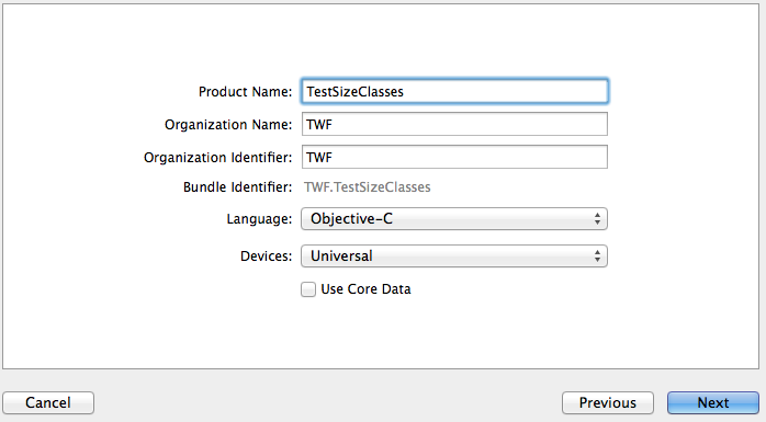
Let's create a test example in Xcode 6. Select SingleViewApplication, set Devices to Universal:
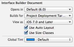
Next, select our Main.storyboard and in the File Inspector tab put a checkmark next to Use Size Classes (if it is not selected by default):
Now let's pay attention to our storyboard, it’s not exactly the way we used to see it:
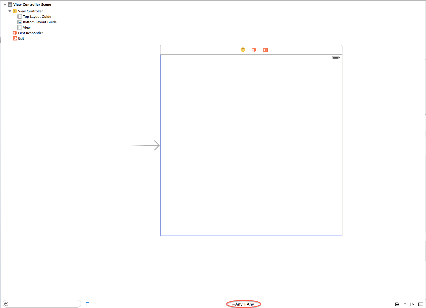
After it was selected Use Size Classes, ViewController has taken some abstract (base) size, with the designation wAny hAny (any height, any width), which we will talk about a little further.
A bit of theory. Each created ViewController has its own UITraitCollection object (providing detailed information on the characteristics of the ViewController, available with iOS 8, more details can be found here), which in turn has 2 Size Class: horizontal and vertical. Each Size Class can have 3 possible values: compact, regular, and any. These values vary depending on the device, as well as its orientation. That is, the application will have its own separate interface for each ViewController based on the current Size Class.
Returning to our wAny hAny, what is it? This is nothing more than a configuration selection grid for working with a certain type of device, which looks like this:
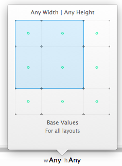
When you hover over a grid, Apple gives the developer tips on what sizes what devices are meant. The overall picture of the grid looks like this:
Base values (any Width | any Height):
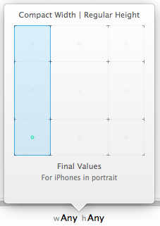
iPhone landscape mode (compact Width | compact Height): iPhone landscape mode (compact Width |

regular Height):
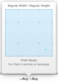
iPad landscape mode and portrait (regular Width | regular Height):
You need to pay attention to the green dots in the middle of each grid square. They show which devices the changes you make in this configuration will be applied. For example, at basic values (any Width | any Height), the points show the developer that the changes will be applied to all types of devices. For this reason, Apple recommends doing most of the work with the interface in this particular configuration.
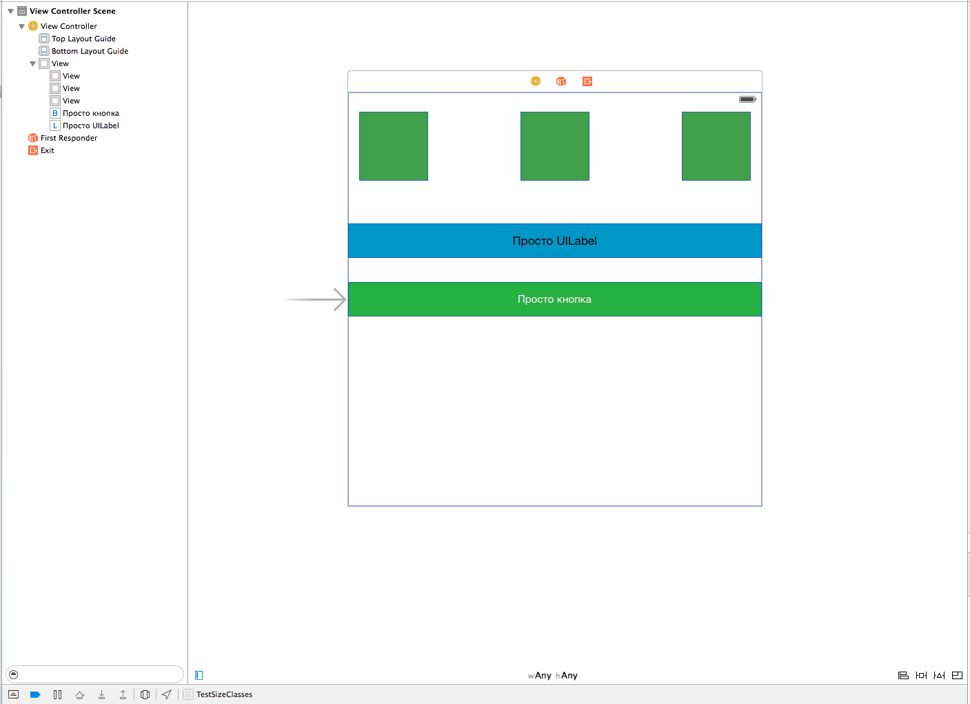
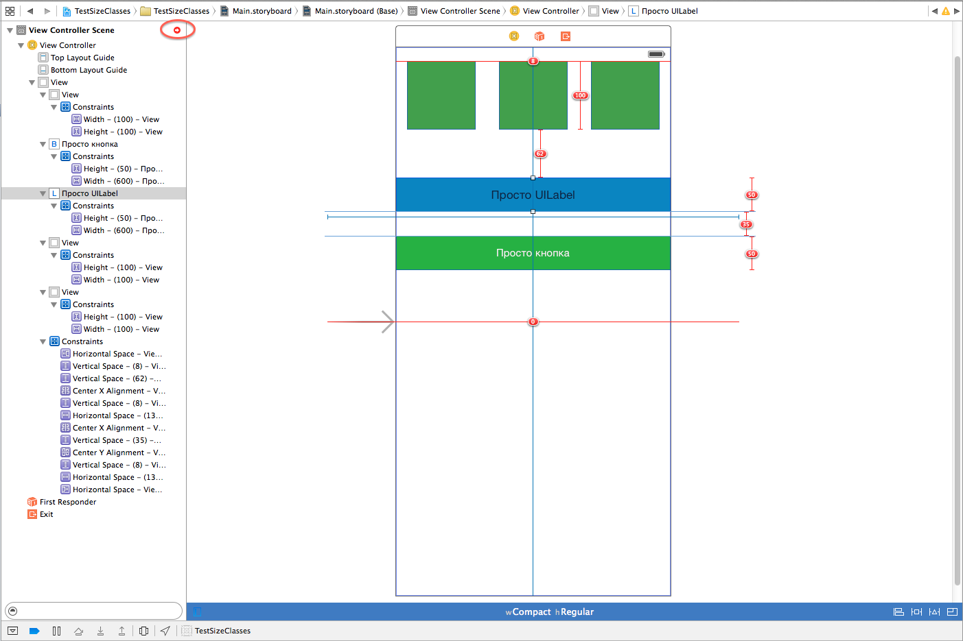
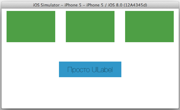
Let's get back to our test case. As stated above, our ViewController has a basic Size Class (any Width | any Height). Add to our ViewController 3 simple Views with a size of 100 by 100, coloring them in green, also add UILabel and UIButton with a width of 600 and a height of 50 and also coloring them for clarity:
Add Constraints: to the
button - centering vertically and horizontally, as well as Height and Wight .
three View - Height and Wight, Horizontal space and Vertical Space. We will do the same with UILabel.
As a result, our ViewController together with Constraints will look like this:

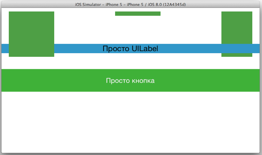
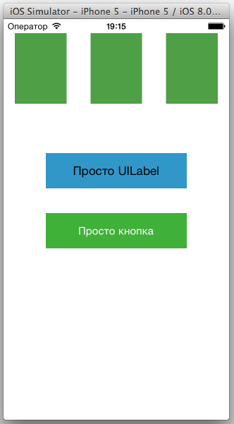
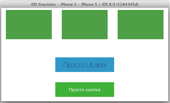
Run our application on iPhone 5 portrait and landscape:

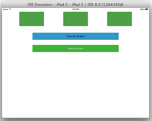
and iPad 2:
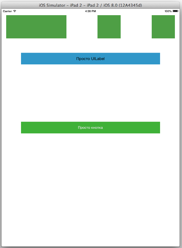
As you can see, the result is not very comforting, on iPhone 5 portrait two views crawled out unclear where, in landscape mode with the dimensions of the view and label, it’s just a disaster, and their width is too large. Everything is not so scary on the iPad, but the distance between the label and the button is too large, and the first UIView has been stretched.
First, fix everything for iPhone 5. First, in Size Classes, select (compact Width | regular Height) for portrait orientation:

Notice that the Size Classes selection bar turns blue. This means that you would be more attentive, since at the moment you are not in the basic configuration, and changes of 4 types will be applicable only to this type and orientation of the device. What are these changes? As it was said, there are 4:
1) Constraint values
2) fonts
3) turning on / off Constraint'ov
4) turning on / off subviews
PS Recall that everything that will be done next applies ONLY to the portrait orientation of iPhone 5, as the green dot in the Size Classes grid informs us!
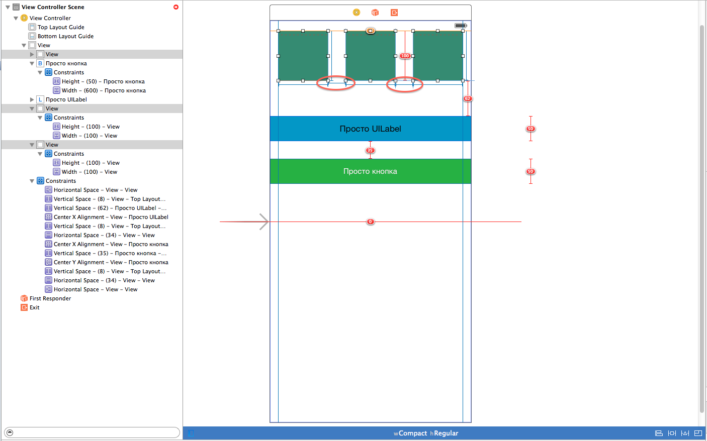
Let's start from point 1 and correct the values of Constraint so that everything looks correct. In this configuration, we see Constraint errors:
To correct them in this orientation, we go to the Constraint settings and select the horizontal distance between the View because for iPhone it is too large:

In the Utilities panel, in the Size Inspector tab, next to the Constant item (and also next to „Installed “, But more about it later) click on the small“ + ”sign:
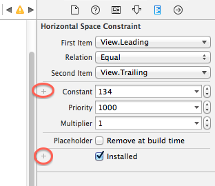
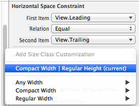
And select“ Compact Width | Regular Height (current) “:
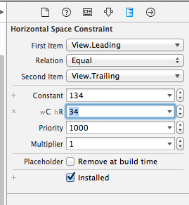
We see that we have a new Constant (wC hR), for this orientation, enter the value 34. We do the same with the second Constraint between the 2nd and 3rd view.
After that, errors related to the width between the view should disappear: We
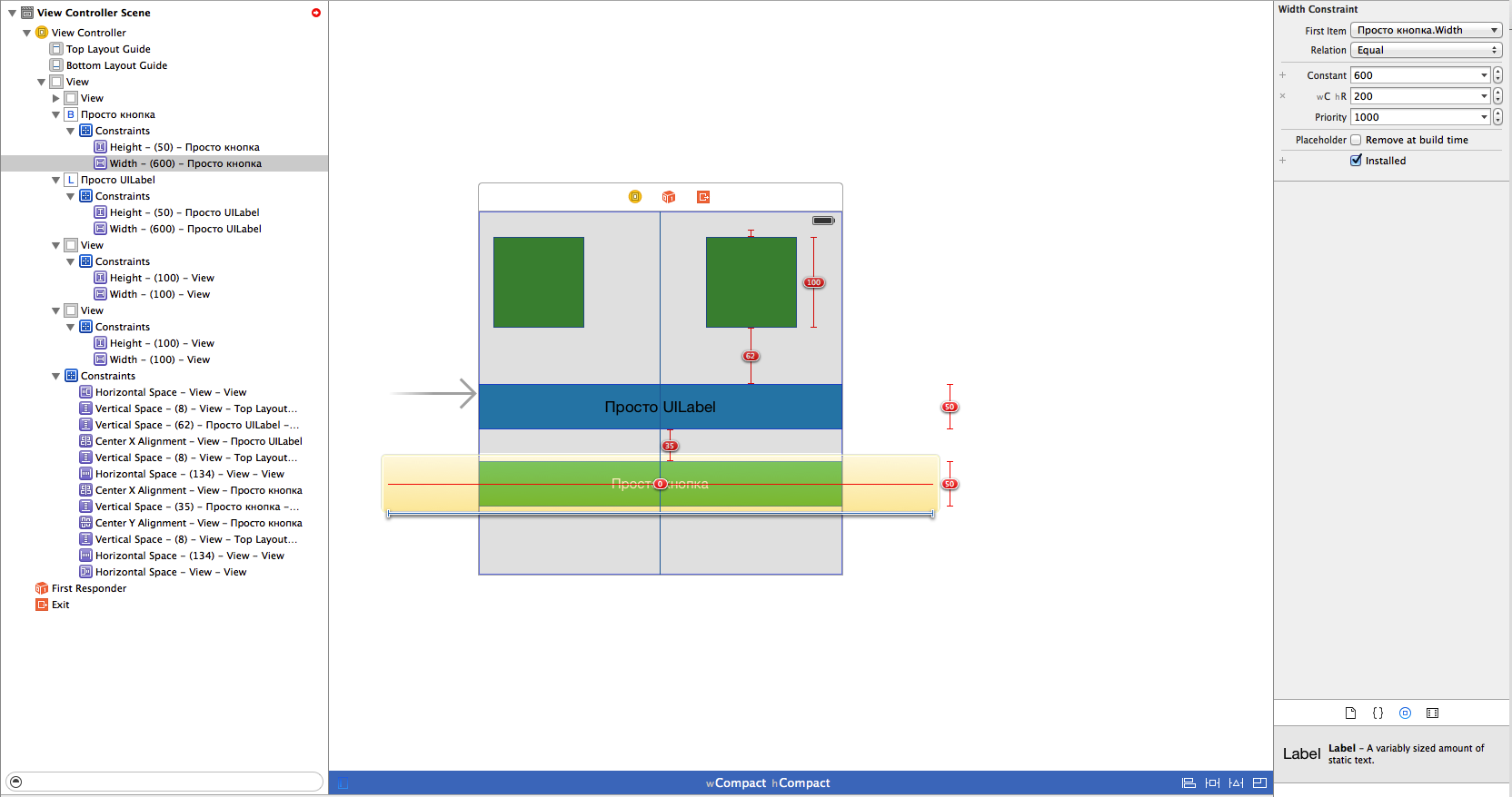
will do the same with the width of the button and label for this orientation. Choose their width, add Constant „Compact Width | Regular Height (current) “, and set the value to 200:

As we recall, we set our button to Horizontal Center in Container and Vertical Center in Container, which causes the remaining conflicts. They can be solved in at least 2 ways, depending on what is required, the 1st method, place the button in the center as it requires, or leave everything as it is and use 3 points from the list above. In this example, we will use the method under number 2, since this is still an article about Size Classes.
So, in order to “turn off” Constraint, which is bothering us, you need to select it from the list:
And again, go to the Size Inspector tab, just now click on the “+” next to the “Installed” checkbox:
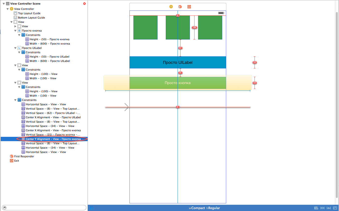
Again, select and select "Compact Width | Regular Height (current) “, and now, like with Constant (wC hR), the wC hR“ Installed ”checkbox appeared, we remove it and we see that the errors have disappeared, but for this configuration this Constrain is turned off:

Run our application and we’ll see that everything is displayed correctly (well, almost everything, since the View sizes were not adjusted for a particular device Xcode automatically reduces one of them):

We will fix this problem later.
We do the same for iPhone 5 landscape, select Size Classes (compact Width | compact Height) in the grid:
We need to change the distance between the view and the size of the button and label for portrait mode, I chose the same values as for portrait mode: the distance between the view 34, the size of the button and label 200. Run our app:
Again, because that we did not customize the size, Xcode stretches the View. Correct this error in portrait (compact Width | regular Height) and landscape (compact Width | compact Height) orientations. Select our 3 views and select Editor -> Pin -> Widths Equally from the menu. After that, run our application for execution and see that everything is displayed correctly:
In order not to repeat for the iPad, we do the same thing as for the iPhone, only in the Size Classes grid, select regular Width | regular Height, which corresponds to the portrait and landscape orientation of the iPad. In this situation, we just updated all Constraint, centered and set Width, Height Equally:
There are 2 points left that did not go through, this is turning on / off subviews and fonts. Choose landscape mode iPhone compact Width | compact Height. Select our UILabel and go to the Attributes Inspector, opposite the font we will see the familiar “+”:
By analogy with Constraint, we add “compact Width | compact Height (current) “. For the value wC hC, set the font Helvetica Neue Ultra Light and size 23. At startup, we will see that in portrait orientation the font is standard and already in the landscape Helvetica Neue:
So, the last item is turning on and off the subviews. I think there is no need to explain anything here, and so everything becomes clear after all these chewing. Everything is similar to turning Constraint off, the only difference is that here we turn off the button for a specific orientation:
In general, my first article was not small, but also small, I hope it is interesting and useful. At the time of writing, Xcode 6 is still in beta, and iPhone 6 has not been released, after the presentation of which documentation will probably be updated, and the appearance of ViewControllers in the storyboard will also change, since in this situation it’s not very convenient to place everything in “squares”, although the iPhone landscape is selected in the Size Classes grid.
Based on materials: developer.apple.com/library/prerelease/ios/recipes/xcode_help-IB_adaptive_sizes/EnablingAdaptiveSizeDesign.html#//apple_ref/doc/uid/TP40014436-CH1-SW1
Thank you for your attention!
So what is Size Classes for? We all know that the iPhone 6 is already approaching with two (at least) different display sizes (4.7 and 5.5), after which the developers will have to bother even more with the UI layout for them + of course the iPad extensions. As a result, the number of all supported screens will be about 7 (a little hello to Android). The hero of today - Size Classes - is just designed to help solve this problem.
Let's create a test example in Xcode 6. Select SingleViewApplication, set Devices to Universal:
Next, select our Main.storyboard and in the File Inspector tab put a checkmark next to Use Size Classes (if it is not selected by default):
Now let's pay attention to our storyboard, it’s not exactly the way we used to see it:
After it was selected Use Size Classes, ViewController has taken some abstract (base) size, with the designation wAny hAny (any height, any width), which we will talk about a little further.
A bit of theory. Each created ViewController has its own UITraitCollection object (providing detailed information on the characteristics of the ViewController, available with iOS 8, more details can be found here), which in turn has 2 Size Class: horizontal and vertical. Each Size Class can have 3 possible values: compact, regular, and any. These values vary depending on the device, as well as its orientation. That is, the application will have its own separate interface for each ViewController based on the current Size Class.
Returning to our wAny hAny, what is it? This is nothing more than a configuration selection grid for working with a certain type of device, which looks like this:
When you hover over a grid, Apple gives the developer tips on what sizes what devices are meant. The overall picture of the grid looks like this:
Base values (any Width | any Height):
iPhone landscape mode (compact Width | compact Height): iPhone landscape mode (compact Width |
regular Height):
iPad landscape mode and portrait (regular Width | regular Height):
You need to pay attention to the green dots in the middle of each grid square. They show which devices the changes you make in this configuration will be applied. For example, at basic values (any Width | any Height), the points show the developer that the changes will be applied to all types of devices. For this reason, Apple recommends doing most of the work with the interface in this particular configuration.
Let's get back to our test case. As stated above, our ViewController has a basic Size Class (any Width | any Height). Add to our ViewController 3 simple Views with a size of 100 by 100, coloring them in green, also add UILabel and UIButton with a width of 600 and a height of 50 and also coloring them for clarity:
Add Constraints: to the
button - centering vertically and horizontally, as well as Height and Wight .
three View - Height and Wight, Horizontal space and Vertical Space. We will do the same with UILabel.
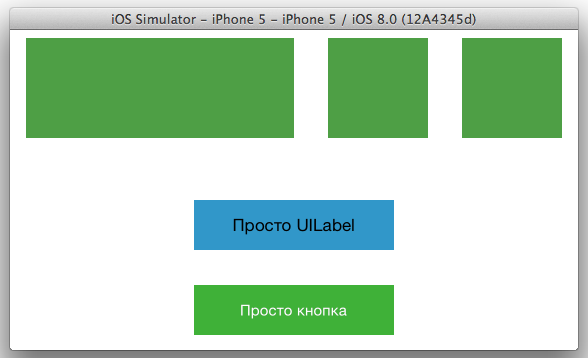
As a result, our ViewController together with Constraints will look like this:
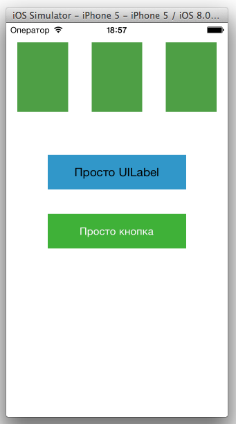
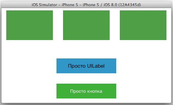
Run our application on iPhone 5 portrait and landscape:
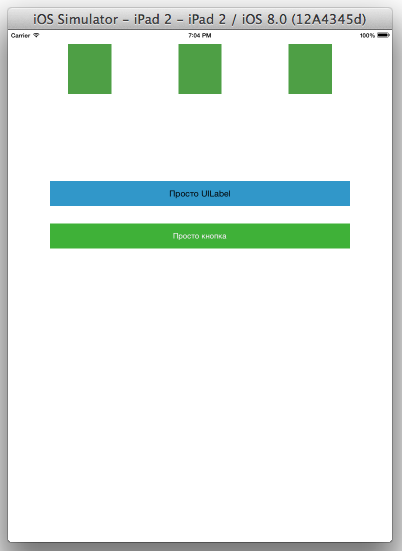
and iPad 2:
As you can see, the result is not very comforting, on iPhone 5 portrait two views crawled out unclear where, in landscape mode with the dimensions of the view and label, it’s just a disaster, and their width is too large. Everything is not so scary on the iPad, but the distance between the label and the button is too large, and the first UIView has been stretched.
First, fix everything for iPhone 5. First, in Size Classes, select (compact Width | regular Height) for portrait orientation:
Notice that the Size Classes selection bar turns blue. This means that you would be more attentive, since at the moment you are not in the basic configuration, and changes of 4 types will be applicable only to this type and orientation of the device. What are these changes? As it was said, there are 4:
1) Constraint values
2) fonts
3) turning on / off Constraint'ov
4) turning on / off subviews
PS Recall that everything that will be done next applies ONLY to the portrait orientation of iPhone 5, as the green dot in the Size Classes grid informs us!
Let's start from point 1 and correct the values of Constraint so that everything looks correct. In this configuration, we see Constraint errors:
To correct them in this orientation, we go to the Constraint settings and select the horizontal distance between the View because for iPhone it is too large:
In the Utilities panel, in the Size Inspector tab, next to the Constant item (and also next to „Installed “, But more about it later) click on the small“ + ”sign:
And select“ Compact Width | Regular Height (current) “:
We see that we have a new Constant (wC hR), for this orientation, enter the value 34. We do the same with the second Constraint between the 2nd and 3rd view.
After that, errors related to the width between the view should disappear: We
will do the same with the width of the button and label for this orientation. Choose their width, add Constant „Compact Width | Regular Height (current) “, and set the value to 200:
As we recall, we set our button to Horizontal Center in Container and Vertical Center in Container, which causes the remaining conflicts. They can be solved in at least 2 ways, depending on what is required, the 1st method, place the button in the center as it requires, or leave everything as it is and use 3 points from the list above. In this example, we will use the method under number 2, since this is still an article about Size Classes.
So, in order to “turn off” Constraint, which is bothering us, you need to select it from the list:
And again, go to the Size Inspector tab, just now click on the “+” next to the “Installed” checkbox:
Again, select and select "Compact Width | Regular Height (current) “, and now, like with Constant (wC hR), the wC hR“ Installed ”checkbox appeared, we remove it and we see that the errors have disappeared, but for this configuration this Constrain is turned off:
Run our application and we’ll see that everything is displayed correctly (well, almost everything, since the View sizes were not adjusted for a particular device Xcode automatically reduces one of them):
We will fix this problem later.
We do the same for iPhone 5 landscape, select Size Classes (compact Width | compact Height) in the grid:
We need to change the distance between the view and the size of the button and label for portrait mode, I chose the same values as for portrait mode: the distance between the view 34, the size of the button and label 200. Run our app:
Again, because that we did not customize the size, Xcode stretches the View. Correct this error in portrait (compact Width | regular Height) and landscape (compact Width | compact Height) orientations. Select our 3 views and select Editor -> Pin -> Widths Equally from the menu. After that, run our application for execution and see that everything is displayed correctly:
In order not to repeat for the iPad, we do the same thing as for the iPhone, only in the Size Classes grid, select regular Width | regular Height, which corresponds to the portrait and landscape orientation of the iPad. In this situation, we just updated all Constraint, centered and set Width, Height Equally:
There are 2 points left that did not go through, this is turning on / off subviews and fonts. Choose landscape mode iPhone compact Width | compact Height. Select our UILabel and go to the Attributes Inspector, opposite the font we will see the familiar “+”:
By analogy with Constraint, we add “compact Width | compact Height (current) “. For the value wC hC, set the font Helvetica Neue Ultra Light and size 23. At startup, we will see that in portrait orientation the font is standard and already in the landscape Helvetica Neue:
So, the last item is turning on and off the subviews. I think there is no need to explain anything here, and so everything becomes clear after all these chewing. Everything is similar to turning Constraint off, the only difference is that here we turn off the button for a specific orientation:
In general, my first article was not small, but also small, I hope it is interesting and useful. At the time of writing, Xcode 6 is still in beta, and iPhone 6 has not been released, after the presentation of which documentation will probably be updated, and the appearance of ViewControllers in the storyboard will also change, since in this situation it’s not very convenient to place everything in “squares”, although the iPhone landscape is selected in the Size Classes grid.
Based on materials: developer.apple.com/library/prerelease/ios/recipes/xcode_help-IB_adaptive_sizes/EnablingAdaptiveSizeDesign.html#//apple_ref/doc/uid/TP40014436-CH1-SW1
Thank you for your attention!