An example of working with the ICE method from a Google and Microsoft product manager
- Transfer
Working with priorities is a task that requires preparation, experience and consideration of a variety of technologies, scientific approaches, and also author's methods.
This article is a translation of material from Hackernoon.com. Its author proposes the use of its own tool for assessing priorities in the framework of ICE Scoring. This article describes the approach in detail and explores a simple and accessible example that is understandable to any product manager.

Itamar Gilad is a renowned consultant in the field of product management and a successful speaker. In his many years of experience, he has held product management positions at Google, Microsoft, and other well-known companies. We offer a translation of his article:
Suppose you manage a product for a small business and its customers. Your goal is to improve customer engagement and retention. You have two ideas on the agenda:
The idea with the toolbar arose several times in negotiations with customers, and you feel that it has good potential, but there is a risk that only experienced users will use it.
The idea of chatbot like the whole company, and the leadership is quite optimistic about it. Also, the feature looks winning for customers.
What would you choose?
This prioritization issues underlie product management. Payment for the wrong choice can be very large and include the cost of development, deployment, maintenance, and other unplanned costs.
We are often tempted to make a decision on the basis of inconclusive signals: majority opinions, opinions of chiefs, industry trends, etc. But time shows that these signals are exactly at the level of a random number generator.
This post is about how, in my opinion, to find the best ideas. It consists of three parts:
ICE Scoring is a prioritization method that was first used by Sean Ellis, known for his active participation in the development of companies such as DropBox and Eventbrite, and in promoting the term Growth Hacking. ICE was originally intended to prioritize growth experiments, but soon became used to evaluate any ideas.
In ICE, you rate ideas like this:

The values in ICE are ranked on a scale from 1 to 10, so that all factors balance the final number. Under the values of 1-10, you can mean anything, as long as the values are consistent with each other.

Now let's take a look at an example of how this works.
So, you decided to calculate ICE points for two ideas: a dashboard and a chatbot. At this early stage, you use rough values based solely on your own intuition.
Impact - you assume that a dashboard will significantly increase user retention, but only experienced ones - you give 5 out of 10. Chatbot, on the other hand, can be an innovative solution for many customers, so you give it 8 out of 10.
Ease of implementation - you rate that dashboard will require 10 person-weeks, and chat bot - 20. Later, you will get better marks from the team. You use this simple table (chosen by you and your team) to convert your score to Ease:
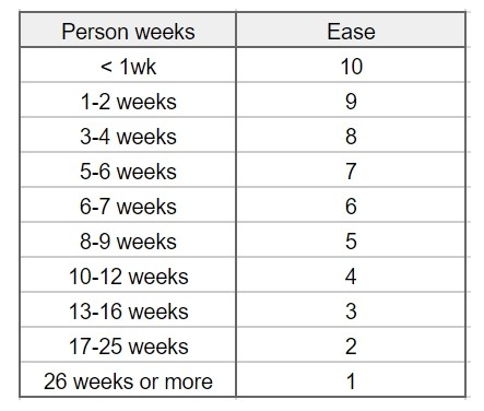
Thus, the toolbar gets the value Ease 4 out of 10 and the chatbot - the value 2.
There is only one way to calculate confidence - this is the search for supporting evidence. For this, I created a tool that can be seen below. It lists the general types of tests and evidence that you may have and the level of confidence they provide: test results, date of completion, personal confidence, thematic support, opinions of other people, market data, etc.
When using the tool, consider which indicators you already have, how many of them and what you need to get more confidence.
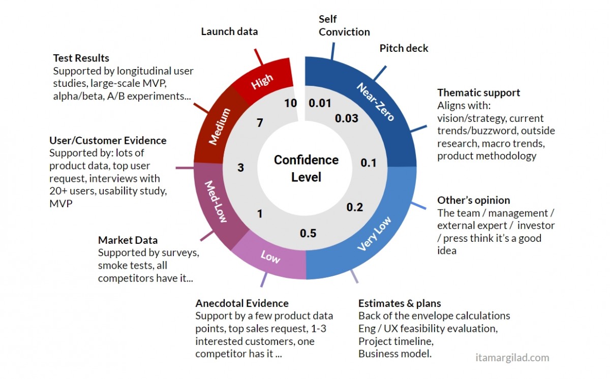
If another proof of evidence is possible in your product or industry, feel free to create your own version of this tool.
Let's go back to the example to evaluate the tool in action.
Supporting evidence for chatbot: personal confidence (you think that this is a good idea), thematic support (in the industry also consider it a good idea) and the opinion of others (your superiors and colleagues consider it a good idea). This gives it a total confidence value of 0.1 out of 10 or Near Zero Confidence. The tool clearly does not consider opinions as a reliable indicator.
What about the dashboard? Here, personal confidence (you think this is a good idea) and occasional support (several clients have asked for it). This actually increases its confidence value to 0.5 out of 10, which is a low confidence. Unfortunately, clients do not predict their future behavior well.
ICE scoring in this case:
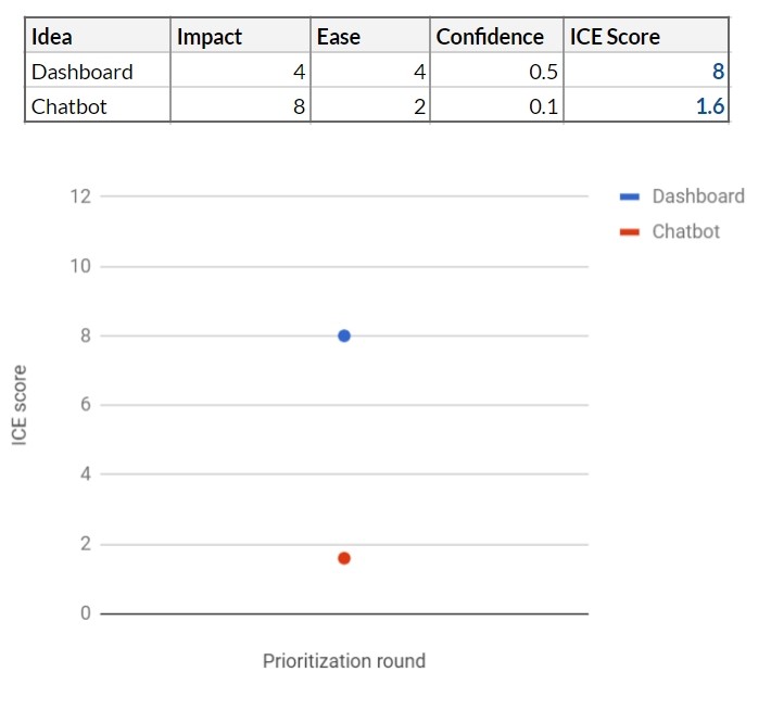
At this point, the toolbar looks like the best idea, but our tool shows that you have not gone beyond the limits of low confidence. There is simply not enough information to make a decision.
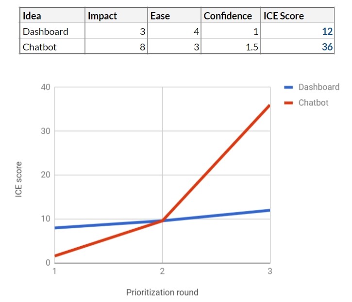
Then you meet with your colleagues responsible for the development and UX, and together begin to evaluate both ideas. Both projects seem feasible at first glance. The main developer offers a rough estimate of labor costs: working with the toolbar will take 12 person-weeks for a release, and with a chatbot it will take 16 person-weeks. According to your Ease scale, this makes it easy to implement in 4 and 3, respectively.
In parallel, you make detailed calculations. On closer inspection, the dashboard looks a bit less promising and gets 3. The chatbot still looks at 8.
Using the trust tool shows that both ideas now pass the Estimates & Plans test and get some confidence. Now the toolbar moves to 0.8 and chat bot to 0.4.

Chatbot rehabilitated a little. Nevertheless, the level of trust is low for a good reason - these are mostly numbers from nowhere, and you understand that you need to gather more evidence.
You send a questionnaire to existing customers, inviting them to choose one of 5 possible new features, including a chatbot and a toolbar. Get hundreds of answers. The results are very positive for the chatbot - this is function number 1 in the questionnaire, and 38% of respondents choose it. Dashboard takes 3rd place with 17% of the vote.
This gives both functions market support, but the chatbot score is up 1.5. For the control panel, confidence has also increased, but only to 1.
Obviously, the chatbot has advanced greatly. It seems that your colleagues and industry data proved their case. Should this data be taken as 100%? Probably not - the project is quite expensive, and we have all that average confidence. Unfortunately, the survey results do not give a very significant signal. We continue to work.
To learn more, you run a user study on 10 existing customers, showing them interactive prototypes of both features. In parallel, you conduct telephone interviews with 20 survey participants who have chosen one of the two suggested features.
The study shows a more interesting picture:
This qualitative research gives you more food for thought. The toolbar seems more popular than you expected. Chatbot is now more like a project with a high level of risk and a high price. Considering our trust tool, you assign toolbars and chatbot trust values 3 and 2.5, respectively.
You set up an effect like this: 6 for a dashboard and 9 for a chatbot. Finally, based on the usability study, you understand that getting a quality UI for chatbot will require more work - you reduce Ease to 2. The
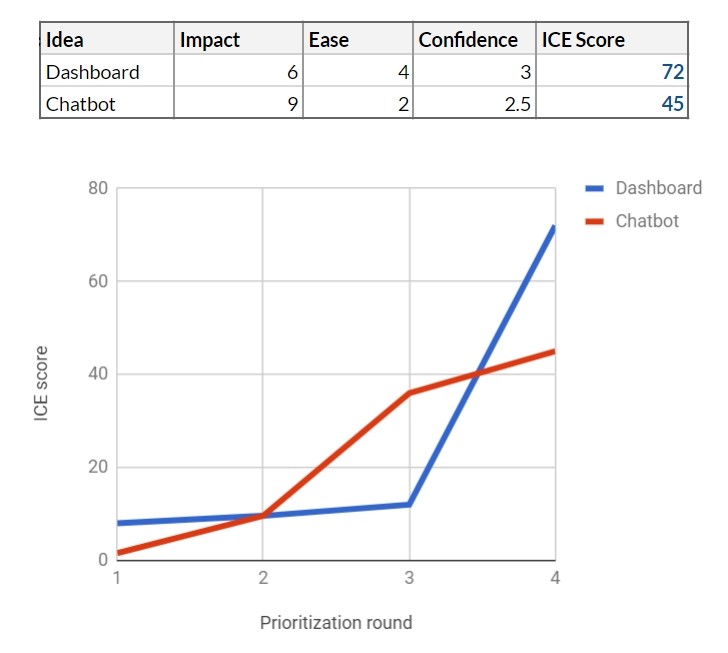
table has changed again, and now the toolbar is in the lead.
You bring results to your team and your leadership. According to ICE, the toolbar should be declared the winner, however, on the other hand, the confidence indicators of both features are far from high. Not wanting to let go of a potentially good feature, the team decides to continue testing both.
You decide to start by creating a chatbot version for a minimum viable product (MVP). Development takes 6 weeks, and you run the MVP for 200 respondents who agreed to take part in the testing. 167 people activate the feature, but its use drops sharply every day, and by the end of the second week you have only 24 active users left.
In subsequent surveys, a clear picture emerges - chatbot is more difficult to use, it is much less useful than participants expected, and, even worse, it creates a negative for customers who value personal contact.
You can modify MVB chatbot and make it much more useful for your customers, but it takes about 40-50 person-weeks.
It is also obvious that far fewer customers than previously expected will call the feature useful. Therefore, you reduce the impact from 9 to 2. This significantly changes the feature, so you can no longer trust the results of user research, so reduce trust to 0.5 using the trust tool.
You run the MVP toolbar on 200 other clients for 5 weeks. The results are very good: 87% of the participants use this feature, many of them daily. Feedback is overwhelmingly positive. You understand that the impact is higher than you expected - 8 points instead of 6. The development team estimates that it will take another 10 person-weeks to launch the toolbar in full, so the ease of implementation gets 4. As a result, you increase your confidence rating with 3 to 6.5.
At this point, prioritization becomes quite simple. Now everyone agrees that the dashboard is the right feature for product development. You keep the chatbot feature in your idea bank, but it will naturally remain “at the bottom”, given the low ICE.
1. Stop investing in bad ideas.
Our example shows how risky it is to bet on features that require a lot of effort and are based on feelings, opinions, industry data, market trends, etc. Most of the ideas are in fact much less useful and more expensive. than we think before developing. The only real way to find the best ideas is to test them and reduce the level of uncertainty.
2. Worry about benefits, not results
Adding a feature prioritization step reduces the speed of product development - it seems so at first glance. But in fact it does not reduce, but increases the speed. By assessing confidence, you simply do not do some bad features. It also focuses the team on specific short-term goals and increases team productivity. This process allows us to learn about the product, consumers, market and ultimately get a better product that has already been tested on real users. Therefore, we are waiting for fewer surprises on the launch day.
3. Encourage diversity of approaches.
In fact, we often have to choose not between two ideas, but between dozens. We reduce the cost of developing an idea based on confidence in it. This allows us to test many different ideas in parallel and avoid the pitfalls associated with traditional long-term planning.

In this example, the team tests 4 ideas in parallel, completing several projects (yellow squares), each of which gradually refines the idea and tests it to increase confidence.
4. Get the location of management and stakeholders
Usually, when I explain this method, people are most concerned about how to get the consent of their management and stakeholders to implement such a prioritization process.
Can we limit their power over the product? You will be surprised. I heard a lot from managers that they are forced to immerse themselves in the process of making product decisions due to the lack of strong options. A weak or strong option is, of course, a subjective concept, but until you see the real state of affairs with real evidence and a clear level of confidence in the evaluation of the feature.
On the other hand, the next time that a CEO forces you to make your super idea, show him how an idea is evaluated using factors of influence, effort and confidence, how ICE indicators for this idea are compared with indicators of other ideas, and how we can test its to clarify the confidence factor.
You can read about the shortcomings of the ICE method, as well as an alternative way of prioritization, in our previous article “ RICE and ICE Scoring: Simple Prioritization Techniques for Advanced Product Managers .”
Was this article helpful to you? Would you like to read the materials of this author? Please tell about it in the comments.
This article is a translation of material from Hackernoon.com. Its author proposes the use of its own tool for assessing priorities in the framework of ICE Scoring. This article describes the approach in detail and explores a simple and accessible example that is understandable to any product manager.
Itamar Gilad is a renowned consultant in the field of product management and a successful speaker. In his many years of experience, he has held product management positions at Google, Microsoft, and other well-known companies. We offer a translation of his article:
Suppose you manage a product for a small business and its customers. Your goal is to improve customer engagement and retention. You have two ideas on the agenda:
- Implementing the main toolbar (dashboard), which allows a business owner to track involvement statistics and all trends.
- Chatbot (chatbot) to automate communication with customers.
The idea with the toolbar arose several times in negotiations with customers, and you feel that it has good potential, but there is a risk that only experienced users will use it.
The idea of chatbot like the whole company, and the leadership is quite optimistic about it. Also, the feature looks winning for customers.
What would you choose?
This prioritization issues underlie product management. Payment for the wrong choice can be very large and include the cost of development, deployment, maintenance, and other unplanned costs.
We are often tempted to make a decision on the basis of inconclusive signals: majority opinions, opinions of chiefs, industry trends, etc. But time shows that these signals are exactly at the level of a random number generator.
This post is about how, in my opinion, to find the best ideas. It consists of three parts:
- ICE indicators
- Levels of trust
- additional verification
Ice scoring
ICE Scoring is a prioritization method that was first used by Sean Ellis, known for his active participation in the development of companies such as DropBox and Eventbrite, and in promoting the term Growth Hacking. ICE was originally intended to prioritize growth experiments, but soon became used to evaluate any ideas.
In ICE, you rate ideas like this:
- Impact demonstrates how an idea has a positive effect on a key indicator that you are trying to improve.
- Ease of implementation or simplicity is an assessment of how much effort and resources are required to implement this idea.
- Confidence demonstrates how confident you are in assessing the impact and ease of implementation.
The values in ICE are ranked on a scale from 1 to 10, so that all factors balance the final number. Under the values of 1-10, you can mean anything, as long as the values are consistent with each other.
Now let's take a look at an example of how this works.
First ICE
So, you decided to calculate ICE points for two ideas: a dashboard and a chatbot. At this early stage, you use rough values based solely on your own intuition.
Impact - you assume that a dashboard will significantly increase user retention, but only experienced ones - you give 5 out of 10. Chatbot, on the other hand, can be an innovative solution for many customers, so you give it 8 out of 10.
Ease of implementation - you rate that dashboard will require 10 person-weeks, and chat bot - 20. Later, you will get better marks from the team. You use this simple table (chosen by you and your team) to convert your score to Ease:
Thus, the toolbar gets the value Ease 4 out of 10 and the chatbot - the value 2.
Confidence calculation
There is only one way to calculate confidence - this is the search for supporting evidence. For this, I created a tool that can be seen below. It lists the general types of tests and evidence that you may have and the level of confidence they provide: test results, date of completion, personal confidence, thematic support, opinions of other people, market data, etc.
When using the tool, consider which indicators you already have, how many of them and what you need to get more confidence.
If another proof of evidence is possible in your product or industry, feel free to create your own version of this tool.
Let's go back to the example to evaluate the tool in action.
Supporting evidence for chatbot: personal confidence (you think that this is a good idea), thematic support (in the industry also consider it a good idea) and the opinion of others (your superiors and colleagues consider it a good idea). This gives it a total confidence value of 0.1 out of 10 or Near Zero Confidence. The tool clearly does not consider opinions as a reliable indicator.
What about the dashboard? Here, personal confidence (you think this is a good idea) and occasional support (several clients have asked for it). This actually increases its confidence value to 0.5 out of 10, which is a low confidence. Unfortunately, clients do not predict their future behavior well.
ICE scoring in this case:
At this point, the toolbar looks like the best idea, but our tool shows that you have not gone beyond the limits of low confidence. There is simply not enough information to make a decision.
Verification of assessment and feasibility
Then you meet with your colleagues responsible for the development and UX, and together begin to evaluate both ideas. Both projects seem feasible at first glance. The main developer offers a rough estimate of labor costs: working with the toolbar will take 12 person-weeks for a release, and with a chatbot it will take 16 person-weeks. According to your Ease scale, this makes it easy to implement in 4 and 3, respectively.
In parallel, you make detailed calculations. On closer inspection, the dashboard looks a bit less promising and gets 3. The chatbot still looks at 8.
Using the trust tool shows that both ideas now pass the Estimates & Plans test and get some confidence. Now the toolbar moves to 0.8 and chat bot to 0.4.
Chatbot rehabilitated a little. Nevertheless, the level of trust is low for a good reason - these are mostly numbers from nowhere, and you understand that you need to gather more evidence.
Market data
You send a questionnaire to existing customers, inviting them to choose one of 5 possible new features, including a chatbot and a toolbar. Get hundreds of answers. The results are very positive for the chatbot - this is function number 1 in the questionnaire, and 38% of respondents choose it. Dashboard takes 3rd place with 17% of the vote.
This gives both functions market support, but the chatbot score is up 1.5. For the control panel, confidence has also increased, but only to 1.
Obviously, the chatbot has advanced greatly. It seems that your colleagues and industry data proved their case. Should this data be taken as 100%? Probably not - the project is quite expensive, and we have all that average confidence. Unfortunately, the survey results do not give a very significant signal. We continue to work.
Word to customers
To learn more, you run a user study on 10 existing customers, showing them interactive prototypes of both features. In parallel, you conduct telephone interviews with 20 survey participants who have chosen one of the two suggested features.
The study shows a more interesting picture:
- 8 out of 10 study participants found the dashboard useful and said they would use it at least once a week. Their understanding of this function correlated well with what you had in mind initially, and they had no problems with its use. Telephone interviews confirmed understanding and a desire to use the feature on average once a week.
- 9 out of 10 study participants said they would use the chatbot willingly. Their level of enthusiasm was very high - everyone immediately understood why this could be useful and many asked him as soon as possible. However, there were problems with usability, and some customers expressed concern that their customers would not like the repetitive and “hackneyed” answers of the bot.
This qualitative research gives you more food for thought. The toolbar seems more popular than you expected. Chatbot is now more like a project with a high level of risk and a high price. Considering our trust tool, you assign toolbars and chatbot trust values 3 and 2.5, respectively.
You set up an effect like this: 6 for a dashboard and 9 for a chatbot. Finally, based on the usability study, you understand that getting a quality UI for chatbot will require more work - you reduce Ease to 2. The
table has changed again, and now the toolbar is in the lead.
You bring results to your team and your leadership. According to ICE, the toolbar should be declared the winner, however, on the other hand, the confidence indicators of both features are far from high. Not wanting to let go of a potentially good feature, the team decides to continue testing both.
Final tests and winner!
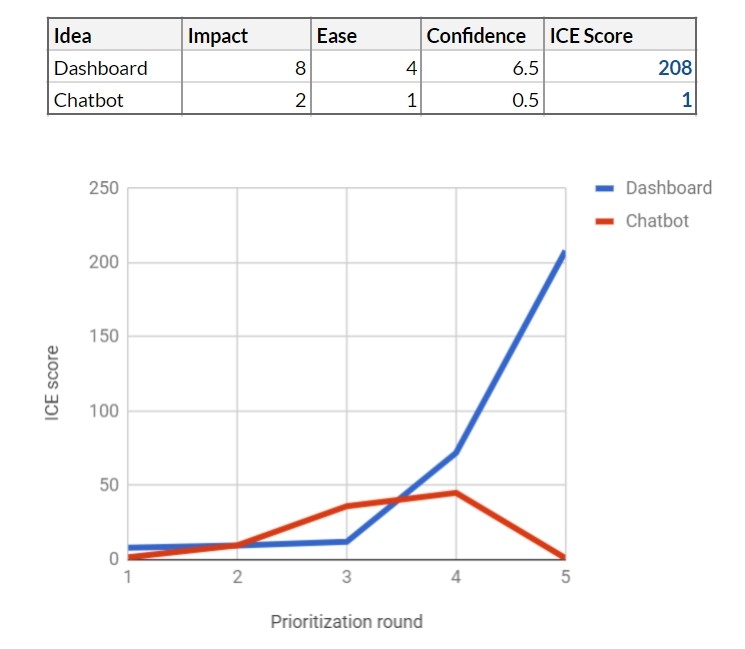
You decide to start by creating a chatbot version for a minimum viable product (MVP). Development takes 6 weeks, and you run the MVP for 200 respondents who agreed to take part in the testing. 167 people activate the feature, but its use drops sharply every day, and by the end of the second week you have only 24 active users left.
In subsequent surveys, a clear picture emerges - chatbot is more difficult to use, it is much less useful than participants expected, and, even worse, it creates a negative for customers who value personal contact.
You can modify MVB chatbot and make it much more useful for your customers, but it takes about 40-50 person-weeks.
It is also obvious that far fewer customers than previously expected will call the feature useful. Therefore, you reduce the impact from 9 to 2. This significantly changes the feature, so you can no longer trust the results of user research, so reduce trust to 0.5 using the trust tool.
You run the MVP toolbar on 200 other clients for 5 weeks. The results are very good: 87% of the participants use this feature, many of them daily. Feedback is overwhelmingly positive. You understand that the impact is higher than you expected - 8 points instead of 6. The development team estimates that it will take another 10 person-weeks to launch the toolbar in full, so the ease of implementation gets 4. As a result, you increase your confidence rating with 3 to 6.5.
At this point, prioritization becomes quite simple. Now everyone agrees that the dashboard is the right feature for product development. You keep the chatbot feature in your idea bank, but it will naturally remain “at the bottom”, given the low ICE.
findings
1. Stop investing in bad ideas.
Our example shows how risky it is to bet on features that require a lot of effort and are based on feelings, opinions, industry data, market trends, etc. Most of the ideas are in fact much less useful and more expensive. than we think before developing. The only real way to find the best ideas is to test them and reduce the level of uncertainty.
2. Worry about benefits, not results
Adding a feature prioritization step reduces the speed of product development - it seems so at first glance. But in fact it does not reduce, but increases the speed. By assessing confidence, you simply do not do some bad features. It also focuses the team on specific short-term goals and increases team productivity. This process allows us to learn about the product, consumers, market and ultimately get a better product that has already been tested on real users. Therefore, we are waiting for fewer surprises on the launch day.
3. Encourage diversity of approaches.
In fact, we often have to choose not between two ideas, but between dozens. We reduce the cost of developing an idea based on confidence in it. This allows us to test many different ideas in parallel and avoid the pitfalls associated with traditional long-term planning.
In this example, the team tests 4 ideas in parallel, completing several projects (yellow squares), each of which gradually refines the idea and tests it to increase confidence.
4. Get the location of management and stakeholders
Usually, when I explain this method, people are most concerned about how to get the consent of their management and stakeholders to implement such a prioritization process.
Can we limit their power over the product? You will be surprised. I heard a lot from managers that they are forced to immerse themselves in the process of making product decisions due to the lack of strong options. A weak or strong option is, of course, a subjective concept, but until you see the real state of affairs with real evidence and a clear level of confidence in the evaluation of the feature.
On the other hand, the next time that a CEO forces you to make your super idea, show him how an idea is evaluated using factors of influence, effort and confidence, how ICE indicators for this idea are compared with indicators of other ideas, and how we can test its to clarify the confidence factor.
You can read about the shortcomings of the ICE method, as well as an alternative way of prioritization, in our previous article “ RICE and ICE Scoring: Simple Prioritization Techniques for Advanced Product Managers .”
Was this article helpful to you? Would you like to read the materials of this author? Please tell about it in the comments.