Search Hype Cycle on Google Trends !?
Many people know the Hype Cycle technology cycle proposed by Gartner. Wikipedia also calls it the hype cycle or the cycle of public interest in technology. Now public interest is clearly manifested in the number of search queries by the name of a technology or technology product. And (Oh joy!) Google has a powerful tool for analyzing the popularity of search queries - Google Trends. For the sake of justice, I must say that Yandex and some others also have statistics, but much less functional. Accordingly, we can check whether Hype Cycle manifests itself in open Google data, and at the same time compare the popularity of some technologies.
Under the cut are a couple of graphs on technologies from Hype Cycle and many graphs on holivarny topics from IT - from XML vs JOSN to MySQL vs HBase. In general, fertile ground for sofa analytics.
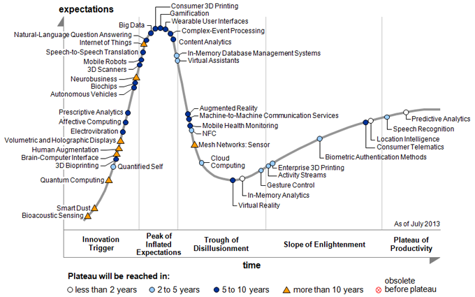
Gartner annually publishes a technology maturity cycle. It will not be superfluous to repeat Wikipedia and say that the cycle consists of five stages - “the emergence of technology” (they only know about technology and there are few search queries), “the peak of excessive expectations” (everyone was interested in what this technology can and how can help in their work ), “Getting rid of illusions” (everyone found out and it became clear that there were too many hopes, no one else was looking for information on this topic), “overcoming shortcomings” (some enthusiasts continue to analyze the state of technology) and “productivity plateau” (at the end finally finds out the technology is not so bad that it returns some popularity). The steps are listed sequentially along the direction of the time axis. On the chart, these steps are separated by vertical lines. The wiki doesn't mention
On the Gartner chart, the X axis is relative time, and the Y axis is the expectation of technology. At first glance, it seems that expectations can be unselectably replaced by the number of search queries related to the technology.
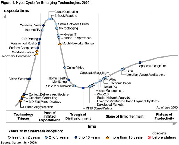
The symbol by which technology is designated is the estimated time during which the technology will reach the "plateau of productivity."
Google Trends was already mentioned on a hub - but very casual. At one time, there were two services with similar features - Google trends and Search for Insights. In 2012, Search for Insights was closed, and its functionality is poured into Google Trends (Here again, sending to Wikipedia).
Google Trends provides normalized graphs of the popularity of selected queries. Those. the graphs show the ratio of the number of requests received to the total number of requests for a given period of time. In general, you can not bother and perceive the graphics intuitively. Data available since 2004.
Also in Google Trends there is an opportunity to determine in which part of the Earth the request was most popular.
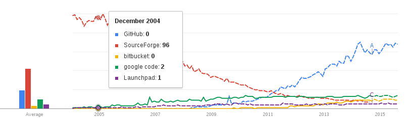
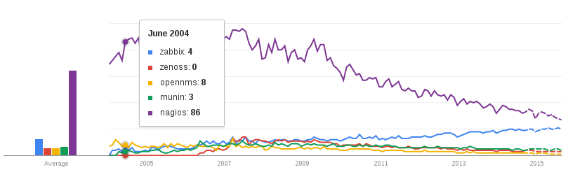
In general, under each picture there is a link to a set of graphs from where the picture was received. Fortunately, Google’s parameters are accepted through the GET method.
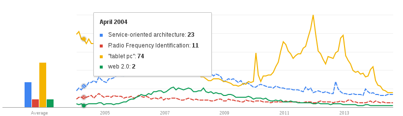
The cycle from 2009 is shown above, i.e. technologies marked with blue circles should already have reached the “plateau of productivity”, and white circles should have been on it for so long. Take Web 2.0, SOA, RFID, and Tablet PC. And what happened:
href
In all, there is still "overcoming the shortcomings" except for tablets - these generally have some kind of anomalous graphics, which is probably associated with mass advertising.
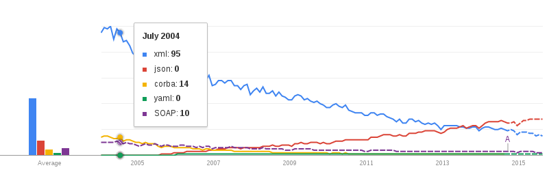
With regard to SOA, the crazy idea came up that the “bridging” involved the transition from XML to JSON. As you can see from the picture, early protocols such as CORBA are almost forgotten, and JSON is gaining popularity and is already ahead of XML.
href
As for me, there are two options - either the hype cycle does not work, or the display of “expectations from technology” -> the number of related search queries does not work.
Certain software products, of course, are not technologies, but it cannot be ruled out that the hype cycle is applicable to them. Of all the graphs viewed, the Google Chrome popularity curve is most similar to the hype cycle:

href
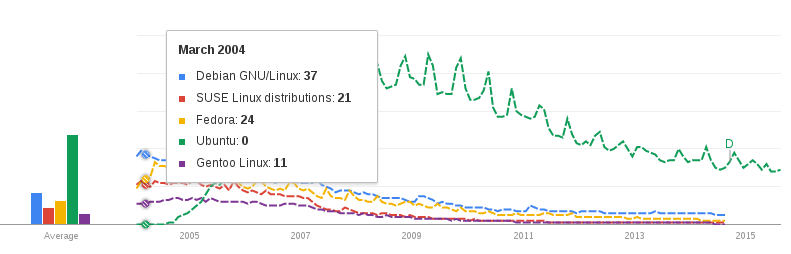
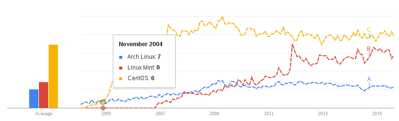
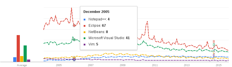
Let's move on to the most interesting. Google Trends provides an additional point of view when choosing which language to learn, which software to use.
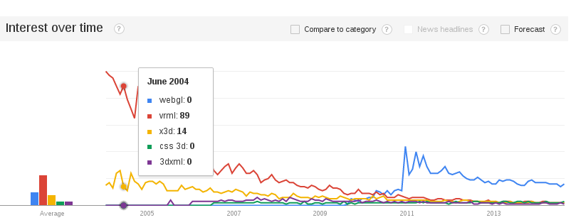
So, from the following picture it is obvious that to display 3D scenes in a browser, it is more promising to use WebGL, rather than outdated VRML with heirs.
href
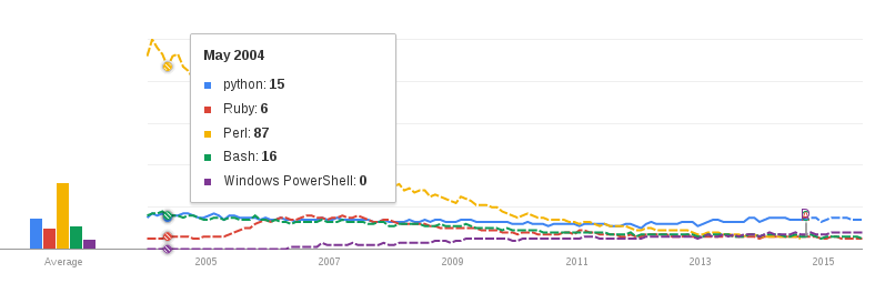
The following figure shows that from the given set the most perspective to study Python. Although of course there is a factor of intentions.
herf
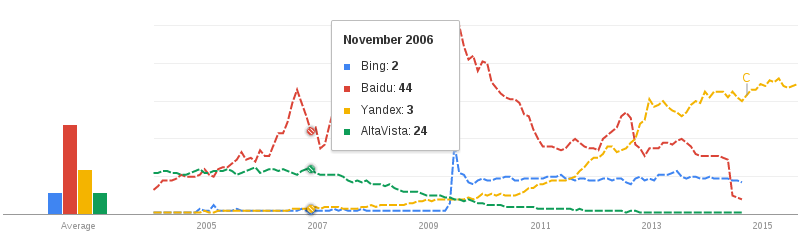
The graph of search portals vividly illustrates the “oblivion” phase using the example of Altavista, which was once very popular.
href
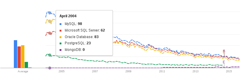
According to databases, it can be said that SQL is losing ground, and NoSQL is gaining popularity, although NoSQL mastodons are still far from the SQL world mastodons.
The following two images illustrate both worlds. For scale in both images, the MongoDB curve is the same color.
href

href
I was very surprised by the decline in the popularity of UML and the complete lack of interest in IDEF:
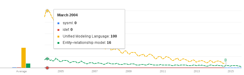
href I was
also surprised by the dynamics of the popularity of sorting algorithms, which would seem to fluctuate around a constant, but no ... in 2005 the
number of requests for these algorithms dropped sharply
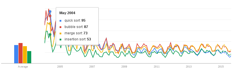
href
Judging by the obtained graphs, the relationship between the actual popularity and the number of requests can hardly be called strong. Especially raises doubts about the popularity of sortings. It is difficult to explain such a decline - whether it increased the number of google users not related to IT, or the calculation algorithm has changed ...
In any case, Google Trends can serve as the source of an extra subsection in your report on choosing a new technology or software.
Good luck.
PS And yes, if you get the idea of an interesting combination of graphs - add in the comments.
Under the cut are a couple of graphs on technologies from Hype Cycle and many graphs on holivarny topics from IT - from XML vs JOSN to MySQL vs HBase. In general, fertile ground for sofa analytics.
Hype cycle
Gartner annually publishes a technology maturity cycle. It will not be superfluous to repeat Wikipedia and say that the cycle consists of five stages - “the emergence of technology” (they only know about technology and there are few search queries), “the peak of excessive expectations” (everyone was interested in what this technology can and how can help in their work ), “Getting rid of illusions” (everyone found out and it became clear that there were too many hopes, no one else was looking for information on this topic), “overcoming shortcomings” (some enthusiasts continue to analyze the state of technology) and “productivity plateau” (at the end finally finds out the technology is not so bad that it returns some popularity). The steps are listed sequentially along the direction of the time axis. On the chart, these steps are separated by vertical lines. The wiki doesn't mention
On the Gartner chart, the X axis is relative time, and the Y axis is the expectation of technology. At first glance, it seems that expectations can be unselectably replaced by the number of search queries related to the technology.
For the curious
The symbol by which technology is designated is the estimated time during which the technology will reach the "plateau of productivity."
Google trends
Google Trends was already mentioned on a hub - but very casual. At one time, there were two services with similar features - Google trends and Search for Insights. In 2012, Search for Insights was closed, and its functionality is poured into Google Trends (Here again, sending to Wikipedia).
Google Trends provides normalized graphs of the popularity of selected queries. Those. the graphs show the ratio of the number of requests received to the total number of requests for a given period of time. In general, you can not bother and perceive the graphics intuitively. Data available since 2004.
Also in Google Trends there is an opportunity to determine in which part of the Earth the request was most popular.
In general, under each picture there is a link to a set of graphs from where the picture was received. Fortunately, Google’s parameters are accepted through the GET method.
Public interest cycle search
The cycle from 2009 is shown above, i.e. technologies marked with blue circles should already have reached the “plateau of productivity”, and white circles should have been on it for so long. Take Web 2.0, SOA, RFID, and Tablet PC. And what happened:
href
In all, there is still "overcoming the shortcomings" except for tablets - these generally have some kind of anomalous graphics, which is probably associated with mass advertising.
With regard to SOA, the crazy idea came up that the “bridging” involved the transition from XML to JSON. As you can see from the picture, early protocols such as CORBA are almost forgotten, and JSON is gaining popularity and is already ahead of XML.
href
As for me, there are two options - either the hype cycle does not work, or the display of “expectations from technology” -> the number of related search queries does not work.
Certain software products, of course, are not technologies, but it cannot be ruled out that the hype cycle is applicable to them. Of all the graphs viewed, the Google Chrome popularity curve is most similar to the hype cycle:
href
Hollywood Themes
Let's move on to the most interesting. Google Trends provides an additional point of view when choosing which language to learn, which software to use.
So, from the following picture it is obvious that to display 3D scenes in a browser, it is more promising to use WebGL, rather than outdated VRML with heirs.
href
The following figure shows that from the given set the most perspective to study Python. Although of course there is a factor of intentions.
herf
The graph of search portals vividly illustrates the “oblivion” phase using the example of Altavista, which was once very popular.
href
According to databases, it can be said that SQL is losing ground, and NoSQL is gaining popularity, although NoSQL mastodons are still far from the SQL world mastodons.
The following two images illustrate both worlds. For scale in both images, the MongoDB curve is the same color.
href
href
I was very surprised by the decline in the popularity of UML and the complete lack of interest in IDEF:
href I was
also surprised by the dynamics of the popularity of sorting algorithms, which would seem to fluctuate around a constant, but no ... in 2005 the
number of requests for these algorithms dropped sharply
href


Judging by the obtained graphs, the relationship between the actual popularity and the number of requests can hardly be called strong. Especially raises doubts about the popularity of sortings. It is difficult to explain such a decline - whether it increased the number of google users not related to IT, or the calculation algorithm has changed ...
In any case, Google Trends can serve as the source of an extra subsection in your report on choosing a new technology or software.
Good luck.
PS And yes, if you get the idea of an interesting combination of graphs - add in the comments.