Useful and service information in the interface
According to my observations, when designing user interaction, designers often do not strike a balance between useful and service information, with a bias in the service. By useful information, I understand the one for which a person comes, for example, to a site. Under the service - one that relates to navigation, brand or interface hardware. For clarity of the thesis, I will show you examples of imbalance, using color coding: in red I highlight the official, useful green.
1. Mortgage calculator VTB24
Huge bias in the service information. Useful information is lost behind the interface.

2. Mortgage calculator of Sberbank .
There is no useful information until you click on the button “Calculate loan”. Therefore, everything is red.

3.Calculation of mortgages in the bank Revival .
A sheet of months, interest rates and monthly payments.

There is no golden rule of balance - only common sense works here. The designer must remember that the user needs useful information, everything else is an appendage and a way to get it. Ideally, service information should not be. To achieve balance, you do not need to be afraid of non-linearity in interfaces.
Examples with optimal balance.
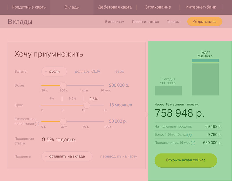
1. Calculation of the deposit in the TKS bank
2. Calculation of the deposit in the fish of the Connected Bank

3. Selection and search for cars in Yandex. Auto
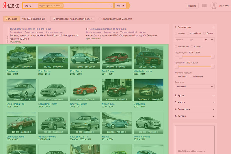
What brings together good examples:
- contrast in the presentation,
- compact placement of service information,
- visual emphasis on useful information.
Summary.
Made an interface - highlight service and useful information. If necessary, balance, remove the bias of the service.
1. Mortgage calculator VTB24
Huge bias in the service information. Useful information is lost behind the interface.
2. Mortgage calculator of Sberbank .
There is no useful information until you click on the button “Calculate loan”. Therefore, everything is red.
3.Calculation of mortgages in the bank Revival .
A sheet of months, interest rates and monthly payments.
There is no golden rule of balance - only common sense works here. The designer must remember that the user needs useful information, everything else is an appendage and a way to get it. Ideally, service information should not be. To achieve balance, you do not need to be afraid of non-linearity in interfaces.
Examples with optimal balance.
1. Calculation of the deposit in the TKS bank
2. Calculation of the deposit in the fish of the Connected Bank
3. Selection and search for cars in Yandex. Auto
What brings together good examples:
- contrast in the presentation,
- compact placement of service information,
- visual emphasis on useful information.
Summary.
Made an interface - highlight service and useful information. If necessary, balance, remove the bias of the service.