 July 10, 2014 at 12:25
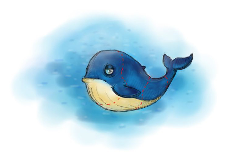
How to eat a whale or the story of a mobile product line
Hello, Habr! Today I would like to talk about the experience of creating a line of mobile applications from the point of view of the design department. This is a story about a common approach to large “whales” - projects, and how to streamline work and use resources efficiently.
Input data
The outlines of the “whale” from afar looked as follows: it was necessary to promptly launch from scratch the line of mobile products for the e-commerce services of Mail.Ru Group: Goods and Money. With careful consideration, the "kit" has increased significantly: in addition to the creation, it was necessary to continue the development of these mobile products, as well as create new ones.
Applications were created simultaneously for two major mobile platforms: iOS and Android, and a staff of two was allocated to create the application design. There is a saying that a real artist should be hungry, but it seems to me that UX processes in product work are clearly strongly romanticized by developers and managers. In reality, it turned out to be too big a dish, even for very hungry people. Therefore, it was decided to entrust part of the design work to freelance specialists, and design and development should be done by our employees.

Strategy and Methodology
Continuing the development of our clearly “animal-lunch” terminology, the strategy is both a plan for changing dishes and etiquette at the same time. Methodology is cutlery. Without these things, you can’t start a meal in a decent society. Imagine a man at a social gathering who is cheerfully trying to eat both soup and salad with his hands? Not only is this not hygienic, it is also traumatic, such a person can get burned or choked.As well-educated people, we decided to eat this “whale” with appetite and self-esteem. Our strategy was as follows:
- create a framework for the simultaneous development of several applications;
- reduce the time of creating interfaces for different mobile platforms;
- find visual solutions that can be easily modified in the future.
Unified design platform
We started by creating a modular product Money Mail.Ru. Based on it, a style was developed, guidelines and common rules were created and then were applied in the development of other applications. The presence of a single design platform helped organize the simultaneous work of several UX teams of freelance specialists. For example, setting goals has become easier and more visual. In addition, we were able to create a single environment for the development team.One coordinate system not only helps to manage work processes, but also serves as support in decision making. As a rule of etiquette, if you agree once that all the devices are located on the plate in the same order as the dishes are served, then even if unknown dishes appear, you will not have room for doubt. You just continue your meal.
A single design platform is an effective tool for coordinating work. An important requirement when creating a standardized interface was the ability to easily apply it to both the iOS and Android versions. Accordingly, it had to be coordinated with the guidelines of these mobile platforms.
Platform Tactics

So, we have decided on the rules of etiquette. Now we needed to find cutlery: knives, forks, spoons and a few more intricate appliances just for cutting a large "whale". One of these devices was the tactics of design convergence for different mobile platforms.

At the beginning of 2012, iOS7 had not yet appeared, and skeomorphism was very popular. This style was far from Android guidelines, which dramatically increased the work of the design department. Therefore, we have facilitated the visual component for iOS versions of products. In particular, they abandoned heavy graphics and made a shift towards the visual stylistics of the Android platform.

This tactic of design convergence for different mobile platforms has helped to reduce the time and allowed to achieve greater visual consistency.
Graphic branding

Another simple but effective tool has become a single style for application icons. In our situation, the icons were the logos of web projects. We abandoned skeomorphism with detailed icons and began to operate only within the framework of simple forms and color schemes.
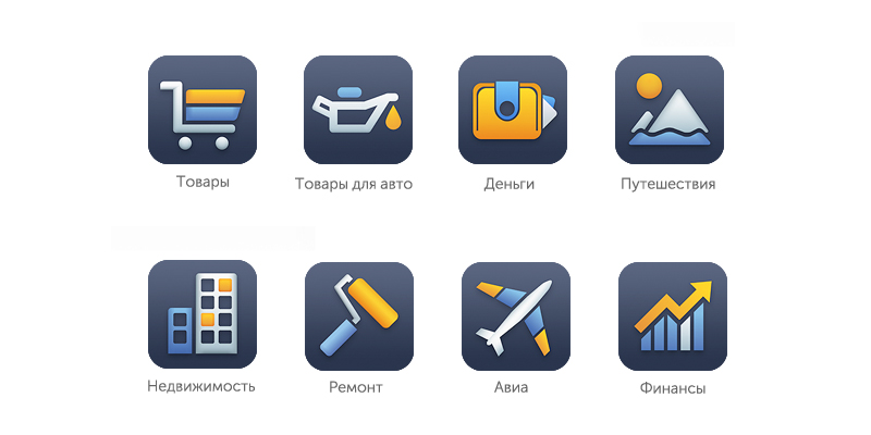
Finding a beautiful solution that combines two contrasting corporate colors - blue and orange - was not easy. Therefore, we proposed to dilute them with neutral colors: white and dark gray. As a result of this addition, the icons look good in any resolution and fit perfectly into the brand requirements. We used the same approach for all icons in applications. As a result, we got a set of uniform icons that can be used in different applications and, if necessary, on web projects.
Development

The design should remain relevant for a long time, because the product launch period cannot be predicted. He should set trends, not follow them. The ability to easily modify style is closely linked to subsequent product development. Ensuring the continuity of changes and setting a trend, gradual design transformations are smoothed out in the perception of users and do not look so obvious. Moving on to the "dining-whale" terminology, the better you make the salts, the longer you can eat them. In the case of our product line, we implemented a solution that, in its development vector, coincided with the direction of development of mobile platforms.

Summary
Even very large "whales" are very tasty and healthy. The question is how to cook them properly. It doesn't matter how big or small the task is, if you clearly understand your goals and formulate the methods by which you will achieve them, then you can turn mountains.Our “kit” helped us to draw the following conclusions:
- A single design platform allowed us to quickly develop and launch several applications in a short time.
- We were able to flexibly manage resources, attracting a sufficient number of freelance specialists if necessary.
- Design convergence tactics for different mobile platforms have reduced labor costs. 70% less time was spent on the second version of the application than on the interface design for the first platform.
- The unification of design has reduced the time to create the front-end of the application.
- The unification of the product line icons contributed to their greater brand recognition and simplified their creation.
Entertaining Arithmetic
The average project duration is 1 month.The average number of screens in one project is 22 layouts.
The average number of participants in the process is 2 people.
All products were created in 2012. Work on their improvement and development was carried out in 2013-2014. If you had similar experience in creating the design of a line of large projects, share it in the comments.