Pulse Habr
callidus77: Remember, in our grid, the installers connected the subscriber. They came, stuck a network card, and he had Frya and no firewood. They scratched their heads and left. Three weeks later, the man finally connects.
Gryat: “For a long time you were looking for firewood.”
He: “I did not search. I wrote them myself. ” Bash
Probably, each author is anxiously following the fate of his articles, such an author always has something missing from the hub. I always lacked tools for monitoring articles - that's why I decided to write them.
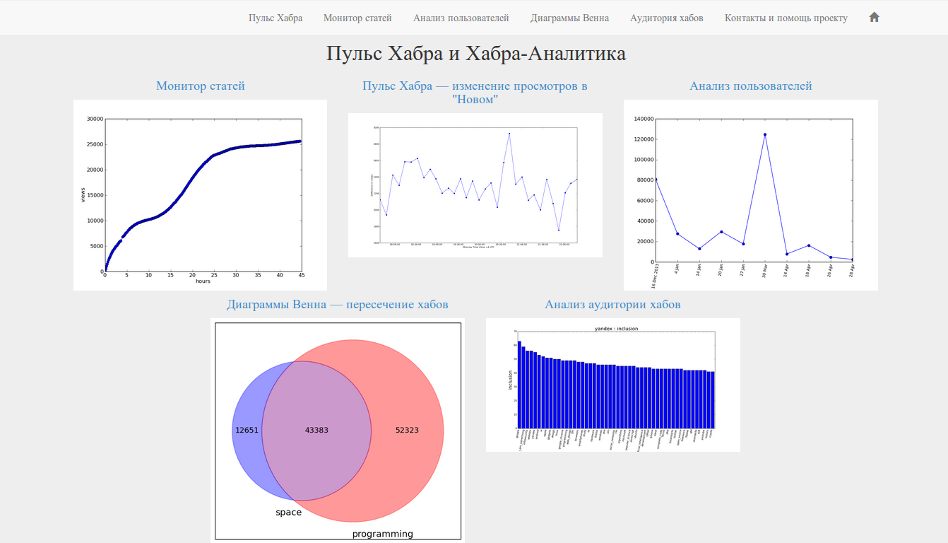
Under the cut, we will deal with the main tools of the resource and potential application. All tools are available at http://www.habr-analytics.com , source code (main functions) on github . For examples and details - welcome to cat!
Article structure
- Pulse Habr
- Article Monitor
- User analysis
- Hub Intersection - Venn Diagrams
- Hub Audience
- Source code and project structure
- Conclusion
* Caution traffic *
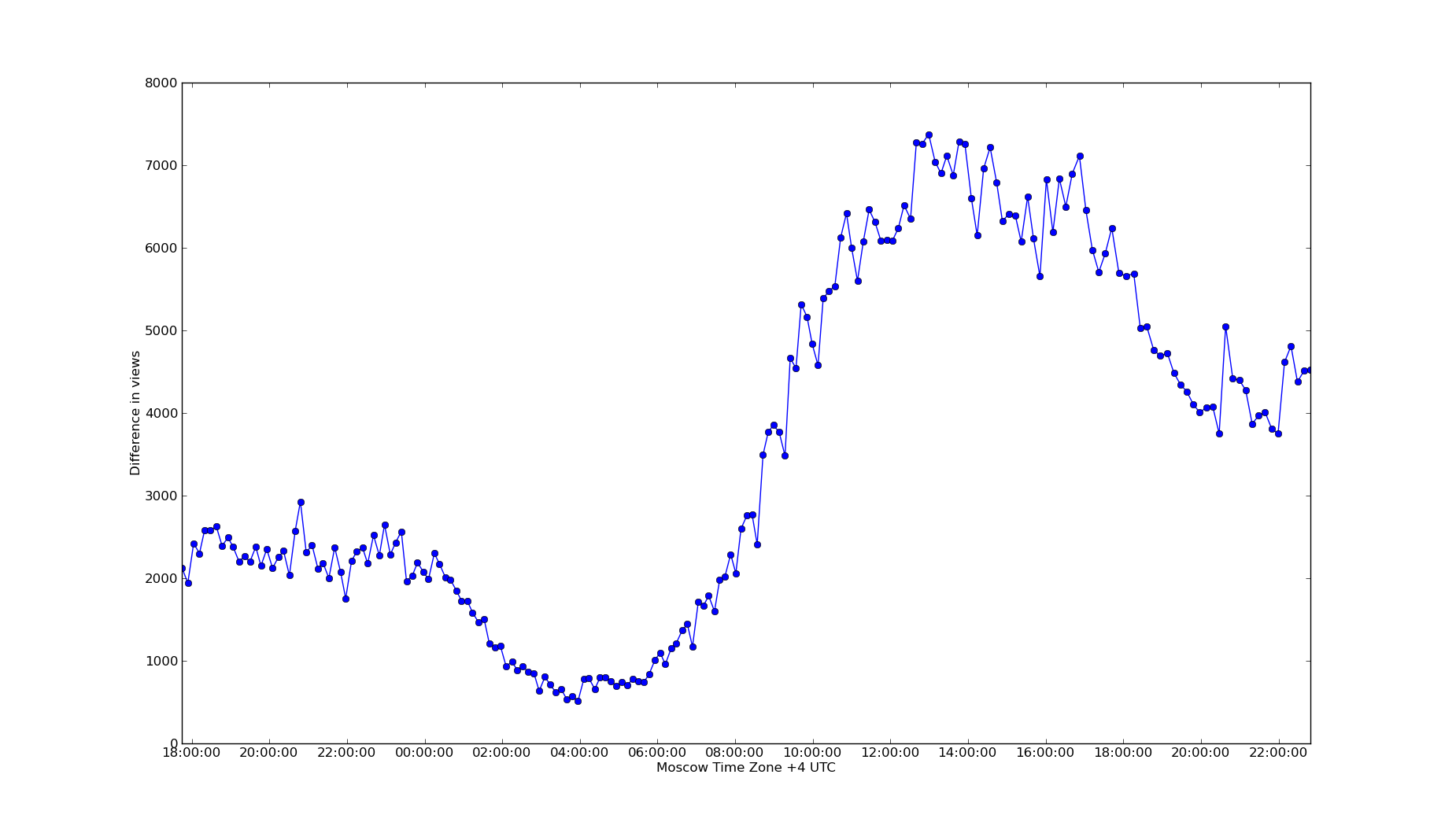
Pulse Habr
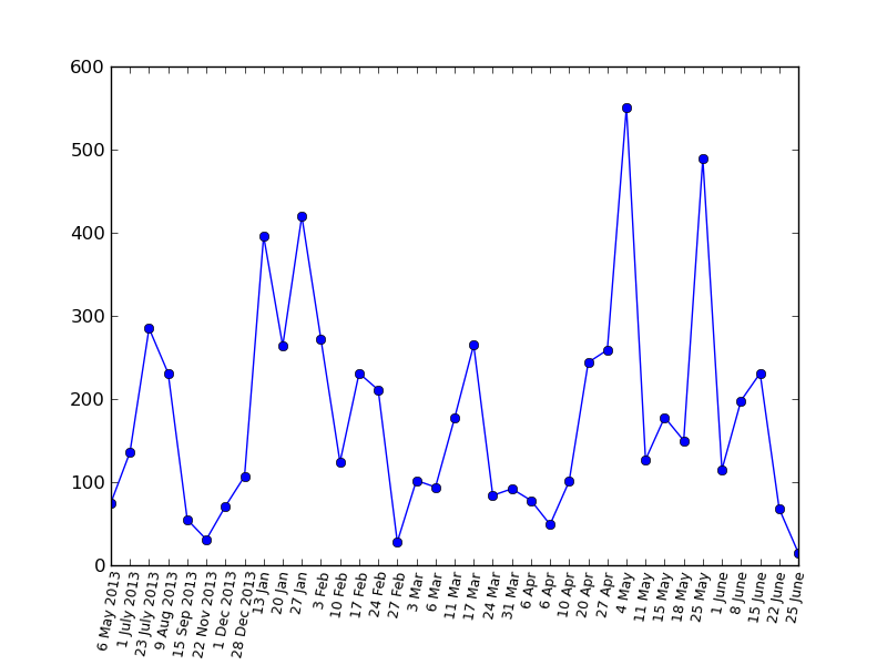
The pulse is one of the most interesting indicators, it shows the dynamics of reading the Habr (more precisely, the articles in the "New"). Between points a fixed interval of seven minutes (plus or minus a minute). In the graph below we can observe the level of activity on the night of Sunday to Monday. It is clearly seen that the articles on Monday morning are read four times more actively than on the night of Sunday to Monday (which is to be expected, but we don’t know in advance how much more they read on Monday morning)
What's the point?
Potential use: timing for article submission. The more actively people read the Habr, the more likely they are to see the article. Accordingly, if the indicator is currently low, then it may be worth revising the time the article was sent.
Available at:
www.habr-analytics.com/pulse
Article Monitor
Perhaps this is one of the functions that I was so lacking that I would have separately written as a standalone application (if you also think that this is a great idea - write to support and let the
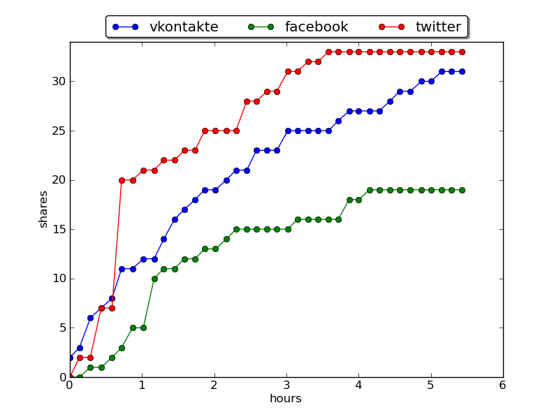
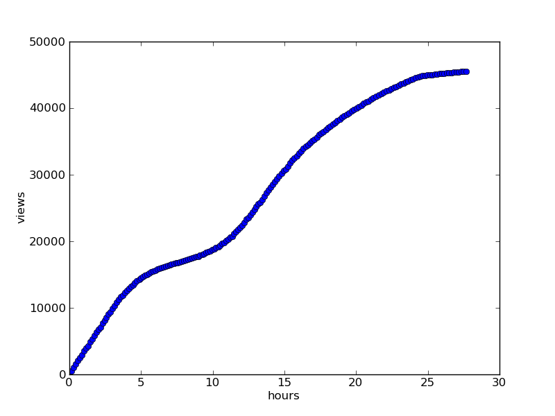
In short, we monitor the change in views, favorites and reposts in social networks (VK, FB, Twitter) in time. The interface is simple: we select an article from the list, the data type and click the "Build Graph" button.
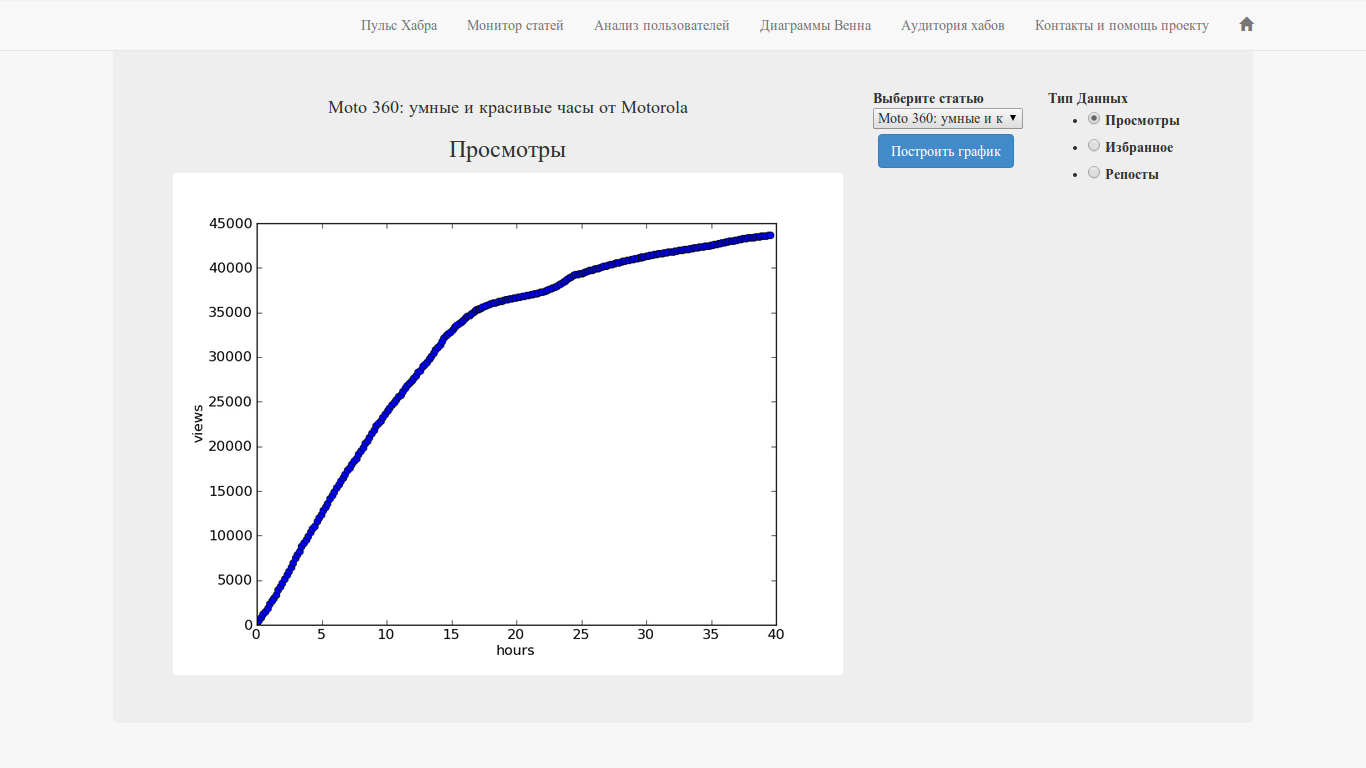
In the repertoire of articles for the last two days (in fact, for the last 52 hours).
Available at:
www.habr-analytics.com/monitor
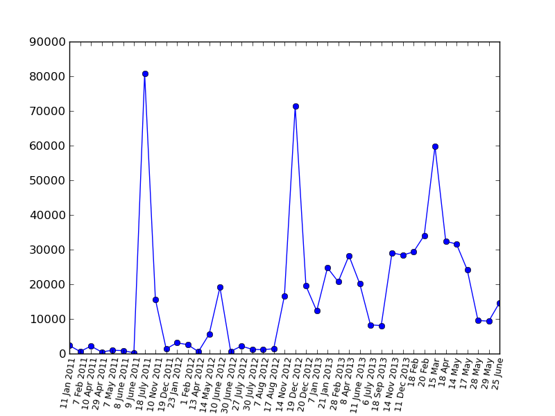
As an example, the graphics for the habr article "Happy Birthday, Elon Musk" :
Views :Happy Birthday, Elon Musk " :
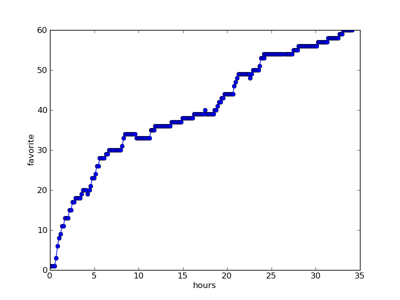
Favorites : Happy Birthday, Elon Musk" :
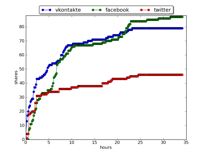
Reposts in social networks : Happy Birthday, Elon Musk " :
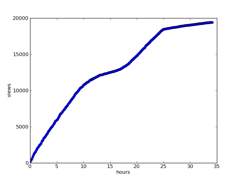
For recent articles, the number of measurements is less (since measurements take place every seven minutes), therefore the graphs look externally look a little different:
Article: “ Don’t pour salt in me into the reactor or non-pulsed nuclear rocket engines ” 5-6 hours after appearing.
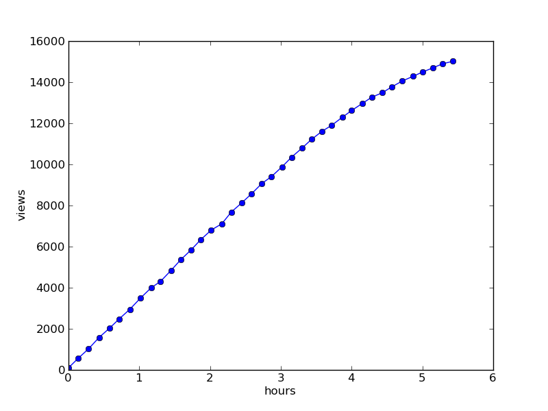
Views : Don’t pour me salt in the reactor or non-pulsed nuclear rocket engines
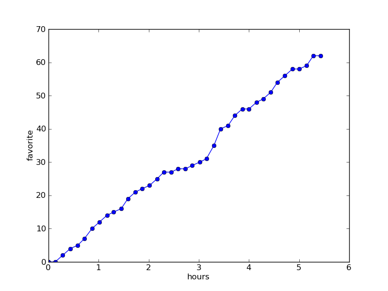
Favorites : Don’t me salt in a
repost or non-pulsed nuclear rocket engines repost in social networks:Do not pour me salt in the reactor or non-pulsed nuclear rocket engines.
For comparison, the timetable for viewing the same article after 27 hours
What's the point
Observe the dynamics of reading the article: did you stop reading the article after it left the "best of the day"? (More often than not, we see that views reach a constant after 24 hours.) On which network does the article spread faster and more actively? How does the dynamics change after reaching the main?
In general, the monitor provides an integral cast of the distribution of articles on the network.
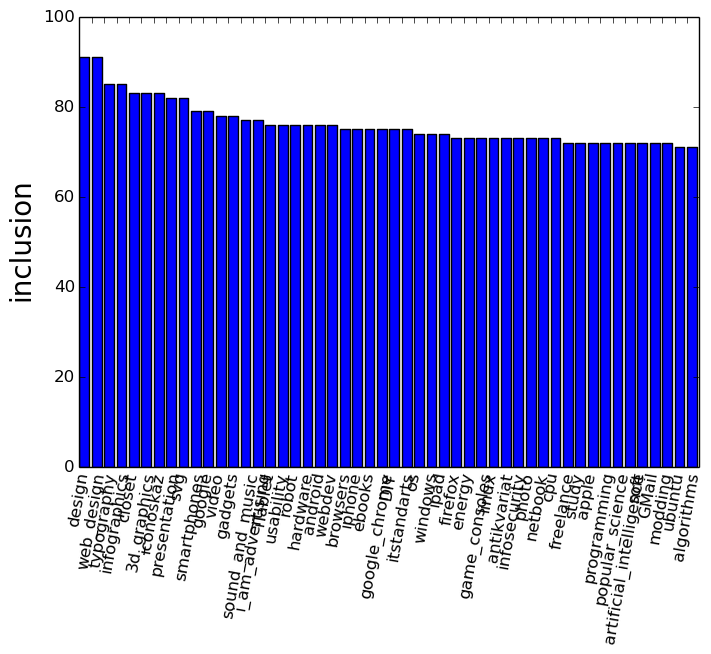
User analysis
Who is not interested in seeing his "history" on Habré? Well, or someone else's; usually, you open a profile and you see only a dry couple of lines: wrote so much, registered then that's all. It always seemed to me something not too interesting and the idea came up - to visualize the user's history.
The interface is extremely simple - username, data type and large button.
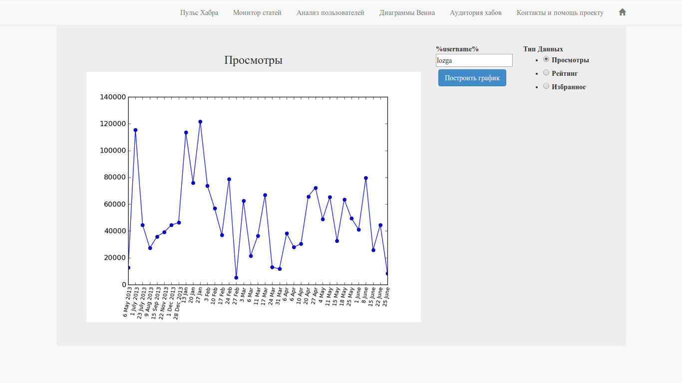
Let's give an example of graphics for the user lozga - simply because it turns out pretty nicely: some “ups” and “downs”.
The “User Analysis” is available at:
www.habr-analytics.com/user
Let's look at the charts in a bit more detail:
Views

Rating
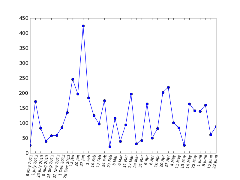
Favorites
Bonus: A viewing chart for PapaBubaDiop(the big peak is the same post about “Field of Miracles” )
Why is this needed?
On the one hand, it allows you to look at the history of your articles on a hub on the other hand, this is a much more informative presentation of the profile in time than a pair of final numbers.
Hub Intersection - Venn Diagrams
Have you ever thought that choosing a second or third hub for an article, you may well not cover a new audience? In order to make sure that the hubs do not intersect and this function is made. You need to select two or three hubs and click on the big button.

Available at:
www.habr-analytics.com/venn
For this function, there is also a standalone version with advanced functionality (for example, working with company hubs) and a habr article with a description: source codes (python) and executable files for Windows, Linux and MacOS (all libraries included).
- python venn.py script and src / folder ; libraries must be installed:
pip install beautifulsoup4 progress urllib3 matplotlib_venn - venn.exe for Windows
- venn.elf for Linux
- venn.osx for Mac OS
Hub Audience
This function gives an idea of the preferences of readers of a particular hub in relation to all other hubs at once.
It is necessary to choose a hub and the result - a histogram of readers' preferences, that is, what else readers of this hub read, as a percentage of the number of subscribers to the source hub.
Available at:
www.habr-analytics.com/audience
There is also a standalone version with advanced functionality (for example, working with company hubs) and a habra article with a description:
The source data called hubs is available on github , there executable files are available for
Source code and project structure
The main (data collection, writing to databases, chart generation, etc.) project code is available on github .

(above is the code for the monitor function).
Since most likely the site will fall from Habra effect advance Vang joke in the spirit: in Habra no detectable pulse or from pulse is not detectable Habr .
But in fact, it’s not scary, if we look at the design of the project, we will notice that the data collection, storage and presentation of the data are separated and the user only interacts with the graphics display interface, but this does not affect the collection, storage and presentation of data.
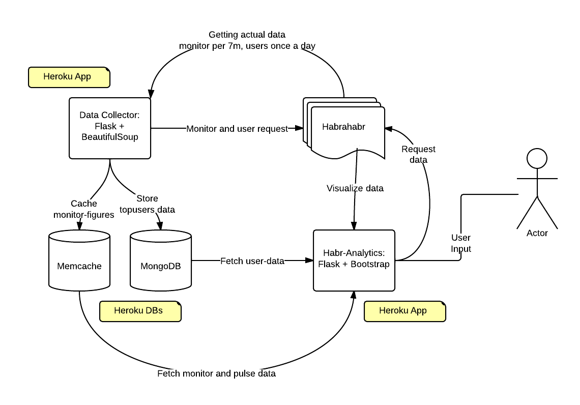
That is, after the habr-wave passes all the data will be in order.
Technical details: everything works on PaaS Heroku, in the form of two applications; both on Flask; interface: Flask + Bootstrap3; mongoHQ and memcached data storage. The data collector parses the Habr, because for some reason access to the API is not given (at least for now).
Conclusion
The project, of course, is not perfect and it requires a thousand and one edits. And maybe you are familiar with layout, data processing or web development and want to help? Advice, ideas and development assistance are welcome.
Any ideas what else needs to be implemented? We are waiting in the comments and / or through any other communication channel.