7 practical lessons on UX
- Transfer
This article will provide an analysis of several lessons on UX / UI that we learned while carefully watching the exhibition for a couple of hundreds of people involved in the playasting of the early build of our game Steamhounds .
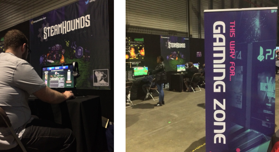
To understand the context, I would say that Steamhounds is a turn-based game, a mix of JRPG and tactical combat on the grid. Players can fight against AI, but if possible we tried to motivate them to play against each other, sitting next to each other at different monitors.
In general, before conducting this experiment, the main scheme and the presentation of information in our game were not absolutely terrible. Experienced players and familiar with the genre, users usually easily understand the game without our intervention. But at such live events there are people who have never seen such games before, and these players help us a lot by showing those hidden oddities and assumptions that we made to the game design.
So, without further ado, let's move on to our observations:
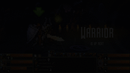
I think most developers know this problem. Surprisingly, a large proportion of players skip any text that you show them. We found that the overwhelming majority (> 80%) of the players simply clicked on the instructions we added to the beginning of the demo, which described the basics of the gameplay:
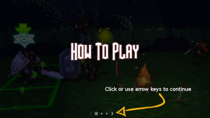
Menu with instructions. Only 20% of the players bother to read it (and 100% of them win the battle)
We also sin with this - to be honest, who reads the instructions when buying a new gadget? We expect it to be user-friendly, and you can more or less learn how to use it through intuition and experimentation.
We were waiting for this, the more serious problem was that even during the game many players missed on-screen prompts . This most strongly influenced the user experience when they did not notice the instructions telling what to do next:
We know that usually screen text is the last thing players tend to turn to when they get stuck. Therefore, let's make it impossible to miss:
We use motion to draw attention to the prompt when it appears, and then continue to animate it until the player follows the instructions. .
Previously, the text was difficult to notice. Having made the player pay attention to him, we practically got rid of the situations when the players asked: “what should I do next?”.
We could probably improve the system by animating the text and arranging it so that it draws attention to the tiles that you need to click on to select a position.
Omit the obvious: the buttons should look like buttons, and the player should be clear what options are available to him at any time.
In Steamhounds, the player in his turn must choose an action from the menu (some ability, for example, “attack from a distance” or “defensive stance”). When this happens, a menu appears:
It works great - a clear audio prompt and attention-grabbing animation of the rotation are reproduced as the menu expands to most of the screen. No one had any problems understanding how to click on one of these buttons. The problem is that after selecting the action menu disappears, and the player must choose a place on the battlefield, which you need to aim his ability.
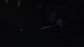
We have noticed that at this stage, some players get stuck searching the screen with the mouse for items to interact with. :
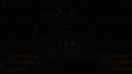
The player is looking for what you can click on the screen, and his irritation increases with every second
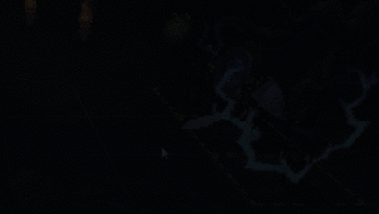
Although we highlight the tiles that you can click on, they stand out rather weakly. Worsening the situation and the fact that players before choosing actions often take a brief look at the enemy, not noticing that there is a selection of tiles. Here is how we solved this problem:
Flickering tiles attract player's attention.
If a player doesn’t point the cursor at a suitable tile for a while, we turn on flickering.
This simple change had the desired effect - at the next playtest session we rarely had to inform the player that he needed to click on the tile to continue. We again applied the well-known principle - to attract attention, you can use the movement / animation . When the flicker attracts their attention, they inevitably hover the mouse over one of the tiles, and the subsequent selection makes its purpose evident.
Indie developers often talk about the idea of “calling to action” when marketing games - it’s necessary that users “subscribe to the newsletter”, “add the game to the wishlist!” Or “write reviews on Steam!”. But also in the game there are times when the player must make a choice or perform a certain action. So why not apply some of these principles to make the next press or player's decision as clear as possible?
Before the start of the battle in Steamhounds, players need to set the starting positions and racks ("formation") for their squad. The process of setting the formation does not immediately become apparent to all players.
Here's how the screen looked before:

Boring and verbose instructions on
how to assign a squad formation. Although it tells the player everything they need to know to define the formation, a couple of problems arise - (a) players do not read the text and (b) instructions are presented as a single block of text that does not look like a clear call to action . That's bad.
Since we have already implemented a beautiful, eye-catching text, why not use it to break this boring block of instructions?
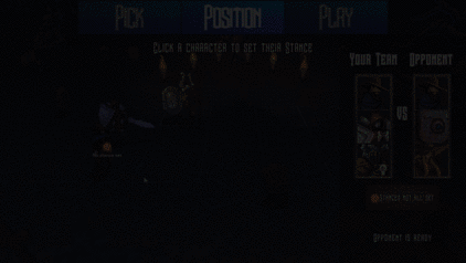
Now we send the player step by step - first, he needs to “click on the character to set his rack”, then “choose the rack”, “choose the position”, etc.
Use contextual clues that tell players what to do right now . Thus, they gradually go through the whole process and are not deterred by long sheets of instructions.
We studied game design and mastered a very specific language used to describe the rules of the game. We know descriptions with keywords that can be found on Magic cards: the Gathering or in the rule book of the board game - “attacks one creature” , “discard 3 cards” , “causes damage to all neighboring characters” . If you are accustomed to such a language, then these instructions are absolutely clear and unambiguous for you. But I’m sure you’ve played games with more casual players who sometimes interpret the rules in a way that your designer brain considers completely unintended.
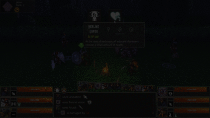
In Steamhounds, the main part of the text with long descriptions of the rules is in tooltips appear when choosing one of the character abilities. Initially, we wanted to make these descriptions as brief and strict as possible - after all, we do not need these pop-up tips to contain huge multi-line text. Therefore, we tried to reduce them to one, maximum two, brief sentences:

Pleasantly brief, but problematic description of the ability of “Focus”: “Gives Focus”
Everything seems to be right, right? But we noticed that players use this ability too rarely .
We thought that the main reason for the unpopularity of the Focus ability is as follows: players who have not read the rules carefully shown to them earlier simply do not have the context necessary to understand the importance or advantages of the ability . Many players skip the familiarization with the rules, and hovering the cursor on this button, they first encounter the mention of the “Focus” mechanics. Therefore, we made the following change:

A slightly more detailed description: “Gives focus. Unlock your most powerful abilities. ”
Yes, the description has become a bit more verbose. But we noticed that the proportion of people using this ability has increased. The new text simultaneously “sells” the ability to the player, and provides additional context so that they can understand its importance from the tooltip itself, even if they did not read the rules.
We learned a general principle from this problem: to describe things in a cool or attractive way, and to strive to make the main mechanic effects obvious to all players, not just to those who have already learned the information from somewhere else .
We made some interesting observations about how the language we use causes some players to interpret the rules in unexpected ways. We felt that this was the result of deep-rooted associations with these words that they have.

The old description of “Vigor Potion”: “Choose a target. Her next attack will deal double damage. ”
What is the problem here? The word "goal" has an aggressive connotation .
The word “goal” is often used in the text of the rules as a neutral term for everything that the ability is aimed at. Experienced players may already get used to this, and understand that the ability described above is obviously an enhancement that you need to use on your own characters. But the association between the word "target" and the attack was so strong that some players believed that this ability should be used on the enemy so that the next attack would cause additional damage.
It seemed that we would have to deviate from the use of such a technical language. Here is how we solved the problem:

Improved description: “Strengthens an ally. His next attack will deal double damage. ”
For the designer, this approach is quite painful - this description seems too verbose. However, we noticed that the new text essentially eliminated the misunderstanding about the effect of this ability, and the players stopped trying to send it to their enemies. Developers should take into account shades of meaning and target audience, and find a balance in what suits them. Too long texts of the rules are definitely a problem, but easy redundancy makes it possible to emphasize the style and character of the game.
Useful lesson: watch the playters to see if the choice of terminology has unexpected consequences . Even among English-speaking users, this can be very dependent on culture.
This problem is similar to the previous topic about connotations of words. Colors are also associated with certain feelings or concepts. We have already used this in the game, creating a highlight tiles to demonstrate the effects of abilities. Red - aggression, green - support / protection, etc.
Spooky red tile lights
In most cases, this worked fine. But there was one association that we could not foresee, and it confused a couple of players. They associated red color not with aggression , but with wrong action . Therefore, when they hover over a target to attack it, they were confused - they thought the game tells them that it is impossible to aim at this character (in fact, the game simply does not show the tile if it is not the right goal).
We tried to avoid “intersections” of conflicting associations. Our solution:
Almost the same (but not quite) red-orange illumination of the tiles.
We just shifted the red illumination closer to a slightly orange shade. It remained to be seen if this really solved the problem (which in fact only affected a couple of players). But the funny thing is that no one else is wrong in this way.
Therefore, I repeat, make sure twice that your interpretation does not negatively affect associations existing in the minds of the players .
We were already aware of this, so we developed and configured the UI to eliminate optional clicks. The problem arose after the last-minute add-on to build a game specifically designed for demonstration at events.
At the end of the battle, the fanfare plays and a large message “Victory” or “Defeat” appears on the screen:
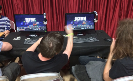
The player can then click on any place on the screen to exit the battle and return to the main menu. We have changed the demo assembly so that after the player exits the battle, the mailing list subscription dialog will be displayed.
It seemed like a great idea, but she had one fatal flaw. The moment the message “victory” or “defeat” appears on the screen is exactly the moment when players shake hands (or begin to quarrel) and get up from their seats. The battle is over and there is no point in sitting at the computer anymore. Therefore, they left without even seeing the mailing dialog box .
The game should automatically in a couple of seconds display the subscription screen.

To be honest, we should have foreseen this in advance, but the function was added at the last moment. However, a simple change — the removal of an optional click — increased the number of subscriptions to our newsletter threefold compared with the previous result. To hell with these optional clicks!
I hope the principles described in this article will be useful in your own game. But most of all, we hope that we can convince you of the value of the standard approach: watch for new players, find moments when they get stuck or confused, and then derive the basic principles and apply them to the whole game.
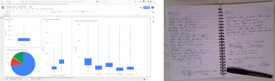
Data and observations collected at PlayExpo London. I love spreadsheets.
We added a code for collecting metrics about the results of battles, the frequency of choosing each character and ability, and various information about the time of using the UI to the demo assembly. This definitely helped us and allowed us to come from a scientific point of view to measuring the impact of the changes we made. But probably the main part of the lessons was received in the good old way "to watch the player from the side and keep handwritten notes."
None of us was an expert in the UX (and unofficially this article was called “7 mistakes in UX that we could avoid”). Like most development teams that do not have a separate UI / UX specialist, we tried to follow common sense and follow the simplest recommendations. But when you so deeply immerse yourself in your own project, it is difficult to objectively evaluate all its roughness. The fresh look of the new pleisters is incredibly valuable - use them as often as possible!
To understand the context, I would say that Steamhounds is a turn-based game, a mix of JRPG and tactical combat on the grid. Players can fight against AI, but if possible we tried to motivate them to play against each other, sitting next to each other at different monitors.
In general, before conducting this experiment, the main scheme and the presentation of information in our game were not absolutely terrible. Experienced players and familiar with the genre, users usually easily understand the game without our intervention. But at such live events there are people who have never seen such games before, and these players help us a lot by showing those hidden oddities and assumptions that we made to the game design.
So, without further ado, let's move on to our observations:
Problem 1: people do not read the text
I think most developers know this problem. Surprisingly, a large proportion of players skip any text that you show them. We found that the overwhelming majority (> 80%) of the players simply clicked on the instructions we added to the beginning of the demo, which described the basics of the gameplay:
Menu with instructions. Only 20% of the players bother to read it (and 100% of them win the battle)
We also sin with this - to be honest, who reads the instructions when buying a new gadget? We expect it to be user-friendly, and you can more or less learn how to use it through intuition and experimentation.
We were waiting for this, the more serious problem was that even during the game many players missed on-screen prompts . This most strongly influenced the user experience when they did not notice the instructions telling what to do next:
Decision
We know that usually screen text is the last thing players tend to turn to when they get stuck. Therefore, let's make it impossible to miss:
We use motion to draw attention to the prompt when it appears, and then continue to animate it until the player follows the instructions. .
Previously, the text was difficult to notice. Having made the player pay attention to him, we practically got rid of the situations when the players asked: “what should I do next?”.
We could probably improve the system by animating the text and arranging it so that it draws attention to the tiles that you need to click on to select a position.
Problem 2: Interactive objects should be visible
Omit the obvious: the buttons should look like buttons, and the player should be clear what options are available to him at any time.
In Steamhounds, the player in his turn must choose an action from the menu (some ability, for example, “attack from a distance” or “defensive stance”). When this happens, a menu appears:
It works great - a clear audio prompt and attention-grabbing animation of the rotation are reproduced as the menu expands to most of the screen. No one had any problems understanding how to click on one of these buttons. The problem is that after selecting the action menu disappears, and the player must choose a place on the battlefield, which you need to aim his ability.
We have noticed that at this stage, some players get stuck searching the screen with the mouse for items to interact with. :
The player is looking for what you can click on the screen, and his irritation increases with every second
Decision
Although we highlight the tiles that you can click on, they stand out rather weakly. Worsening the situation and the fact that players before choosing actions often take a brief look at the enemy, not noticing that there is a selection of tiles. Here is how we solved this problem:
Flickering tiles attract player's attention.
If a player doesn’t point the cursor at a suitable tile for a while, we turn on flickering.
This simple change had the desired effect - at the next playtest session we rarely had to inform the player that he needed to click on the tile to continue. We again applied the well-known principle - to attract attention, you can use the movement / animation . When the flicker attracts their attention, they inevitably hover the mouse over one of the tiles, and the subsequent selection makes its purpose evident.
Problem 3: calls to action should be instant / contextual
Indie developers often talk about the idea of “calling to action” when marketing games - it’s necessary that users “subscribe to the newsletter”, “add the game to the wishlist!” Or “write reviews on Steam!”. But also in the game there are times when the player must make a choice or perform a certain action. So why not apply some of these principles to make the next press or player's decision as clear as possible?
Before the start of the battle in Steamhounds, players need to set the starting positions and racks ("formation") for their squad. The process of setting the formation does not immediately become apparent to all players.
Here's how the screen looked before:
Boring and verbose instructions on
how to assign a squad formation. Although it tells the player everything they need to know to define the formation, a couple of problems arise - (a) players do not read the text and (b) instructions are presented as a single block of text that does not look like a clear call to action . That's bad.
Decision
Since we have already implemented a beautiful, eye-catching text, why not use it to break this boring block of instructions?
Now we send the player step by step - first, he needs to “click on the character to set his rack”, then “choose the rack”, “choose the position”, etc.
Use contextual clues that tell players what to do right now . Thus, they gradually go through the whole process and are not deterred by long sheets of instructions.
Problem: short and technical terminology should be used in moderation
We studied game design and mastered a very specific language used to describe the rules of the game. We know descriptions with keywords that can be found on Magic cards: the Gathering or in the rule book of the board game - “attacks one creature” , “discard 3 cards” , “causes damage to all neighboring characters” . If you are accustomed to such a language, then these instructions are absolutely clear and unambiguous for you. But I’m sure you’ve played games with more casual players who sometimes interpret the rules in a way that your designer brain considers completely unintended.
In Steamhounds, the main part of the text with long descriptions of the rules is in tooltips appear when choosing one of the character abilities. Initially, we wanted to make these descriptions as brief and strict as possible - after all, we do not need these pop-up tips to contain huge multi-line text. Therefore, we tried to reduce them to one, maximum two, brief sentences:
Pleasantly brief, but problematic description of the ability of “Focus”: “Gives Focus”
Everything seems to be right, right? But we noticed that players use this ability too rarely .
Decision
We thought that the main reason for the unpopularity of the Focus ability is as follows: players who have not read the rules carefully shown to them earlier simply do not have the context necessary to understand the importance or advantages of the ability . Many players skip the familiarization with the rules, and hovering the cursor on this button, they first encounter the mention of the “Focus” mechanics. Therefore, we made the following change:
A slightly more detailed description: “Gives focus. Unlock your most powerful abilities. ”
Yes, the description has become a bit more verbose. But we noticed that the proportion of people using this ability has increased. The new text simultaneously “sells” the ability to the player, and provides additional context so that they can understand its importance from the tooltip itself, even if they did not read the rules.
We learned a general principle from this problem: to describe things in a cool or attractive way, and to strive to make the main mechanic effects obvious to all players, not just to those who have already learned the information from somewhere else .
Problem 5: people are biased about certain words
We made some interesting observations about how the language we use causes some players to interpret the rules in unexpected ways. We felt that this was the result of deep-rooted associations with these words that they have.
The old description of “Vigor Potion”: “Choose a target. Her next attack will deal double damage. ”
What is the problem here? The word "goal" has an aggressive connotation .
The word “goal” is often used in the text of the rules as a neutral term for everything that the ability is aimed at. Experienced players may already get used to this, and understand that the ability described above is obviously an enhancement that you need to use on your own characters. But the association between the word "target" and the attack was so strong that some players believed that this ability should be used on the enemy so that the next attack would cause additional damage.
Decision
It seemed that we would have to deviate from the use of such a technical language. Here is how we solved the problem:
Improved description: “Strengthens an ally. His next attack will deal double damage. ”
For the designer, this approach is quite painful - this description seems too verbose. However, we noticed that the new text essentially eliminated the misunderstanding about the effect of this ability, and the players stopped trying to send it to their enemies. Developers should take into account shades of meaning and target audience, and find a balance in what suits them. Too long texts of the rules are definitely a problem, but easy redundancy makes it possible to emphasize the style and character of the game.
Useful lesson: watch the playters to see if the choice of terminology has unexpected consequences . Even among English-speaking users, this can be very dependent on culture.
Problem 6: people have associations with certain colors
This problem is similar to the previous topic about connotations of words. Colors are also associated with certain feelings or concepts. We have already used this in the game, creating a highlight tiles to demonstrate the effects of abilities. Red - aggression, green - support / protection, etc.
Spooky red tile lights
In most cases, this worked fine. But there was one association that we could not foresee, and it confused a couple of players. They associated red color not with aggression , but with wrong action . Therefore, when they hover over a target to attack it, they were confused - they thought the game tells them that it is impossible to aim at this character (in fact, the game simply does not show the tile if it is not the right goal).
Decision
We tried to avoid “intersections” of conflicting associations. Our solution:
Almost the same (but not quite) red-orange illumination of the tiles.
We just shifted the red illumination closer to a slightly orange shade. It remained to be seen if this really solved the problem (which in fact only affected a couple of players). But the funny thing is that no one else is wrong in this way.
Therefore, I repeat, make sure twice that your interpretation does not negatively affect associations existing in the minds of the players .
Problem 7: extra clicks are evil
We were already aware of this, so we developed and configured the UI to eliminate optional clicks. The problem arose after the last-minute add-on to build a game specifically designed for demonstration at events.
At the end of the battle, the fanfare plays and a large message “Victory” or “Defeat” appears on the screen:
The player can then click on any place on the screen to exit the battle and return to the main menu. We have changed the demo assembly so that after the player exits the battle, the mailing list subscription dialog will be displayed.
It seemed like a great idea, but she had one fatal flaw. The moment the message “victory” or “defeat” appears on the screen is exactly the moment when players shake hands (or begin to quarrel) and get up from their seats. The battle is over and there is no point in sitting at the computer anymore. Therefore, they left without even seeing the mailing dialog box .
Decision
The game should automatically in a couple of seconds display the subscription screen.
To be honest, we should have foreseen this in advance, but the function was added at the last moment. However, a simple change — the removal of an optional click — increased the number of subscriptions to our newsletter threefold compared with the previous result. To hell with these optional clicks!
findings
- Use motion / animations to draw attention to text prompts.
- Make interactive UI elements obvious
- Think of clues as calls to action. Make them instant and contextual.
- Do not go over the technical language and strive to convey context to help players understand their decisions.
- Check unexpected mental associations with flowers, words, etc.
- Smooth UI movement, eliminating unnecessary clicks.
I hope the principles described in this article will be useful in your own game. But most of all, we hope that we can convince you of the value of the standard approach: watch for new players, find moments when they get stuck or confused, and then derive the basic principles and apply them to the whole game.
Data and observations collected at PlayExpo London. I love spreadsheets.
We added a code for collecting metrics about the results of battles, the frequency of choosing each character and ability, and various information about the time of using the UI to the demo assembly. This definitely helped us and allowed us to come from a scientific point of view to measuring the impact of the changes we made. But probably the main part of the lessons was received in the good old way "to watch the player from the side and keep handwritten notes."
None of us was an expert in the UX (and unofficially this article was called “7 mistakes in UX that we could avoid”). Like most development teams that do not have a separate UI / UX specialist, we tried to follow common sense and follow the simplest recommendations. But when you so deeply immerse yourself in your own project, it is difficult to objectively evaluate all its roughness. The fresh look of the new pleisters is incredibly valuable - use them as often as possible!