Kalashnikov: legend or anti-brand?
Hello, Habr!
Today let's talk about industrial branding. Namely - about Kalashnikov. Opinions about the recently presented logo were published on the Composition website , and the site of the Kalashnikov weapons brand lies here . Everyone knows that this is a domestic legend, but it’s exactly like a “legend” - it does not look.
Let'scry a look at this logo. And to the site.

At first glance, the defense industry is a sector that does not require any special frills in the presentation and design. On the other hand, when it comes to the legendary brand - “Kalashnikov”, military austerities seem to me personally inappropriate. Take another look at the site and the logo that Lebedev smashed to smithereens last fall, dubbing the logo "shovel shit drawn with an unsteady hand." You can agree or disagree with this opinion of Artemy, but by going to the main page of our main arms factory, you involuntarily begin to share his point of view.
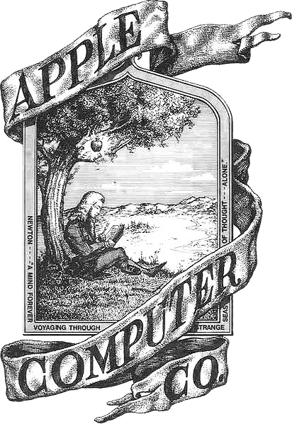
The logo is really shovel and kurguzy. Still, the two most important characteristics of a successful logo are: memorability and compactness. Moreover, for the sake of the latter, designers sometimes refuse very beautiful logos, such as, for example, the first Apple logo . But since it was unrecognizable and not simple enough, it had to be discarded. Here the logo, on the one hand, is unforgettable and bulky, on the other - completely ugly. More precisely, memorable, but with a minus sign. The only letter “K” smeared in an oval is worth something.
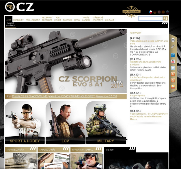
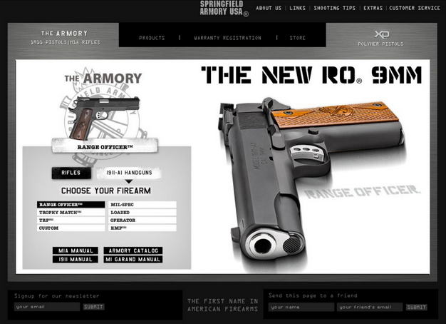
Perhaps this site alone is appropriate. For some fishing shop, but certainly not for a major world-famous brand. Just imagine if such a site was at the head offices of TNCs. Yes, again, the defense industry is a specific area. But if, say, go to the Czech website Česká zbrojovka as or the Americans Springfield Armory - for some reason there are no special questions regarding the design and convenience of the sites. The presentation is decent, the design is modern, competent. It is immediately clear that the manufacturer is confident in the steepness of its products.
Of course, walking through a number of foreign sites of weapons enterprises, you can feel the tube heat of Internet portals of the late 1990s with a godlessly outdated design and tasteless pictures. But, you see, one thing is the site of companies known to a narrow circle of specialists, another is the site of perhaps the most famous gunsmiths in the world.
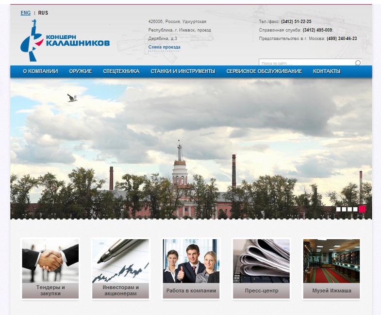
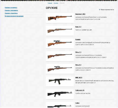
At the same time, the Kalashnikov site is much more similar to the Internet site of the provincial store Hunting and Fishing. A separate topic is the design of sections of the site, which seems to have been stripped from amateur sites of fans of the Soviet automobile industry.
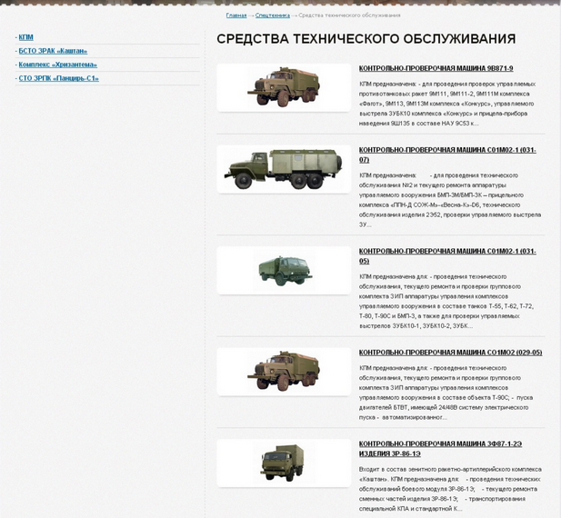
The site uses a huge number of elements that are inconsistent with each other: starting with the use of an incomprehensible palette of colors (black, completely empty footer spot, gradient fill of the grid under the main carousel, differently "cut" borders of the carousel and footer).
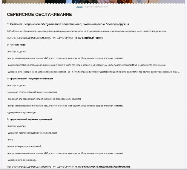
When creating a resource, it’s best to immediately complete the filled pages. In attempts to create a product catalog, not only errors were made in the content, but also an important but completely inoperative function was viewed for dealers (it leads to an empty section with the text "Text here ..."):

Clear business, the weapon site is a delicate matter. It is unlikely that the state-owned enterprise will make an entertainment resource from its online platform. But also, going through the pages of the Kalashnikov site, there is a kind of depressing and dull feeling, as after passing through the corridors of old government offices with shabby paint on the walls. Website developers do not feel the brand’s power and steepness, definitely.
- slow page generation;
- Caching is not configured in the user's browser;
- plug-in JavaScript in the library and other static resources are not optimized;
- site layout is not optimal, because of this, the speed of updating the site is reduced;
- the main page of the site weighs 1.7 mb (which complicates the page loading for users with low Internet speeds);
- lack of adaptability
The site and the logo are clearly blinded in a hurry. For some reason, involuntarily, the term “scoop” revolves in the language.
The trouble with our defense industry is an absolute reluctance to understand that in the modern world (for many years) the site is a business card, and the logo is the face of the company. Immediately the design and presentation turned out to be extremely popular, in the spirit of “vodka-matryoshka-balalaika-perestroika”. The rebranding of the company is urgently needed, until some wise men to the current logo also finished the bear with earflaps.
Today let's talk about industrial branding. Namely - about Kalashnikov. Opinions about the recently presented logo were published on the Composition website , and the site of the Kalashnikov weapons brand lies here . Everyone knows that this is a domestic legend, but it’s exactly like a “legend” - it does not look.
Let's
At first glance, the defense industry is a sector that does not require any special frills in the presentation and design. On the other hand, when it comes to the legendary brand - “Kalashnikov”, military austerities seem to me personally inappropriate. Take another look at the site and the logo that Lebedev smashed to smithereens last fall, dubbing the logo "shovel shit drawn with an unsteady hand." You can agree or disagree with this opinion of Artemy, but by going to the main page of our main arms factory, you involuntarily begin to share his point of view.
The logo is really shovel and kurguzy. Still, the two most important characteristics of a successful logo are: memorability and compactness. Moreover, for the sake of the latter, designers sometimes refuse very beautiful logos, such as, for example, the first Apple logo . But since it was unrecognizable and not simple enough, it had to be discarded. Here the logo, on the one hand, is unforgettable and bulky, on the other - completely ugly. More precisely, memorable, but with a minus sign. The only letter “K” smeared in an oval is worth something.
Perhaps this site alone is appropriate. For some fishing shop, but certainly not for a major world-famous brand. Just imagine if such a site was at the head offices of TNCs. Yes, again, the defense industry is a specific area. But if, say, go to the Czech website Česká zbrojovka as or the Americans Springfield Armory - for some reason there are no special questions regarding the design and convenience of the sites. The presentation is decent, the design is modern, competent. It is immediately clear that the manufacturer is confident in the steepness of its products.
Of course, walking through a number of foreign sites of weapons enterprises, you can feel the tube heat of Internet portals of the late 1990s with a godlessly outdated design and tasteless pictures. But, you see, one thing is the site of companies known to a narrow circle of specialists, another is the site of perhaps the most famous gunsmiths in the world.
At the same time, the Kalashnikov site is much more similar to the Internet site of the provincial store Hunting and Fishing. A separate topic is the design of sections of the site, which seems to have been stripped from amateur sites of fans of the Soviet automobile industry.
The site uses a huge number of elements that are inconsistent with each other: starting with the use of an incomprehensible palette of colors (black, completely empty footer spot, gradient fill of the grid under the main carousel, differently "cut" borders of the carousel and footer).
When creating a resource, it’s best to immediately complete the filled pages. In attempts to create a product catalog, not only errors were made in the content, but also an important but completely inoperative function was viewed for dealers (it leads to an empty section with the text "Text here ..."):
Clear business, the weapon site is a delicate matter. It is unlikely that the state-owned enterprise will make an entertainment resource from its online platform. But also, going through the pages of the Kalashnikov site, there is a kind of depressing and dull feeling, as after passing through the corridors of old government offices with shabby paint on the walls. Website developers do not feel the brand’s power and steepness, definitely.
Verdict
- slow page generation;
- Caching is not configured in the user's browser;
- plug-in JavaScript in the library and other static resources are not optimized;
- site layout is not optimal, because of this, the speed of updating the site is reduced;
- the main page of the site weighs 1.7 mb (which complicates the page loading for users with low Internet speeds);
- lack of adaptability
The site and the logo are clearly blinded in a hurry. For some reason, involuntarily, the term “scoop” revolves in the language.
The trouble with our defense industry is an absolute reluctance to understand that in the modern world (for many years) the site is a business card, and the logo is the face of the company. Immediately the design and presentation turned out to be extremely popular, in the spirit of “vodka-matryoshka-balalaika-perestroika”. The rebranding of the company is urgently needed, until some wise men to the current logo also finished the bear with earflaps.