Good interface design. Part 3
- Transfer
- Tutorial
This is the third part of the Good User Interface notes translated . The first 16 parts were previously translated by our colleagues from ADV on Habré, and the second 11 were translated by us.
Idea 28
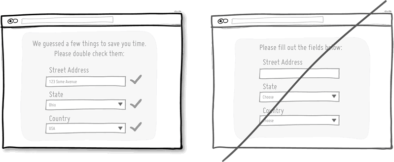
Default selections or self-filling learning fields reduce the amount of work a user needs to do. This is a standard technique that helps people progress in forms faster, given that their time is limited. One of the most disgusting things in terms of interface design and converting visitors to customers is to ask users again and again to provide the data that they have already indicated. Try to make fields that will themselves be filled with the most popular or already known values, and do not ask people to fill them in every time. The less work the better.
Idea 29
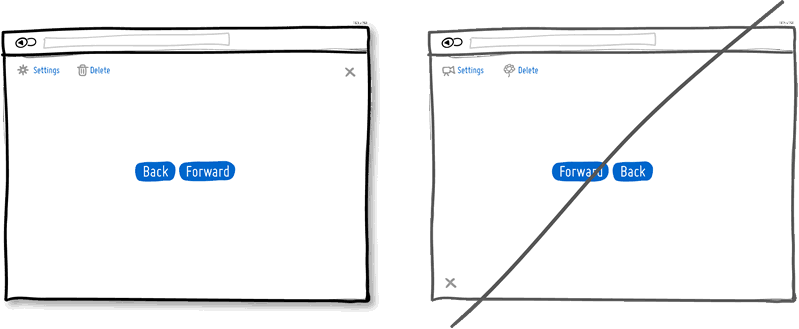
Tradition is the older sister of sequence. If there are similar elements throughout the interface, people will not have to suffer. Another advantage is that it reduces the learning time for the interface. With the help of established traditional ideas of interfaces, we get used to closing the windows in the upper right corner (in most cases) or expect the settings icons to have a certain appearance. Of course, there are situations when traditions become inappropriate and give way to new patterns. In such cases, make sure that they make sense and carry good intentions.
Idea 30
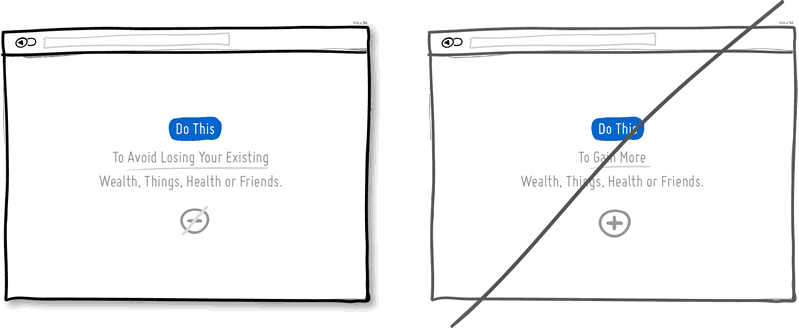
We love to win and hate to lose. According to the rules of the psychology of motivation , we are more likely to avoid losses than to receive benefits. This can be applied to the way the product is designed and presented. A strategy that emphasizes that a product will help protect the client’s current well-being, wealth, or social status may be more effective than trying to offer the client something else that he doesn’t have yet. What do insurance companies sell - post-accident payments or protection of what is dear to us?
Idea 31
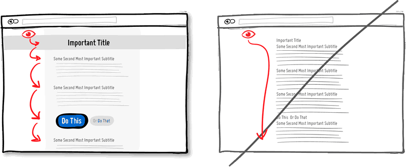
A good visual hierarchy helps to separate the most important elements from the less important. The visual hierarchy consists of such things as alignment, convergence, color, tone, structuring, font size, element size, filling, adding space, and more. If correctly applied, such elements of the visual language can work together to direct and stop the person’s attention within the page, thereby improving overall readability. The visual hierarchy can create friction and slow us down, preventing us from glancing at the page from top to bottom - and this is its main advantage. With a good visual hierarchy, we can spend more time on the page and, as a result, pay attention to more elements and characteristics. Imagine this is a trip. You can go along the highway and get to the destination (end of the page) faster, or you can go along a picturesque route and remember more interesting things along the way. Let your eyes catch on something.
Idea 32
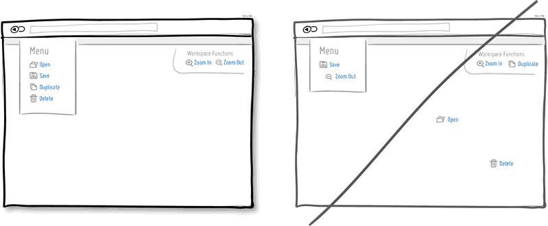
Combining related elements is the main way to improve interface design. Most of us know that the fork and knife, or the Open and Save functions, are usually nearby. Interconnected elements just have to be next to each other to maintain logic and reduce cognitive friction. People don’t like to spend time looking for something.
Idea 33
When it comes to forms and errors, it is usually best to detect and display errors as early as possible. The well-known interaction pattern that we want to emphasize here is, of course, an instant check. By displaying error messages as they occur (for example, to the right of the input field), they can be corrected as soon as they appear in context. On the other hand, if you show error messages later (for example, after submitting the form), this forces people to do additional mental work, forcing them to remember what they did in the previous steps.

Idea 34
By letting the user enter data in a format convenient for him, computers can become more human. The interface must understand the various ways of entering data and become more friendly. A great example is when we ask for a phone number that can be entered in a huge number of different ways - with brackets, extension numbers, hyphens, area codes and more. Better make your code work more actively than users.

Idea 35
Urgency is a persuasion tactic that can be used to encourage people to act now and not later (or never at all). It is quite effective, as it usually implies a certain time limit, since what is available now may not be available tomorrow. It is also effective, because it is associated with the fear of loss and acts in the same way - we do not like to lose opportunities. Urgency refers to one of those strategies that some regard as downright as an annoying and dirty way to get people to act. However, this is an affordable strategy that works if used honestly. Be careful when creating a false sense of urgency, because if users catch you on this, it will have the opposite effect.
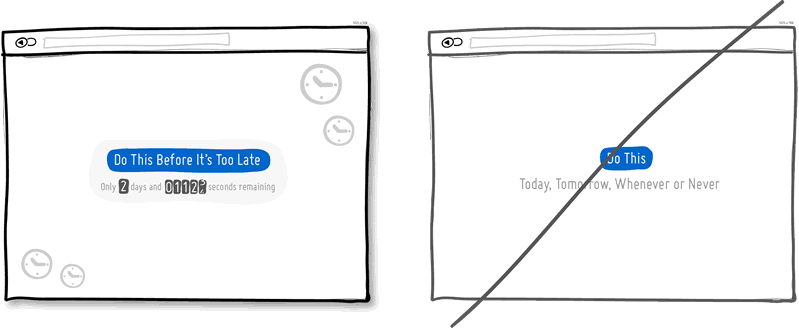
Idea 36
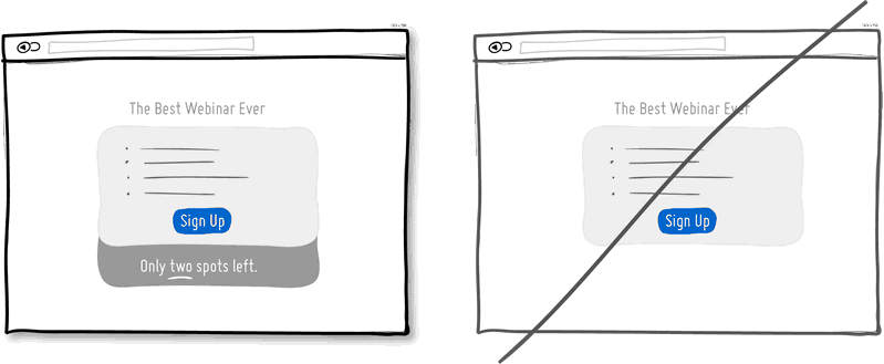
When something is small, we value it more. Limited means that once there was more, today less, and tomorrow there may not be anything at all. Imagine a wholesale store and a boutique, and look at the difference in their prices. Then again introduce the wholesaler and pay attention to one strategy of limitation that they apply to increase the supply of products. Some wholesalers or large retailers sometimes deliberately restrict supplies without purchasing goods already sold. In software, we sometimes forget about limitations, since most often bits and bytes can be very easily copied, and thanks to the copy-paste function, there is an abundance. However, in the world of interfaces, limitation can still be used to constrain the real world. Think about the shortage of the number of tickets that you can sell for the webinar, the number of customers you can serve per month, the number of physical units of products that you have left before the next batch is made. All these points can be shown to the user in order to urge him to urgent action, providing more information. Remember the supply and demand. Remember that less is better.
Idea 37
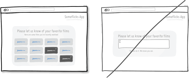
This is a classic design principle, strongly associated with psychology, which implies that it is easier to recognize something existing than to try to remember, delving into your memory. Recognition is based on various hints or keys that help us, allowing us to touch on the previous experience. Remembering forces us to independently explore the bowels of memory. Perhaps this is the reason why in exams sometimes multiple-choice questions are easier than open-ended questions. Give users the ability to recognize things that they have previously encountered, rather than hoping that they all remember.
Idea 38
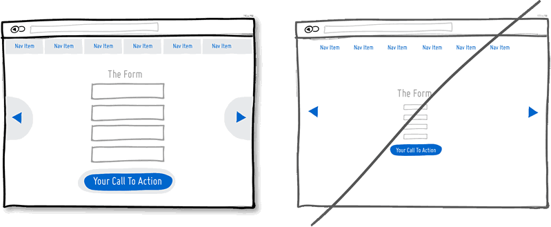
Links, forms and buttons can be made more clickable if you increase their size. According to Fitts’s law , the further and / or the smaller the object, the longer we will try to click on it. That is why it is better to increase the form fields, call to action buttons and links. On the other hand, you can also save the appearance of the visual element, increasing only its response area. A popular example is text links on mobile devices or in the navigation menu, which increase along with the response area.
This is a translation of the tips for a project called " Good UI " by Jakub Linowski . Transferred to UXDepot with the approval of the author.
This is the third part of the Good User Interface notes translated . The first 16 parts were previously translated by our colleagues from ADV on Habré, and the second 11 were translated by us.
PS from translators : I hope you enjoyed the article. We will be glad if you indicate to us errors in the translation, so that we can quickly correct them. Email us at editor@uxfox.ru , please :)
Idea 28
Use the default options without forcing people to choose
Default selections or self-filling learning fields reduce the amount of work a user needs to do. This is a standard technique that helps people progress in forms faster, given that their time is limited. One of the most disgusting things in terms of interface design and converting visitors to customers is to ask users again and again to provide the data that they have already indicated. Try to make fields that will themselves be filled with the most popular or already known values, and do not ask people to fill them in every time. The less work the better.
Idea 29
Use traditional ideas and do not try to invent a wheel
Tradition is the older sister of sequence. If there are similar elements throughout the interface, people will not have to suffer. Another advantage is that it reduces the learning time for the interface. With the help of established traditional ideas of interfaces, we get used to closing the windows in the upper right corner (in most cases) or expect the settings icons to have a certain appearance. Of course, there are situations when traditions become inappropriate and give way to new patterns. In such cases, make sure that they make sense and carry good intentions.
Idea 30
Use fear of loss, not emphasize benefits
We love to win and hate to lose. According to the rules of the psychology of motivation , we are more likely to avoid losses than to receive benefits. This can be applied to the way the product is designed and presented. A strategy that emphasizes that a product will help protect the client’s current well-being, wealth, or social status may be more effective than trying to offer the client something else that he doesn’t have yet. What do insurance companies sell - post-accident payments or protection of what is dear to us?
Idea 31
Use visual hierarchy instead of uniformity
A good visual hierarchy helps to separate the most important elements from the less important. The visual hierarchy consists of such things as alignment, convergence, color, tone, structuring, font size, element size, filling, adding space, and more. If correctly applied, such elements of the visual language can work together to direct and stop the person’s attention within the page, thereby improving overall readability. The visual hierarchy can create friction and slow us down, preventing us from glancing at the page from top to bottom - and this is its main advantage. With a good visual hierarchy, we can spend more time on the page and, as a result, pay attention to more elements and characteristics. Imagine this is a trip. You can go along the highway and get to the destination (end of the page) faster, or you can go along a picturesque route and remember more interesting things along the way. Let your eyes catch on something.
Idea 32
Group interconnected elements, not scatter them
Combining related elements is the main way to improve interface design. Most of us know that the fork and knife, or the Open and Save functions, are usually nearby. Interconnected elements just have to be next to each other to maintain logic and reduce cognitive friction. People don’t like to spend time looking for something.
Idea 33
Instant check instead of deferred errors
When it comes to forms and errors, it is usually best to detect and display errors as early as possible. The well-known interaction pattern that we want to emphasize here is, of course, an instant check. By displaying error messages as they occur (for example, to the right of the input field), they can be corrected as soon as they appear in context. On the other hand, if you show error messages later (for example, after submitting the form), this forces people to do additional mental work, forcing them to remember what they did in the previous steps.
Idea 34
Use free data entry instead of strict
By letting the user enter data in a format convenient for him, computers can become more human. The interface must understand the various ways of entering data and become more friendly. A great example is when we ask for a phone number that can be entered in a huge number of different ways - with brackets, extension numbers, hyphens, area codes and more. Better make your code work more actively than users.
Idea 35
Use urgency instead of uncertainty
Urgency is a persuasion tactic that can be used to encourage people to act now and not later (or never at all). It is quite effective, as it usually implies a certain time limit, since what is available now may not be available tomorrow. It is also effective, because it is associated with the fear of loss and acts in the same way - we do not like to lose opportunities. Urgency refers to one of those strategies that some regard as downright as an annoying and dirty way to get people to act. However, this is an affordable strategy that works if used honestly. Be careful when creating a false sense of urgency, because if users catch you on this, it will have the opposite effect.
Idea 36
Use limitedness instead of abundance
When something is small, we value it more. Limited means that once there was more, today less, and tomorrow there may not be anything at all. Imagine a wholesale store and a boutique, and look at the difference in their prices. Then again introduce the wholesaler and pay attention to one strategy of limitation that they apply to increase the supply of products. Some wholesalers or large retailers sometimes deliberately restrict supplies without purchasing goods already sold. In software, we sometimes forget about limitations, since most often bits and bytes can be very easily copied, and thanks to the copy-paste function, there is an abundance. However, in the world of interfaces, limitation can still be used to constrain the real world. Think about the shortage of the number of tickets that you can sell for the webinar, the number of customers you can serve per month, the number of physical units of products that you have left before the next batch is made. All these points can be shown to the user in order to urge him to urgent action, providing more information. Remember the supply and demand. Remember that less is better.
Idea 37
Give the user a choice, do not make remember
This is a classic design principle, strongly associated with psychology, which implies that it is easier to recognize something existing than to try to remember, delving into your memory. Recognition is based on various hints or keys that help us, allowing us to touch on the previous experience. Remembering forces us to independently explore the bowels of memory. Perhaps this is the reason why in exams sometimes multiple-choice questions are easier than open-ended questions. Give users the ability to recognize things that they have previously encountered, rather than hoping that they all remember.
Idea 38
Use large response areas instead of tiny
Links, forms and buttons can be made more clickable if you increase their size. According to Fitts’s law , the further and / or the smaller the object, the longer we will try to click on it. That is why it is better to increase the form fields, call to action buttons and links. On the other hand, you can also save the appearance of the visual element, increasing only its response area. A popular example is text links on mobile devices or in the navigation menu, which increase along with the response area.
This is a translation of the tips for a project called " Good UI " by Jakub Linowski . Transferred to UXDepot with the approval of the author.
This is the third part of the Good User Interface notes translated . The first 16 parts were previously translated by our colleagues from ADV on Habré, and the second 11 were translated by us.
PS from translators : I hope you enjoyed the article. We will be glad if you indicate to us errors in the translation, so that we can quickly correct them. Email us at editor@uxfox.ru , please :)