"Storytelling with Data", Cole Nussbaumer Knaflic: An Informal Summary of the Book
“Our Cyntists generated a bunch of graphs, and we absolutely do not know where to put them. Let's try to attach them somehow. ” (c) overheard
“Bad graphics everywhere. In my work, I constantly meet extremely dubious data visualizations. No one makes bad graphics intentionally. But it happens. Again and again. In each company in all sectors of the economy by employees of all levels. This happens in the media. This is where you expect people to be able to visualize the data. ” (c) the author of the book.
This happens here, too, on Habré: looking through the articles in the “Data Visualization” stream, I often find myself thinking that I do not understand and cannot grasp the essence of what is displayed. The article will look at a few examples. And what is most unpleasant for me, it happens in my work too. Not constantly, but more often than we would like.
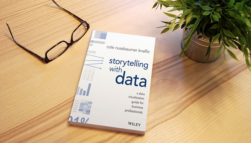
The title of the book "Storytelling with Data" sounded convincing. I chose it for the evening reading and did not regret it. In the book there are no formulas, cunning and unusual graphs, complex cases. English is understandable. Quality printing. Reads like fiction. The book will be useful to all who have to make presentations based on data. I think that it will be especially useful for those involved in data analytics.
This review is very informal: the thoughts of the author of the book, my thoughts, situations from my work, as well as the cribs on matplotlib follow the links. There will be a lot of pictures. Almost all illustrations are redrawn from a book in Python.
I was taught statistics at the university, now students are taught machine learning, schools of data from large companies have appeared. But so far I have not heard that data analysts are seriously taught to “tell stories” on the basis of data. But this is a necessary step of turning data into information and knowledge. It is important to tell the client about the findings. And to tell so that he was clear and fascinating, so that he immediately wanted to improve something in business (perhaps with our help), and not just said: “Well, ok, sounds interesting,” and went to do his daily business .
A couple of quotes from Habr:
The book begins with examples of transformation of unsuccessful visualizations into understandable ones. Here is one of them.
Jupyter Notebook on GitHub
If, in the first case, my reaction to the chart was: “What is this?”, Then in the second case, it took only a few seconds to grasp the essence of the information, and then go into the details.
Virtually every visualization for a presentation is a piece of work. I build graphs using matplotlib, and the author of the book - using Excel. To facilitate the work in the future, I implemented for myself the generation of some graphs from a book in Python. The code contains a bunch of "fine tuning" files. It turned out a kind of cheat sheet with comments. Available by reference .
Let's take a quick look at the contents of the parts of the book.
Exploratory vs explanatory. Data analysis is similar to finding pearls: sometimes you need to open 100 oysters (check 100 hypotheses) to find a pair of pearls. In the process of such work, we visualize the data for ourselves. When it comes time to talk about the results, very often there is a desire to use the same charts and tell about all the work done: “We open the first oyster. Is empty. But do not worry, we still have 99 oysters. Open the second. Don't do that. It is necessary to separate the research ( exploratory ) analysis from the explanatory ( explanatory ). At the stage of explanatory analysis, it is necessary to lay time for it, you need to do other visualizations depending on the context: to whom, what and how.
One of the interesting examples where I would like to see an explanatory analysis instead of a research one - the article “ Analysis of Habrahabr and Geektimes articles ”. The author issued a bunch of graphs and tables, but I did not see any conclusions from them. It would be very interesting to know when to publish articles in order to get maximum views. According to one schedule this is Sunday, according to another schedule - 6 am. But will 6 am Sunday be a good time to publish? Not sure. One of the comments:
To.It is quite obvious that the content and detail depends on the audience. But here you can miss. Once, one of the irritated listeners told me: “There are 10 engineers sitting in front of you who have been involved in oil production for the majority of their lives, and you have been telling us how to do an analysis of production decline curves for 20 minutes? !!”. And it's good that he said this, since I had a similar content for another 20 minutes.
What.Invisible to me thought. It is important to clearly indicate what actions you expect from the audience. For example, allocate another 10M rubles, hire 5 developers, reduce the department, raise the temperature in the boiler to 700C, give a start to the project on forecasting operational debt. This is uncomfortable. There is always the feeling that the “business” knows much better, and it’s scary to make a crazy offer. But if the audience did not understand what, in fact, they want from it, then everything may be limited to the overheard report. Listen, say thank you and go about their business further.
The “business” probably knows better, but the “business” at this moment may be busy with completely different things: the factory is on fire or the hackers have irretrievably erased some of the historical data from the sensors. (All these are real situations). Behave as an expert in the subject area: you analyzed the data, looked at the process from the inside. In any case, even an erroneous proposal can give rise to a constructive discussion.
Recently, for one of the customers, I did a great job: I analyzed data for 3 years from several sources. I put together the finds in several voluminous Excel spreadsheets and Word documents, sent an email, hoping that several projects would start. In response he received: “Yes, it is very interesting!”. And that's all. Now I understand that there could be no other answer.
How.Charts for presentations are different from charts for letters. In the first case, we see the reaction of the audience, at any time we can answer questions, give explanations. Therefore, the level of detail of charts for letters should be higher.
The author provides a list of good ways to visualize data. From the unusual for me: visualization using simple text and slope graphics (slopegraphs).
Simple text. If something can be expressed in one digit, then the graph may not be needed.
Jupyter Notebook on GitHub
Recently used this idea to present a project of monitoring and forecasting settlements with agents: “ 7,000,000 rubles of accumulated debt at the time of an agent bankruptcy.” The effect was remarkable, the audience immediately tuned to the desired mood.
Tilt chartOnce upon a time, I used parallel plots from SAS JMP for a long time. Something similar to. Unfortunately, in many environments this method of visualization does not exist, and in fact it is ideal for multivariate comparisons:
Jupyter Notebook on GitHub
Recently on Habré there was an article " Best IT employers: first results of service ratings on My Circle. " There was a schedule, because of which there was a discussion in the comments:

Small companies, on average, are ranked higher than large companies in almost all parameters. It became interesting to me, but does it make sense to move from an average small company to a good large one? The result of the comparison using the slope graph:

Bad ways to visualize.The author of the book warns against using pie charts, donut diagrams, and also advises never to use 3D.
Pie charts. I know it for myself: when I see a pie chart, I immediately start looking for numbers (percentages) on it. And if there are no numbers, then I just skip it. People find it hard to compare angles without a protractor. The only thing that is lost in the transition from the pie chart is the visualization of the fact that all the parts together form a whole (100%). But if the pie chart as a whole does not work, then it does not matter.
Donut charts. Even worse is circular, because instead of comparing the angles, it is necessary to compare the lengths of the arcs.
3D. A couple of examples made using Excel.
What do you think is D?
Not only do you need to trace your finger to the value of 35 (it’s difficult to make a turn with your eyes), so 35 is not correct either. The correct value is 40!
3D combined with pie charts does wonders. How much C is greater than B? At least about?

In fact, C is less than B by 5% and they are equal to 30% and 35%, respectively! Just do not use 3D for data visualization.
Each element on the graph carries a cognitive load. The higher the signal-to-noise ratio of the visualization, the better. Not at the expense of clarity, of course. The extra elements make the graph at first glance visually much more complicated than it actually is. As a result, part of the audience will decide not to make an effort and spend time to sort out the visualization. With me this often happens on Habré: “Oh! This graph seems to be interesting, but some kind of too complex. Perhaps, I will leave a bookmark, and I will understand next time. ” Authors of articles on Habré lose nothing from such a decision. But after all in my place there could be a potential client, an investor, an employee or an employer.
The author of the book explains what is garbage on the charts, and how to deal with it. Just give one example.

Despite the fact that the graph visualizes a very simple "find", my first thought: "Uh-uh?". The brain refuses to waste energy in order to penetrate into the information.

Jupyter Notebook on GitHub
The brain does not panic anymore . There was a desire to understand.
A little exercise. Count the number of digits "3" in the next picture.
I would definitely not do this task, most likely you didn’t do it either. The only way for an ordinary person (not a genius) to perform is to view all the numbers in a row from top to bottom from left to right. The correct answer is 6.
Now look at the following picture. How much easier now to perform the task:

According to research, a person decides in 8–10 seconds of viewing a chart whether he should spend more time or better focus on something else. Graphs without attention-grabbing attributes are similar to the first image. Most likely, the audience will be too lazy to understand, and after 8 seconds it will lose interest without receiving any information. If the graph looks like the second picture, the audience grasps the highlighted information at a glance. Faster than it is aware. And even if, after 8 seconds, readers turn their attention to something else, the most important part of the information will be received.
The only way to get information from this schedule is to read it in full: The
revised schedule immediately focuses the attention of the audience on a specific “find”: something must be done with noise insulation.
Jupyter Notebook on github
For me, designers are people who draw beautiful pictures. I am not a designer, I have never managed to get beautiful pictures. Fortunately, it’s easier to visualize data. It is necessary to develop graphics, taking into account the following points: opportunities ( affordance ), accessibility ( accessibility ) and aesthetics ( aesthetics ).
Opportunities. When we take tailors' scissors, it becomes immediately clear where to put your thumb, and where - a few other fingers. With charts as well: the audience should immediately understand where to look and what to do with this schedule. For this:
Jupyter Notebook on GitHub
Accessibility. The concept of accessibility suggests that the design should be suitable for people with different capabilities. This refers to people with different experience, knowledge, technical skills, and degree of involvement in the subject area. You may be an engineer, but do not require a higher technical education audience to understand your schedules:
What is this chart all about?
Something is beginning to appear: there are some applications that have been processed less than what was received since May.
Now everything is clear: people left, the team is not coping, we need to hire two more specialists.

Jupyter Notebook on GitHub
Aesthetics. Recently on Habré there was an article “ Visualization of comments from YouTube channels of international and local touhou communities ”. Honestly, I did not understand why I need it, and what information I can get from the charts ... But how beautiful they are! I enjoyed watching everything (without understanding anything). By spending extra time and effort on the aesthetics of your schedules, you increase the chance that the audience will be more patient and attentive to them. Accordingly, the chances are increased that the audience will understand what you want to convey.
For this:
An example of how to bring the graph in aesthetic appearance:


Jupyter Notebook on github
The author gives 5 examples of good visualizations and examines in detail why they are made that way.
I liked this example:

Jupyter Notebook on GitHub
Good story is exciting. Based on the experience of literature and cinema, the author shows how to tell interesting stories using data. One of the tips: before preparing a presentation, write a “big idea” (express the main ideas in one sentence) and a “three-minute story” (describe the main findings on a half page of text).
Each story has 3 main parts: the beginning, the middle and the end.
There are two main story strategies:
1. In chronological order:
a. Identify the problem
b. Collected data to better understand the situation
c. Analyzed the data (reviewed the situation from different angles, took into account other factors)
d. Found a solution
e. Based on all this, we recommend the following steps
: 2. Start at the end:
a. We recommend doing this and that
b. We support this recommendation with data
The author leads the reader on the example of all the steps and lessons of the book:
And you can see an example in the book. I recommend reading.
“Bad graphics everywhere. In my work, I constantly meet extremely dubious data visualizations. No one makes bad graphics intentionally. But it happens. Again and again. In each company in all sectors of the economy by employees of all levels. This happens in the media. This is where you expect people to be able to visualize the data. ” (c) the author of the book.
This happens here, too, on Habré: looking through the articles in the “Data Visualization” stream, I often find myself thinking that I do not understand and cannot grasp the essence of what is displayed. The article will look at a few examples. And what is most unpleasant for me, it happens in my work too. Not constantly, but more often than we would like.
The title of the book "Storytelling with Data" sounded convincing. I chose it for the evening reading and did not regret it. In the book there are no formulas, cunning and unusual graphs, complex cases. English is understandable. Quality printing. Reads like fiction. The book will be useful to all who have to make presentations based on data. I think that it will be especially useful for those involved in data analytics.
This review is very informal: the thoughts of the author of the book, my thoughts, situations from my work, as well as the cribs on matplotlib follow the links. There will be a lot of pictures. Almost all illustrations are redrawn from a book in Python.
I was taught statistics at the university, now students are taught machine learning, schools of data from large companies have appeared. But so far I have not heard that data analysts are seriously taught to “tell stories” on the basis of data. But this is a necessary step of turning data into information and knowledge. It is important to tell the client about the findings. And to tell so that he was clear and fascinating, so that he immediately wanted to improve something in business (perhaps with our help), and not just said: “Well, ok, sounds interesting,” and went to do his daily business .
A couple of quotes from Habr:
In a conversation with Jonathan Nolis, one of the foremost Seattle data analyst who works with companies from the Fortune 500, we discussed the following question: “Which of the two skills is more important for a specialist working with data is the ability to use sophisticated learning or the ability to draw good slides in PowerPoint? ". Nolis argued in favor of the latter, believing that an accessible explanation of the analysis results remains a key element in working with information.But the second quote about soft skills:
What do data analysts actually do? Findings from 35 interviews
- Let's start with soft skills - because they are not enough. Despite the fact that the data scientist is a technical profession, it is extremely important to be able to correctly / beautifully present the result of your work. Roughly speaking, like an iPhone - he has not only a good stuffing, but also an appearance, packaging, history. People need to learn how to present their results: write blog posts, speak, share code. The best data scientists understand this very well, and they do. Otherwise, you can get stuck in your hole, and even go unnoticed with a cool result.
“I find it difficult to understand the motivation of a data scientist who does not see beauty in mathematics” - Kirill Danilyuk, Data Scientist
Introduction
The book begins with examples of transformation of unsuccessful visualizations into understandable ones. Here is one of them.
It was:
It became:
Jupyter Notebook on GitHub
If, in the first case, my reaction to the chart was: “What is this?”, Then in the second case, it took only a few seconds to grasp the essence of the information, and then go into the details.
Virtually every visualization for a presentation is a piece of work. I build graphs using matplotlib, and the author of the book - using Excel. To facilitate the work in the future, I implemented for myself the generation of some graphs from a book in Python. The code contains a bunch of "fine tuning" files. It turned out a kind of cheat sheet with comments. Available by reference .
Let's take a quick look at the contents of the parts of the book.
Part 1: The Importance of Context
Exploratory vs explanatory. Data analysis is similar to finding pearls: sometimes you need to open 100 oysters (check 100 hypotheses) to find a pair of pearls. In the process of such work, we visualize the data for ourselves. When it comes time to talk about the results, very often there is a desire to use the same charts and tell about all the work done: “We open the first oyster. Is empty. But do not worry, we still have 99 oysters. Open the second. Don't do that. It is necessary to separate the research ( exploratory ) analysis from the explanatory ( explanatory ). At the stage of explanatory analysis, it is necessary to lay time for it, you need to do other visualizations depending on the context: to whom, what and how.
One of the interesting examples where I would like to see an explanatory analysis instead of a research one - the article “ Analysis of Habrahabr and Geektimes articles ”. The author issued a bunch of graphs and tables, but I did not see any conclusions from them. It would be very interesting to know when to publish articles in order to get maximum views. According to one schedule this is Sunday, according to another schedule - 6 am. But will 6 am Sunday be a good time to publish? Not sure. One of the comments:
To.It is quite obvious that the content and detail depends on the audience. But here you can miss. Once, one of the irritated listeners told me: “There are 10 engineers sitting in front of you who have been involved in oil production for the majority of their lives, and you have been telling us how to do an analysis of production decline curves for 20 minutes? !!”. And it's good that he said this, since I had a similar content for another 20 minutes.
What.Invisible to me thought. It is important to clearly indicate what actions you expect from the audience. For example, allocate another 10M rubles, hire 5 developers, reduce the department, raise the temperature in the boiler to 700C, give a start to the project on forecasting operational debt. This is uncomfortable. There is always the feeling that the “business” knows much better, and it’s scary to make a crazy offer. But if the audience did not understand what, in fact, they want from it, then everything may be limited to the overheard report. Listen, say thank you and go about their business further.
The “business” probably knows better, but the “business” at this moment may be busy with completely different things: the factory is on fire or the hackers have irretrievably erased some of the historical data from the sensors. (All these are real situations). Behave as an expert in the subject area: you analyzed the data, looked at the process from the inside. In any case, even an erroneous proposal can give rise to a constructive discussion.
Recently, for one of the customers, I did a great job: I analyzed data for 3 years from several sources. I put together the finds in several voluminous Excel spreadsheets and Word documents, sent an email, hoping that several projects would start. In response he received: “Yes, it is very interesting!”. And that's all. Now I understand that there could be no other answer.
How.Charts for presentations are different from charts for letters. In the first case, we see the reaction of the audience, at any time we can answer questions, give explanations. Therefore, the level of detail of charts for letters should be higher.
Part 2: Choosing Effective Visualization
The author provides a list of good ways to visualize data. From the unusual for me: visualization using simple text and slope graphics (slopegraphs).
Simple text. If something can be expressed in one digit, then the graph may not be needed.
Jupyter Notebook on GitHub
Recently used this idea to present a project of monitoring and forecasting settlements with agents: “ 7,000,000 rubles of accumulated debt at the time of an agent bankruptcy.” The effect was remarkable, the audience immediately tuned to the desired mood.
Tilt chartOnce upon a time, I used parallel plots from SAS JMP for a long time. Something similar to. Unfortunately, in many environments this method of visualization does not exist, and in fact it is ideal for multivariate comparisons:
Jupyter Notebook on GitHub
Recently on Habré there was an article " Best IT employers: first results of service ratings on My Circle. " There was a schedule, because of which there was a discussion in the comments:
Small companies, on average, are ranked higher than large companies in almost all parameters. It became interesting to me, but does it make sense to move from an average small company to a good large one? The result of the comparison using the slope graph:
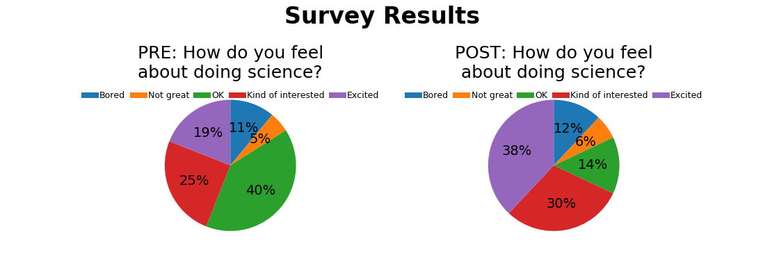
Bad ways to visualize.The author of the book warns against using pie charts, donut diagrams, and also advises never to use 3D.
Pie charts. I know it for myself: when I see a pie chart, I immediately start looking for numbers (percentages) on it. And if there are no numbers, then I just skip it. People find it hard to compare angles without a protractor. The only thing that is lost in the transition from the pie chart is the visualization of the fact that all the parts together form a whole (100%). But if the pie chart as a whole does not work, then it does not matter.
Donut charts. Even worse is circular, because instead of comparing the angles, it is necessary to compare the lengths of the arcs.
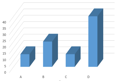
3D. A couple of examples made using Excel.
What do you think is D?
Not only do you need to trace your finger to the value of 35 (it’s difficult to make a turn with your eyes), so 35 is not correct either. The correct value is 40!
3D combined with pie charts does wonders. How much C is greater than B? At least about?
In fact, C is less than B by 5% and they are equal to 30% and 35%, respectively! Just do not use 3D for data visualization.
Part 3: Garbage is your enemy!
Each element on the graph carries a cognitive load. The higher the signal-to-noise ratio of the visualization, the better. Not at the expense of clarity, of course. The extra elements make the graph at first glance visually much more complicated than it actually is. As a result, part of the audience will decide not to make an effort and spend time to sort out the visualization. With me this often happens on Habré: “Oh! This graph seems to be interesting, but some kind of too complex. Perhaps, I will leave a bookmark, and I will understand next time. ” Authors of articles on Habré lose nothing from such a decision. But after all in my place there could be a potential client, an investor, an employee or an employer.
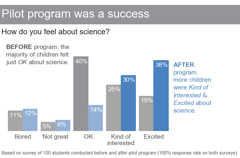
The author of the book explains what is garbage on the charts, and how to deal with it. Just give one example.
It was:
Despite the fact that the graph visualizes a very simple "find", my first thought: "Uh-uh?". The brain refuses to waste energy in order to penetrate into the information.
It became:
Jupyter Notebook on GitHub
The brain does not panic anymore . There was a desire to understand.
Part 4: Focus the attention of the audience
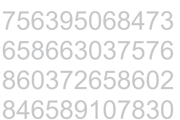
A little exercise. Count the number of digits "3" in the next picture.
I would definitely not do this task, most likely you didn’t do it either. The only way for an ordinary person (not a genius) to perform is to view all the numbers in a row from top to bottom from left to right. The correct answer is 6.
Now look at the following picture. How much easier now to perform the task:
According to research, a person decides in 8–10 seconds of viewing a chart whether he should spend more time or better focus on something else. Graphs without attention-grabbing attributes are similar to the first image. Most likely, the audience will be too lazy to understand, and after 8 seconds it will lose interest without receiving any information. If the graph looks like the second picture, the audience grasps the highlighted information at a glance. Faster than it is aware. And even if, after 8 seconds, readers turn their attention to something else, the most important part of the information will be received.
The only way to get information from this schedule is to read it in full: The
revised schedule immediately focuses the attention of the audience on a specific “find”: something must be done with noise insulation.
Jupyter Notebook on github
Part 5: Think like a designer
For me, designers are people who draw beautiful pictures. I am not a designer, I have never managed to get beautiful pictures. Fortunately, it’s easier to visualize data. It is necessary to develop graphics, taking into account the following points: opportunities ( affordance ), accessibility ( accessibility ) and aesthetics ( aesthetics ).
Opportunities. When we take tailors' scissors, it becomes immediately clear where to put your thumb, and where - a few other fingers. With charts as well: the audience should immediately understand where to look and what to do with this schedule. For this:
- Highlight important points. It is recommended to allocate no more than 10% of visualization elements, otherwise the effect is lost. “It’s easy to find a hawk among pigeons, but it gets harder and harder when there are more bird species.”
- Eliminate distractions. “Perfection is achieved not when there is nothing to add, but when there is nothing to remove,” - Antoine de Saint-Exupery.
a. Not all data is equally important. Dispose of non-critical components.
b. When parts are not needed, aggregate.
c. Periodically ask yourself: if it is thrown out, will something change? Do not change - throw out.
d. Send background elements to the back. Use gray for this. - Create a clear hierarchy of information. Using different attributes that attract attention, show your audience how to obtain information in the sequence. For example, as in the following graph:
Jupyter Notebook on GitHub
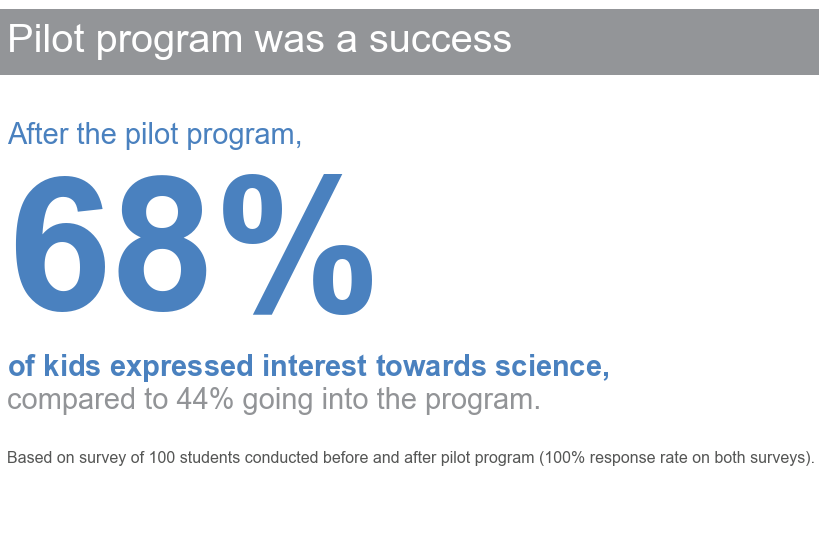
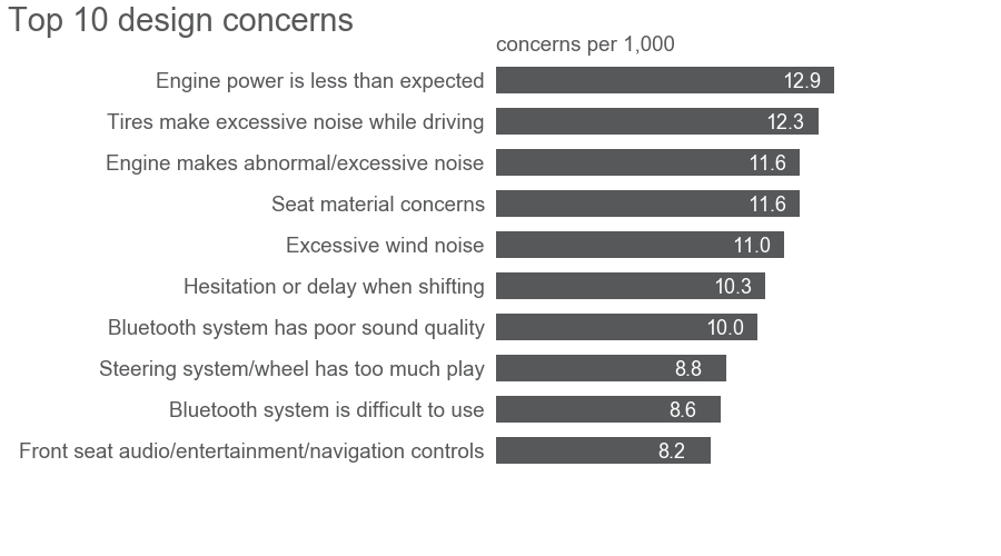
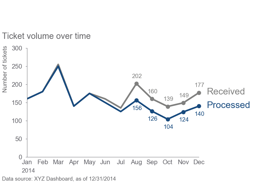
Accessibility. The concept of accessibility suggests that the design should be suitable for people with different capabilities. This refers to people with different experience, knowledge, technical skills, and degree of involvement in the subject area. You may be an engineer, but do not require a higher technical education audience to understand your schedules:
- Do not over complicate. If possible, use visually clean fonts (Arial), understandable words, short sentences.
- The text is your friend. At a minimum, there should be a title and axis names on the chart. Let's see how simple text can change the perception of graphics:
No text
What is this chart all about?
Minimum required text
Something is beginning to appear: there are some applications that have been processed less than what was received since May.
A lot of text
Now everything is clear: people left, the team is not coping, we need to hire two more specialists.
Jupyter Notebook on GitHub
Aesthetics. Recently on Habré there was an article “ Visualization of comments from YouTube channels of international and local touhou communities ”. Honestly, I did not understand why I need it, and what information I can get from the charts ... But how beautiful they are! I enjoyed watching everything (without understanding anything). By spending extra time and effort on the aesthetics of your schedules, you increase the chance that the audience will be more patient and attentive to them. Accordingly, the chances are increased that the audience will understand what you want to convey.
For this:
- Use color wisely.
- Pay attention to alignment.
- Make more spaces (empty spaces).
An example of how to bring the graph in aesthetic appearance:
It was
It became
Jupyter Notebook on github
Part 6: Critical review of visualizations
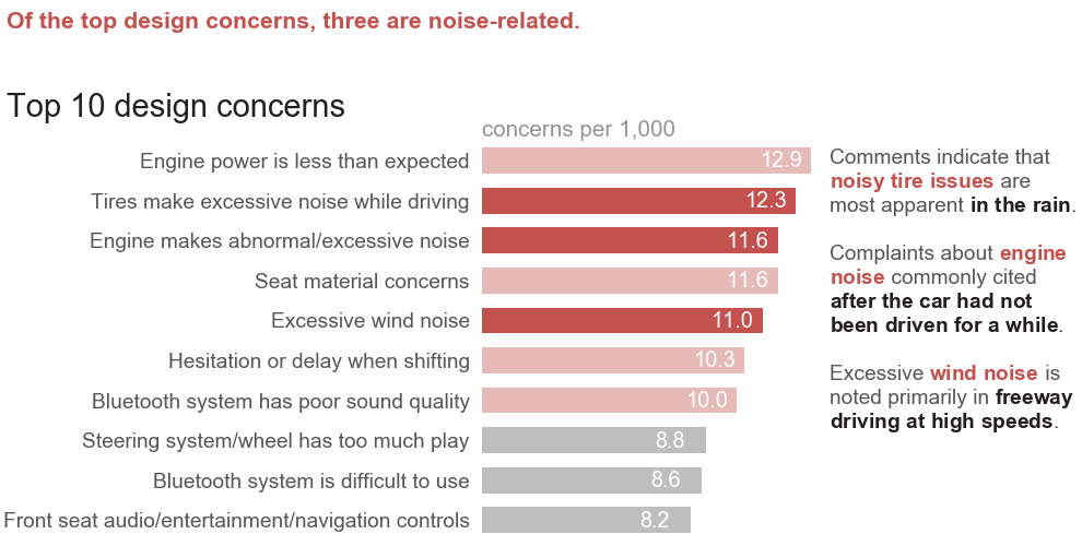
The author gives 5 examples of good visualizations and examines in detail why they are made that way.
I liked this example:
Jupyter Notebook on GitHub
- Understandable visual hierarchy: read the heading, go to the bold numbers, by them from right to left we reach the text "Unmet need (gap)". In a few seconds, we grasp: if we do nothing, then the unmet need will increase.
- From "Unmet need (gap)" we read all tags. We understand where the directors and the main sources of new directors are lost, thanks to the fact that the columns are signed directly.
- Very interesting idea of negative columns.
Part 7: Narrative Lessons
Good story is exciting. Based on the experience of literature and cinema, the author shows how to tell interesting stories using data. One of the tips: before preparing a presentation, write a “big idea” (express the main ideas in one sentence) and a “three-minute story” (describe the main findings on a half page of text).
Each story has 3 main parts: the beginning, the middle and the end.
- Start. Indicates a problem. If there is no clear problem, then perhaps the presentation is also not needed. "Why should this interest me?"
- The middle . Shows how the problem can be solved. "Why can I make a proposed decision?"
- The end. Call to action. “What do I need to start doing right now to solve the problem?”
There are two main story strategies:
1. In chronological order:
a. Identify the problem
b. Collected data to better understand the situation
c. Analyzed the data (reviewed the situation from different angles, took into account other factors)
d. Found a solution
e. Based on all this, we recommend the following steps
: 2. Start at the end:
a. We recommend doing this and that
b. We support this recommendation with data
Part 8: Putting It All Together
The author leads the reader on the example of all the steps and lessons of the book:
- Shows a bad schedule
- Describes what the context of the presentation can be
- Selects a good visualization method.
- Removes all trash,
- Determines where to focus the attention of the audience, and uses attracting attributes for this,
- Brings graphics to an aesthetic look.
- Prepares a full presentation.
And you can see an example in the book. I recommend reading.