Who is making up this? Or again about usability mail.ru
Each time, coming from completely unexpected places on the Network to read mail on mail.ru, I come across the same unpleasant trifle. This "pebble in the shoe" finally got me so much that I decided to tell you about it.
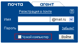 The theater begins with a hanger, and the web service begins with authorization. The mail.ru authorization form is familiar to everyone (who is not familiar with it, see screenshot). Since I enter, as I have already said, from the most unexpected places, each time I turn on the “Alien Computer” checkbox so that the service does not substitute my login for the next person who visited this page (or maybe he doesn’t analyze it yet). What could be easier, you say. Just click on the checkmark or on its signature. All offline applications behave this way, and most modern web services behave this way (for example, the checkboxes "Closed Habratopik ..." and "Disable automatic transfers ..." on the page where I write this). But apparently those unfamiliar webmasters who made up the login form did not know about the wonderful tag
For fun, I looked into the code. This is how it is done now:
and so, in my humble opinion, it should be done:
Only one tag, even the input field already has an id. Work for 30 seconds with smoke breaks, and save time by half a second for each user - how many logins do they have with the main? A million a day? If 1% logs in from the Alien Computer, it’s one and a half man-hours a day saving universal time :)
PS I wrote this topic not to reproach mail.ru, but to edify future web-UI typesetters. Remember, even a little thing can help your product become the best in the world. Or interfere.
PSS Lovers minus karma - do not hesitate to express your opinion in the comments, suddenly it will be interesting :)
The theater begins with a hanger, and the web service begins with authorization. The mail.ru authorization form is familiar to everyone (who is not familiar with it, see screenshot). Since I enter, as I have already said, from the most unexpected places, each time I turn on the “Alien Computer” checkbox so that the service does not substitute my login for the next person who visited this page (or maybe he doesn’t analyze it yet). What could be easier, you say. Just click on the checkmark or on its signature. All offline applications behave this way, and most modern web services behave this way (for example, the checkboxes "Closed Habratopik ..." and "Disable automatic transfers ..." on the page where I write this). But apparently those unfamiliar webmasters who made up the login form did not know about the wonderful tag labeland its attribute for. Therefore, to set this checkbox, you need to click on it. For fun, I looked into the code. This is how it is done now:
another's computer
and so, in my humble opinion, it should be done:
Only one tag, even the input field already has an id. Work for 30 seconds with smoke breaks, and save time by half a second for each user - how many logins do they have with the main? A million a day? If 1% logs in from the Alien Computer, it’s one and a half man-hours a day saving universal time :)
PS I wrote this topic not to reproach mail.ru, but to edify future web-UI typesetters. Remember, even a little thing can help your product become the best in the world. Or interfere.
PSS Lovers minus karma - do not hesitate to express your opinion in the comments, suddenly it will be interesting :)