Designing application screens: from planning to design layout
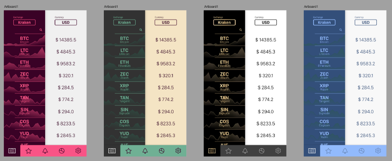
Translator's note: today we are publishing a translation of the article by sixteen-year-old Indian developer Harshita Arora. Harshita began studying graphic design from the age of 13. She is now engaged in the creation of mobile applications. In the article, Arora shares the nuances of developing application design from scratch using the example of creating your own cryptocurrency app - Crypto Price Tracker.
The article is devoted to the primary design - the need to analyze the functions and capabilities of the program being created before starting work on it, in order to take into account all the necessary points when creating an application. It should be noted that this material will be especially useful for novice developers (completely newbies), since the author herself has been doing this relatively recently.
Skillbox recommends: Practical two-month course "UX-design" .
We remind: for all readers of Habr - a discount of 10,000 rubles when writing to any Skillbox course on the promotional code "Habr".
In general, the work on the design of the application is divided into the following steps:
- creating a task flow diagram (user-flow) for each screen;
- creating wireframes;
- selection of color palette and style;
- creating layouts;
- creating an interactive prototype of an application that users can test;
- pointing the gloss to the final design.
Task flow diagrams
The first step in the design process is to identify the list of features that you want to add to your application. As soon as you have a well-formed idea, you should start working on creating a task flow diagram. It allows you to visually see how the app will work.
During the work, 3 elements are usually used:
- Rectangles that depict screens.
- Diamonds for demonstration of decision making by the user (pressing the button, swipe, etc.).
- Arrows that combine elements together.

Actually, we are talking about the usual flowchart that demonstrates the decision making by the user when they hit different screens of the application.
Wireframes
As soon as you are finished with user-flow, it's time to start working with wireframes. They show (with a certain approximation) what the application will be like and how it will look. This is a rough sketch showing the main elements for each screen.
In order not to draw the borders of the phone case every time, I use the UI Stencils service .
Here is an example of a wireframe.
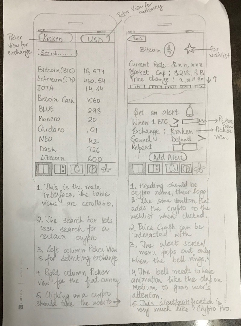
After these sketches are ready, you can use the Pop app to combine individual sketches into a single scheme, the elements of which are linked to each other.
Design and color palette
This is my favorite stage. You can choose anything you want, after which we begin experiments on individual color solutions. For me, the best repositories of examples of designs and palettes are Mobile Patterns and Pttrns , as well as Color Hunt .
Layouts
Yes, finally we can proceed to the design, creation of application layouts. Layout in a design sense is a visual representation of your design. At this stage, the layout should be as close to reality as possible so that you can understand how the application looks and works.
There are various development tools, tools for creating layouts. I use Affinity. Creating apps for iOS, I most often work with Sketch .
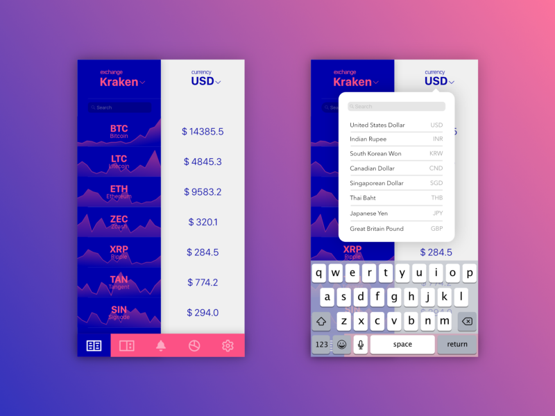
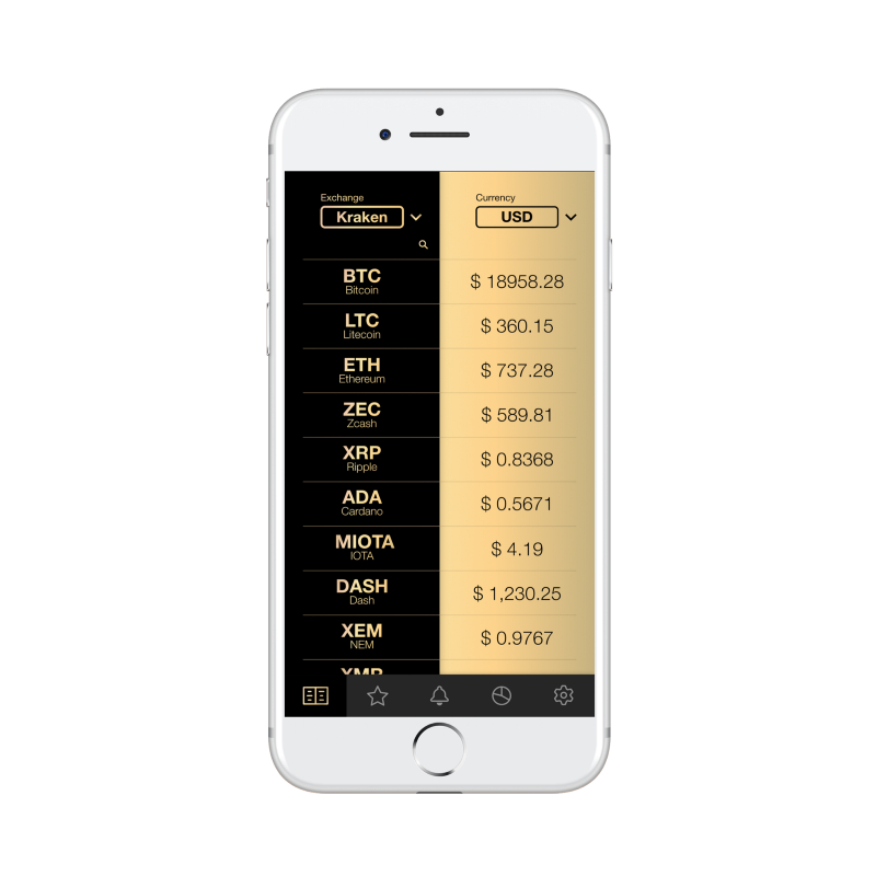
Here is an example of some early layouts of my own application.
Here is a job with a color palette.

In the process, it is worthwhile to show your layouts to colleagues and acquaintances - so you can get feedback without having direct access to potential users. In my case, most people to whom I showed mock-ups liked the black and gold version.
By the way, in the process of discussing your work, be prepared to meet with new ideas - something very interesting can be offered to you! - and offers. You can get very interesting ideas when communicating with potential users of the application.
In my case, I got a few ideas that I then used in the new layout.
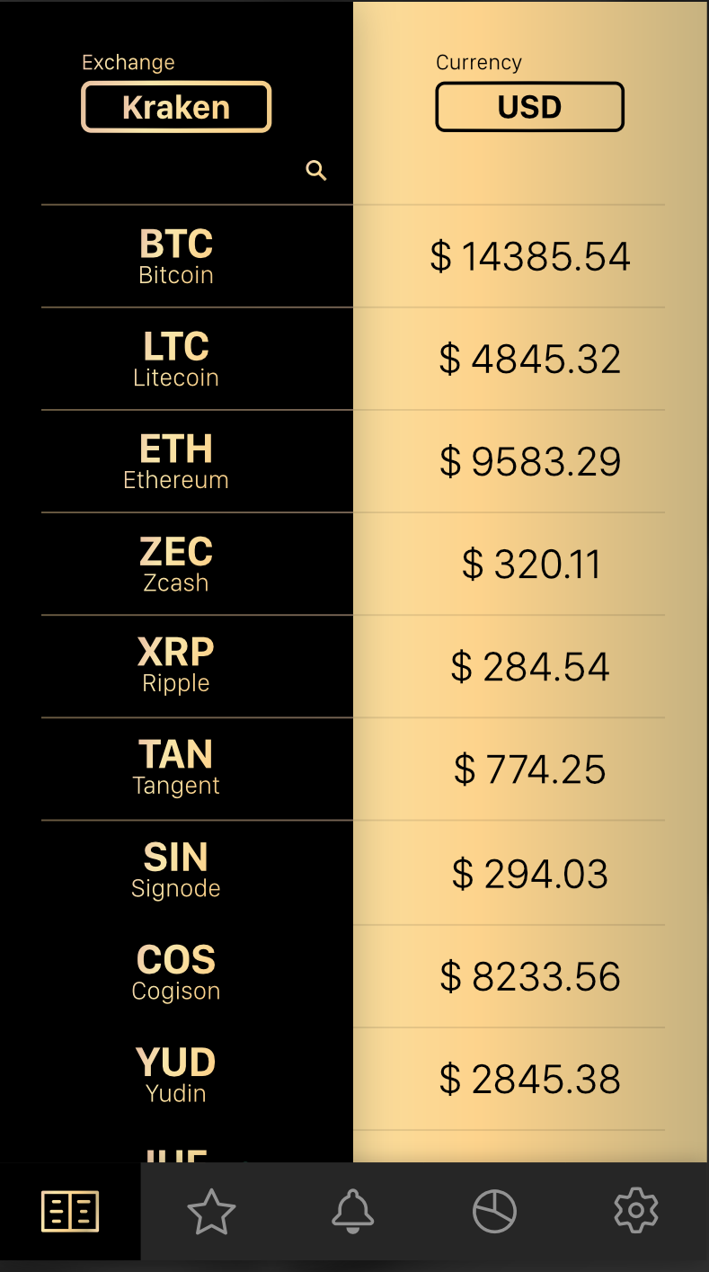
The design of the application is concise, there are icons and all controls on the taskbar. Then I worked all the other screens of the application, taking this screen design as a basis.
The result was brought together in Adobe XD.
Skillbox recommends:
- Practical course "Mobile developer from scratch . "
- Online course "Mobile Developer PRO" .
- Practical course Python-developer from scratch .
