5 CSS tricks you should know about
Watching the flow of questions on CSS on the Toaster has long noticed that many of them are repeated many, many times. Yes, there are really stupid questions, which RTFM is so drawn to answer! But there are more entertaining. They are associated with not quite a standard layout. Not such that the eyes on the forehead were made, but also noticeably beyond the conventional bootstrap and traditional tutorials for beginners. Similar questions are quite difficult to google - usually the whole point in the picture, but also annoying to answer each time. In this article we will try to look at some tricks covering a fairly wide range of such issues. The information is primarily addressed to beginner designers, but it is possible and experienced to be inspired.
1. Back and forth
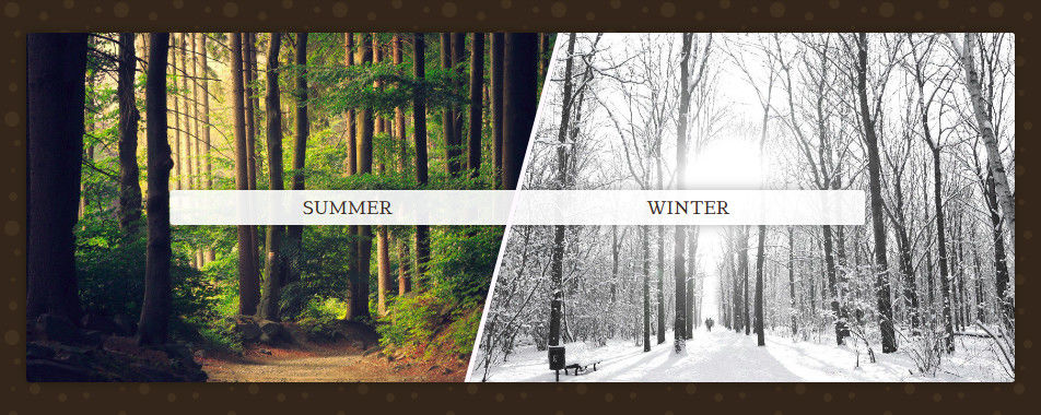
Let's start with the simple. If you transform an element container and then apply the opposite transformation to its content, you can get a lot of interesting things. This is often used to create oblique sections. Consider the following markup:
<divclass='custom-section'><divclass='block -left'><imgclass='background'src='...' /><aclass='link'href=''>Summer</a></div><divclass='block -right'><imgclass='background'src='...' /><aclass='link'href=''>Winter</a></div></div>Pretty simple, nothing extra. From it we get the following result:
How did this happen? Here we applied transform: skew(-15deg)for the block and transform: skew(15deg)for the content - pictures and links. Actually that's all. Applied the transformation and canceled it for posterity. It looks like this:
.custom-section {
    > .block.-left {
        transform: skew(-15deg) translate(-15%);
    }
    > .block.-left > .background {
        transform: skew(15deg) translateX(15%);
    }
}
When used, transform: skewit may be necessary to compensate for the length of the content or move it slightly, which we did with transform: translate.
In such components images are often used as a tagimg. It will not be superfluous to remember aboutobject-fit: cover.
Of course, such actions can be done with other transformations. For example, rotateit gives us the opportunity to make a dial or arrange photos in a circle:
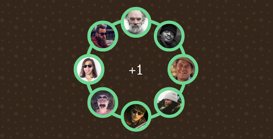
The principle of operation is the same. Applied the transformation and canceled it for the children:
.image-wrapper {
    &:nth-of-type(2) {
        transform: rotate(45deg);
        .image { transform: rotate(-45deg); }
    }
    &:nth-of-type(3) {
        transform: rotate(90deg);
        .image { transform: rotate(-90deg); }
    }
    и.т.д.
}
2. Bordienta
In CSS, we have quite limited possibilities for shaping the borders of elements. But in the head designer everything is very different. This leads to the fact that the beginner coder often gets into a stupor and offers to give the designer a keyboard on the head . On the Toaster, people often ask about how to leave only corners of a standard border, make a double / triple border, etc. All such issues can be solved using gradients.
The basic idea is simple to the impossibility: take linear gradients and use them to draw the border we want. In our society, the influence of stereotypes is very strong and apparently it simply does not occur to many people that tools (in particular, CSS properties) can be used not quite for their intended purpose.
Actually best illustrated by these words of a living example:
Here we see two approaches to using gradients: in border-imageand background-image. The first option can be convenient in combination with the property border-image-slice, and the second has long been popular for drawing anything.
.example {
    &:nth-of-type(1) {
        border-size: 3px;
        border-style: solid;
        border-image: linear-gradient(to bottom, #86CB92 0%, transparent 40%, transparent 60%, #86CB92 100%);
        border-image-slice: 1;
    }
    &:nth-of-type(3) {
        background: linear-gradient(to right, #86CB92 0%, transparent 100%),
            linear-gradient(to right, transparent 0%, #86CB92 100%),
            linear-gradient(to bottom, #86CB92 0%, transparent 100%),
            linear-gradient(to bottom, transparent 0%, #86CB92 100%),
            linear-gradient(to right, #86CB92 0%, #86CB92 100%),
            linear-gradient(to right, #86CB92 0%, #86CB92 100%);
        background-size: 70% 3px, 70% 3px, 3px 70%, 3px 70%, 20% 20%, 20% 20%;
        background-position: 50% 0, 50% 100%, 050%, 100% 50%, 5% 5%, 95% 95%;
        background-repeat: no-repeat;
    }
}
In Safari, as always, there are problems with transparency. Always use expanded recording withborder-widthandborder-style, as in the first example, instead of shortborder: 3px solid transparent.
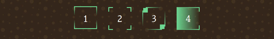
3. Partial style duplication
And since we're talking about boarders, let's say a few words about duplication. Also a useful trick. If an element has a border, we can take one of its pseudo-elements ( ::beforeor ::after), put it on top, set the same size in 100% / 100%and fully or partially duplicate the border of the main element.
.overflow-example {
    border: solid 5px #fff;position: relative;
    &::after {
        display: block;
        content:'';
        position: absolute;
        top:0;
        left:0;
        height:100%;
        width:100%;
        border-bottom: solid 5px #fff;
    }
}
This will give the opportunity to make "crawling out" content across the border of the element:
A similar effect is often found on advertising pages, so that it is definitely worth adopting.
Do not forget to add pointer-events: noneall the elements that overlap the content.4. Content taken out of context.
Getting the element out of the parent's boundaries leads us to another thing - pulling the element out of context. z-indexEvery property designer knows about the property , but few people remember about it when it comes to multilayer sandwiches from the effects. As a result, this leads to unnecessary complexity of the markup.
Consider an example. You need to make a flashlight effect (something like lighting the background and borders of the elements in a certain radius from the cursor). How to approach this issue?
Suppose we already have a markup:
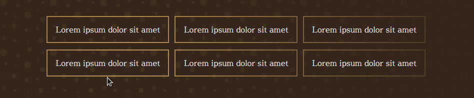
<divclass='custom-grid'><divclass='item'><divclass='text'>Lorem ipsum dolor sit amet</div></div><divclass='item'><divclass='text'>Lorem ipsum dolor sit amet</div></div>
    и.т.д.
Can we somehow add the highlight right here? Yes. And the solution is very simple:
- We put on top of all this a large radial gradient with a transparent hole in the center
- With the help of
z-indextearing content from the current context and it is automatically placed on top of the gradient
By itself, the radial gradient is not unusual:
.shadow {
    position: absolute;
    left: 50%;
    top: 50%;
    height: 200vh;
    width: 200vw;
    transform: translateX(-50%) translateY(-50%);
    background: radial-gradient(circle at center, transparent 0%, transparent 5%, #302015 70%, #302015 100%);
}
In such effects attached to a mouse, dimensions of 200vh / 200vw are often used to ensure that their edges do not crawl into the area visible by the user.
It turned out a sandwich. Borders remained below, a gradient lay in the middle, everything was covered with content from above. Even in the existing markup, such an effect will be added with just one element and a couple of lines of CSS. There are of course exceptions, but still. It remains only to revive the effect by tying it to the mouse:
const grid   = document.getElementById('js-grid');
const shadow = grid.querySelector('.shadow');
document.addEventListener('mousemove', (e) => {
    const rect = grid.getBoundingClientRect();
    window.requestAnimationFrame(() => {
        shadow.style.left = `${e.clientX - rect.left}px`;
        shadow.style.top = `${e.clientY - rect.top}px`;
    });
});
This technique can also be used with modal windows or menus, overlapping everything else with a beautiful shadow.
5. Sandwich from SVG and HTML
Sandwiches. Hmm ... There is another one. Very useful. He solves the following problem: if we have some kind of scheme, map, graph or something else in the form of SVG pictures inserted into the markup, then with adaptive change in its size, the texts on it start to decrease or increase. This is not only that can lead to their "blurring" and distortion of proportions, but also knocks out this very scheme or graph from the general style of the page.

To fix this thing, you can put on top of SVG the usual one div, in which to type all these inscriptions with absolute positioning.
.mixed-graph {
    > .svg {
        ....
    }
    > .dots {
        position: absolute;
        z-index: 1;
    }
}
It’s convenient to do it right viewbox='0 0 100 100'off the picture so that the coordinates of absolute positioning in the HTML layer coincide with the coordinates in the SVG layer.In this way we will be able to make a conditional schedule, on which all the inscriptions will be the same as on the rest of the page. In combination with adaptive typography, this can produce very pleasant results.
Instead of conclusion
Beginning designers, explore and use all the features that provide you with your tools. The world is changing. Many heavy jQuery plugins are now easily replaced with a couple of lines of CSS, and the page design options are no match for what they were in the early 2000s. It is time to change the perception of the world of web development, to accept the fact that the “layout” is becoming an increasingly wide area of activity, and to begin to make modern websites without looking at past stereotypes and limitations.