Three reincarnations online store. How to drain money, time and why templates are good
Twice Ku!
2016 ended, and the online store LEDROID.ru remained in its original form. Then we got the idea if it was time to upgrade?
What eventually happened, why not do so, or how to save 200 thousand rubles?
Case under the cut
The store owes its appearance simply to the will of chance, since it was not planned at all in advance. He is the brainchild of the MakeShop.pro studio. LEDROID.ru became one of its first cases. But a store was being developed for one of our clients, who later changed his mind to open the site and did not pay for the work already completed by that time.
But I did not think the goodness was going to disappear. And to really have your own store would be nice. And the matter is not so much in additional earnings, but in gaining one’s own experience. Since LEDROID.ru and began its development.
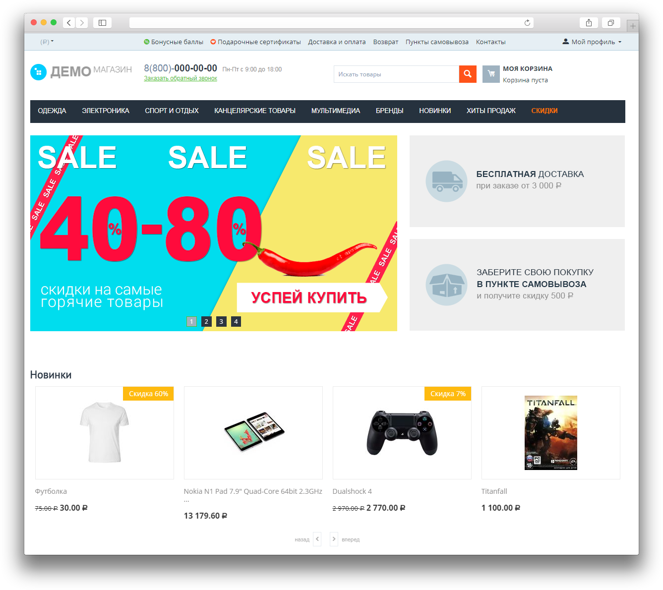
At the time of the start of good templates on CS-Cart really was not. And the simplest, cheapest and fast way was the adaptation of the standard template.
It looks like this:
Naturally, the customer wanted diversity and adaptation to his tasks. That's why we started sketching.
As a result, the main page seemed to us as follows:
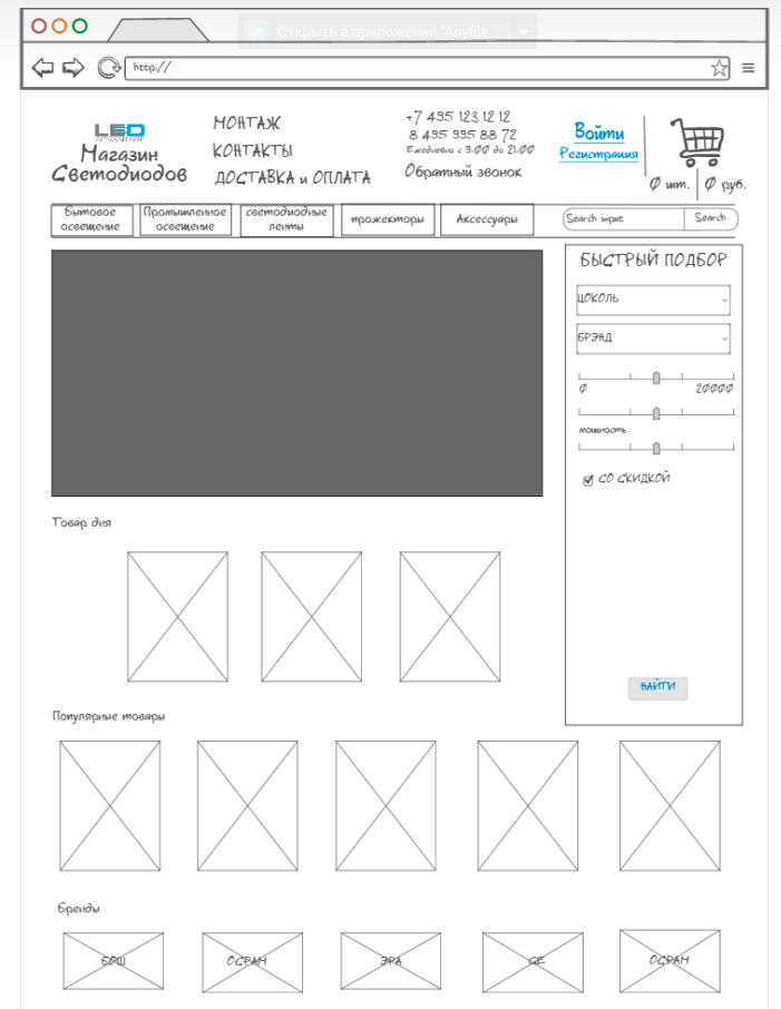
A feature of the store was the ability to select products from the main page using a filter. The visitor was asked to enter only the basic parameters of the desired product and then select the appropriate option from the proposed range. But such a decision did not justify itself, so at the moment we have refused the filter on the main page. The menu with categories and subcategories of goods turned out to be more popular.
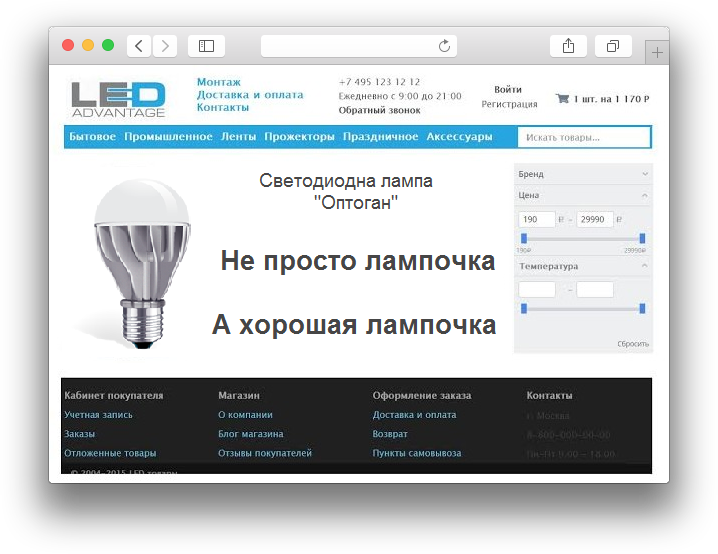
Unfortunately, we did not save the original version. But it looked like this:
In this form, we existed for about a year. And in general, quite positive.
In general, the store felt good and sold. But as time went on, the idea to update the design began to visit us more often. At that time, we thought that the coolest options could be spied on in the foreign market. Actually there and turned their gaze.
By the implementation of the second option, we have already approached with greater seriousness. The sketch was drawn in color and scale.
Here it is:
Provided various marketing chips. Banners. Block with main categories. Added a block to quickly track your order.
As time went. We sawed. And thus all the pages were worked out. As a result, the sketches were transferred to the work of the designer.
It turned out something like this:
It didn’t make me happy, the site looked like from the late eighties. Apparently not those foreign sites we watched.
This is still only a quarter of the work. A month and a half has already passed. Further, all this was necessary to impose, to develop the necessary modules.
Total spent:
At that moment when we were still drawing sketches, there was already a ready-made good template on the market. But since the forces have already been spent enough, and the toad choked us and did not allow us to drop this mouse bustle and just roll it. We injected and continued to eat the cactus.
Half of the modules we have not done. Yes, and in the process of layout they refused from many things from design. The site looked like this.
And yet we are tired of sawing golden weights and chasing the departing train. We threw this bad job. They commissioned the designer to develop a new logo and brand colors.
Bought a template and related modules to it ~ 12,000 rubles.
Rolled a template ~ work day.
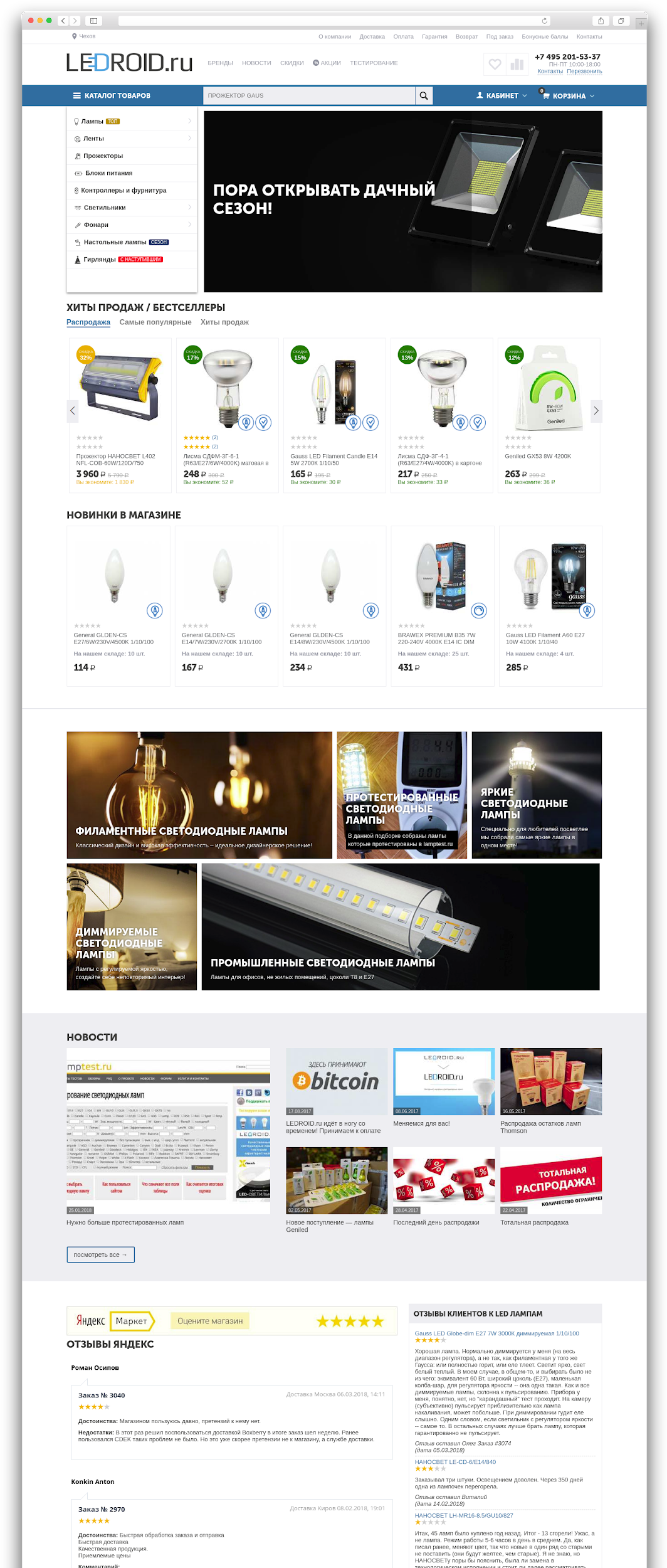
Home Page
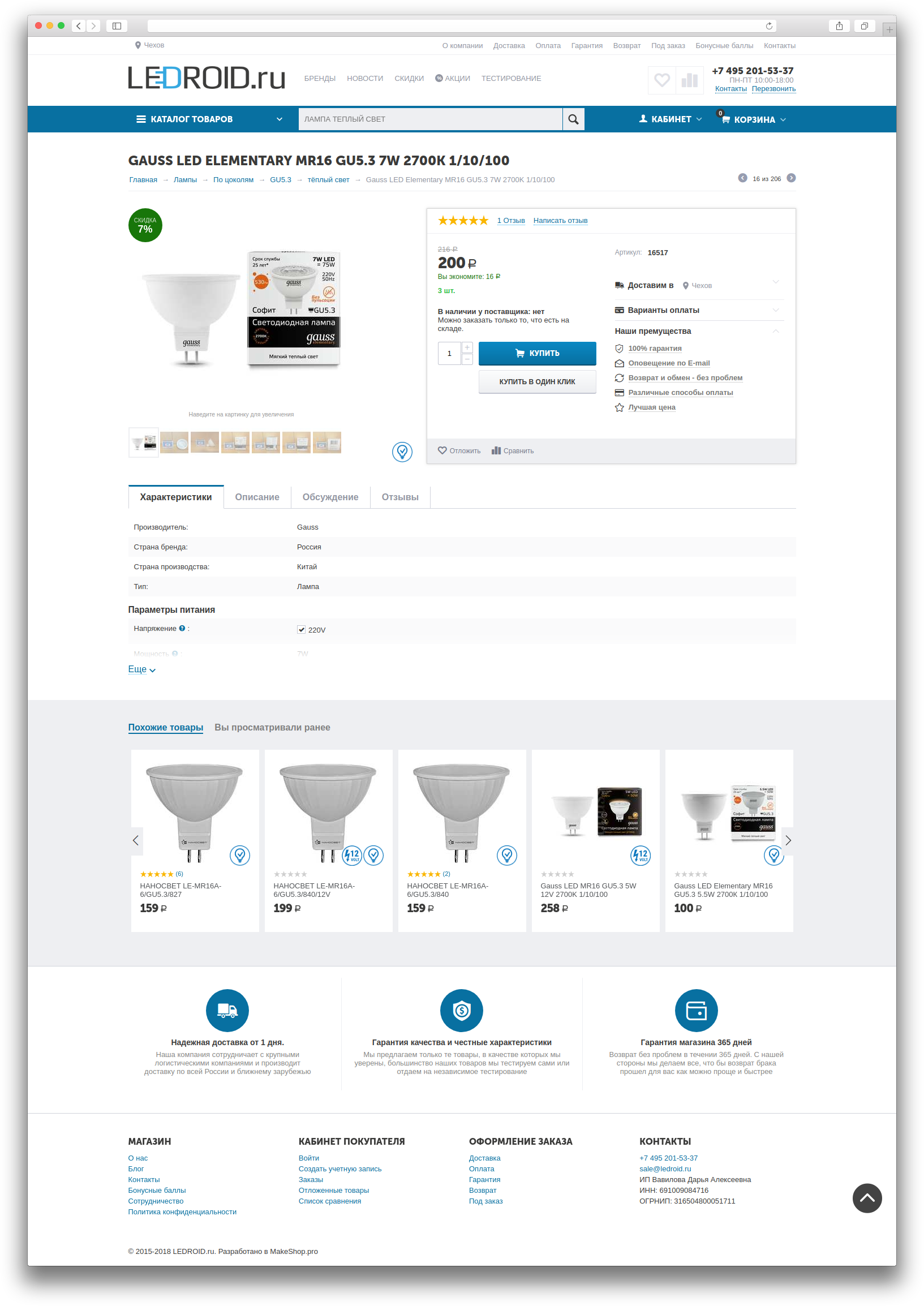
Item Card
What did you get with the template? If in one sentence, it is a bunch of modules that are updated and expanded, adaptability and elaboration.
100% Adaptability, convenience in all details. The template looks great on tablet screens in both horizontal and vertical position.
SEO optimization. Fixed CS-Cart bugs.
Fixed, adaptive top panel of the site. The panel included all the main navigation elements. When scrolling content, the panel takes a fixed position at the top of the site and allows the client to always see the menu, search, office and cart.
Perfect menu. The menu is flexible.
Three types of presentation of goods. Three types of product cards. You can choose the most appropriate look for your product.
The size of the discount affects the color of the nameplate. Marketing trick.
Buttons "Category full screen width" and "Hide filters". This functionality allows with one click to stretch the layout of the list of goods to the full width of the page, and also to hide the filter block, which will allow the buyer to focus on the choice of commodity items.
Expanded banners. Create professional, responsive banners without design skills, just copy the picture and enter texts into the editor. In 2 minutes you will get the most effective, adaptive banner in any resolutions, which can also carry SEO functions.
Banners in the category. Place banners directly in the product grid of category pages, advertise, notify, stimulate in an original and effective way, as market leaders do.
Product of the day.Create promotional items marked with a special nameplate in the lists, as well as having a countdown timer until the end of the action on their cards. Advertise them actively on the main page with the help of a special promo block.
And this is not a complete list of features of the template for $ 200.
Shashechki you or go?
The moral of the story is, the online store must sell. The design should not interfere. The site should be convenient first of all for the client.
Individual solutions are like a homemade car. It seems cool, but expensive and long. Not everyone will master. It is easier to buy a conveyor solution and finish it if necessary. Individual solutions are possible, most often these are some narrow niches.
If you decide to make your site using template solutions, then the choice of a template should be approached seriously and responsibly, as well as the choice of the engine. Be sure to find out how well tech support works with the developers of this template, how often updates come out and whether the template is generally supported. Examine the demo sites and opportunities before buying, ask for a presentation and tell you about the points of interest. Otherwise, all the advantages described above can easily become minuses.
In monetary terms, it is difficult to say exactly how much this experiment cost us. But if we estimate that we started drawing the sketch in November 2016, we rolled out a new design for the site in February 2017. And this was not a complete version. That scale, I would rate thousands in 200-250.
2016 ended, and the online store LEDROID.ru remained in its original form. Then we got the idea if it was time to upgrade?
What eventually happened, why not do so, or how to save 200 thousand rubles?
Case under the cut
1. The first pancake
The store owes its appearance simply to the will of chance, since it was not planned at all in advance. He is the brainchild of the MakeShop.pro studio. LEDROID.ru became one of its first cases. But a store was being developed for one of our clients, who later changed his mind to open the site and did not pay for the work already completed by that time.
But I did not think the goodness was going to disappear. And to really have your own store would be nice. And the matter is not so much in additional earnings, but in gaining one’s own experience. Since LEDROID.ru and began its development.
At the time of the start of good templates on CS-Cart really was not. And the simplest, cheapest and fast way was the adaptation of the standard template.
It looks like this:
Naturally, the customer wanted diversity and adaptation to his tasks. That's why we started sketching.
As a result, the main page seemed to us as follows:
A feature of the store was the ability to select products from the main page using a filter. The visitor was asked to enter only the basic parameters of the desired product and then select the appropriate option from the proposed range. But such a decision did not justify itself, so at the moment we have refused the filter on the main page. The menu with categories and subcategories of goods turned out to be more popular.
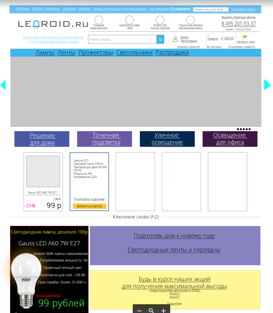
Unfortunately, we did not save the original version. But it looked like this:
In this form, we existed for about a year. And in general, quite positive.
2. Option number two. Pain.
In general, the store felt good and sold. But as time went on, the idea to update the design began to visit us more often. At that time, we thought that the coolest options could be spied on in the foreign market. Actually there and turned their gaze.
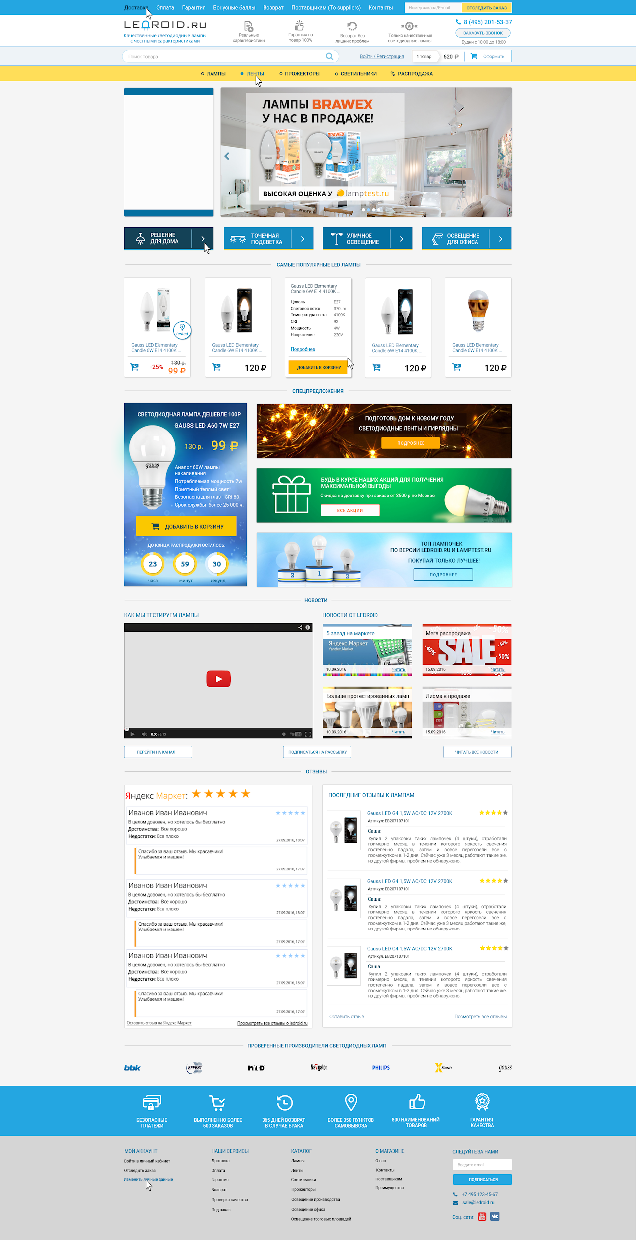
By the implementation of the second option, we have already approached with greater seriousness. The sketch was drawn in color and scale.
Here it is:
Provided various marketing chips. Banners. Block with main categories. Added a block to quickly track your order.
As time went. We sawed. And thus all the pages were worked out. As a result, the sketches were transferred to the work of the designer.
It turned out something like this:
It didn’t make me happy, the site looked like from the late eighties. Apparently not those foreign sites we watched.
This is still only a quarter of the work. A month and a half has already passed. Further, all this was necessary to impose, to develop the necessary modules.
Total spent:
- on drawing a sketch - time,
- on design - studio resources,
- on the layout - studio resources,
- for modules that no one else needs - studio resources.
At that moment when we were still drawing sketches, there was already a ready-made good template on the market. But since the forces have already been spent enough, and the toad choked us and did not allow us to drop this mouse bustle and just roll it. We injected and continued to eat the cactus.
Result
Half of the modules we have not done. Yes, and in the process of layout they refused from many things from design. The site looked like this.
3. Three drop everything and roll pattern
And yet we are tired of sawing golden weights and chasing the departing train. We threw this bad job. They commissioned the designer to develop a new logo and brand colors.
Bought a template and related modules to it ~ 12,000 rubles.
Rolled a template ~ work day.
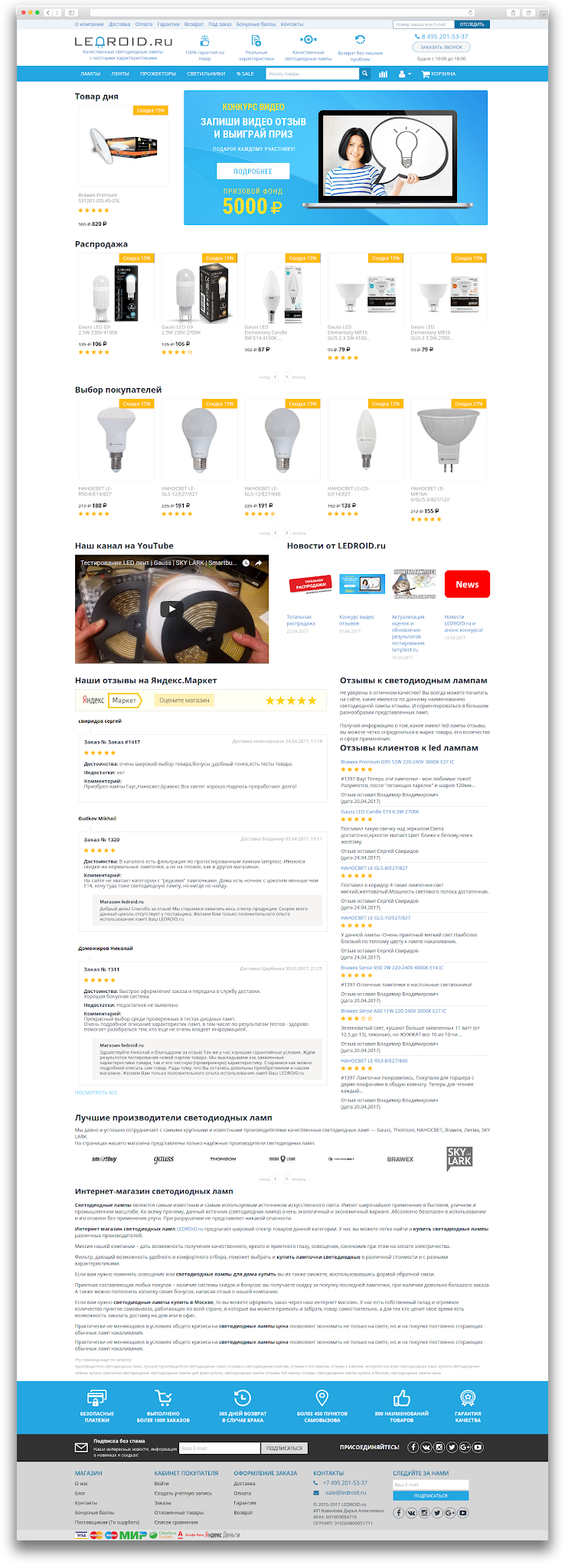
Got the following result
Home Page
Item Card
What did you get with the template? If in one sentence, it is a bunch of modules that are updated and expanded, adaptability and elaboration.
And if the points, then (copy-paste from the press release of the module):
100% Adaptability, convenience in all details. The template looks great on tablet screens in both horizontal and vertical position.
SEO optimization. Fixed CS-Cart bugs.
Fixed, adaptive top panel of the site. The panel included all the main navigation elements. When scrolling content, the panel takes a fixed position at the top of the site and allows the client to always see the menu, search, office and cart.
Perfect menu. The menu is flexible.
Three types of presentation of goods. Three types of product cards. You can choose the most appropriate look for your product.
The size of the discount affects the color of the nameplate. Marketing trick.
Buttons "Category full screen width" and "Hide filters". This functionality allows with one click to stretch the layout of the list of goods to the full width of the page, and also to hide the filter block, which will allow the buyer to focus on the choice of commodity items.
Expanded banners. Create professional, responsive banners without design skills, just copy the picture and enter texts into the editor. In 2 minutes you will get the most effective, adaptive banner in any resolutions, which can also carry SEO functions.
Banners in the category. Place banners directly in the product grid of category pages, advertise, notify, stimulate in an original and effective way, as market leaders do.
Product of the day.Create promotional items marked with a special nameplate in the lists, as well as having a countdown timer until the end of the action on their cards. Advertise them actively on the main page with the help of a special promo block.
And this is not a complete list of features of the template for $ 200.
Morality
Shashechki you or go?
The moral of the story is, the online store must sell. The design should not interfere. The site should be convenient first of all for the client.
Individual solutions are like a homemade car. It seems cool, but expensive and long. Not everyone will master. It is easier to buy a conveyor solution and finish it if necessary. Individual solutions are possible, most often these are some narrow niches.
Conclusions (points) that we have learned for ourselves:
- A mass product that the team is working on will be better than cutting something alone. Unless it's some kind of narrow task or niche.
- It is never too late to turn around and reconsider if you feel that you are going in the wrong direction.
- Do not cling to the old, try to look at things soberly.
- Time is money. While you impose something, competitors sell.
Parting words
If you decide to make your site using template solutions, then the choice of a template should be approached seriously and responsibly, as well as the choice of the engine. Be sure to find out how well tech support works with the developers of this template, how often updates come out and whether the template is generally supported. Examine the demo sites and opportunities before buying, ask for a presentation and tell you about the points of interest. Otherwise, all the advantages described above can easily become minuses.
P.S.
In monetary terms, it is difficult to say exactly how much this experiment cost us. But if we estimate that we started drawing the sketch in November 2016, we rolled out a new design for the site in February 2017. And this was not a complete version. That scale, I would rate thousands in 200-250.