10 interface design tips
Hi, Habr! I present to your attention the translation of the article " 10 Tips to Designing Perfect Forms ".
Forms play the role of a portal between the user and the system and are often the basis of the page. Authorization, registration, status updates, billing information or shipping addresses are controlled by forms. For online stores, well-designed forms play a significant role. From my own experience, good design doubles online sales.
Since forms perform important functions for the user interface, there are rules for their design.
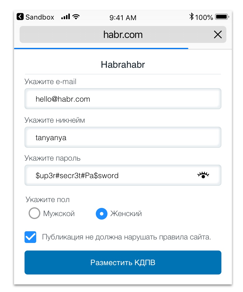
Start with the simplest element - the text field. This is the most common component of many forms, so by doing it right you are halfway there.
There are 3 main elements for the form: a text field, a title and an error message. Whatever design you choose to create them, make sure that the user knows what information is required, and if there is an error, how to get rid of it.
Trends are born and die. It is now fashionable to place placeholder as a heading. Its use, albeit not erroneously, but raises some UX (approx. "User experience") problems. The fact is that when the field is filled in, the user does not see the title.
Headings must always be seen. Therefore, they are placed on top.
Why is it above and not to the left of the data entry field?
When the title is to the left of the text field, the elements on the screen of the phone will move relative to each other. First, think about how everything will look on the phone screen.
Help the user by specifying an example in placeholder.
Another argument in favor of placing headers above the data entry field is that the user reads information along a vertical line, as according to research, this is faster than moving the view from the left to the right column.

For a standard text field, error messages are needed.
Here are 3 tips for their design:
On the client side, problems are detected when the required field is empty or the email is entered incorrectly:
Provide information on which field is in error. For security reasons, some developers do not indicate an error in your email or password during authorization, and this is absolutely normal. But when a user subscribes to a newsletter or enters his address upon purchase, indicate to him which field is incorrect and why.
Every time you draw up a text field, check how the error will look like before and after pressing the “send” button.
Inform the user if the field requires certain criteria, for example, if the password must contain a certain number of characters or combine numbers and letters.
Specify how strong the password is, whether the email is registered on the site, or if the login is not busy.

Visually, the shape looks more concise, if their combinations are used. Consider how the user will use the form from the phone.
If all fields are text, the user will have to constantly open the keyboard.
For a change, offer the user to switch from a text field to a dropdown (note: “drop-down lists”) or to radiobutton and back.
Think about how the user holds the phone, and how to eliminate the inconvenience caused by a combination of the same data entry fields.

Sometimes there is confusion when choosing a radiobutton, dropdown and checkbox.
Radiobutton is great for providing a small number of possible answers. Please select a possible answer in advance or skip this field.
Radiobutton - the best solution in the case when you can choose only one option.
When you need more items, a more appropriate option would be a dropdown (in practice - more than 5-6 responses). You can also select the default item or set the placeholder "Select item".
A checkbox is the best choice when you need to fill in only one field (for example, terms and conditions), or more than one answer option is provided. If you want to choose which promotional mailings to send to the user, the checkbox will allow you to make more than one choice.
Using a checkbox instead of a radiobutton should not limit you in user interface design decisions.
As a designer, you have enough freedom in choosing how the UI (note: “user interface”) elements will be displayed on the screen. Even if you want to somehow change the checkbox so that they are more interesting, this should not affect the user's perception.
Instead of writing text in front of small circles, you can create pictures or icons for selection.

If the goal of a business is to sell a product, then your goal as a designer is to eliminate as much as possible inconvenience between the user and the system.
Removing unnecessary fields will allow the user to make less effort.
At registration it is important to know various types of forms of payment and delivery.
If the sales department wants to know the preferences of customers, you can do this when you confirm the email.
Always look for ways to use the minimum visible fields.
If you want to optimize the online store, minimize the number of fields for the shipping address and checkout.
If you are making an interface for booking air tickets, show the user the smallest number of fields required to view available flights.
Then you can offer more conditions: the number of bags, etc.

Depending on the street name, filling in the address bar can take a lot of time, especially from the phone. Writing an address correctly can be even more difficult.
Consider using GoogleMapsAPI to automatically fill in street names. This means that the user only needs to enter a few characters and select the desired street from the list. You can also automatically fill in the zip code, based on the street name, but we will discuss this later.

Use logic to enter some information for the user to make his life easier.
If you want to fill in some fields for the user, always give him the opportunity to enter information himself. There is a possibility that you will be mistaken in something.
For example, you use GoogleMapsAPI to find a street in Germany. Knowing the name of the street, you can get the area code. However, some streets in Germany are quite large, so they cover different codes, so the information may be incorrect in the case of border streets. Always give the user the opportunity to enter data if necessary.
Using conditional logic for all countries of the world will require too much work, so you need to be aware of the meaning of their efforts. Browse the countries from which orders are most often received, and first start to optimize them. If this leads to an increase in income, do the same with the rest of the countries.

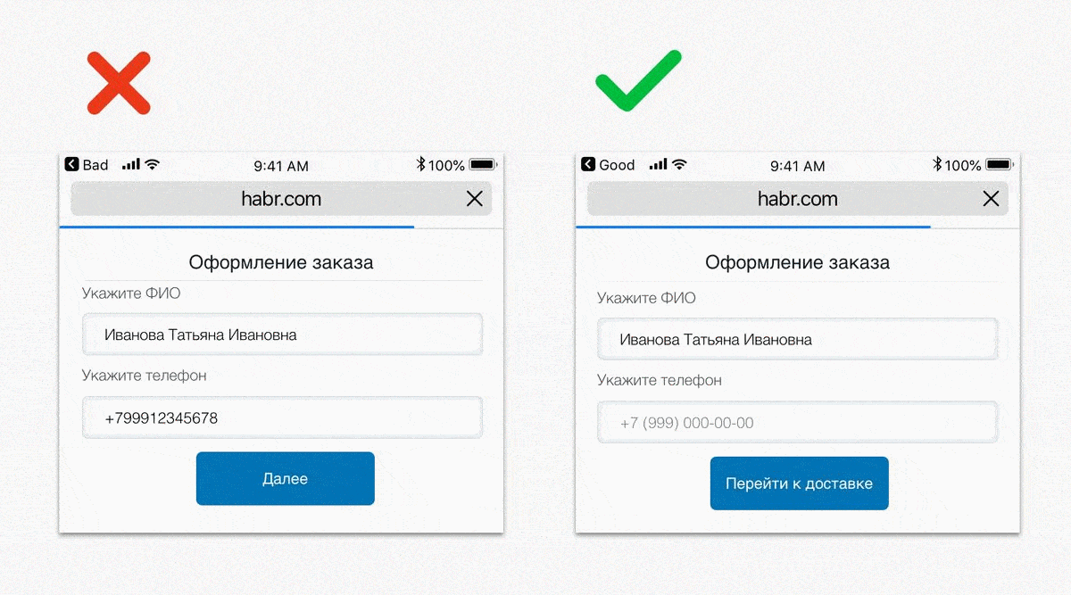
We have previously discussed that placeholder is not always used, since it disappears when you enter information. But we did not consider other ways of using it that can help the user.
Placeholder is a great opportunity to show the user how to enter information. A good example is telephone input. Does the user need to enter a country code? Or a city code?
When you need a phone or card number in a specific format, inform the user about it, providing an example of filling in the placeholder. This is a great way to troubleshoot errors by simply indicating what information is needed: a country code, etc.

If another form for entry follows after filling in, notify the user.
Instead of “Next” or “Pay” you can write “Check order” or “PayPal payment”.
Add messages indicating the following steps after clicking a button. Will the order be completed or will the user have time to check everything? Will he go to pay?
Always look for ways to bring comfort to the user, especially if it is related to his bank account.
I get annoyed every time I shop on Amazon, because I don’t get all the information, including shipping costs, until the last step. Be honest with your user. Deserve trust, providing the necessary information at each step of filling, clearly explain what to expect with further use.

Once you have launched a bright new form, continue to analyze it. If you find that many users are leaving the site, find out the reason. Conduct a survey to find out why users experience discomfort, then work on eliminating this inconvenience. For a designer, the work is never “complete”.
Sometimes the design of forms is not so interesting, but if they are done well, they can change the perception of the site or application by the user. Carefully work out the forms to make it easier for the user. Clearly give further directions, provide hints with warnings and placeholders, and offer autocompletion so that users do not type too much.
Forms play the role of a portal between the user and the system and are often the basis of the page. Authorization, registration, status updates, billing information or shipping addresses are controlled by forms. For online stores, well-designed forms play a significant role. From my own experience, good design doubles online sales.
Since forms perform important functions for the user interface, there are rules for their design.
1. Start by entering data.
Start with the simplest element - the text field. This is the most common component of many forms, so by doing it right you are halfway there.
There are 3 main elements for the form: a text field, a title and an error message. Whatever design you choose to create them, make sure that the user knows what information is required, and if there is an error, how to get rid of it.
Headings must be on top
Trends are born and die. It is now fashionable to place placeholder as a heading. Its use, albeit not erroneously, but raises some UX (approx. "User experience") problems. The fact is that when the field is filled in, the user does not see the title.
Headings must always be seen. Therefore, they are placed on top.
Why is it above and not to the left of the data entry field?
When the title is to the left of the text field, the elements on the screen of the phone will move relative to each other. First, think about how everything will look on the phone screen.
Help the user by specifying an example in placeholder.
Another argument in favor of placing headers above the data entry field is that the user reads information along a vertical line, as according to research, this is faster than moving the view from the left to the right column.
2. Error message and warnings
For a standard text field, error messages are needed.
Here are 3 tips for their design:
The error arises both because of the client, and because of the server
On the client side, problems are detected when the required field is empty or the email is entered incorrectly:
- The server checks if the given email exists;
- The user is notified of a client error before submitting the form. Errors are necessary to prevent the user from sending incorrect information.
Clarify error messages
Provide information on which field is in error. For security reasons, some developers do not indicate an error in your email or password during authorization, and this is absolutely normal. But when a user subscribes to a newsletter or enters his address upon purchase, indicate to him which field is incorrect and why.
Every time you draw up a text field, check how the error will look like before and after pressing the “send” button.
Use warnings
Inform the user if the field requires certain criteria, for example, if the password must contain a certain number of characters or combine numbers and letters.
Specify how strong the password is, whether the email is registered on the site, or if the login is not busy.
3. Use matching forms.
Visually, the shape looks more concise, if their combinations are used. Consider how the user will use the form from the phone.
If all fields are text, the user will have to constantly open the keyboard.
For a change, offer the user to switch from a text field to a dropdown (note: “drop-down lists”) or to radiobutton and back.
Think about how the user holds the phone, and how to eliminate the inconvenience caused by a combination of the same data entry fields.
4. Radio Buttons, Dropdowns and Checkboxes
Sometimes there is confusion when choosing a radiobutton, dropdown and checkbox.
Radiobutton is great for providing a small number of possible answers. Please select a possible answer in advance or skip this field.
Radiobutton - the best solution in the case when you can choose only one option.
When you need more items, a more appropriate option would be a dropdown (in practice - more than 5-6 responses). You can also select the default item or set the placeholder "Select item".
A checkbox is the best choice when you need to fill in only one field (for example, terms and conditions), or more than one answer option is provided. If you want to choose which promotional mailings to send to the user, the checkbox will allow you to make more than one choice.
Using a checkbox instead of a radiobutton should not limit you in user interface design decisions.
As a designer, you have enough freedom in choosing how the UI (note: “user interface”) elements will be displayed on the screen. Even if you want to somehow change the checkbox so that they are more interesting, this should not affect the user's perception.
Instead of writing text in front of small circles, you can create pictures or icons for selection.
5. If possible, exclude optional input fields.
If the goal of a business is to sell a product, then your goal as a designer is to eliminate as much as possible inconvenience between the user and the system.
Removing unnecessary fields will allow the user to make less effort.
At registration it is important to know various types of forms of payment and delivery.
If the sales department wants to know the preferences of customers, you can do this when you confirm the email.
Always look for ways to use the minimum visible fields.
If you want to optimize the online store, minimize the number of fields for the shipping address and checkout.
If you are making an interface for booking air tickets, show the user the smallest number of fields required to view available flights.
Then you can offer more conditions: the number of bags, etc.
6. Use autocomplete for large forms.
Depending on the street name, filling in the address bar can take a lot of time, especially from the phone. Writing an address correctly can be even more difficult.
Consider using GoogleMapsAPI to automatically fill in street names. This means that the user only needs to enter a few characters and select the desired street from the list. You can also automatically fill in the zip code, based on the street name, but we will discuss this later.
7. Use conditional logic
Use logic to enter some information for the user to make his life easier.
- If the user's country is known, the design may contain additional fields (“state” if you are in the USA, “county” - in Ireland, etc.)
- Use the zip code to enter the name of a city, state or province
- If you calculate the user's country by IP address, is it possible to insert the country code in the phone field?
If you want to fill in some fields for the user, always give him the opportunity to enter information himself. There is a possibility that you will be mistaken in something.
For example, you use GoogleMapsAPI to find a street in Germany. Knowing the name of the street, you can get the area code. However, some streets in Germany are quite large, so they cover different codes, so the information may be incorrect in the case of border streets. Always give the user the opportunity to enter data if necessary.
Using conditional logic for all countries of the world will require too much work, so you need to be aware of the meaning of their efforts. Browse the countries from which orders are most often received, and first start to optimize them. If this leads to an increase in income, do the same with the rest of the countries.
8. Use Placeholder correctly
We have previously discussed that placeholder is not always used, since it disappears when you enter information. But we did not consider other ways of using it that can help the user.
Placeholder is a great opportunity to show the user how to enter information. A good example is telephone input. Does the user need to enter a country code? Or a city code?
When you need a phone or card number in a specific format, inform the user about it, providing an example of filling in the placeholder. This is a great way to troubleshoot errors by simply indicating what information is needed: a country code, etc.
9. Report the following steps
If another form for entry follows after filling in, notify the user.
Instead of “Next” or “Pay” you can write “Check order” or “PayPal payment”.
Add messages indicating the following steps after clicking a button. Will the order be completed or will the user have time to check everything? Will he go to pay?
Always look for ways to bring comfort to the user, especially if it is related to his bank account.
I get annoyed every time I shop on Amazon, because I don’t get all the information, including shipping costs, until the last step. Be honest with your user. Deserve trust, providing the necessary information at each step of filling, clearly explain what to expect with further use.
10. Keep looking for ways to optimize.
Once you have launched a bright new form, continue to analyze it. If you find that many users are leaving the site, find out the reason. Conduct a survey to find out why users experience discomfort, then work on eliminating this inconvenience. For a designer, the work is never “complete”.
Conclusion
Sometimes the design of forms is not so interesting, but if they are done well, they can change the perception of the site or application by the user. Carefully work out the forms to make it easier for the user. Clearly give further directions, provide hints with warnings and placeholders, and offer autocompletion so that users do not type too much.