 November 15, 2012 at 04:33
Responsive Layout Types
Every day there are more and more sites with adaptive layout. When designing such a design, the first thing a developer thinks about is a general presentation of content on devices with different screen sizes. In this article, I described some types (layouts) of adaptive layouts.
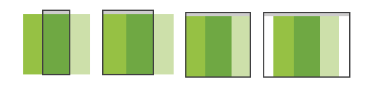
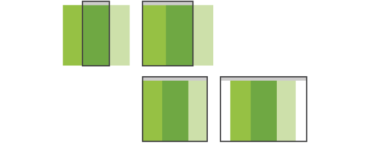
Rubber
A simple to implement and user-friendly type of presentation of content. The main blocks are compressed to the width of the screen of the mobile device, where this is not possible - they are rebuilt into one long tape. This layout is very simple to implement using responsive CSS frameworks such as Twitter Bootstrap.
Examples:
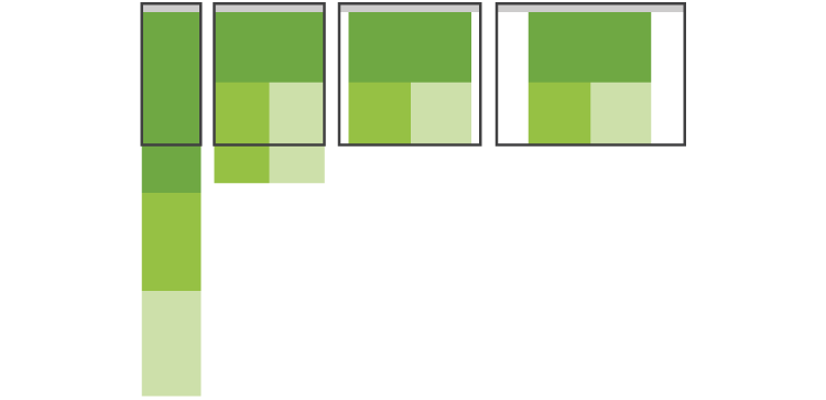
Block Migration
An obvious way for a multi-column site: when the screen width is reduced, additional blocks (sidebars) are transferred to the bottom of the layout.
Examples:
Switch layouts
This method is most convenient when reading a site from various devices: a separate layout is developed for each screen resolution. The method is time-consuming, therefore less popular than the previous two.

Examples:
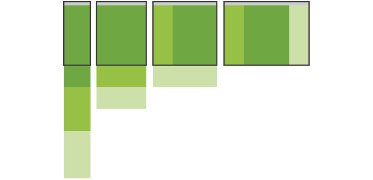
Small blood adaptability
A very simple way that is suitable for simple sites. Achieved by elementary scaling of images and typography. Not very popular because not flexible.

Examples:
Panels
A method that came from mobile applications, where an additional menu may appear with horizontal or vertical tapas. The main drawback is the non-obviousness of actions for the user: it is very unusual to see mobile navigation on a website. But I think that over time the method will become quite popular.
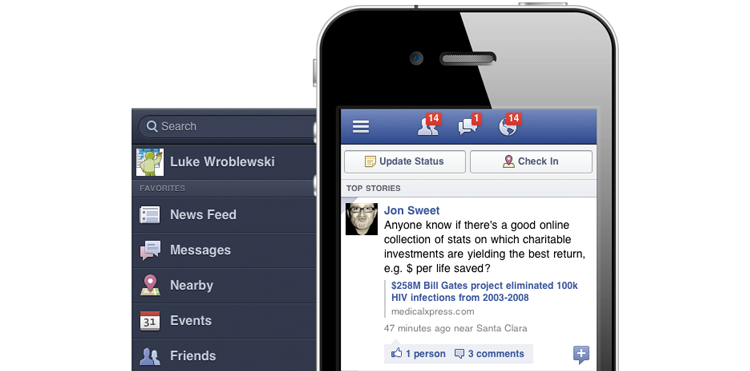
An example of panels in a mobile application:
An example of panels on sites:
The above mock-ups are not universal solutions, for each project it is necessary to choose the most suitable method for the needs and possibilities.
Useful sites:
- mediaqueri.es - gallery of responsive sites
- Blog with the original Luke Wroblewski
- Brad Frost Blog