The best interface is the lack of an interface
- Transfer
“Atmadm”
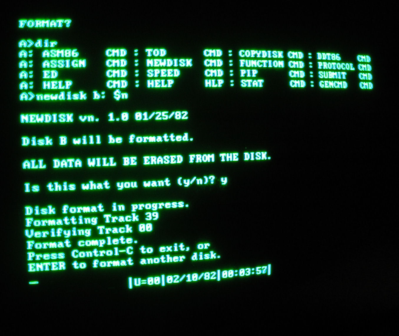
Previously, our work was a nightmare from a heap of letters.
“Chkntfs”
“dir”

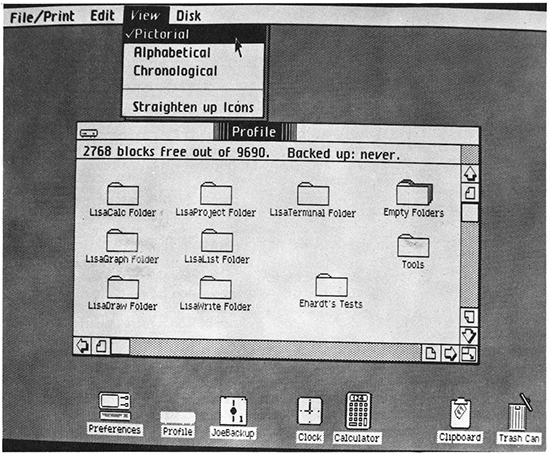
Then, in 1984, adapting Xerox WIMP PARK , Apple threw us forward a galactic leap away from these terrible DOS command lines, into the world of graphical user interfaces [PI].
 Apple Lisa We seemed to see clearly. And later, ten years later, when we were able to touch the Palm Pilot instead of moving the mouse, we were even more impressed. But today, our love of digital interfaces is out of control. The interface was the answer to every design problem. How to make a car better? Get the interface on it. 
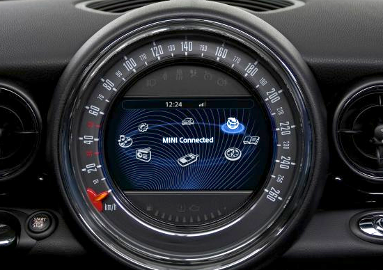
BMW Mini Cooper Speedometer
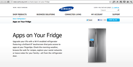
 Who will give up on Twitter’s speedometer capabilities? How to make a refrigerator better? Weak interface on it.  “Bleed your life” with an improved refrigerator door.  I love to watch my tweets while pouring some water from the refrigerator. How to improve the hotel lobby? Put the interface into it. A giant touchscreen with news and weather is exactly what I was so missing during my stay at the hotel. Creative thinking in technology should focus on problem solving, rather than just making interfaces. As said


Donald Norman in 1990, “The main problem with the interface is that it is an interface. Interfaces are obstacles in the way. I do not want to focus on the interface. I want to focus on work ... I don’t want to be aware of myself using a computer, I want to be aware of myself doing a thing. ”
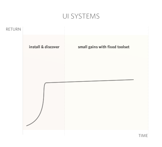
It is time for us to cross the line of screens-based thinking. Because when we think in screens, we create a design based on a model that is inherently unnatural, inhuman, and reduces satisfaction. It takes a lot of talent, money and time to make these systems even a little more convenient, and, despite all the efforts made, the programs, unfortunately, improve only after a thorough rework.
But there is a better way: Without Interface [BI]. This design methodology, which aims to create a radically simple technological future without digital interfaces. Following three simple principles, we will be able to design smarter, more convenient systems that will make our lives better.
Recently, some car companies have developed their own smartphone apps that open the door of a car. Typically, an unlock feature works as follows:
Thirteen steps later, she finally managed to get into her car.
The application forces the driver to use her phone. She needs to learn a new interface. This new interaction is designed in a sequence pleasing to the computer, and not to the person.
If we exclude PI, then only three natural steps remain.
Everything else besides these three steps is not commendable.
Sound crazy? Well, that’s how Mercedes-Benz decided in 1999 . Watch the first 22 seconds of this incredibly sensible (but absolutely not attractive) demonstration:
Thank you, Chris.
After reframing from the design limitations of iPhone resolution in favor of our natural sequence of actions, Mercedes created an incredibly intuitive and elegant access to the car. The car feels that a key is nearby and the door opens without unnecessary additional actions.
This is good design thinking. Indeed: in solving everyday tasks, the best interface is the lack of an interface.
Another example.
Several companies, including Google , have developed smartphone apps that allow users to pay merchants using NFS . Here's how it works:
If we exclude PI, we again get only three natural steps:
Ordering food from a person at the front desk is a natural interaction. And that’s enough to pay with Auto Tab in Payment-so-Square. Take a look starting at 2:08.
Auto Taboo in Pay-Square Of course, at first it takes a little PI. But thanks to the "background" determination of the location, the user does not interact with the PI, and can simply perform its natural sequence of actions.
As Jack Dorsey from Square explained above: “NFS is just something else that you have to do. These are the other actions you need to perform. And in fact, these actions are not peculiar to humans: swipe the device around another device and wait for the beep. It even feels wrong. ”
The absence of PI means that machines should help us instead of adapting to them.
In PI, we also encounter unnatural methods of interaction, which are modeled for the needs of the computer. We have to manage complex databases to get simple information. We must remember countless passwords with rules such as one uppercase letter, two numbers and a punctuation mark. And more importantly, we are constantly moving away from those things that we would really like to do.
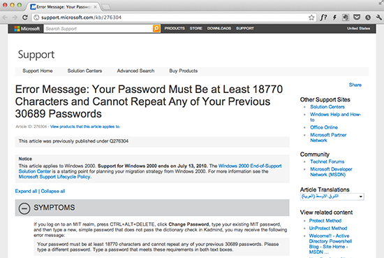
Password request in Windows 2000.
Working on the principle of No PI, the design focuses on your needs. There is no interface for the sake of the interface itself. Instead, computers serve you.
Your car door unlocks when you approach it. Your TV will turn on the channel you want to watch. Your alarm clock will set itself up and even wake you up exactly during the REM sleep phase.
Even your car will let you know when something is wrong:
When we discard screen-dependent thinking, we develop design solely for human needs. In the end, a good interaction design does not consist of good screens; it consists of good interactions.
I know: you are beautiful. You are a unique , incredibly complex individual, full of personal interests and desires.
Therefore, to develop an excellent PI individually for you is very difficult. For this we need knowledgeable leaders, serious research, deep insight ... frankly, this is not a simple test.
So why do companies spend millions of dollars just to create interfaces that are unnatural in nature, figuring out what’s natural for you? And what is even more surprising: why do they continue to do this when PIs often do not meet expected satisfaction rates?
Remember when you first signed up for Gmail. Once, when you discovered innovative features such as viewing discussions, you were very impressed. But over time, satisfaction declined. The interface is out of date.
Unfortunately, out of all possible solutions to the problem, Google chose the most banal version of the next round of development, forcing its designers and engineers to spend an incredible amount of time and effort on redesign. And after they do this, you will encounter painful learning how to interact with the new interface; some things will work better, and some worse.
In contrast, BI systems, on the contrary, focus on you. These systems are not attached to screens, but instead are capable of growing organically and quickly according to your needs.
Let's talk for example about the Trunk Club .
This is a fashion startup.
They do not position themselves as a service, a development company or an app maker. This is an important installation that has been lost today by most startups. This means that they serve people, not screens.
And since we are going to talk about the Trunk Club, I’ll mention some of the similar ones: Bombfel , Anskraff , Swag of the Mans and Maine Pax .
After logging in to the Trunk Club, you will have an introductory dialogue with the stylist. Then they will send you the first batch of clothes. If you like it, leave it; if not, return it. Considering what you leave and what you return, the Trunk Club will learn more and more about you, each time offering more successful options.
Does user satisfaction drop over time? No, satisfaction is growing.
 

Without a cumbersome PI site, it’s easier to become more and more relevant. For fashion, the best interface is the lack of an interface.
Another company focusing on adapting to your needs is Nest.
When I first saw Nest, it seemed to me that they simply jammed the interface on the thermometer and called it "innovation."
Over time, the need to use the Nest interface is minimized.
What is most surprising in the Nest thermostat is that he does not want to have PI.
Nest is studying you. It keeps track of when you wake up, what temperature do you prefer during the day. Nest has worked hard to eliminate the need for his interface by monitoring you.
The foundation of the BI was laid by numerous members of the design community.
In 1988, Mark Weiser of Xerox PARK came up with "ubiquitous computing calculations." In 1995, it became part of his abstract model at Kalm Technology :
In 1998, Donald Norman wrote his Invisible Computer . From the publisher’s site :
In 1999, Kevin Ashton delivered a speech on the Internet of Things. Here are his words :
Today we have practically all the necessary technologies to achieve most of these goals.
This year, Amber Case talked about Wiser-anticipated background positioning.
We can achieve a lot today even with the most basic tools.
Previously, our work was a nightmare from a heap of letters.
“Chkntfs”
“dir”

Then, in 1984, adapting Xerox WIMP PARK , Apple threw us forward a galactic leap away from these terrible DOS command lines, into the world of graphical user interfaces [PI].
 Apple Lisa We seemed to see clearly. And later, ten years later, when we were able to touch the Palm Pilot instead of moving the mouse, we were even more impressed. But today, our love of digital interfaces is out of control. The interface was the answer to every design problem. How to make a car better? Get the interface on it. 
BMW Mini Cooper Speedometer
 Who will give up on Twitter’s speedometer capabilities? How to make a refrigerator better? Weak interface on it.  “Bleed your life” with an improved refrigerator door.  I love to watch my tweets while pouring some water from the refrigerator. How to improve the hotel lobby? Put the interface into it. A giant touchscreen with news and weather is exactly what I was so missing during my stay at the hotel. Creative thinking in technology should focus on problem solving, rather than just making interfaces. As said
Donald Norman in 1990, “The main problem with the interface is that it is an interface. Interfaces are obstacles in the way. I do not want to focus on the interface. I want to focus on work ... I don’t want to be aware of myself using a computer, I want to be aware of myself doing a thing. ”
It is time for us to cross the line of screens-based thinking. Because when we think in screens, we create a design based on a model that is inherently unnatural, inhuman, and reduces satisfaction. It takes a lot of talent, money and time to make these systems even a little more convenient, and, despite all the efforts made, the programs, unfortunately, improve only after a thorough rework.
But there is a better way: Without Interface [BI]. This design methodology, which aims to create a radically simple technological future without digital interfaces. Following three simple principles, we will be able to design smarter, more convenient systems that will make our lives better.
Principle 1: Give up the interface in favor of the natural process.
Recently, some car companies have developed their own smartphone apps that open the door of a car. Typically, an unlock feature works as follows:
- The driver approaches the car
- Pulls out her smartphone from her purse.
- Turns on the phone
- Swipe to unlock
- Enters a password in the phone
- Scrolls through a sea of icons trying to find the right application
- Click the icon of the desired application
- Waiting for application download
- Looks at the application and tries to figure out (or remembers) how it works.
- Determines which menu is best to go to open the door and presses it.
- Presses the door unlock button
- Door unlocks
- She opens the car door
Thirteen steps later, she finally managed to get into her car.
The application forces the driver to use her phone. She needs to learn a new interface. This new interaction is designed in a sequence pleasing to the computer, and not to the person.
If we exclude PI, then only three natural steps remain.
- The driver approaches the car;
- The car door unlocks;
- She opens the car door.
Everything else besides these three steps is not commendable.
Sound crazy? Well, that’s how Mercedes-Benz decided in 1999 . Watch the first 22 seconds of this incredibly sensible (but absolutely not attractive) demonstration:
Thank you, Chris.
After reframing from the design limitations of iPhone resolution in favor of our natural sequence of actions, Mercedes created an incredibly intuitive and elegant access to the car. The car feels that a key is nearby and the door opens without unnecessary additional actions.
This is good design thinking. Indeed: in solving everyday tasks, the best interface is the lack of an interface.
Another example.
Several companies, including Google , have developed smartphone apps that allow users to pay merchants using NFS . Here's how it works:
- The buyer enters the shop;
- Orders a sandwich;
- Pulls out a smartphone from his pocket;
- Turns on the phone;
- Swipes the screen to unlock;
- Enters a password into the phone;
- Scrolls through a sea of icons trying to find the Google Vollet application;
- Click the icon of the desired application;
- Waiting for the application to download;
- He looks at the application and tries to figure out (or remembers) how it works;
- It is determined which menu is better to go to find your credit cards connected to Google Vollet. In this example, “payment types”;
- Scrolls through the screens to find the desired credit card;
- Click on the selected credit card;
- Finds an NFS-reader near the cash register;
- Attaches your smartphone to an NFS-reader for payment;
- He sits down and eats his sandwich.
If we exclude PI, we again get only three natural steps:
- The buyer enters the shop;
- Orders a sandwich;
- He sits down and eats his sandwich.
Ordering food from a person at the front desk is a natural interaction. And that’s enough to pay with Auto Tab in Payment-so-Square. Take a look starting at 2:08.
Auto Taboo in Pay-Square Of course, at first it takes a little PI. But thanks to the "background" determination of the location, the user does not interact with the PI, and can simply perform its natural sequence of actions.
As Jack Dorsey from Square explained above: “NFS is just something else that you have to do. These are the other actions you need to perform. And in fact, these actions are not peculiar to humans: swipe the device around another device and wait for the beep. It even feels wrong. ”
Principle 2: Use computers instead of servicing them.
The absence of PI means that machines should help us instead of adapting to them.
In PI, we also encounter unnatural methods of interaction, which are modeled for the needs of the computer. We have to manage complex databases to get simple information. We must remember countless passwords with rules such as one uppercase letter, two numbers and a punctuation mark. And more importantly, we are constantly moving away from those things that we would really like to do.

Password request in Windows 2000.
Working on the principle of No PI, the design focuses on your needs. There is no interface for the sake of the interface itself. Instead, computers serve you.
Your car door unlocks when you approach it. Your TV will turn on the channel you want to watch. Your alarm clock will set itself up and even wake you up exactly during the REM sleep phase.
Even your car will let you know when something is wrong:
When we discard screen-dependent thinking, we develop design solely for human needs. In the end, a good interaction design does not consist of good screens; it consists of good interactions.
Principle 3: Build systems that adapt to people.
I know: you are beautiful. You are a unique , incredibly complex individual, full of personal interests and desires.
Therefore, to develop an excellent PI individually for you is very difficult. For this we need knowledgeable leaders, serious research, deep insight ... frankly, this is not a simple test.
So why do companies spend millions of dollars just to create interfaces that are unnatural in nature, figuring out what’s natural for you? And what is even more surprising: why do they continue to do this when PIs often do not meet expected satisfaction rates?
Remember when you first signed up for Gmail. Once, when you discovered innovative features such as viewing discussions, you were very impressed. But over time, satisfaction declined. The interface is out of date.

Unfortunately, out of all possible solutions to the problem, Google chose the most banal version of the next round of development, forcing its designers and engineers to spend an incredible amount of time and effort on redesign. And after they do this, you will encounter painful learning how to interact with the new interface; some things will work better, and some worse.
In contrast, BI systems, on the contrary, focus on you. These systems are not attached to screens, but instead are capable of growing organically and quickly according to your needs.
Let's talk for example about the Trunk Club .
This is a fashion startup.
They do not position themselves as a service, a development company or an app maker. This is an important installation that has been lost today by most startups. This means that they serve people, not screens.
And since we are going to talk about the Trunk Club, I’ll mention some of the similar ones: Bombfel , Anskraff , Swag of the Mans and Maine Pax .
After logging in to the Trunk Club, you will have an introductory dialogue with the stylist. Then they will send you the first batch of clothes. If you like it, leave it; if not, return it. Considering what you leave and what you return, the Trunk Club will learn more and more about you, each time offering more successful options.
Does user satisfaction drop over time? No, satisfaction is growing.
 Without a cumbersome PI site, it’s easier to become more and more relevant. For fashion, the best interface is the lack of an interface.
Another company focusing on adapting to your needs is Nest.
When I first saw Nest, it seemed to me that they simply jammed the interface on the thermometer and called it "innovation."
Over time, the need to use the Nest interface is minimized.
What is most surprising in the Nest thermostat is that he does not want to have PI.
Nest is studying you. It keeps track of when you wake up, what temperature do you prefer during the day. Nest has worked hard to eliminate the need for his interface by monitoring you.
In my opinion, I already heard this somewhere ...
The foundation of the BI was laid by numerous members of the design community.
In 1988, Mark Weiser of Xerox PARK came up with "ubiquitous computing calculations." In 1995, it became part of his abstract model at Kalm Technology :
“The influence of technology will intensify many times, as they are embedded in the matter of everyday life. With the development of technology, they will become more and more embedded and invisible, they will calm our lives, removing troubles, while maintaining our connection with what is really important. ”
In 1998, Donald Norman wrote his Invisible Computer . From the publisher’s site :
“... Norman shows why a computer is so difficult to use and why this complexity is fundamental in its nature. The only answer, Norman says, is to start re-developing information devices that fit the needs of people and their lives. ”
In 1999, Kevin Ashton delivered a speech on the Internet of Things. Here are his words :
“If we had computers that knew everything there was to know about things, then using the data they collected without our help, we could track and calculate everything, and significantly reduce costs, losses and expenses.”
Today we have practically all the necessary technologies to achieve most of these goals.
This year, Amber Case talked about Wiser-anticipated background positioning.
We can achieve a lot today even with the most basic tools.