What should the reader do for you to read more?
I am an interface designer, and when things piss me off, I draw them a new interface. Usually this does not affect the problem, but it becomes easier.
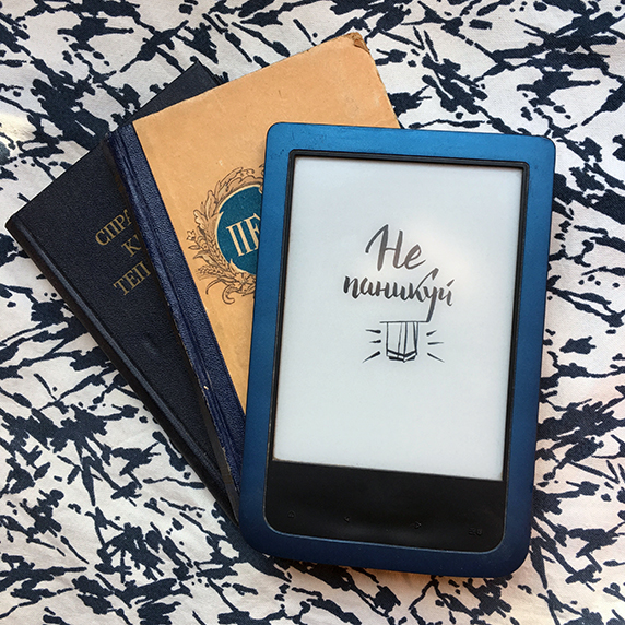
So, once they gave me a reading room.
Consider slow screen
The interface for the reader is difficult to do, because the e-ink screen (and the reading room stuffing) react painfully slow. It feels like the reader's response is 3-4 times longer than that of a smartphone.
All complex gestures and animations should be disposed of as far as possible.
For example, the size of the text increases if you put two fingers on the reader and dissolve. This works with photos, but it’s impossible to set 13 point size instead of 12, and the gesture is recognized randomly in 100% of cases.
Suggest the next step
I noticed that when I started the book, I read every day (and night) and everything is fine. The most problematic place is the gap between the books. It may take several weeks or months between the end of one and the beginning of a new one.
This fallout is a problem point, and the reader needs to be caught there.
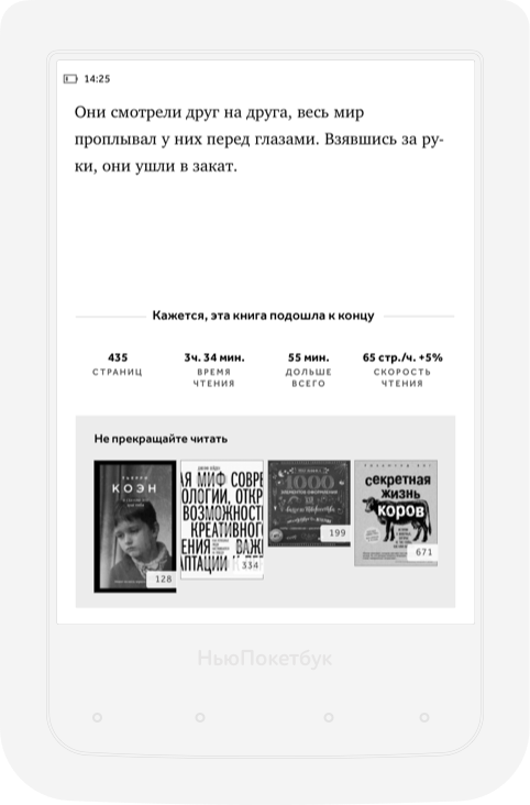
On the last page we show the unread books of the same author, books of a similar genre, books from the same folder. Any books.
The truth is not clear where to show this block: often in books after the main content there are notes or tables of contents. That is, the book is actually read, but until the end of another 50 pages.

It would be cool to recognize the beginning of the notes and show the entire binding at the end of the text, and not at the end of the book.
Bookmate used to simply ask for a book review on 98% of the book. But the decision is not very beautiful, because there is the most drama, and then some pop-ups. Now they ask after the last page. The phone is easy to squander up to 100%, the reader tach gestures handles unpleasantly. In fact, it seems that the system could recognize the title “notes”.
Remove flour choice
You can add a randomizer button that will issue a random book card from the unread.
“I downloaded 10 new books, I'm too lazy to choose, let's at least something”
Show statistics
This month you read 17 pages - I could see on the screen of my reader, be ashamed, and start reading. But the poketbook does not collect statistics (or collects, but does not show). Kindle collects some stupid statistics, but at least something. But we can collect unrealistically cool facts! For example, how different is the reading speed of books with the genre of nauchpop and romance novels. What book I reread the most times. What day of the week I usually read more.
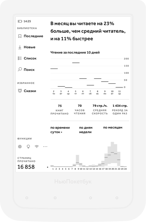
Of course, statistics and tracking should be completely disabled.
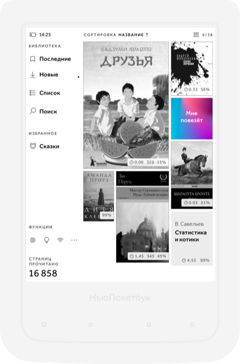
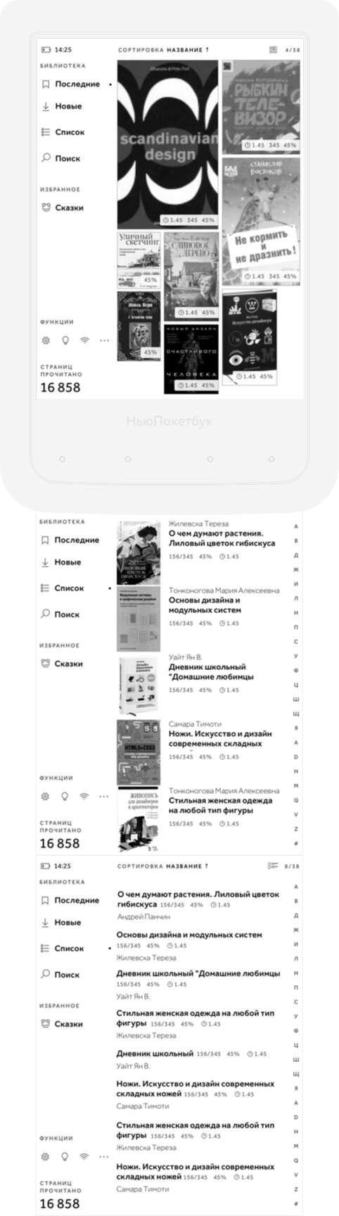
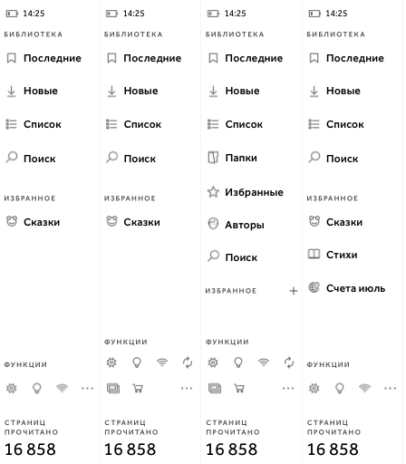
Simplify navigation
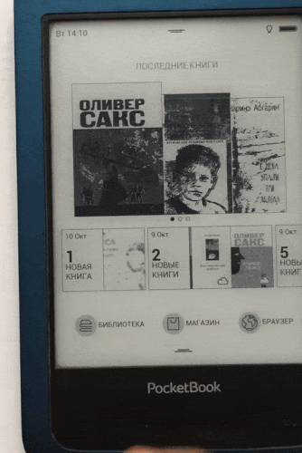
Now the navigation is arranged like this: on the main page you can see a few of the most recently read and downloaded books. And in the library, books are shown in a list, where they can be sorted according to several parameters.
Make the list clearer and “cleaner”
People choose books very differently: someone scrolls through the list with the names, and it is more convenient for someone to choose by the cover, as in a bookstore. For each you need to make your own way of display. But I think the default should be with a magazine layout (well, I'm a designer after all).
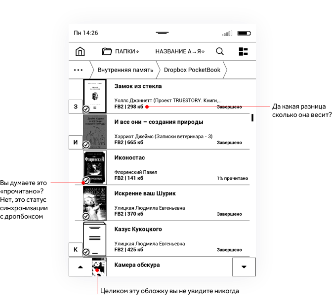
Add useful information about books
About the book, you can show something more interesting than the weight in kilobytes. For example: “The book has 334 pages, you will spend about 4 hours on reading” or “You have read 45% of the book, the remaining 64 pages will take 50 minutes.”

By the way, if we learn from statistics to track which book we read faster, slower, more often, saving more quotes, making more bookmarks, then we can show these statuses with the help of badges.
Help quickly navigate through the list of folders
I like Noushen’s approach, which assigns a random small picture to each folder. The picture is easy to remember, and it seems it will help to orient if there are a lot of folders.
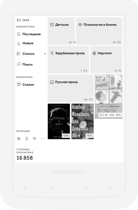
The folder can be chosen, and then it will appear in quick access to the menu on the left. By the way, it also has quick access to all technical functions (which can be shown or hidden), and smart folders.
Help solve this book or not
There is almost always a summary on the cover of a bookstore to quickly understand what the book is about. If you go to the menu, you can also find such a page in the package, but it is small, inconvenient, and there is no motivation to go there.
- But in the book we just open the book and read the first couple of pages!
- In the reading room it does not work, especially if you choose from several books - a large book loads 10 seconds, you can die. Easier to show annotation and brief info about the book.
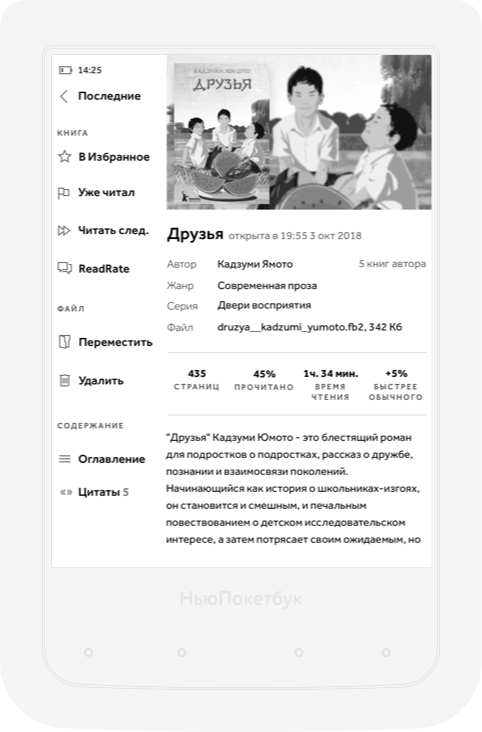
On the same page there is a quick access to all actions that can be done with the book, and in the sheet below you will see the saved quotes.
Remind
I do not like push-notifications and mailing (except the one where a man writes about wine). But I am pleased to receive a newsletter from Rescyutaim, which says how much Isat in youtube I worked this week because it concerns me.
Perhaps sending out questions with questions about whether the downloaded books were able to read will also not be annoying.
Make a normal built-in online store
But this I will try next time - too big a task.
- I drew these pictures, deeply studying the behavior of users in the amount of two and a half pieces. Surely, in something wrong, and a lot of people use the reader is not so. If you are one of them, tell us what you are missing and what in my interface seems strange and inconvenient to you.
- I do not work in Poketbuk (a pity), and all these pictures are irrelevant to reality.