 October 8, 2012 at 00:38
CSS multi-column details
- Transfer
- Tutorial
In continuation of my topic New in CSS3: multi-column, flexbox, grid layout, I suggest you translate the article with a deeper immersion in the multi- column property with simple and illustrative examples.
It has been proved in practice by newspapers and magazines that text divided into several columns is perceived much easier. Until recently, it was a problem to display content on web pages in such a way, it reached the point where the layout designer split the text into several divs. But things can get a lot easier with the CSS3 Multi Column Module.
Official specification , browser support .
Use the HTML5 article tag :
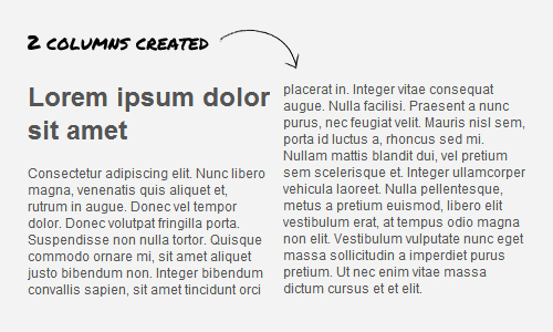
We break the text into two columns:
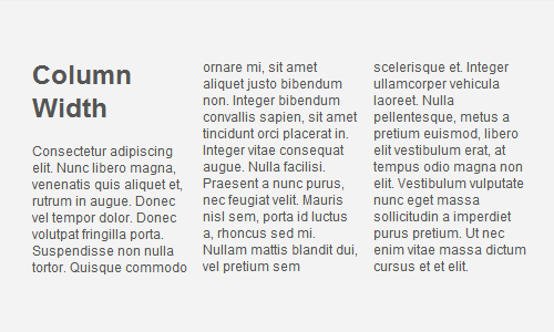
Using the column-width property, you can set the columns to the required width:
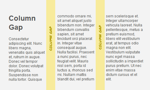
The interval is set by the column-gap property in px or em, and cannot be negative:
The column-rule property allows you to add a separator between columns, the principle of operation is similar to border .
The column-span property works similarly to colspan in table , combining the desired columns.
+ sources .
Thanks to the CSS3 Multi Column Module, you can very easily and quickly split texts into human-readable columns. The list of supported browsers is already sufficient to try multicolumn on working projects. For older browsers, you can use a special javascript library .
It has been proved in practice by newspapers and magazines that text divided into several columns is perceived much easier. Until recently, it was a problem to display content on web pages in such a way, it reached the point where the layout designer split the text into several divs. But things can get a lot easier with the CSS3 Multi Column Module.
Official specification , browser support .
Create multi-column content
Use the HTML5 article tag :
    Lorem ipsum dolor sit amet, consectetur adipiscing elit. Nunc libero magna, venenatis quis aliquet et,
    rutrum in augue. Donec vel tempor dolor. Donec volutpat fringilla porta. Suspendisse non nulla tortor.
    Quisque commodo ornare mi, sit amet aliquet justo bibendum non. Integer bibendum convallis sapien, sit
    amet tincidunt orci placerat in. Integer vitae consequat augue.
    //и т.д.
We break the text into two columns:
article {
    -webkit-column-count:2;
    -moz-column-count:2;
    column-count:2;
}
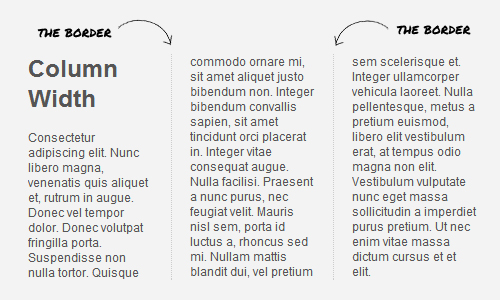
Using the column-width property, you can set the columns to the required width:
article {
    -moz-column-width: 150px;
    -webkit-column-width: 150px;
    column-width: 150px;
}
Column spacing
The interval is set by the column-gap property in px or em, and cannot be negative:
article {
    -webkit-column-gap: 30px;
    -moz-column-gap: 30px;
    column-gap: 30px;
}
Column separator
The column-rule property allows you to add a separator between columns, the principle of operation is similar to border .
article {
    -moz-column-rule: 1px dotted #ccc;
    -webkit-column-rule: 1px dotted #ccc;
    column-rule: 1px dotted #ccc;
}
Column Association
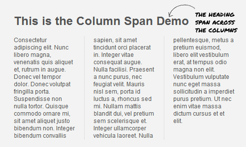
The column-span property works similarly to colspan in table , combining the desired columns.
article h1 {
    -webkit-column-span: all;
    column-span:all;
}
Demo of all examples
+ sources .
Total
Thanks to the CSS3 Multi Column Module, you can very easily and quickly split texts into human-readable columns. The list of supported browsers is already sufficient to try multicolumn on working projects. For older browsers, you can use a special javascript library .