 September 21, 2012 at 15:17
We consider the width of the screens for site visitors
Introduction
Recently I was discussing with a designer girl under what screen sizes should draw websites. Our arguments were, to put it mildly, unreasonable:
- My site on my home computer is too wide, I need to make it under a wide screen.
- It is necessary to do under small screens. A lot of people are surfing the Internet from mobile devices. Almost no one has large monitors.
- Yes, a lot of people with such monitors! All my friends have big monitors.
- Yes, you have friends - designers and photographers. But the people do not have such monitors!
It is clear that we needed more compelling arguments - it is time to turn to statistics.
Count
There are a number of sites that provide access to the collected data about their visitors. One of these sites is the former SpyLog, and now Openstat, which also displays a report on screen resolution . The data there, at first glance, are not very useful: knowing that the most popular resolution - 1366 × 768 - is found in 19 percent of visitors will help me a little. But we can get this data as a separate file that we can process. There are 4 formats available - PDF, XLS and two text: CSV and Tab separated, called tsv here, which we will take.
Most of the file is lines of the form
1366x768 4097016,19 18,43 % 263923118 1147661296wget 'https://www.openstat.ru/rest/v0.3/ct:openstat:trends/display/columns/20120820-20120920?column=0%0Dvisitors_sum_average&column=0%0Dvisitors_sum_average_verticalpercent&column=0%0Dsessions_sum&column=0%0Dpageviews_sum&primary_column=0&view_id=1810&format=tsv' -O - \
| perl -nlaF'\t' -MList::Util=max \
-e '$F[0]=~s/x.*//||next;$sum{$F[0]}+=$F[4];END{for$k(0..max(keys%sum)){print"$k\t$sum{$k}"}}'
We get a list of pairs of width and total number of visitors:
0
1 445931
2
3
4
5
6
7
8
9
10 29183
eleven
...
It is clear that there is no sense in taking into account all possible values of the width - it is necessary to evaluate the value ranges. Let us calculate the sum of the number of visitors having a certain screen width with the number of visitors having screens of smaller width. You can do this in any office suite (in my case - LibreOffice), in it you can immediately build a schedule. The resulting table with the graph is ge.tt/9iHIH8O (110 kilobytes).
Lightly embellish the graph - add labels of popular values:
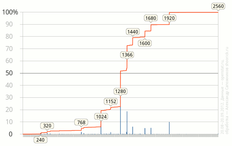
Some conclusions
- As of September 2012, the most popular (29%) width is 1280 points, in addition, a little more than half of the visitors have monitors with a width not exceeding 1280 points. On the other hand, the number of people with large monitors, wider than 1280 pixels, is also very large and is approaching half.
- Other widespread values are 1366 (19%), 1024 (13%), 1920 (10%).
- More than 80% of site visitors have screens up to 1600 pixels wide. Screens wider than 1920 pixels are still very rare - their share is about a quarter percent.
- The width of “almost 800 dots”, which was popular among web designers 10-15 years ago, is now found in about five percent of cases, and even then most of them are mobile devices.
- Based on the fact that the share of Opera Mini browser by some counters (for example liveinternet.ru ) is estimated at more than 12 percent (openstat estimates it much more modestly - 3.75%), we can assume that the share of mobile devices and, as a result, small screens , still higher than on this graph. It seems that devices with Opera Mini just do not fall into the statistics - several years ago there was no JavaScript in it.