UX-challenge: designing a mobile bank application in 5 days
Not long ago, Alfa-Bank Ukraine held a contest, inviting everyone to design a design concept for a mobile bank for two use cases, apparently realizing that their current application does not meet users' expectations.
Special emphasis in the contest description was made on UX, so the task seemed interesting to us. True, from the moment of acquaintance with the competition and the deadline for accepting applications it was only 5 days. Well, the challenge is accepted.
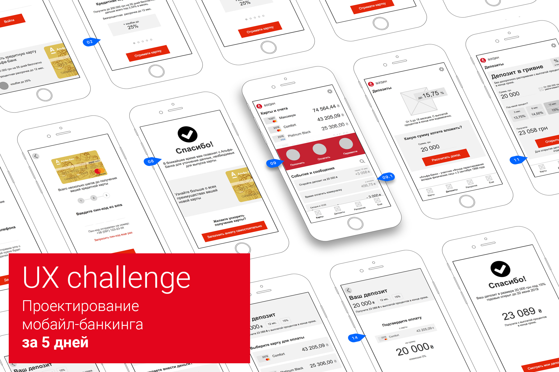
Under the cut is a long but useful story about designing a mobile bank interface in a short time. Those who master it awaits a bonus at the end.
There was no time for full-fledged research, so a simple way was chosen: an analysis of existing marketing activities, receiving advice on products with a call center, interviews with several bank customers and corridor testing of the prototype.
The design concept was based on the UCD methodology. Key tools:
The first proposed use case sounded like this:
Insight # 1
According to the proposed case, the user needs a credit card, so you can safely remove 9 debit cards. 8 left - already easier.
Insight # 2
On closer inspection, it turned out that 8 credit cards are slightly different from each other. But there is one that has the maximum benefits and has the strongest marketing support.
Given the context of the card order and use case, it is advisable to offer the user only one card, demonstrating its clear advantages. This approach greatly simplifies the interaction with the interface, and therefore increases the conversion. And most importantly - it corresponds to the existing marketing strategy of the bank.
Total: our task is to “sell” only one, but the most “tasty” credit card.
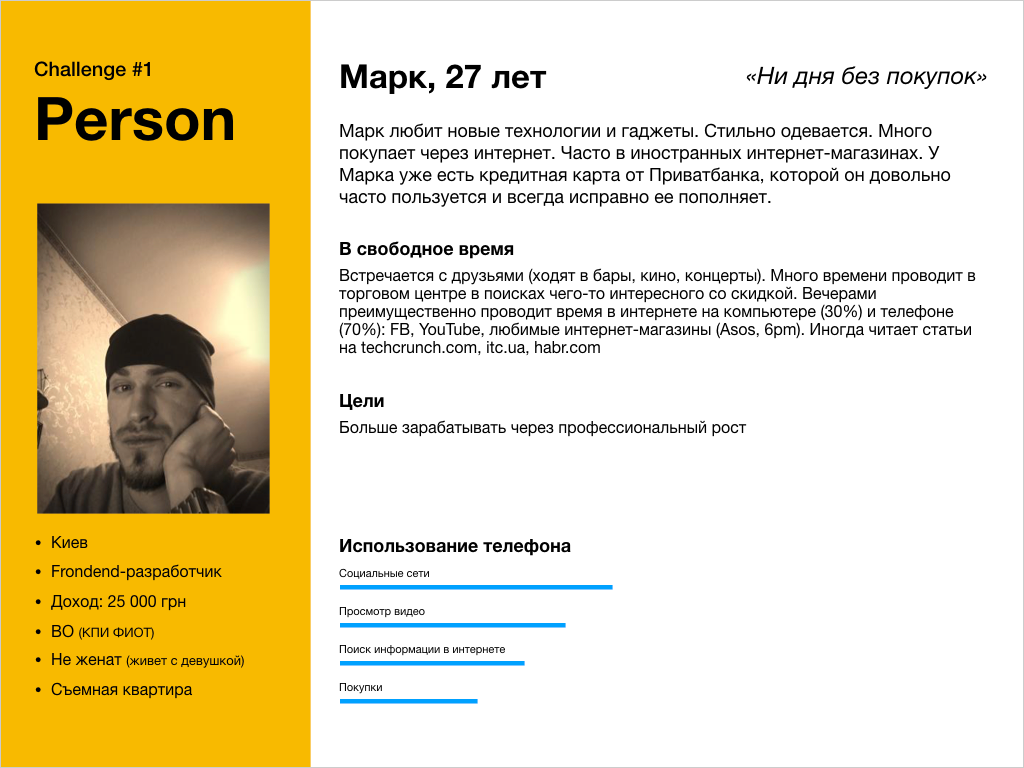
Yes, the persona - fictional characters. But a properly composed person helps the team focus on the right things and make fewer mistakes. The person must be as realistic and coherent as possible.
For the case of ordering a credit card, we have composed such a person:
The scenario is a fictional story about the sequence of a person’s events in “everyday life” on the way to achieving the goal. In the scenario, it is important to record where the user is now located, his degree of abstraction (environment) , with the help of which he interacts with the product (technology) , why and how he got on the product (context) .
Signs of a good script:
The full scenario turned out to be quite voluminous, therefore for the article we present the key ones: environment, technologies and context:


Having made a user flow and having formed requirements for each screen, you can proceed to the design of the interface. Let us analyze the interface solutions for each stage of the user path.


The first screen of the application after launch is as minimalistic as possible and provides two key needs:
Considering the formed expectation at the stage of advertising communication, as well as the fact that it is a less attractive offer to become a bank customer than a card with a limit of 200,000 UAH, a card with key advantages is immediately positioned on the first screen.
The block with the map is designed as a banner. The credit card slides smoothly across the screen, let’s see what you can click on.


The title “Get a credit card from Alfa-Bank” clearly forms expectations: “Clicking on this thing I can order a card”

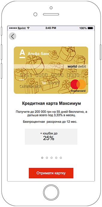
A slider from 5 screens reveals the main advantages of a credit card Maximum in simple and understandable language.
The first slide contains key information. Each subsequent slide expands it.


After examining the current forms on the site and talking to the support service, we found out that the opening of the card remotely, in any case, occurs through a call center. Considering also that the user may not have the necessary documents at hand, to order a card, you just need to enter and confirm a phone number.
You can also catch existing bank customers by phone number by offering them a different interaction scenario.
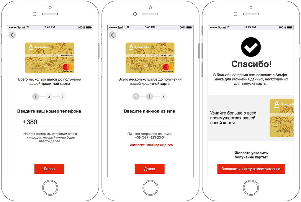

To order a card, just enter the phone number. All the rest will make a call center.
Filling in personal data is a difficult task for users. Even more, it is complicated by the fact that the necessary documents may not always be at hand.
Stage with the filling of the questionnaire is not mandatory. The interface informs you that the card has already been ordered. And only if the user wants to speed up the process, he can fill out the questionnaire on his own.


In the transition to self-completion of the questionnaire, the user sees a simple form with a minimum number of fields.
All items are simple and do not require any documents at hand.
By clicking the Save button, the user sees that there are other forms. To fill them need documents. But nothing is required. He understands that everything is saved and he can continue filling in later if necessary.
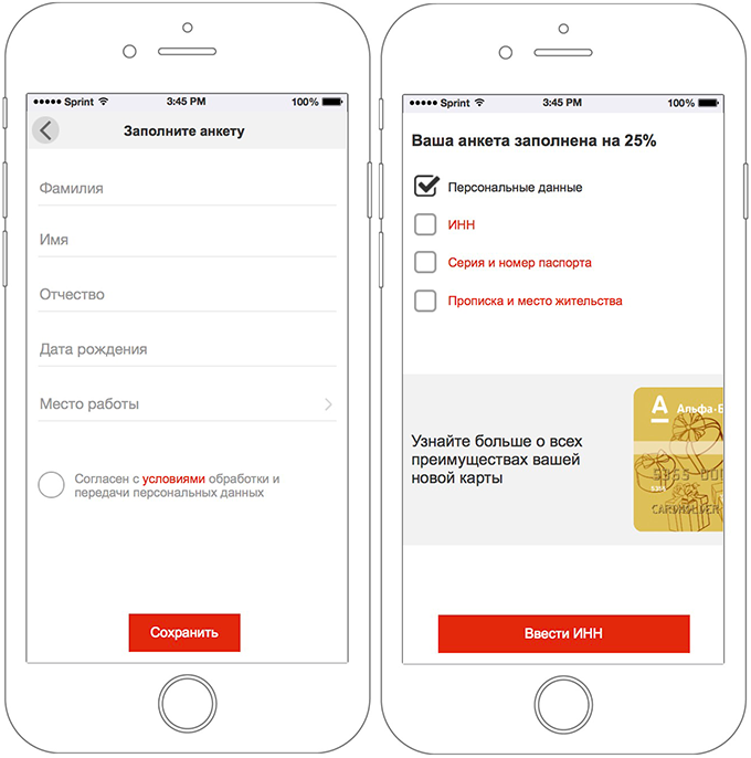
Forms are grouped in such a way that they can be filled out, having only part of the information with you. For example, if a user knows his TIN by heart, he can fill it out. At the same time, for those who do not remember him and do not have it at hand, there are no difficulties in filling in other data.
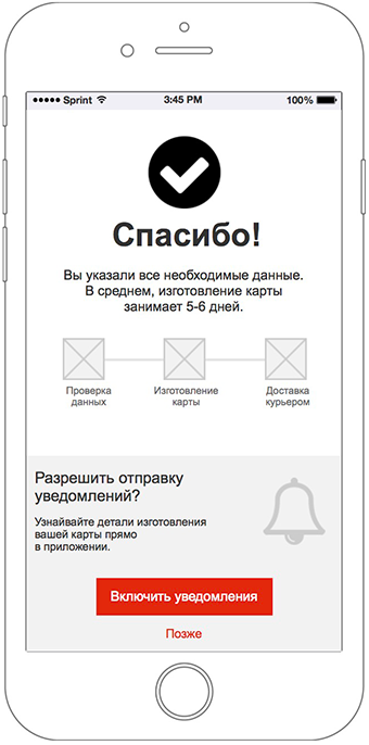
By filling in all the fields on your own or using a call center, the user sees the corresponding confirmation screen.
On this screen, for the first time, permission is gently requested for sending push notifications in exchange for understandable value for the user: tracking card status.
In iOS and Android, there is only one chance to get permission to send notifications in the application, so the system query window is displayed only if the user delivers it consciously.


While the Alfa-Bank card is issued, the application displays in real time the current status of the card.
Any questions from the client will be promptly answered by the support service in Alpha chat.
When the time comes to receive the card, the courier will call and agree on a convenient time and place of delivery.

The goal is reached, the client is satisfied:

“This is the best card I have ever had. So much freedom and chic cashback. And it was so easy to order it! ”
One of the requirements besides the closure of two use cases was the visualization of the concept of the main screen. Since there was no separate use case for the main screen in the task, we turned to recent research by Usabilitylab and found that the mobile bank application must meet three expectations:
We placed them all on one screen, providing easy and fast access to the most important functions of a mobile bank.
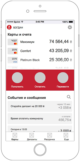
Account balances are immediately visible. To view all the cards do not need to go to a separate screen. Simply scroll through the list of maps, and the content on the screen is optimized for easy interaction with them.
All actions on all cards in one place. Smart tape is similar to popular messengers and not only offers quick access to all perfect operations, but also reminds you to pay for a communal flat or to earn money by opening a deposit. To see everything, you do not need to go to a separate screen. Simply scroll the tape and the content on the screen is optimized for easy interaction with it.
The main thing in the center.Key actions: replenish, pay, transfer is always at hand, even when you interact with cards or statement.
The status of the main screen when interacting with a list of maps and events.

The second proposed use case sounded like this:
Alfa-Bank offers several options for deposits in different currencies, for different periods and interest rates.
Insight # 1
Considering the use case, we only work out the scenario of opening a deposit in the national currency.
Insight # 2
According to the use case, the client is interested in a deposit for a year, which means that we also do not consider a savings deposit with a lower yield in this decision.
Total: our task is to “sell” the most profitable deposit for the client with a high interest rate for a period of 3 to 18 months, with interest paid at the end or monthly.


And we will analyze the interface solutions for each stage of the user path.

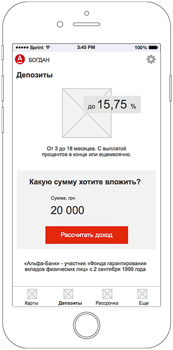
The main way to open a deposit in a mobile application is to go to the appropriate section of the menu. The screen briefly informs about the conditions of deposit placement and focuses on the ability to calculate the income from the amount of the investment.
But there is another way - go directly to the calculated options of deposits directly from the main screen of the mobile bank. Using special algorithms, the system offers to open a deposit for those clients who, due to a number of signs, are most inclined to this (for example, card account balances).


Deposit submission is extremely simplified and actually consists of two settings:
The choice of the method of obtaining interest is implemented in the form of cards, combined in a slider.
Thus, the key on the screen is always the interest rate and income.


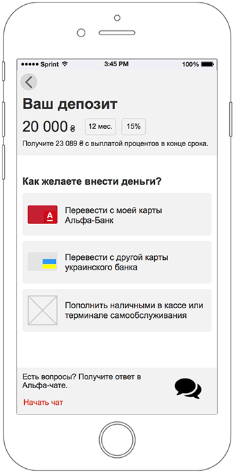
Mimicking the classic ordering in the online store, each stage of the deposit contains key information: the amount of the investment, the term, the interest rate, and also recalls the benefits.
You can make money on deposit in several ways.
A significantly increased degree of responsibility may cause a refusal if the user does not receive an answer to any questions right there. The alpha chat, available directly in this screen, allows you to reduce the filament. No need to go anywhere.


This screen is shown only if the user has several cards. If there is only one card, the transition to the confirmation of payment occurs immediately.
The screen focuses on cards that are suitable for payment.
If the user has other cards not suitable for this payment, they are also displayed, but in a separate list. Thus, the feeling of a mistake is not created: “Stop, I wanted to pay with another card, where is it? Probably something is not working. "

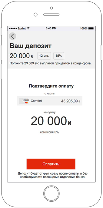
The final deposit screen contains all the key information about the deposit, method and amount of payment.
The caption under the button reminds you that this is all you need to make a deposit. There is no need to visit the bank.

On the final screen, the user sees information about the successful opening of the deposit.
In order to emotionally support the user after parting with money, he is greatly reminded of the value: the income that he will receive at the end of the deposit term.
The button "View my deposits" returns the user to the normal interface of the application.


With an active deposit, the “Deposit” screen view changes. The key emphasis is shifting to open deposits.
Deposit is easy to identify by the amount of investment.
Progress bar allows you to quickly track the status of the deposit. Subject to the opening of a deposit with a monthly interest payment, the corresponding segments appear on the progress bar. Achievement of a segment - interest payment.
To manage the deposit settings, just click on it (the usual pattern used throughout the application).

The goal is achieved, the client is satisfied:

“My money is in a safe place and works for me. Opening a deposit was so easy! ”
The main emphasis in our work was placed on the interface of the prototype and in addition to it were drawn several layouts of the main screens. Another part of the time went to design an interactive presentation. As a result, the whole quest spent 72 hours within 5 working days.
This story is about having even limited resources and time, you can create more convenient and useful interfaces.
Considering the lack of time and the status of the task, we greatly simplified the usual design processes and neglected two important stages: research and full testing.
But even so, in just 5 days and with the help of a simple methodology, we managed to create a much more user-friendly interface than what thousands of bank customers now have to interact with every day.
Read to the end? Here is the promised bonus - an interactive prototype that can be played .
PS If this material was useful, there is more .
Special emphasis in the contest description was made on UX, so the task seemed interesting to us. True, from the moment of acquaintance with the competition and the deadline for accepting applications it was only 5 days. Well, the challenge is accepted.
Under the cut is a long but useful story about designing a mobile bank interface in a short time. Those who master it awaits a bonus at the end.
There was no time for full-fledged research, so a simple way was chosen: an analysis of existing marketing activities, receiving advice on products with a call center, interviews with several bank customers and corridor testing of the prototype.
User-Centered Design
The design concept was based on the UCD methodology. Key tools:
- Persons (persons) - collective images of typical representatives of the target audience of the product, combined for a number of related signs into persons.
- Use cases (use cases) - a brief description of the task within the product that the person needs to perform.
- Use scenarios (scenarios) - fictional stories about the sequence of events of a person in the "everyday life" on the way to achieving the goal.
Challenge # 1: Order a card
The first proposed use case sounded like this:
“I, as a non-client of Alfa-Bank, want to get a credit card, because it has one of the best conditions on the market to make payments on the Internet and pay for utilities”The key problem is that the bank offers 17 card options, including 8 credit and 9 debit cards. In the existing bank application, an attempt has been made to select among them all.
Insight # 1
According to the proposed case, the user needs a credit card, so you can safely remove 9 debit cards. 8 left - already easier.
Insight # 2
On closer inspection, it turned out that 8 credit cards are slightly different from each other. But there is one that has the maximum benefits and has the strongest marketing support.
Given the context of the card order and use case, it is advisable to offer the user only one card, demonstrating its clear advantages. This approach greatly simplifies the interaction with the interface, and therefore increases the conversion. And most importantly - it corresponds to the existing marketing strategy of the bank.
Total: our task is to “sell” only one, but the most “tasty” credit card.
Make up person
Yes, the persona - fictional characters. But a properly composed person helps the team focus on the right things and make fewer mistakes. The person must be as realistic and coherent as possible.
For the case of ordering a credit card, we have composed such a person:
We write the script
The scenario is a fictional story about the sequence of a person’s events in “everyday life” on the way to achieving the goal. In the scenario, it is important to record where the user is now located, his degree of abstraction (environment) , with the help of which he interacts with the product (technology) , why and how he got on the product (context) .
Signs of a good script:
- A good script is consistent as a dance and builds a complete story (if the user has done this, he expects this, but nothing else).
- A good script allows you to fully penetrate the character and relive his (but not your) interaction experience.
- A good script does not contain descriptions of interface solutions and is limited to the expectations and feelings of the user.
- A good script allows you to build a high-quality user path (user flow) and formalize specific interface requirements.
The full scenario turned out to be quite voluminous, therefore for the article we present the key ones: environment, technologies and context:
User path
Having made a user flow and having formed requirements for each screen, you can proceed to the design of the interface. Let us analyze the interface solutions for each stage of the user path.
The first screen of the application after launch is as minimalistic as possible and provides two key needs:
- login - for existing bank customers
- become a client - for potential bank customers
Considering the formed expectation at the stage of advertising communication, as well as the fact that it is a less attractive offer to become a bank customer than a card with a limit of 200,000 UAH, a card with key advantages is immediately positioned on the first screen.
The block with the map is designed as a banner. The credit card slides smoothly across the screen, let’s see what you can click on.
The title “Get a credit card from Alfa-Bank” clearly forms expectations: “Clicking on this thing I can order a card”
A slider from 5 screens reveals the main advantages of a credit card Maximum in simple and understandable language.
The first slide contains key information. Each subsequent slide expands it.
After examining the current forms on the site and talking to the support service, we found out that the opening of the card remotely, in any case, occurs through a call center. Considering also that the user may not have the necessary documents at hand, to order a card, you just need to enter and confirm a phone number.
You can also catch existing bank customers by phone number by offering them a different interaction scenario.
To order a card, just enter the phone number. All the rest will make a call center.
Filling in personal data is a difficult task for users. Even more, it is complicated by the fact that the necessary documents may not always be at hand.
Stage with the filling of the questionnaire is not mandatory. The interface informs you that the card has already been ordered. And only if the user wants to speed up the process, he can fill out the questionnaire on his own.
In the transition to self-completion of the questionnaire, the user sees a simple form with a minimum number of fields.
All items are simple and do not require any documents at hand.
By clicking the Save button, the user sees that there are other forms. To fill them need documents. But nothing is required. He understands that everything is saved and he can continue filling in later if necessary.
Forms are grouped in such a way that they can be filled out, having only part of the information with you. For example, if a user knows his TIN by heart, he can fill it out. At the same time, for those who do not remember him and do not have it at hand, there are no difficulties in filling in other data.
By filling in all the fields on your own or using a call center, the user sees the corresponding confirmation screen.
On this screen, for the first time, permission is gently requested for sending push notifications in exchange for understandable value for the user: tracking card status.
In iOS and Android, there is only one chance to get permission to send notifications in the application, so the system query window is displayed only if the user delivers it consciously.
While the Alfa-Bank card is issued, the application displays in real time the current status of the card.
Any questions from the client will be promptly answered by the support service in Alpha chat.
When the time comes to receive the card, the courier will call and agree on a convenient time and place of delivery.
The goal is reached, the client is satisfied:
“This is the best card I have ever had. So much freedom and chic cashback. And it was so easy to order it! ”
Main screen
One of the requirements besides the closure of two use cases was the visualization of the concept of the main screen. Since there was no separate use case for the main screen in the task, we turned to recent research by Usabilitylab and found that the mobile bank application must meet three expectations:
- Provide quick access to view account balances
- Track all expenses and charges
- Perform basic banking tasks
We placed them all on one screen, providing easy and fast access to the most important functions of a mobile bank.
Account balances are immediately visible. To view all the cards do not need to go to a separate screen. Simply scroll through the list of maps, and the content on the screen is optimized for easy interaction with them.
All actions on all cards in one place. Smart tape is similar to popular messengers and not only offers quick access to all perfect operations, but also reminds you to pay for a communal flat or to earn money by opening a deposit. To see everything, you do not need to go to a separate screen. Simply scroll the tape and the content on the screen is optimized for easy interaction with it.
The main thing in the center.Key actions: replenish, pay, transfer is always at hand, even when you interact with cards or statement.
The status of the main screen when interacting with a list of maps and events.
Challenge # 2: Opening Deposit
The second proposed use case sounded like this:
“I, as a client of Alfa-Bank, which has a card, which I regularly use, want to open a deposit in the amount of 20,000 hryvnia for a period of 12 months in order to increase my funds”
Alfa-Bank offers several options for deposits in different currencies, for different periods and interest rates.
Insight # 1
Considering the use case, we only work out the scenario of opening a deposit in the national currency.
Insight # 2
According to the use case, the client is interested in a deposit for a year, which means that we also do not consider a savings deposit with a lower yield in this decision.
Total: our task is to “sell” the most profitable deposit for the client with a high interest rate for a period of 3 to 18 months, with interest paid at the end or monthly.
Make up person
We write the script
User path
And we will analyze the interface solutions for each stage of the user path.
The main way to open a deposit in a mobile application is to go to the appropriate section of the menu. The screen briefly informs about the conditions of deposit placement and focuses on the ability to calculate the income from the amount of the investment.
But there is another way - go directly to the calculated options of deposits directly from the main screen of the mobile bank. Using special algorithms, the system offers to open a deposit for those clients who, due to a number of signs, are most inclined to this (for example, card account balances).
Deposit submission is extremely simplified and actually consists of two settings:
- interest generation method
- “Deposit term / interest rate”.
The choice of the method of obtaining interest is implemented in the form of cards, combined in a slider.
Thus, the key on the screen is always the interest rate and income.
Displaying a fair interest rate plays a significant role in building trust. Now on the official website of the bank, the tactics of hidden conditions are used, when the user has to make considerable efforts to obtain real data, which, as a result, creates a certain embarrassment and reduces trust.
Mimicking the classic ordering in the online store, each stage of the deposit contains key information: the amount of the investment, the term, the interest rate, and also recalls the benefits.
You can make money on deposit in several ways.
A significantly increased degree of responsibility may cause a refusal if the user does not receive an answer to any questions right there. The alpha chat, available directly in this screen, allows you to reduce the filament. No need to go anywhere.
This screen is shown only if the user has several cards. If there is only one card, the transition to the confirmation of payment occurs immediately.
The screen focuses on cards that are suitable for payment.
If the user has other cards not suitable for this payment, they are also displayed, but in a separate list. Thus, the feeling of a mistake is not created: “Stop, I wanted to pay with another card, where is it? Probably something is not working. "
The final deposit screen contains all the key information about the deposit, method and amount of payment.
The caption under the button reminds you that this is all you need to make a deposit. There is no need to visit the bank.
On the final screen, the user sees information about the successful opening of the deposit.
In order to emotionally support the user after parting with money, he is greatly reminded of the value: the income that he will receive at the end of the deposit term.
The button "View my deposits" returns the user to the normal interface of the application.
With an active deposit, the “Deposit” screen view changes. The key emphasis is shifting to open deposits.
Deposit is easy to identify by the amount of investment.
Progress bar allows you to quickly track the status of the deposit. Subject to the opening of a deposit with a monthly interest payment, the corresponding segments appear on the progress bar. Achievement of a segment - interest payment.
To manage the deposit settings, just click on it (the usual pattern used throughout the application).
The goal is achieved, the client is satisfied:
“My money is in a safe place and works for me. Opening a deposit was so easy! ”
72 hours for everything
The main emphasis in our work was placed on the interface of the prototype and in addition to it were drawn several layouts of the main screens. Another part of the time went to design an interactive presentation. As a result, the whole quest spent 72 hours within 5 working days.
Total:
This story is about having even limited resources and time, you can create more convenient and useful interfaces.
Considering the lack of time and the status of the task, we greatly simplified the usual design processes and neglected two important stages: research and full testing.
But even so, in just 5 days and with the help of a simple methodology, we managed to create a much more user-friendly interface than what thousands of bank customers now have to interact with every day.
Read to the end? Here is the promised bonus - an interactive prototype that can be played .
PS If this material was useful, there is more .