Visualization of comments on YouTube: videos, channels, genres, cross-genres
Hello! Tanner Stokes once wrote an add- on rewriting the text of comments on YouTube in “herp derp”. To some it made life much better. We went the same way, but slightly changed the concept. We present comments from YouTube in the form of pictures, or rather graphs with vertices and edges. And visualize all types of objects - from videos and channels to cross-genre intersections. How do we do it? Let's find out.
Philosophers say that it is not facts that are important, but their comparison. Similarly, it is not the fact of commenting a video that is important to us, but a comparison of the actions of commentators in different videos. Steadily reproducible situations correspond to the patterns visible in the visualization. The main task that we have chosen is the visualization and detection of patterns on its basis, as well as a general mapping of the interaction of commentators on YouTube in order to compile an atlas of comments.
For pumping out comments, until recently, we used the web service Youtube Comment Scraper , which allows you to download comments from the selected video.
Now we use our own tool, which allows pumping comments of one or several channels entirely, which is much more convenient for our purposes.
To visualize the data, we use Gephi v. 0.9.2 . To lay the vertices and edges, we use the Force Atlas 2 algorithm. To display the statistics, the “Average (weighted) degree” and “Modularity” functions are used.
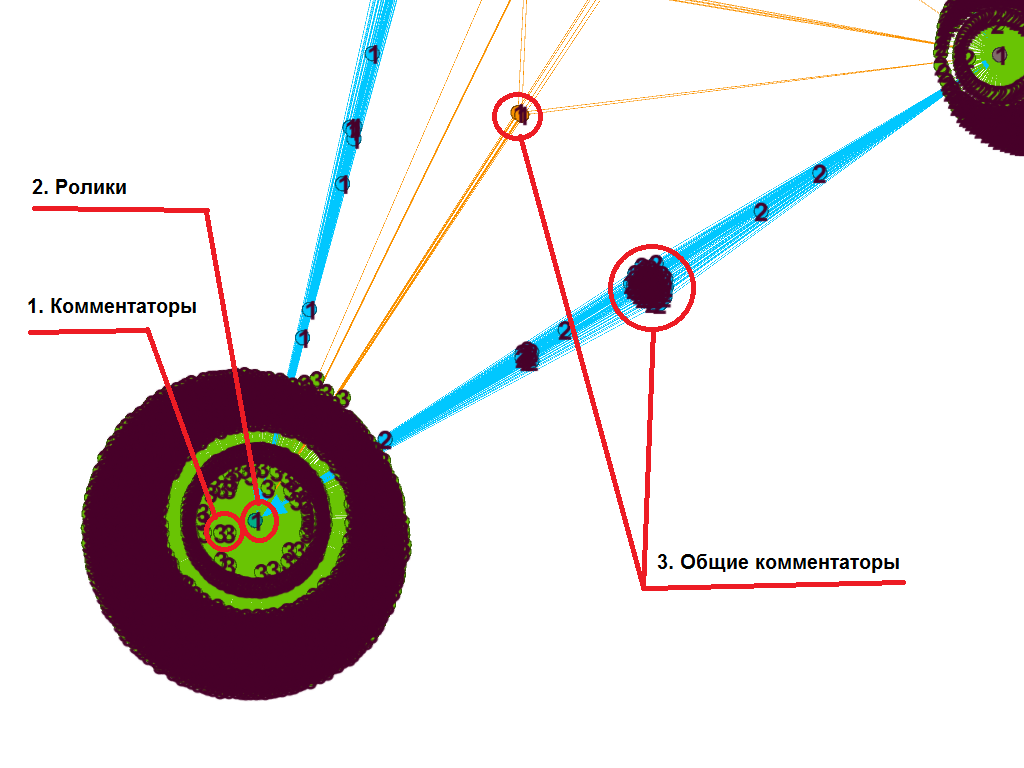
The question arises, how can you track comments, what objective indicators do you need to take for this? We tried to bind usernames to movie IDs - in our case, their sequential numbering, for example, “OverlordXXX” - “1”; “Overlord XXY” - “2” and so on. Then created two files, “Nodes” and “Edges”, on this manual .
Visualization in Gephi is as follows. Commentators (1) are connected to rollers (2), which is a commenting. If the commentator has commented on more than one video, he is associated with all the videos he commented on (3).
For the comparison of commentators, three videos were selected ( 1 , 2 , 3 ).
The result of the visualization of the comments on the videos in Gephi: The
comments on the videos are presented in the form of a directed graph with 12,647 nodes and 6370 edges. The visualization shows that the interaction of the commentators between the three rollers is weak. This is largely consistent with the difference in the content of the videos, which is reflected in the commenting on each of them. The first video demonstrates the experience with a magnetron. The second video includes both experience and coverage of events not directly related to the experience. The third video is devoted only to events without reference to experiments.
For the control measurement, the rollers of the same channel were used ( 1, 2 , 3 ), but unlike the previous ones, it is more closely related to each other in a similar context (experiments involving a memetic stuntman).
Visualization results:
Roller comments are presented as a directed graph with 11305 vertices and 9302 edges. The general context corresponds to the strong interaction of commentators from at least two of the three videos.
That is, the difference, or vice versa, the generality of commentators in different videos correlates with different, or vice versa, the general context of the videos. What is interesting, visualization, even without prior acquaintance with the content, is very well captured.
For visualization, 472,286 comments were selected. 172 channel videos: A
general commenting cloud links most clips. On this basis, we can talk about the channel as semantic (semantic and contextual) integrity. But there are interesting regional features. It is easy to see the regions of two symmetric sets of comments colored in green and blue highlighted at the top of the image:
As it turned out, they are formed by comments to four videos about firecrackers ( 1 , 2 , 3 , 4 ) where the pyrotechnics were drawn.
It can be assumed that the relatively low connectivity of these videos with the rest is explained by the transition to them from outside links and, as a result, by the emergence of a specific audience that is indirectly related to the rest of the channel content.
Preliminary conclusion - in the visualization of comments works well the selection of regions. And then you can explore a particular region with the help of qualitative methods - for example, content analysis and ethnography.
To work with the genre field, nine YouTube channels ( 1 , 2 , 3 , 4 , 5 , 6 , 7 , 8 , 9 ) were used, the authors of which indicated in the description the review of films as the main type of content.
Visualization 1 920 865 comments to videos of all channels:
Visualization has shown that two large (from 1 million subscribers) channels literally absorb seven small (up to 500 thousand subscribers) channels. In fact, small channels have become regions of large channels, which is noticeable in the picture in the form of the corresponding color of the region. It can be assumed that commentators of small channels are mostly included in the number of commentators of large channels. That is, for their research, Venn diagrams are more suitable, for example, where you can see exactly how many of them and in what proportions they are presented in different channels.
For the control comparison, 513282 comments of eight channels ( 1 , 2 , 3 , 4 , 5 , 6 , 7 , 8) were visualized.) in the beauty blog genre:
A strong intersection of channels is observed only in two subsets, while the two channels (black and lilac) are relatively weakly related to the others. Unlike the first example, beauty blog commentators are less inclined to interact and in some cases are relatively isolated audiences. Consequently, this should be taken into account in the task of maximally reaching the audience of channels, for example, for advertising purposes. If in the case of film reviews, it is enough to order advertising on million-plus channels, then in the case of beauty blogs, you need to order advertising, including on isolated channels, otherwise their audience will not be covered.
To visualize the cross-genre intersection, three channels were selected in the genres of beauty blog ( 1 , 14,231 comments on 115 videos), experiments ( 2 , 72,163 comments on 81 videos ) and travel ( 3 , 135,403 comments on 482 videos).
1) Visualization of the intersection of commentators of a beauty blog and experiments:

2) Visualization of commentators of experiments and travels:
3) Visualization of commentators of a beauty blog and travels:
4) Visualization of commentators of all channels:
Visually, you can see that commentators of channels on travel and experiments have a number of intersections, and commentators of a beauty blog, despite their general isolation from the rest, are more connected with travel commentators than with commentators of experiments.
The general trend towards visualization justifies itself in the case of research comments.
In the case of research channels or individual videos visualization allows you to select and detail the regions of interest to the researcher. This greatly simplifies the subsequent qualitative study of comments and video content YouTube channels.
From the practical side, visualization of the intersection of the active audience of the channel (commentators) can be useful, for example, in cases of optimization of advertising on channels. If during the visualization a strong and stable intersection of commentators of channels / sets of channels is revealed, this allows you to properly distribute advertising and, as a result, save on its placement.
Why do we visualize
Philosophers say that it is not facts that are important, but their comparison. Similarly, it is not the fact of commenting a video that is important to us, but a comparison of the actions of commentators in different videos. Steadily reproducible situations correspond to the patterns visible in the visualization. The main task that we have chosen is the visualization and detection of patterns on its basis, as well as a general mapping of the interaction of commentators on YouTube in order to compile an atlas of comments.
Soft
For pumping out comments, until recently, we used the web service Youtube Comment Scraper , which allows you to download comments from the selected video.
Now we use our own tool, which allows pumping comments of one or several channels entirely, which is much more convenient for our purposes.
To visualize the data, we use Gephi v. 0.9.2 . To lay the vertices and edges, we use the Force Atlas 2 algorithm. To display the statistics, the “Average (weighted) degree” and “Modularity” functions are used.
Algorithm
The question arises, how can you track comments, what objective indicators do you need to take for this? We tried to bind usernames to movie IDs - in our case, their sequential numbering, for example, “OverlordXXX” - “1”; “Overlord XXY” - “2” and so on. Then created two files, “Nodes” and “Edges”, on this manual .
Visualization in Gephi is as follows. Commentators (1) are connected to rollers (2), which is a commenting. If the commentator has commented on more than one video, he is associated with all the videos he commented on (3).
Visualization of comments to videos
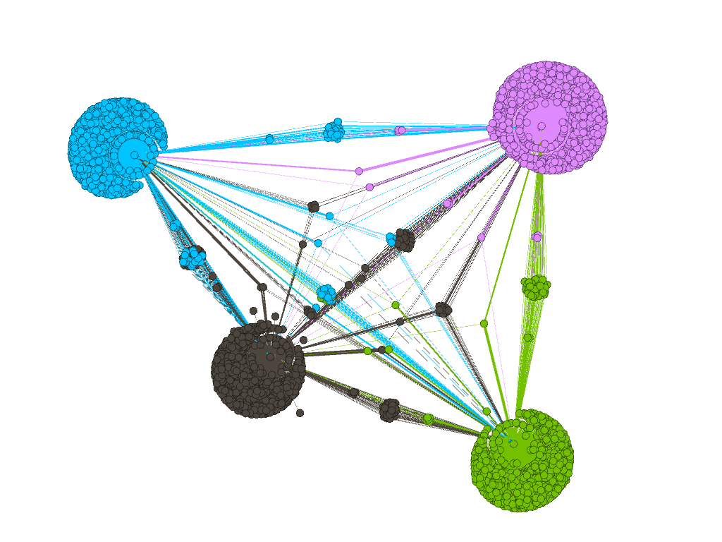
For the comparison of commentators, three videos were selected ( 1 , 2 , 3 ).
The result of the visualization of the comments on the videos in Gephi: The
comments on the videos are presented in the form of a directed graph with 12,647 nodes and 6370 edges. The visualization shows that the interaction of the commentators between the three rollers is weak. This is largely consistent with the difference in the content of the videos, which is reflected in the commenting on each of them. The first video demonstrates the experience with a magnetron. The second video includes both experience and coverage of events not directly related to the experience. The third video is devoted only to events without reference to experiments.
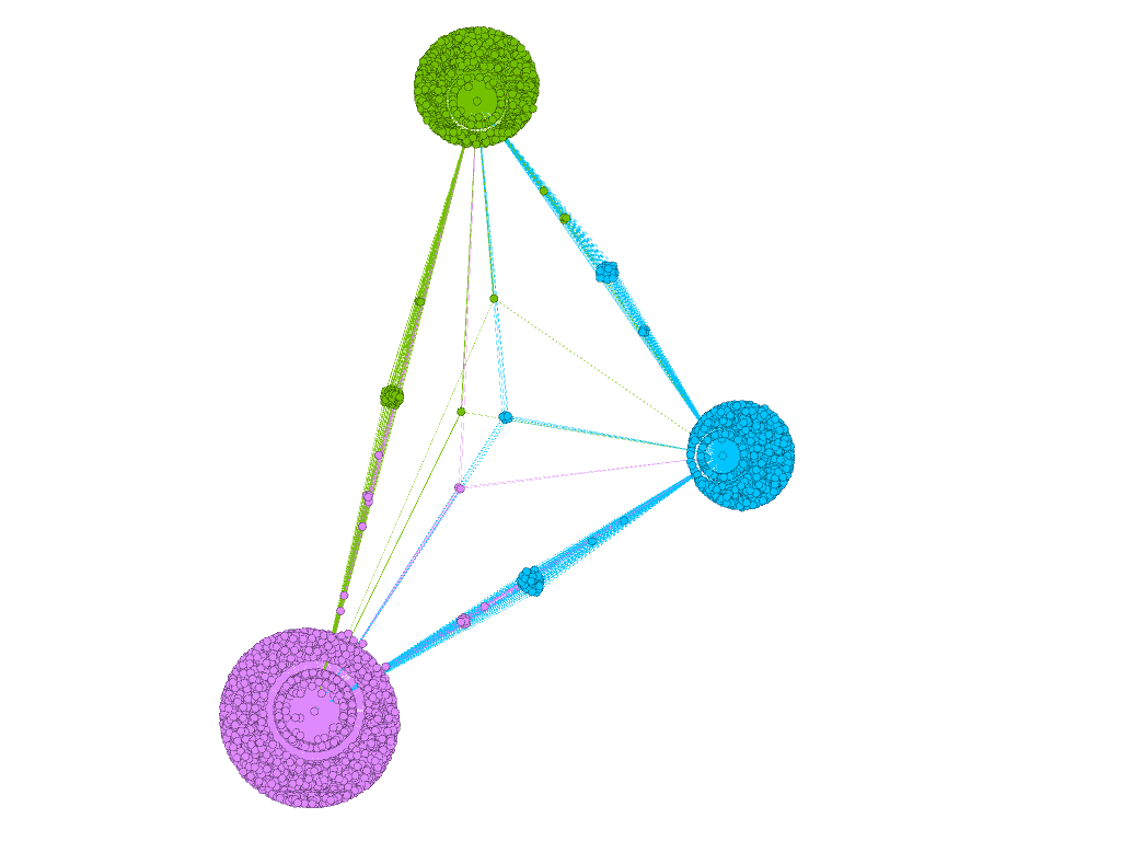
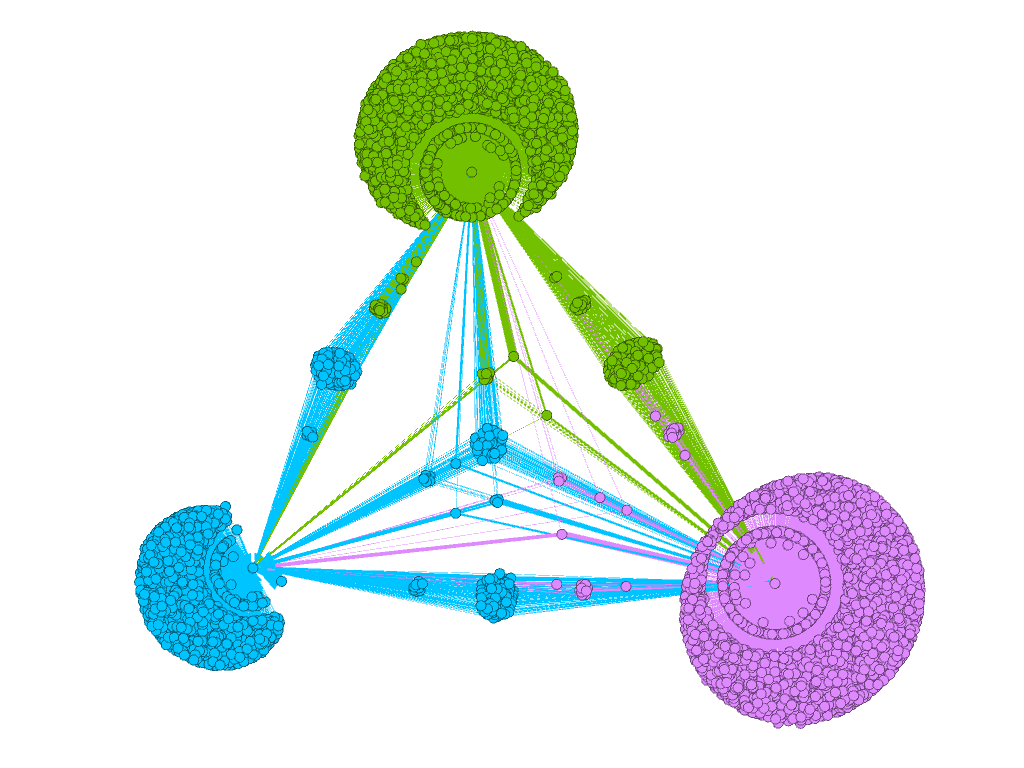
For the control measurement, the rollers of the same channel were used ( 1, 2 , 3 ), but unlike the previous ones, it is more closely related to each other in a similar context (experiments involving a memetic stuntman).
Visualization results:
Roller comments are presented as a directed graph with 11305 vertices and 9302 edges. The general context corresponds to the strong interaction of commentators from at least two of the three videos.
That is, the difference, or vice versa, the generality of commentators in different videos correlates with different, or vice versa, the general context of the videos. What is interesting, visualization, even without prior acquaintance with the content, is very well captured.
Visualization of YouTube channel comments
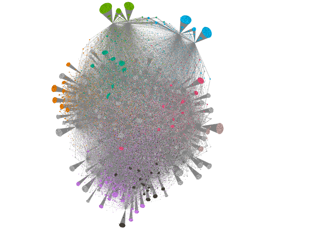
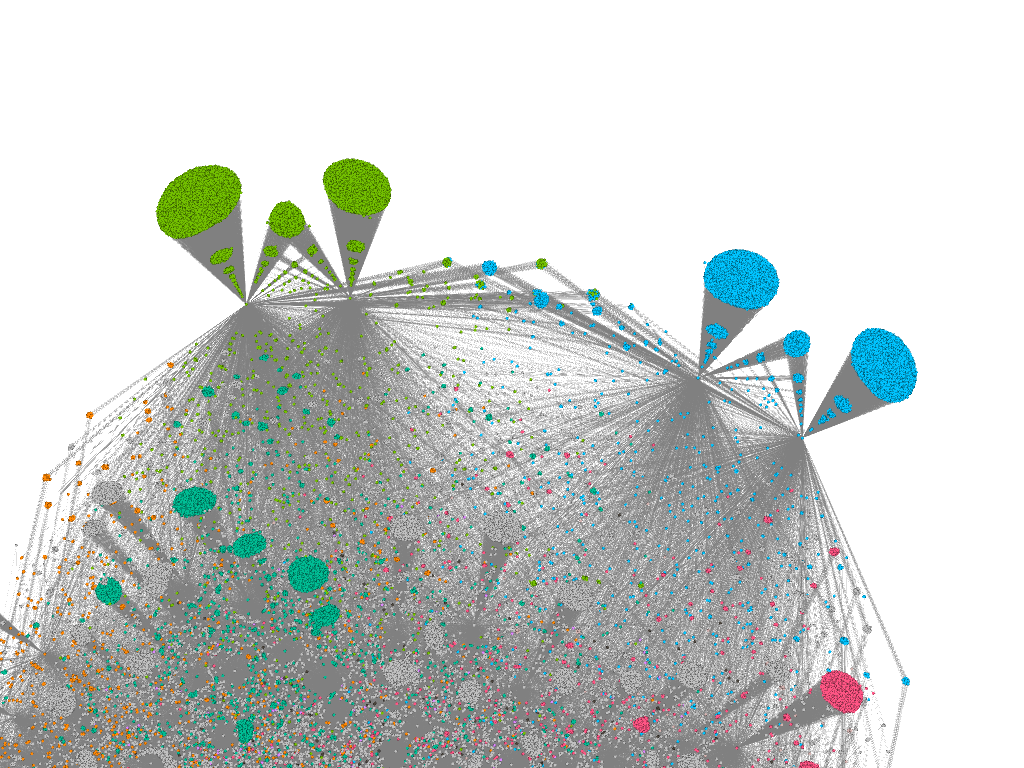
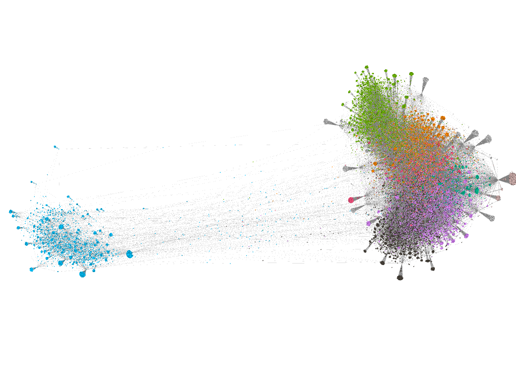
For visualization, 472,286 comments were selected. 172 channel videos: A
general commenting cloud links most clips. On this basis, we can talk about the channel as semantic (semantic and contextual) integrity. But there are interesting regional features. It is easy to see the regions of two symmetric sets of comments colored in green and blue highlighted at the top of the image:
As it turned out, they are formed by comments to four videos about firecrackers ( 1 , 2 , 3 , 4 ) where the pyrotechnics were drawn.
It can be assumed that the relatively low connectivity of these videos with the rest is explained by the transition to them from outside links and, as a result, by the emergence of a specific audience that is indirectly related to the rest of the channel content.
Preliminary conclusion - in the visualization of comments works well the selection of regions. And then you can explore a particular region with the help of qualitative methods - for example, content analysis and ethnography.
Visualization of YouTube comments: films review
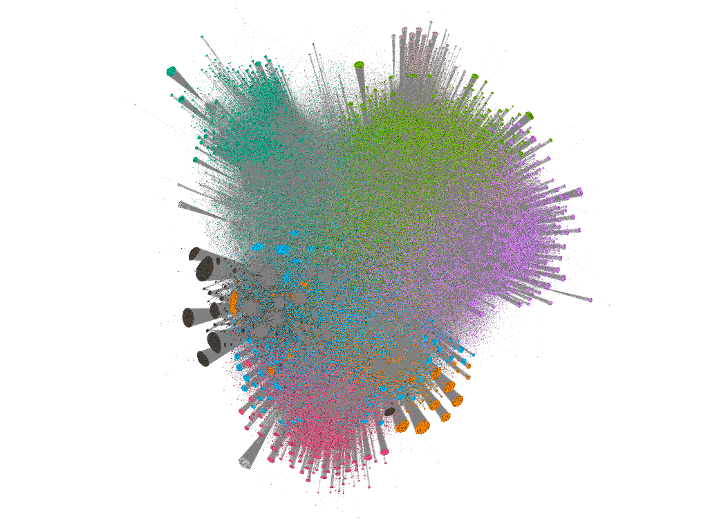
To work with the genre field, nine YouTube channels ( 1 , 2 , 3 , 4 , 5 , 6 , 7 , 8 , 9 ) were used, the authors of which indicated in the description the review of films as the main type of content.
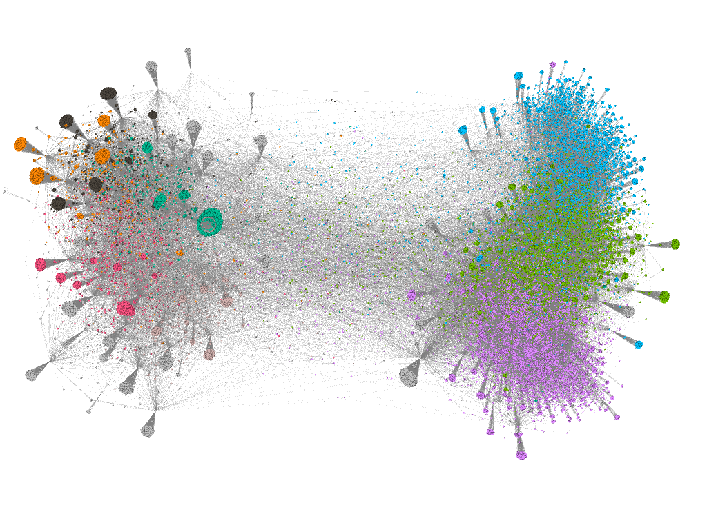
Visualization 1 920 865 comments to videos of all channels:
Visualization has shown that two large (from 1 million subscribers) channels literally absorb seven small (up to 500 thousand subscribers) channels. In fact, small channels have become regions of large channels, which is noticeable in the picture in the form of the corresponding color of the region. It can be assumed that commentators of small channels are mostly included in the number of commentators of large channels. That is, for their research, Venn diagrams are more suitable, for example, where you can see exactly how many of them and in what proportions they are presented in different channels.
For the control comparison, 513282 comments of eight channels ( 1 , 2 , 3 , 4 , 5 , 6 , 7 , 8) were visualized.) in the beauty blog genre:
A strong intersection of channels is observed only in two subsets, while the two channels (black and lilac) are relatively weakly related to the others. Unlike the first example, beauty blog commentators are less inclined to interact and in some cases are relatively isolated audiences. Consequently, this should be taken into account in the task of maximally reaching the audience of channels, for example, for advertising purposes. If in the case of film reviews, it is enough to order advertising on million-plus channels, then in the case of beauty blogs, you need to order advertising, including on isolated channels, otherwise their audience will not be covered.
Visualize cross-genre intersection comments
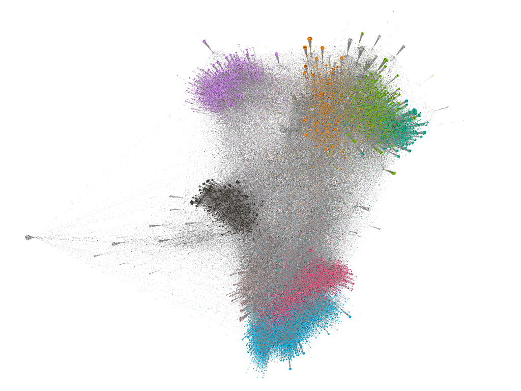
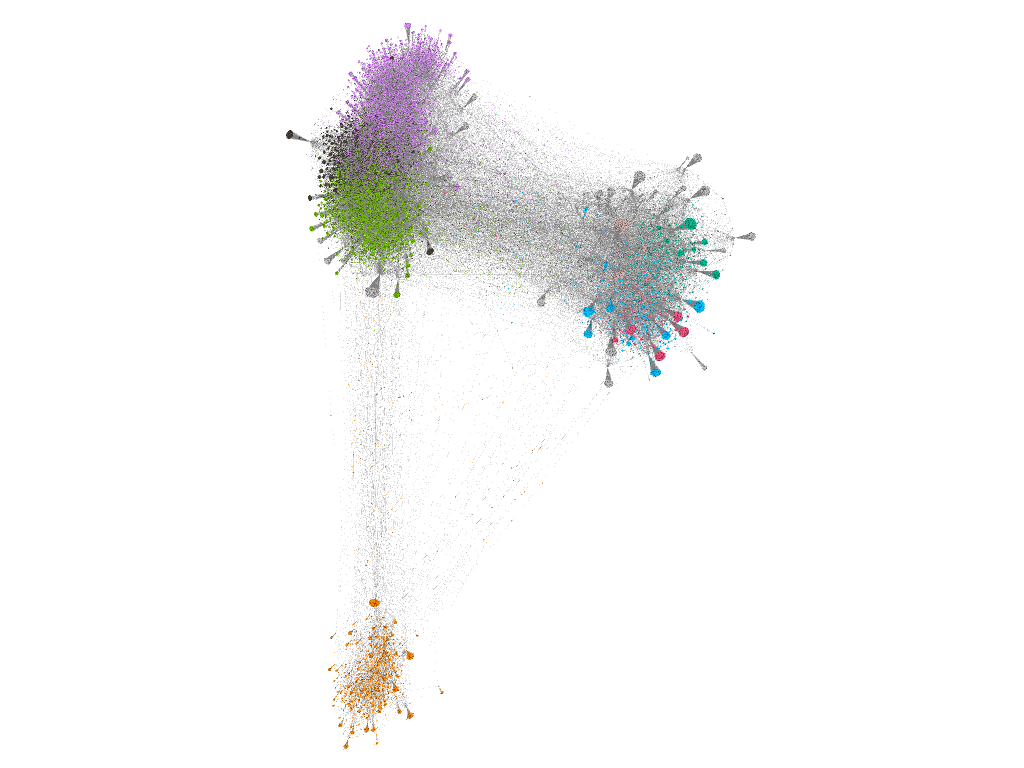
To visualize the cross-genre intersection, three channels were selected in the genres of beauty blog ( 1 , 14,231 comments on 115 videos), experiments ( 2 , 72,163 comments on 81 videos ) and travel ( 3 , 135,403 comments on 482 videos).
1) Visualization of the intersection of commentators of a beauty blog and experiments:
2) Visualization of commentators of experiments and travels:
3) Visualization of commentators of a beauty blog and travels:
4) Visualization of commentators of all channels:
Visually, you can see that commentators of channels on travel and experiments have a number of intersections, and commentators of a beauty blog, despite their general isolation from the rest, are more connected with travel commentators than with commentators of experiments.
Preliminary results
The general trend towards visualization justifies itself in the case of research comments.
In the case of research channels or individual videos visualization allows you to select and detail the regions of interest to the researcher. This greatly simplifies the subsequent qualitative study of comments and video content YouTube channels.
From the practical side, visualization of the intersection of the active audience of the channel (commentators) can be useful, for example, in cases of optimization of advertising on channels. If during the visualization a strong and stable intersection of commentators of channels / sets of channels is revealed, this allows you to properly distribute advertising and, as a result, save on its placement.