 July 12, 2018 at 11:32
What we know about Ant Design
It’s hard to imagine a React web application without a component library. You either gradually replenish such a library yourself as needed, or use a hodgepodge of ready-made solutions carefully selected by the number of stars in the vast ocean of npm modules.

If you're lucky, at the start of the project you will already have a ready-to-use design system with React components, agreed with the designers and tested on combat projects. But what if no design, no designers, much less a design system on the project are and are not planned? What if the MVP version of the application should be ready yesterday, and there’s no time left for stylistically linking the date picker you wrote with that select box from the github? As a rule, in such cases, before starting a project, they opt for the use of ready-made component libraries in order to minimize the time spent on writing your own bicycles.
Given the popularity of React, its component approach and the wild hype of recent years around design systems, the choice of such libraries should be amazing. So we thought when a couple of years ago we started searching for such a system. In fact, everything turned out to be not so sunny. Component libraries that fit our needs can be counted on the fingers. We chose Ant Design and since then have never regretted it, having implemented about six projects using this library.

Strictly speaking, Ant Design is a complete design system, a visual language. With its principles, style guides and a library of components, which will be discussed in this article. The project is supported by developers from the Alibaba Group. The same people also support dva - a framework based on the popular React, Redux, React-Router stack, which is actively used in Alibaba projects. This explains the close integration of both projects and the abundance of Chinese in the documentation and issue on the github. Ant Design itself is written in TypeScript, styled using Less, and ported to Angular and Vue, but ports are supported by completely different people.
We will not describe the principles of Ant Design as a system design or features of working with dva - all these are topics for individual articles. We focus on what Ant Design can offer precisely as a component library for React.
We will not list all the components: the list is quite impressive. It is better to familiarize yourself with it on the official website . The documentation is very detailed and with lots of examples. Most components can be used separately from Ant Design, using react-component modules , which, all of a sudden, are supported by the same people from Alibaba.
Ant Design, in our opinion, has two features that distinguish it from similar libraries: tables and forms. Both of these features are, in fact, not simple components. We will tell you more about them.
Built-in pagination
By default - client. But you can write your own without problems. That is, implementing server pagination is not difficult.
Filtering and sorting
Filtering by a drop-down selector with options is available out of the box. Describe the sorting and filtering functions yourself. By default, tables are not able to filter records by the entered string. But you can write your own custom filter, which is described in detail in the documentation. Admittedly, the process is rather painful, but there are many opportunities.
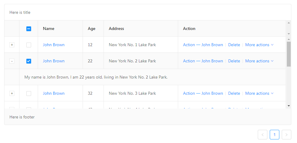
Row Selection
If you need to ensure that specific table rows are selected for further user action, Ant Design tables provide a fairly flexible API for this.
Nesting
Sometimes it is necessary to make some table rows expandable to hide additional information. Ant Design Tables do this out of the box.
Merging cells The
merging of cells in the header and in the rows is different, but in both cases you need to know in advance which cells need to be merged and specify them explicitly. This greatly complicates the processing of dynamic data, but in principle does not make it impossible. We had a similar experience, which required the creation of additional abstractions that described the attributes of the union and told the table which cells were already combined and which were not.
Editable Cells
The API for tables is generally quite flexible and allows you to render cells as you like. So that cell editing is only a special case of the ingenious use of the provided features, which is described in detail in the documentation.
Fixing columns and title
Perhaps the most popular for drawing large amounts of feature data. You can fix both the left and right columns, the table title, and even all together. It works not without periodically occurring bugs, but quite tolerably.
Ok, and what are the disadvantages?
The first thing I want to report is that Ant Design tables do not support virtualization by default (but the documentation describes in detail how to screw virtualization to a List using react-virtualized). And the default page size of 5 lines is not just. Due to the huge amount of crammed functionality, the render method in the tables works with every sneeze (for example, when hovering over a row - this is necessary for the fixed columns to work correctly).
Because of all of the above, Ant Design tables are poorly suited for drawing a large number of rows - more than a hundred rows are already capable of significantly dragging down application performance.
The second is the default table styles. Apparently, in Chinese it is not considered shameful to use word-break: break-word ;, and in tables this property is used consciously, but as a result, even examples from official documentation without limiting the maximum width of tables can look like this:
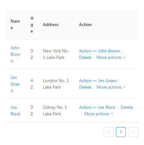
The problem is easily solved, but unpleasant when you come across her for the first time.
Continuing the conversation about styles, it can be noted that the content in the table cells has a vertical alignment in the middle, which does not look very good with a lot of content in the cell. All this, of course, is a matter of taste, but on each new project with Ant Design we add several style hooks that slightly change the appearance of the tables. Otherwise, Ant Design tables are a great tool that has few peers in the React ecosystem. We are going further.

The Form container component itself can do little: hide the asterisks of required fields, change the relative location of labels and fields, and call the onSubmit handler. Much more important is HOC Form.create, which adds a large number of useful methods and takes control of form elements wrapped in a built-in decorator.
In the created form, you can add validation rules with simple objects, synchronize field values with the Redux Store, store default field values separately, then apply them by calling one method ... There are a lot of possibilities. Beginners often start using the components of Ant Design forms separately, so before you start using forms on a project with Ant Design installed, we recommend that you carefully read the section of the documentation on Form - owning this tool eliminates the need to write a lot of bicycles.
Form Components
Ant Design provides many useful customizable form components. Basically, these are already standard fields, switches and selectors with some distinctive features.
As a recommended way to customize your Ant Design theme, it is suggested that you rewrite Less variables with
The classic way - connecting and rewriting styles - also works, but is not recommended, since it draws the styles of absolutely all components, regardless of whether you use all or only a few of them.
Separately, it should be said that creating a dark theme turned out to be more difficult than we thought. This entailed not only rewriting a large number of variables (and there are many), but also writing a certain number of styles already on top of Ant Design. With bright topics, such problems usually do not arise.
For internationalization, Ant Design offers a wrapper
Of course, the Ant Design library is not without flaws. These include, for example, poor adaptation to mobile devices (there is even a separate Ant Design Mobile , but this is a completely different story). And yet, against the background of alternatives, this project stands out for its scale, consistency, a large set of ready-made solutions (there is even an official boilerplate for admin panels - Ant Design Pro ). We recommend using Ant Design to quickly start projects that are not too demanding on web design, MVP versions, projects that do not involve a wide audience.
If you're lucky, at the start of the project you will already have a ready-to-use design system with React components, agreed with the designers and tested on combat projects. But what if no design, no designers, much less a design system on the project are and are not planned? What if the MVP version of the application should be ready yesterday, and there’s no time left for stylistically linking the date picker you wrote with that select box from the github? As a rule, in such cases, before starting a project, they opt for the use of ready-made component libraries in order to minimize the time spent on writing your own bicycles.
Given the popularity of React, its component approach and the wild hype of recent years around design systems, the choice of such libraries should be amazing. So we thought when a couple of years ago we started searching for such a system. In fact, everything turned out to be not so sunny. Component libraries that fit our needs can be counted on the fingers. We chose Ant Design and since then have never regretted it, having implemented about six projects using this library.
Ant design
Strictly speaking, Ant Design is a complete design system, a visual language. With its principles, style guides and a library of components, which will be discussed in this article. The project is supported by developers from the Alibaba Group. The same people also support dva - a framework based on the popular React, Redux, React-Router stack, which is actively used in Alibaba projects. This explains the close integration of both projects and the abundance of Chinese in the documentation and issue on the github. Ant Design itself is written in TypeScript, styled using Less, and ported to Angular and Vue, but ports are supported by completely different people.
We will not describe the principles of Ant Design as a system design or features of working with dva - all these are topics for individual articles. We focus on what Ant Design can offer precisely as a component library for React.
What is good about Ant Design
We will not list all the components: the list is quite impressive. It is better to familiarize yourself with it on the official website . The documentation is very detailed and with lots of examples. Most components can be used separately from Ant Design, using react-component modules , which, all of a sudden, are supported by the same people from Alibaba.
Ant Design, in our opinion, has two features that distinguish it from similar libraries: tables and forms. Both of these features are, in fact, not simple components. We will tell you more about them.
Tables
Built-in pagination
By default - client. But you can write your own without problems. That is, implementing server pagination is not difficult.
Filtering and sorting
Filtering by a drop-down selector with options is available out of the box. Describe the sorting and filtering functions yourself. By default, tables are not able to filter records by the entered string. But you can write your own custom filter, which is described in detail in the documentation. Admittedly, the process is rather painful, but there are many opportunities.
Row Selection
If you need to ensure that specific table rows are selected for further user action, Ant Design tables provide a fairly flexible API for this.
Nesting
Sometimes it is necessary to make some table rows expandable to hide additional information. Ant Design Tables do this out of the box.
Merging cells The
merging of cells in the header and in the rows is different, but in both cases you need to know in advance which cells need to be merged and specify them explicitly. This greatly complicates the processing of dynamic data, but in principle does not make it impossible. We had a similar experience, which required the creation of additional abstractions that described the attributes of the union and told the table which cells were already combined and which were not.
Editable Cells
The API for tables is generally quite flexible and allows you to render cells as you like. So that cell editing is only a special case of the ingenious use of the provided features, which is described in detail in the documentation.
Fixing columns and title
Perhaps the most popular for drawing large amounts of feature data. You can fix both the left and right columns, the table title, and even all together. It works not without periodically occurring bugs, but quite tolerably.
Ok, and what are the disadvantages?
The first thing I want to report is that Ant Design tables do not support virtualization by default (but the documentation describes in detail how to screw virtualization to a List using react-virtualized). And the default page size of 5 lines is not just. Due to the huge amount of crammed functionality, the render method in the tables works with every sneeze (for example, when hovering over a row - this is necessary for the fixed columns to work correctly).
Because of all of the above, Ant Design tables are poorly suited for drawing a large number of rows - more than a hundred rows are already capable of significantly dragging down application performance.
The second is the default table styles. Apparently, in Chinese it is not considered shameful to use word-break: break-word ;, and in tables this property is used consciously, but as a result, even examples from official documentation without limiting the maximum width of tables can look like this:
The problem is easily solved, but unpleasant when you come across her for the first time.
Continuing the conversation about styles, it can be noted that the content in the table cells has a vertical alignment in the middle, which does not look very good with a lot of content in the cell. All this, of course, is a matter of taste, but on each new project with Ant Design we add several style hooks that slightly change the appearance of the tables. Otherwise, Ant Design tables are a great tool that has few peers in the React ecosystem. We are going further.
Forms
The Form container component itself can do little: hide the asterisks of required fields, change the relative location of labels and fields, and call the onSubmit handler. Much more important is HOC Form.create, which adds a large number of useful methods and takes control of form elements wrapped in a built-in decorator.
In the created form, you can add validation rules with simple objects, synchronize field values with the Redux Store, store default field values separately, then apply them by calling one method ... There are a lot of possibilities. Beginners often start using the components of Ant Design forms separately, so before you start using forms on a project with Ant Design installed, we recommend that you carefully read the section of the documentation on Form - owning this tool eliminates the need to write a lot of bicycles.
Form Components
Ant Design provides many useful customizable form components. Basically, these are already standard fields, switches and selectors with some distinctive features.
- Input and InputNumber are two different components
- DatePicker can only select one day or period. We did not find a way to fasten the ability to select two or more independent dates to it.
- RangePicker often does not fit on mobile devices. You have to use two DatePickers.
- TimePicker is made in the form of three combined selections (hours, minutes, seconds), which may not seem familiar to everyone.
- The Upload component API seemed to us not too flexible.
Customization and localization
As a recommended way to customize your Ant Design theme, it is suggested that you rewrite Less variables with
less-loader. This method looks pretty crutal and involves storing the theme config in the form of a js-object. The bonus, however, is the ability to use the variables specified in the config in all assembly less-files without additional imports. The classic way - connecting and rewriting styles - also works, but is not recommended, since it draws the styles of absolutely all components, regardless of whether you use all or only a few of them.
Separately, it should be said that creating a dark theme turned out to be more difficult than we thought. This entailed not only rewriting a large number of variables (and there are many), but also writing a certain number of styles already on top of Ant Design. With bright topics, such problems usually do not arise.
For internationalization, Ant Design offers a wrapper
LocaleProviderand a list of locales to choose from. ru_RU is in the list.Total
Of course, the Ant Design library is not without flaws. These include, for example, poor adaptation to mobile devices (there is even a separate Ant Design Mobile , but this is a completely different story). And yet, against the background of alternatives, this project stands out for its scale, consistency, a large set of ready-made solutions (there is even an official boilerplate for admin panels - Ant Design Pro ). We recommend using Ant Design to quickly start projects that are not too demanding on web design, MVP versions, projects that do not involve a wide audience.