Ethan Marcott's Responsive Web Design Book
 Many of you may have read Ethan Marcott 's Responsive Web Design in the original. For those who have not done this yet, I have good news - in the spring of this year, Mann, Ivanov and Ferber published this book in Russian called Responsive Web Design .
Why is it worth reading this book?
Firstly, this thin book (only 176 pages) contains a description of a technology that has already become revolutionary. If you evaluate the impact that this book has had on the Web and the web development process, then it can be put on a par with such innovative books of past years as: “Web Design by Standards” by Jeffrey Zeldman and “AJAX in Action” .
Secondly, this book was written by Ethan Marcotte, the man who came up with the concept of responsive web design.
Thirdly, in November 2011, Responsive Web Design was recognized by .net magazine as one of the 25 best books for web designers and developers .
What is responsive web design?
For the first time, the term Responsive Web Design was used on May 25, 2010 in the eponymous article by Ethan Marcott, published in A List Apart magazine .
Responsive web design is a technology for creating web pages that provides the convenience of viewing them on various devices (desktop computers, laptops, tablets, smartphones, televisions with an Internet connection (for example, through a game console), etc.) . The goal of responsive web design is the versatility of website HTML markup for a variety of devices. In order for the website to be easily viewed from devices of various resolutions and formats, the technology of responsive web design does not need to create separate versions of the website for each specific type of device.
Responsive web design is based on 3 principles:
- Flexible grid-based layout
- Flexible images
- Media queries (CSS3 media queries)
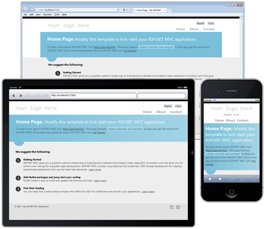
If you have already worked with a typical ASP.NET MVC 4 RC web application (Internet Application template), it means that you have already seen responsive web design in action. The pages of this web application can be flexibly adjusted to different screen sizes, and for screens with a width of less than 850 pixels (for example, smartphone screens), special styles are used (connected using a media query):

Book structure
Now directly about the book. Responsive Web Design is a step-by-step guide to creating a responsive website. The author is using the example of the test website "ROBOT ... OR NOT?" Step-by-step shows how responsive web design technology can improve a website with a fixed layout.
In the first chapter, the author talks about the reasons that led to the emergence of responsive web design technology, and its basic principles.
In the second chapter, the author shows how to make the page layout more flexible (rubber). Examples are given of how to correctly calculate the size of page elements in relative units (the size of the text should be specified in
em`ah, and the sizes of blocks, margins and indents in percent).The third chapter deals with the technology of flexible images - images that can adapt to various screen sizes, and provides a number of ways for cross-browser implementation of this technology.
If you previously read the joint book by Dan Sederholm and Ethan Marcott, “CSS Handmade” (namely, the 6th chapter of the “Rubber Grid”), then many of the concepts from the 2nd and 3rd chapters of “Responsive Web Design” will be are familiar.
The fourth chapter discusses CSS3 media queries technology and meta tag usage features
viewport. The examples show how, using media queries, you can set styles that focus on specific types of devices. In addition, the author provides links to JavaScript libraries that provide support for media queries in older versions of browsers.The fifth chapter lists the problems that can arise when creating responsive websites. The classic technology of responsive web design assumes that the version of the website for the desktop computer is taken as the basis, and then it is adapted for tablets and smartphones. This approach has one significant drawback: mobile users have to download design elements that were developed for the stationary version of the site, which leads to an increase in the amount of traffic and loading time of web pages. As a solution to this problem, it is proposed to take as a basis the approach of Luc Wroblewski , described in detail in the book "Mobile First!". With this approach, a mobile version of the site must first be created, and only then styles and capabilities for devices with a large screen size can be added to it. Ethan Marcott also notes that responsive web design requires changes to the web development process. In fact, responsive web design combines the design and development stages, and the process becomes more iterative, which requires closer interaction between graphic designers and front-end developers. At the end of the chapter, the author shows how responsive web design is combined with the concept of progressive enhancement.
Advantages and disadvantages of the Russian edition
The undoubted advantages of the Russian edition include: high-quality translation and the availability of color illustrations (it is still very rare for technical literature published here).
Perhaps I found only one drawback of this publication - the incorrect use of quotation marks in listings (instead of “double” and “single” computer quotes, “herringbone” and “Maror quotation marks” are used).
