Lesson 2. Create your application on Ext.NET, part 1
Containers (Container, Panel, TabPanel, ViewPort) and layouts (BorderLayout, AccordionLayout, CardLayout)
Introduction
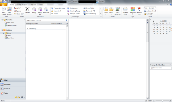
Well, let's get started. Our ultimate goal will be to create an interface roughly similar to Microsoft Outlook 2010 . Why exactly this interface? The reason is simple - because Ext.NET is often used in the corporate sector or close to it, and the user of this audience often wants to see something similar to Outlook. Plus, this markup is quite complex and therefore interesting. Do not worry, you can make many other interfaces, but it's all somehow later. I must make a reservation right away that we will not make a full copy of the Outlook interface, we will limit ourselves only to the most necessary.
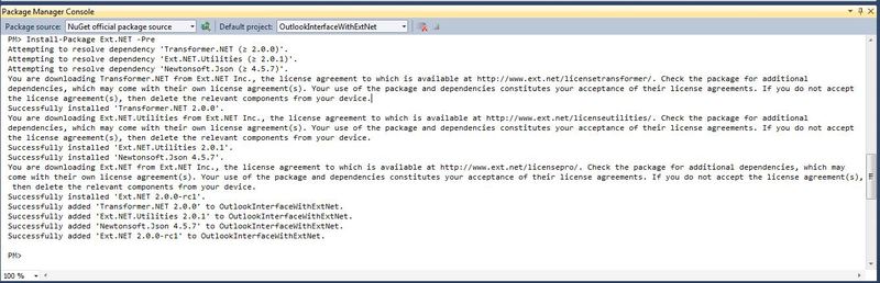
First, create an empty ASP.NET application and call it " OutlookInterfaceWithExtNet ".

Run the “Package Manager Console (Tools -> Library Package Manager -> Package Manager Console ). " And type the following command " PM -> Install-Package Ext.NET -Pre" . Using NuGet, we import Ext.NET and get almost the same application that was in the last lesson.
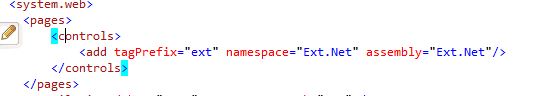
We’ll tweak “Web.config” so that we don’t add an assembly link with Ext.NET components everywhere.
Delete the file “Ext.NET.Default.aspx” from the project, we will not need it in this project.
ViewPort, BorderLayout and AccordionLayout
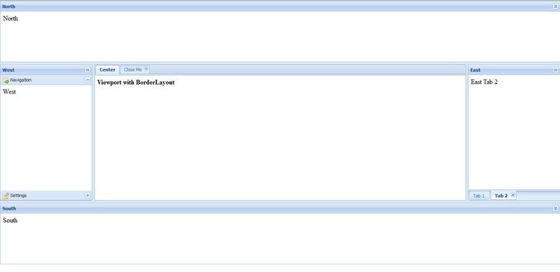
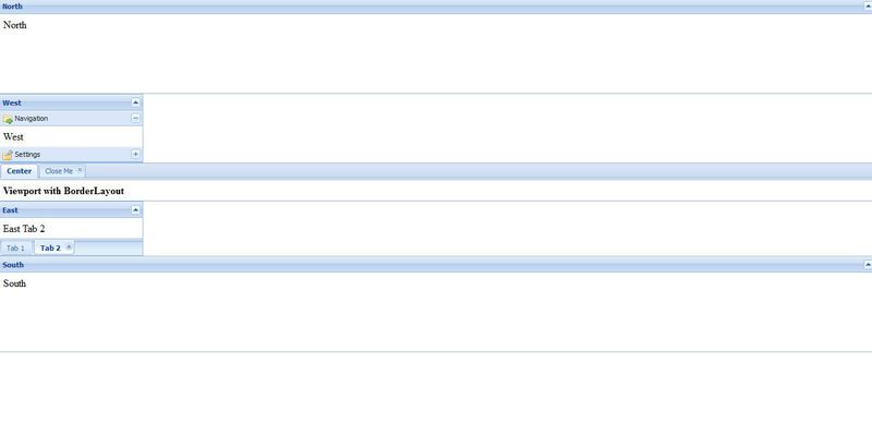
Now that all the preparations are finished, copy the markup from the following example http://examples.ext.net/#/ViewPort/Basic/Built_in_Markup/ into the new file “Default.aspx”. Let's remove the assembly registration, it is already registered with us in Web.config. We get the following markup:
Viewport with BorderLayout - Ext.NET Examples We see the following markup tree on this page, the attributes important to us are indicated in parentheses :
- Viewport
- Panel ( Region = "North" )
- Panel ( Layout = “AccordionLayout”, Region = “West )
- Panel
- Panel
- TabPanel ( Region = "Center" )
- Panel ( Title = "Center" )
- Panel ( Title = “Close me” )
- Panel ( Region = "East" )
- TabPanel ( TabPosition = "Bottom" )
- Panel ( Title = "Tab 1" )
- Panel ( Title = “Tab 2” )
- TabPanel ( TabPosition = "Bottom" )
- Panel ( Region = "South" )
Before starting to disassemble, let's see what is displayed in the browser. Make this page the default page and run it. We will see the area marked out in 5 parts, and it occupies the entire area of the page.
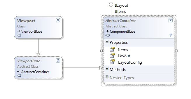
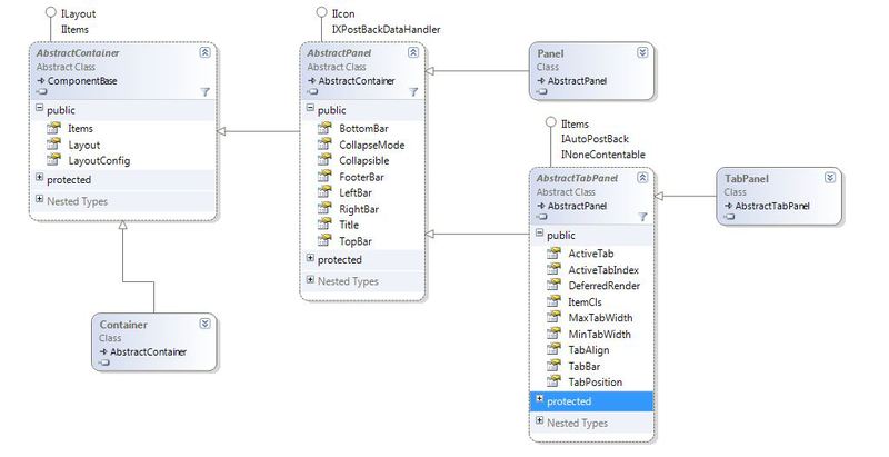
Now let's understand how it all happened. Let's start with the most important node - with ViewPort. Ext.NET has a wide variety of containers. The main role, which place a number of other controls. All of them inherit from the AbstractContainer class and have a special Items collection, which contains child controls.
In our markup in the root of the tree we see a special container, it is called " ViewPort ", it has one interesting property that sets it apart from the rest of the containers, it takesall available area on the page. You can resize your browser window as you wish and ViewPort will always stretch along with it, occupying all available space. Therefore, it is convenient to use it as a basic element in the markup. But it has one limitation, there can be only one ViewPort on the page , which is logical for itself, because you only have one browser window.
Now let's pay attention to the Layout attribute of the ViewPort , which has a value of " border ". It has an ulterior motive and they are usually used together. Let's remove this attribute and see what happens.
In principle, nothing bad happened, only the Elements inside our ViewPort stood on top of each other. Typical behavior for block elements in HTML. The reason is that the Layout attribute indicates the way the elements are arranged in the container. There is also LayoutConfig , which performs fine-tuning of the layout. These properties are defined in the base class "AbstractContainer" and all containers in Ext.NET inherit this property.
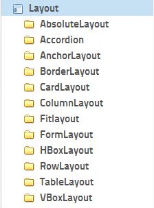
If you are interested in what other Layouts are, then you can look at http://examples.ext.net in the Layout node. Now we will discuss only those that we will need. You can read a good tutorial on markup, though with ExtJS Pre,http://rawberg.com/wp-content/uploads/ExtJS-Layouts.pdf . It details the key points for working with markup, which are true for Ext.NET.
In our particular case, we use BorderLayout , it places the children of the container, in our case it is ViewPort, with a maximum of five parts or a minimum of one. To understand by what principle he places them, let's look at the child elements of ViewPort. It contains four Panels and one TabPanel and each has an attribute " Region" , with a value from the set: " North", "West", "Center", "East", "South". As you probably already guessed, they indicate the 4 cardinal points and the central element, i.e. to place these elements inside the ViewPort container . Border markup has the following rules:
- There should always be a child with the Region = “Center” attribute . Therefore, there must be at least one element in this markup
- This central element takes up the space that remains after the space has been allocated to all the other elements involved in the markup.
Basically, nothing complicated in BorderLayout anymore. Let's summarize:
- Ext.NET has containers that inherit from AbstractContainer and contain a collection of child items;
- Containers do not affect the layout of elements; for this, the Layout and LayoutConfig properties are used;
- There is a special ViewPort container that occupies the entire available area in the browser window;
- There is a BorderLayout, which allows you to arrange its children in the container using the Region attribute.
I believe that many people paid attention to the panel with the value Region = "West" and the heading "West", or rather, the value of its Layout attribute. Look at the display of its children. They are grouped into a so-called accordion. This is done using the value of the attribute we already know - Layout = "accordion". In principle, this is not difficult, so we will not linger on AccordionLayout .
Container, Panel, TabPanel
Control Panel is the main container in Ext.NET.
Consider the main properties of the Panel class:
| Property Name | A type | Inherited from | Description |
| Animcollapse | bool | Abstractpanel | Indicates whether or not to minimize or maximize the panel. It only makes sense if the Collapsible property is true. |
| Bottombar | Ext.Net.ToolbarCollection | Abstractpanel | A collection of items that will be displayed at the very bottom of the panel. |
| Closable | bool | Abstractpanel | Can I close the panel |
| Collapsemode | Ext.Net.CollapseMode | Abstractpanel | Defines how the minimize button is displayed. Takes one of the values of the Enum CollapseMode: Default, Mini, Placeholder. It only makes sense if the Collapsible property is true. The default is 'Default'. |
| Collapsible | bool | Abstractpanel | Indicates whether the panel can be minimized. The default is false. |
| Defaults | Ext.Net.ParameterCollection | Abstractcontainer | The set of parameters that will be added to each element of the container. |
| Defaulttype | String | Abstractcontainer | Specifies xtype for default children. The default is 'panel'. Xtype is a unique class identifier in ExtJS. Read more docs.sencha.com/ext-js/4-1/# ! /Api/Ext.AbstractComponent-cfg-xtype |
| Footerbar | Ext.Net.ToolbarCollection | Abstractpanel | A collection of items that will be displayed at the bottom of the panel. |
| Items | Ext.Net.ItemsCollection | Abstractcontainer | The set of components that will be displayed inside the container |
| Layout | String | Abstractcontainer | Indicates the layout of items in a container |
| Layoutconfig | Ext.Net.LayoutConfigCollection | Abstractcontainer | Indicates parameters / settings for layout of elements in the container |
| Leftbar | Ext.Net.ToolbarCollection | Abstractpanel | A collection of items that will be displayed on the left side of the panel. |
| Rightbar | Ext.Net.ToolbarCollection | Abstractpanel | A collection of items that will be displayed on the right side of the panel. |
| Title | String | Abstractpanel | The title of the panel. Default '' |
| Tools | Ext.Net.ToolsCollection | Abstractpanel | The set of buttons that appear next to the panel title. Commonly used to display help, minimize, close buttons |
| Topbar | Ext.Net.ToolbarCollection | Abstractpanel | A collection of items that will be displayed on top of the panel. |
Instead of Panel, you can use Container , a simpler implementation of AbstractContainer, to speed up client-side rendering . Let's see what happens if we use Container rather than Panel as the child elements of ViewPort. The code we will use is the following:
Viewport with BorderLayout - Ext.NET Examples 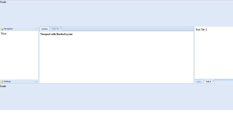
The dimensions are preserved and the contents of the elements remain. Purely visual, we lost only the panel headers, the border and background became transparent. Also, a small button was lost that allowed the panel to collapse to increase space for the central element; its presence was provided by the value of the following attribute - Collapsible = “true”. But this attribute is not supported in Container, and this functionality has been merged.
Let's look at the results of the profiler in both cases - in the case of using Panel and in the case of using Container.
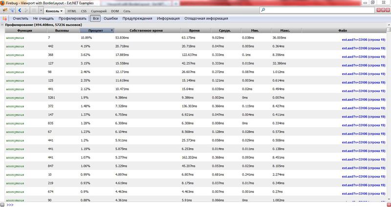
Profiling results using Container instead of Panel in ViewPort Profiling
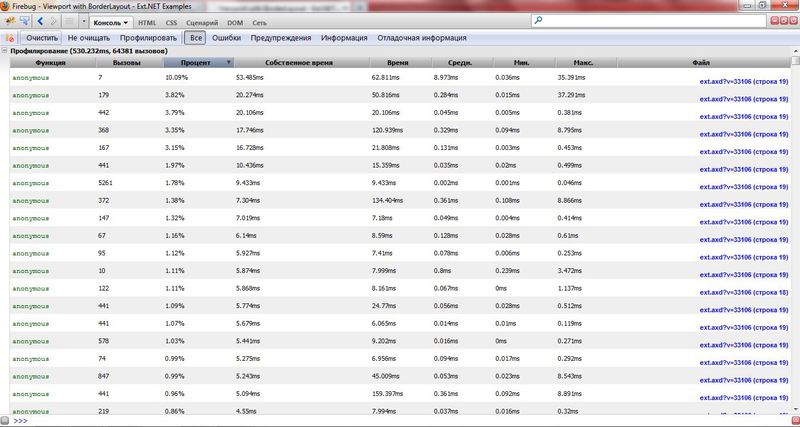
results using Panel in ViewPort
As you can see from the results, the replacementonly 4 Panels per Container , reduced rendering time by more than 30ms ( 494ms instead of 530ms) and the number of calls to JavaScript functions by 7000 (57236 instead of 64381) . Which is a pretty good result, considering that usually in Ext.NET applications several hundred Panel are used. But if you are definitely not sure about the benefits and advantages of using Container instead of Panel, I recommend using Panel. Often this does not bring a fundamental gain in speed, because browsers are working faster, client machine capacities too, and this can add many times more potential problems. We will not save and leave Panel.
The next container we meet is the " TabPanel"- panel for tabs. The control is a container for the Panel and each of them is a tab. The title value is indicated in the " Title " attribute of the container, and if you want the tab to be closed, then pay attention to the " Closable " attribute . TabPanel in its implementation uses another interesting Layout - CardLayout. We will not dwell on it in detail. In short, it presents the children of the container as a stack of cards and displays only the top one to the user. Those. the user at each moment of time displays only one element from his set of child elements. To understand, you can look at the following example.
Consider the main properties of the TabPanel class (because TabPanel is a descendant of AbstractPanel, then all the properties described for Panel are also valid for it, but some will not work because they do not make sense):
| Property Name | A type | Inherited from | Description |
| Activetab | Ext.Net.AbstractComponent | AbstractTabPanel | The identifier, index, or directly tab that will be displayed by default. Useful if you want TabPanel to open, for example 2, the tab |
| ActiveTabIndex | int | AbstractTabPanel | Default Tab Index |
| Deferredender | bool | AbstractTabPanel | If True , the tab items will not be loaded into the browser until the tab becomes active or visible. This allows you to speed up performance with a large number of items in tabs. If False, the elements of all tabs will be loaded immediately, often reducing performance . It is used in rare cases: when there are problems with the display of controls or when the user is annoyed by the delay when clicking on the tab. True by default |
| ItemCls | String | AbstractTabPanel | CSS class to be added to each tab. The default is "x-tabpanel-child" |
| MaxTabWidth | int | AbstractTabPanel | Maximum Tab Width |
| MinTabWidth | int | AbstractTabPanel | Minimum tab width |
| Tabalign | Ext.Net.TabAlign | AbstractTabPanel | Tab direction. Either right to left (Ext.Net.TabAlign.Left) or left to right (Ext.Net.TabAlign.Left). By default Ext.Net.TabAlign.Left |
| Tabposition | Ext.Net.TabPosition | AbstractTabPanel | The position of the tab headers. Either from above (Ext.Net.TabPosition.Top), or (Ext.Net.TabPosition.Bottom). By default Ext.Net.TabPosition.Top |
Create basic basic markup
Now that we have the knowledge we have gained, we can begin to create the most basic markup for our application. It will not be very much, but we are just starting. All panels of our ViewPort remained in place, but in accordance with our requirements, they received proper design. Let's look at the markup, which turned out in the end, you can insert it into Default.aspx and work with it yourself.
«a la Outlook» приложение, часть 1 And if we run it, we will get the following view of our main page:

There is nothing complicated in the markup, these are all components familiar to us. However, if you have questions, then write.
We will stop there. The foundation of our application is laid down, although it is usually the same for all applications. In the next part, we will take another step - we will make the top menu (Ribbon) and along the way we will deal with Toobar, Button, SplitButton and other other interesting components.
The project can be downloaded here.
Thank you for your attention and enjoy reading!