Where I am? Where am I? Or how users are oriented
Any behavior is a form of interaction. Antonym (anti-interaction and non-conduct) does not exist, and it is impossible to not interact.
Everything on the site interacts with the user. The arrangement of blocks, copywriting, text color, alignment of forms, the absence or presence of a grid are all parts of communication. It’s the same with a person - the message carries everything from the type of gait to the color of the skin and the length of the skirt. And all people perceive these messages almost instantly.
Somewhere there was a study that girls make a decision whether to sleep with a boy (or vice versa) one and a half seconds after they saw him. And the site has about the same time to give the impression of a pleasant, necessary and interesting. Well, maybe a little more, because the mechanism for evaluating other individuals has evolved longer than the algorithm for recognizing the necessary pages on the Internet. Metrica considers visits less than 15 seconds to be denied, but this is more likely an indicator of visitors who seem to understand what you are doing, and for some reason this did not suit them. But in <5 seconds people who may be and need your services leave, but, loading the page, they think "oh my God, that this is where I got", and they leave, having lost the opportunity to transform your life with the help of your dream site forever .
For example, consider 2 sites for searching for real estate (I do not advertise any of the resources and have no relation to them):

Suppose we don’t know that this is a huge monstrous base throughout the real estate (you don’t know? I envy you, so the housing issue did not spoil you).
What do you have time to understand in one and a half seconds?
Everything, as in the passport office, it is obvious that there will be no beautiful smiling girls and martinis.
By the headings it’s clear that the site is about real estate, it seems all over Russia (column on the right). The numbers (56,425 apartments in Moscow) are scary, that is, there is a lot of data. That is, if you have time to delve into this heap, you will have an apartment in the Central Administrative District without furniture, with white walls for 30,000, but the journey will be long.

It quickly becomes clear that this is a pretty, human place, no officialdom. There are few offers (in fact, there are, in fact, only 3 of them), but since there is not enough information, it means it is something special.
With a cursory glance, it is more or less clear that this is all happiness only in Moscow.
So what messages do we get?
And if the first characteristic is more or less personal, and the third tends to change over time, then the income of the site directly depends on the second. If visitors incorrectly evaluate why a site is needed, they either do not touch it or use it incorrectly. It’s as if the natives found a lighter: it can change their whole life, but if they don’t get interested in it, or they start using it like a picker in their nose, the culinary revolution will not happen.
What needs to be done in order for the site to be used for its intended purpose? There are two ways - simple and complex. You can rotate the page, place accents and priorities, make an eye-catching interface. Or you can just introduce yourself.
If a man in a white coat and hat comes up to you, you will most likely guess that he will treat your cold. At the same time, with the same obviousness, you will understand that the person standing in front of you is a doctor if he simply says this with a sufficient degree of conviction.

For example, the “Find Here” website has a rather unusual and complex functioning template.
Therefore, in addition to the detailed FAQ and the form, at the very beginning there are several lines that explain what is happening at all:

The trailer is the same, only a little more expensive and drawn out way to tell about yourself. For example, Dropbox prefers to explain how it will change your life for the better, using the video:

Trailers have an advantage - during the video you can show your advantages, fall in love with your product and create a clear image. On the other hand, the same dropbox movie takes two minutes. That is, if the user does not have an extra two minutes, what he will do on this your site, he will not understand. Maybe they sell boxes there?
(In a recent post, “ Why I Hate YouTube, ” the author extensively told why he doesn’t like to watch long videos, when you can say the same thing in a nutshell. The article was, in fact, about manuals, but it can be extrapolated to promo pages)
For example , here is the Prezi homepage:
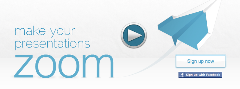
Even if I don’t watch the video, in less than a second I’ll understand that you can create presentations on the site (expanding or coming up, or still not know which ones, and you can watch the video to find out which ones).
On news sites there is a concept of lead - a short sentence that reflects the essence of the news. The reader quickly perceives the news “Debris of a missing helicopter was discovered in Yakutia”, “CERN announced the discovery of a new subatomic particle”, and if he is interested, he will read in which area of Yakutia the helicopter, its make, number of passengers or details about the Higgs boson fell. But he already recognized the main events of the day in the first couple of seconds.
On the other hand, if the service is not too complicated and has one, simple and main function, what should be done with it from the context, right?
If your application, like a door, performs only one function, it should be clear from its appearance what to do with it.

On this door it is obvious that it needs to be pulled or pushed. And the site should understand how to use it. If you need to buy on the site, it means that there should be goods, prices, and buy buttons.
For example, here is an online store selling sporting goods, including tents:
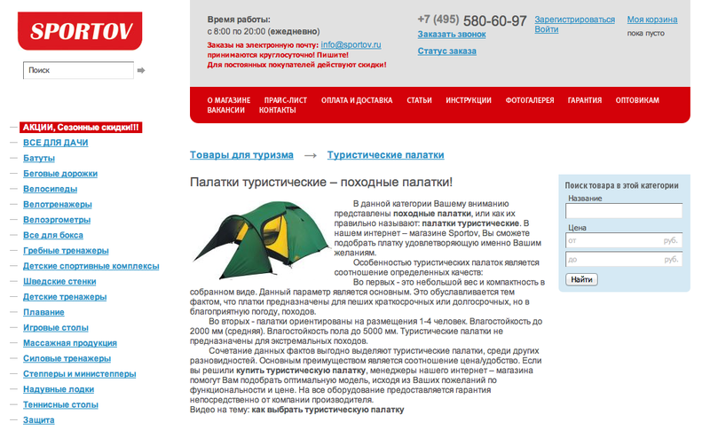
Surely, the long text written by the SEOs is optimized for the search algorithm. Maybe it is thanks to him that the site is on the first page in Google. But the problem is that it does not look like an online store. Cards with goods are on the second, if not the third screen, and I doubt that a large number of users will be interested in the text about “tourist tents, camping tents, buy a tourist tent” so much that it scrolls down.
Imagine a sports store where the entire large hall is pasted with posters about a healthy lifestyle, and the goods are in a small utility room in the far corner.
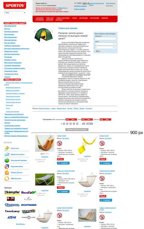
* Only one thousand pixels below the first screen
The site should have on the main page, in the first screen, typical signs of its specialization. The store has cards with goods, the air carrier has a set of forms where-when, the search engine has a search line.
Description of the site no longer than 5-6 words in a prominent place. Mockinbird is an online prototyping tool, Dropbox is a cloud-based data warehouse, Basecamph is a project management and collaboration tool. This sounds like a captain’s remarks. Evidence, only for projects whose number of users has exceeded that pleasant feature, when developers already have an impressive bank account, and at least every second of the target audience has heard about the project.
Everything on the site interacts with the user. The arrangement of blocks, copywriting, text color, alignment of forms, the absence or presence of a grid are all parts of communication. It’s the same with a person - the message carries everything from the type of gait to the color of the skin and the length of the skirt. And all people perceive these messages almost instantly.
Somewhere there was a study that girls make a decision whether to sleep with a boy (or vice versa) one and a half seconds after they saw him. And the site has about the same time to give the impression of a pleasant, necessary and interesting. Well, maybe a little more, because the mechanism for evaluating other individuals has evolved longer than the algorithm for recognizing the necessary pages on the Internet. Metrica considers visits less than 15 seconds to be denied, but this is more likely an indicator of visitors who seem to understand what you are doing, and for some reason this did not suit them. But in <5 seconds people who may be and need your services leave, but, loading the page, they think "oh my God, that this is where I got", and they leave, having lost the opportunity to transform your life with the help of your dream site forever .
For example, consider 2 sites for searching for real estate (I do not advertise any of the resources and have no relation to them):
1. CYAN

Suppose we don’t know that this is a huge monstrous base throughout the real estate (you don’t know? I envy you, so the housing issue did not spoil you).
What do you have time to understand in one and a half seconds?
Everything, as in the passport office, it is obvious that there will be no beautiful smiling girls and martinis.
By the headings it’s clear that the site is about real estate, it seems all over Russia (column on the right). The numbers (56,425 apartments in Moscow) are scary, that is, there is a lot of data. That is, if you have time to delve into this heap, you will have an apartment in the Central Administrative District without furniture, with white walls for 30,000, but the journey will be long.
2. And from our window

It quickly becomes clear that this is a pretty, human place, no officialdom. There are few offers (in fact, there are, in fact, only 3 of them), but since there is not enough information, it means it is something special.
With a cursory glance, it is more or less clear that this is all happiness only in Moscow.
So what messages do we get?
- Brand character - business-corporate, luxurious, comfortable
- The purpose of the site - what to do on it? Read, buy, talk?
- The amount of information - what is it, a sports palace or a makeshift? How much time will it take me? Is there anything else here?
And if the first characteristic is more or less personal, and the third tends to change over time, then the income of the site directly depends on the second. If visitors incorrectly evaluate why a site is needed, they either do not touch it or use it incorrectly. It’s as if the natives found a lighter: it can change their whole life, but if they don’t get interested in it, or they start using it like a picker in their nose, the culinary revolution will not happen.
What needs to be done in order for the site to be used for its intended purpose? There are two ways - simple and complex. You can rotate the page, place accents and priorities, make an eye-catching interface. Or you can just introduce yourself.
If a man in a white coat and hat comes up to you, you will most likely guess that he will treat your cold. At the same time, with the same obviousness, you will understand that the person standing in front of you is a doctor if he simply says this with a sufficient degree of conviction.

For example, the “Find Here” website has a rather unusual and complex functioning template.
Therefore, in addition to the detailed FAQ and the form, at the very beginning there are several lines that explain what is happening at all:

The trailer is the same, only a little more expensive and drawn out way to tell about yourself. For example, Dropbox prefers to explain how it will change your life for the better, using the video:

Trailers have an advantage - during the video you can show your advantages, fall in love with your product and create a clear image. On the other hand, the same dropbox movie takes two minutes. That is, if the user does not have an extra two minutes, what he will do on this your site, he will not understand. Maybe they sell boxes there?
(In a recent post, “ Why I Hate YouTube, ” the author extensively told why he doesn’t like to watch long videos, when you can say the same thing in a nutshell. The article was, in fact, about manuals, but it can be extrapolated to promo pages)
For example , here is the Prezi homepage:

Even if I don’t watch the video, in less than a second I’ll understand that you can create presentations on the site (expanding or coming up, or still not know which ones, and you can watch the video to find out which ones).
On news sites there is a concept of lead - a short sentence that reflects the essence of the news. The reader quickly perceives the news “Debris of a missing helicopter was discovered in Yakutia”, “CERN announced the discovery of a new subatomic particle”, and if he is interested, he will read in which area of Yakutia the helicopter, its make, number of passengers or details about the Higgs boson fell. But he already recognized the main events of the day in the first couple of seconds.
On the other hand, if the service is not too complicated and has one, simple and main function, what should be done with it from the context, right?
If your application, like a door, performs only one function, it should be clear from its appearance what to do with it.

On this door it is obvious that it needs to be pulled or pushed. And the site should understand how to use it. If you need to buy on the site, it means that there should be goods, prices, and buy buttons.
For example, here is an online store selling sporting goods, including tents:

Surely, the long text written by the SEOs is optimized for the search algorithm. Maybe it is thanks to him that the site is on the first page in Google. But the problem is that it does not look like an online store. Cards with goods are on the second, if not the third screen, and I doubt that a large number of users will be interested in the text about “tourist tents, camping tents, buy a tourist tent” so much that it scrolls down.
Imagine a sports store where the entire large hall is pasted with posters about a healthy lifestyle, and the goods are in a small utility room in the far corner.

* Only one thousand pixels below the first screen
Summary
The site should have on the main page, in the first screen, typical signs of its specialization. The store has cards with goods, the air carrier has a set of forms where-when, the search engine has a search line.
Description of the site no longer than 5-6 words in a prominent place. Mockinbird is an online prototyping tool, Dropbox is a cloud-based data warehouse, Basecamph is a project management and collaboration tool. This sounds like a captain’s remarks. Evidence, only for projects whose number of users has exceeded that pleasant feature, when developers already have an impressive bank account, and at least every second of the target audience has heard about the project.
