SurfPatrol. Testing the interface?
We already wrote about SurfPatrol , a service for checking PC security . Over the past few months, we have seriously worked on its interface, and soon the service will get an updated look. SurfPatrol was originally conceived as simple and straightforward for the average user. We ask Habrausers to evaluate the new interface from this point of view. We will be glad to see a barrel of honey and a fly in the ointment :)
Akhtung! A lot of pictures.
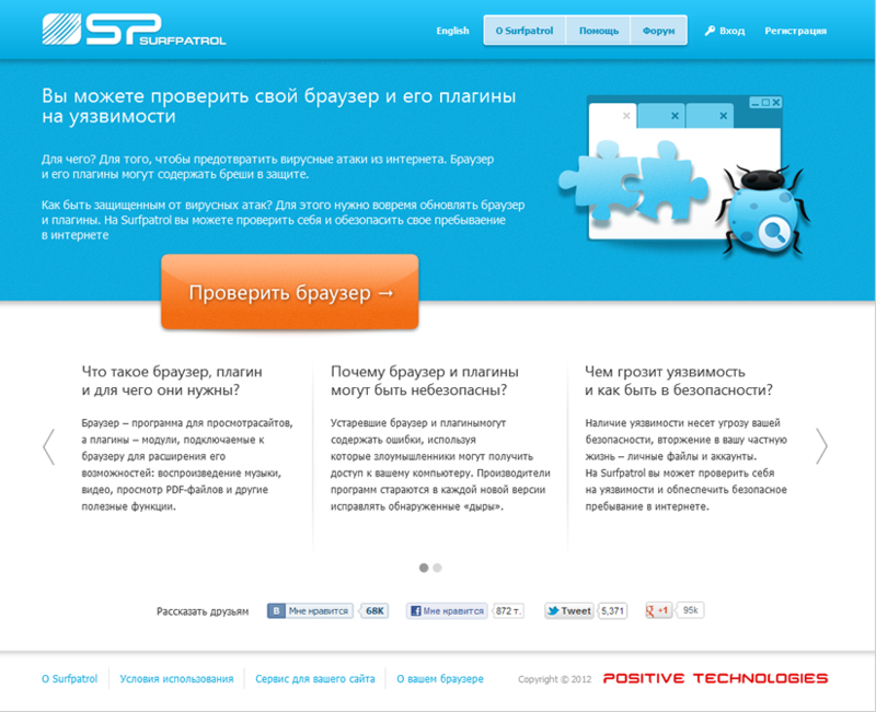
So, the main page with a small educational program about the need to check the browser - and actually the button that calls for this action. You can talk about the service on social networks using special buttons. But how noticeable are they on the main page? ..
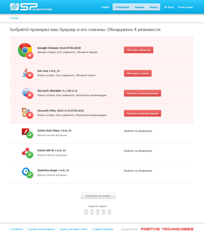
After checking, we get to the reports page. Here you can see how susceptible to cyber intrusions (potentially) our current browser and all its plugins are. Buttons-informants are active: by clicking on them, you can go to the official website of the browser or plug-in to download corrections or updates.
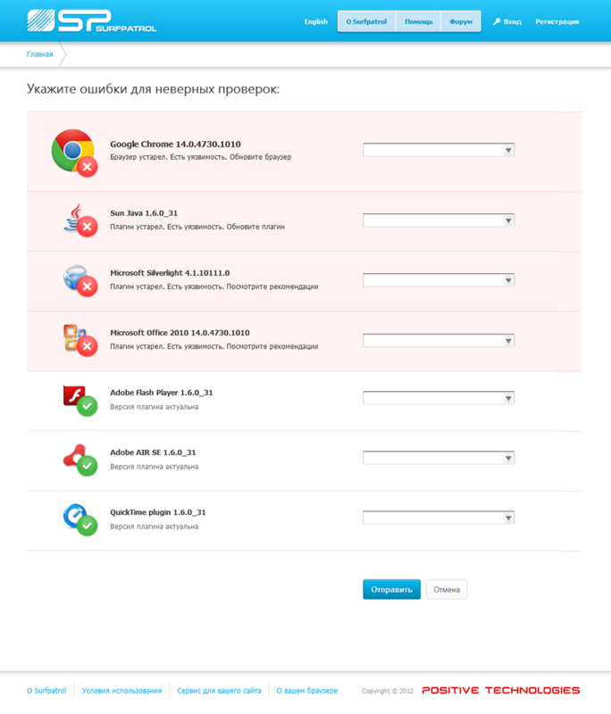
If the user believes that the service made a mistake, you can inform the developers about this by clicking on the "Report a bug" button. It is assumed that the user views information on all components of the list to the end and sees this button at the bottom of the page. However, in the process of developing the interface, this arrangement of the button caused an active discussion and a lot of doubts. How successful, in your opinion, was the final version?
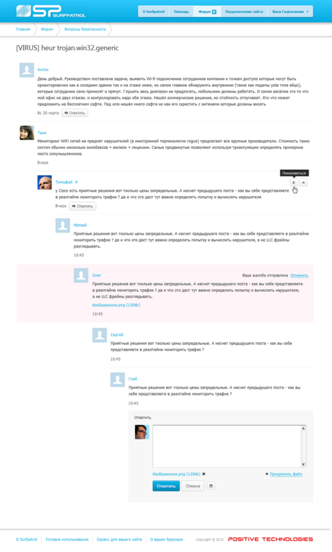
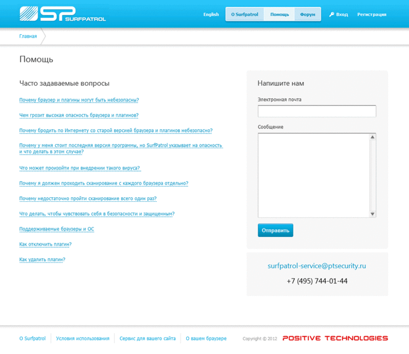
To interact with the support and communication service within the community, a forum has been implemented (only registered users can leave messages). In addition to the forum, you can get feedback and find answers to your questions in the "Help" section. There is a feedback form, contact information and FAQ. The main doubt that arose among the developers of the interface is related to overload. Will the user confuse the abundance of information on this page? In conclusion, we add that we will be especially grateful for the reasoned and constructive criticism.
Akhtung! A lot of pictures.
So, the main page with a small educational program about the need to check the browser - and actually the button that calls for this action. You can talk about the service on social networks using special buttons. But how noticeable are they on the main page? ..
After checking, we get to the reports page. Here you can see how susceptible to cyber intrusions (potentially) our current browser and all its plugins are. Buttons-informants are active: by clicking on them, you can go to the official website of the browser or plug-in to download corrections or updates.
If the user believes that the service made a mistake, you can inform the developers about this by clicking on the "Report a bug" button. It is assumed that the user views information on all components of the list to the end and sees this button at the bottom of the page. However, in the process of developing the interface, this arrangement of the button caused an active discussion and a lot of doubts. How successful, in your opinion, was the final version?
To interact with the support and communication service within the community, a forum has been implemented (only registered users can leave messages). In addition to the forum, you can get feedback and find answers to your questions in the "Help" section. There is a feedback form, contact information and FAQ. The main doubt that arose among the developers of the interface is related to overload. Will the user confuse the abundance of information on this page? In conclusion, we add that we will be especially grateful for the reasoned and constructive criticism.