Simple customization of Checkbox and Radio
Instead of joining
Good day to all!
Customization of form elements is probably one of the most exciting activities in web design. Whether this occupation is justified is decided by everyone for himself, although it is obvious that in our time, designers and layout designers devote their time and energy to this.
Unfortunately, CSS alone is often not enough to easily style a particular form element. This is probably why many people use things like Uniform for their forms. Personally, I always try to reduce the amount of Javascript used for such purposes, so I want to talk about a completely native HTML + CSS method for customizing radio buttons and checkboxes.
I am sure that for most specialists on Habré, they use similar methods, for those who use js-libraries, like Uniform , I hope this article will be useful.
Go!
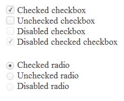
So, we ’ll immediately set a goal: to design checkboxes and radio buttons so that they look like Uniform js-magic , but make it as simple as possible, native to HTML and CSS , and also avoid the use of unnecessary tags, preserving semantics. Something like this.
The main idea is based on the native "ability" of the HTML label tag to establish a connection with a specific form element. Actually that's all, then only the code.
Markup
< ul >
< li >
< input id = "cfirst" type = "checkbox" name = "first" checked hidden / >
< label for = "cfirst" > Checked checkbox < / label >
< / li >
< li >
< input id = "csecond" type = "checkbox" name = "second " hidden />
< label for = "csecond" > Unchecked checkbox < / label >
< / li >
< li >
< input id = "cthird" type = "checkbox" name = "third" hidden disabled / >
< label for = "cthird" > Disabled checkbox < / label >
< / li >
<li >
< input id = "clast" type = "checkbox" name = "last" checked hidden disabled / >
< label for = "clast" > Disabled checked checkbox < / label >
< / li >
< / ul >
< ul >
< li >
< input id = "rfirst" type = "radio" name = "radio" checked hidden / >
< label for = "rfirst" > Checked radio < / label >
< / li >
< li >
< input id = "rsecond" type = "radio" name = "radio" hidden / >
< label for = " rsecond " > Unchecked radio < / label >
</ li >
< li>
< input id = "rthird" type = "radio" name = "radio" hidden disabled / >
< label for = "rthird" > Disabled radio < / label >
< / li >
< / ul >
Completely native markup. Using label along with input is just like from tutorials. The important point is that you need to specify an id for each input and for for label to bind them.
I think everyone noticed the use of the hidden attribute , which hides the input elements themselves , however, due to the connection with the label , we can still manipulate them. As a result, we get something like: It's
completely boring, but everything works. Now it remains to arrange all this good as it should. To do this, use the sprite that is used on the siteUniform .
Registration
input [ type = "checkbox" ] ,
input [ type = "radio" ] {
display : none ;
}
input [ type = "checkbox" ] + label ,
input [ type = "radio" ] + label {
font : 18px bold ;
color : # 444 ;
cursor : pointer ;
}
input [type = "checkbox" ] + label : : before ,
input [ type = "radio" ] + label : : before {
content : "" ;
display : inline- block ;
height : 18px ;
width : 18px ;
margin : 0 5px 0 0 ;
background-image : url ( uniformjs.com/images/sprite.png ) ;
background-repeat : no-repeat ;
}
Input [ type = "checkbox" ] + label : : before {
background-position : -38px -260px ;
}
Input [ type = "radio" ] + label : : before {
background-position : 0px -279px ;
}
input [ type = "checkbox" ] : checked + label :: before {
background-position : -114px -260px ;
}
Input [ type = "radio" ] : checked + label : : before {
background-position : -108px -279px ;
}
Input [ type = "checkbox" ] : disabled + label : : before {
background-position : -152px -260px ;
}
input [ type ="checkbox Central" ] : checked Only : disabled + label : : the before {
background Used-position : -171px -260px ;
}
Input [ type = "radio" ] : disabled + label : : before {
background-position : -144px -279px ;
}
Input the [ of the type = "a radio" ] : checked Only : disabled + label : : the before {
background Used-position : -162px -279px ;
}
It's still as simple as possible. We use the before pseudo-element in order to show our “virtual controls” and the user did not notice the substitution. Parts of the sprite, change depending on the state of the input .
The result is something like:
Demo The
benefits of using this approach compared to the same Uniform are obvious. No javascript for decoration, no extra tags, more simple, correct and semantic markup. The same method can be used to give these elements more bizarre shapes. For example, iPhone-style checkboxes can be repaired without problems without using javascript.
I hope this article will be useful for beginner typesetters and stop them about using js-crutches for such purposes. Thanks for attention!
UPD: As noted by the respected SelenIT2, this method probably will not work in the Safari browser for the iOS platform due to the annoying error in supporting the html specification ( link ).