Skeuomorphism and Narration
- Transfer
Designers love to hate skeuomorphism . “It's just a decoration,” they say. “It is completely useless. It will be out of fashion. ” Or as Mark Bolton , co-founder of the Live Simple Steps , tweeted :
However, Apple and many other software developers continue to actively use this technique in some applications. Many are furious, not wondering “why.” Why do Apple and many others continue to walk along a slippery slope? They all lost a sense of quality design, that's for sure. Or not?
There are some advantages to the practicality of skeuomorphic design, which are often praised. In Aibuks, for example, Apple, using a book metaphor, makes it obvious that you need to turn pages with swipe. Elasticity - a cute, small effect when scrolling to the end of the list - is also largely a skeuomorphism, although this almost imperceptible effect is loved by many. But since these advantages of skeuomorphism are so good, let's talk about skeuomorphism, which makes people crazy, useless, pursuing exclusively design goals.
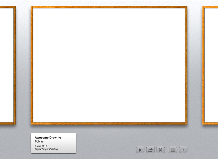
Paper is an iPad application. It was released recently and caused a certain resonance. Here is what you see first of all after launching the application:

Notepads, so that I fail! It's simplemust be the decision of a designer who likes to grind pixels and create photorealistic icons. Perhaps he just wanted to amuse his designer ego and send a couple of screenshots to Dribble . It has nothing to do with developing good software.
Well, maybe that's connected.
Let's take a look at the purpose of the Paper. This is how Fifti Three, who developed the application (founded by former Microsoft employees), presents it at Up Store (my emphasis):
It's all about collecting ideas. Quick and dirty. It is here to quickly sketch something. This is simply a notebook. A drawing application can be anything: something for prototyping and sketching, or a tool for professional artists . Be that as it may, Paper is not like that. The interface not only keeps in touch with its purpose, but also helps you plunge into a state in which you are not shy about expressing your ideas in an unbiased way. The interface tells the story and sets the tone for all experiences.
This is the start screen of the Brushis drawing application , used to create at least four New Yorker artwork:
The interface tells a completely different story. If I wish to spend an hour or two implementing one of my ideas, this interface will only spur me on. If I want to quickly make a couple of sketches, this interface can discourage such a desire. I do not want my ugly, quick-drawn sketches to be placed on the wall in a frame for public viewing. I will think twice before quickly sketching something in this application.
The functionality of Paper and Brushis is almost identical, but the pursued purpose is categorically different.
In “Snow Leopard” the “Photo Bus” application looks like this:

And later “Lion” appeared with its full-screen mode. The composition of skeuomorphism arrives on the first platform:
Bang bang! Curtains. Wooden panels. Metal buttons. Apple, is it?
Once again, let's take a look at the “Bus Photo” function: take pictures, record videos and apply various filters to them. The first version made it easy and simple. She, however, did not keep in touch with the purpose of the "Photo Bus": to fool around and have fun. Let me show you :
"Photo Bus" is a digital toy. The first version, albeit neat and functional, did not look like a toy. She was not funny, did not cause a desire to play with her. In the new full-screen version, Apple uses skeuomorphism to engage users in the game.
Skeuomorphism is actually about the connection with feelings and their consolidation, about bringing the application to the level of not just an instrument, but a memorable experience. It shows the purpose of the interface, not just the functions that it includes.
Making music should be fun, right? This is a reason enough for the tablet version of Garage Band to look like this:

But not like that:
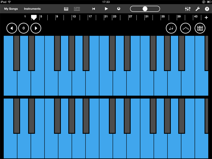
And although this option can be more functional, neater and closer to the functions of the interface, it does not carry fun. With the same success, I can compose music in Excel. The “Garage Band” interface not only presents opportunities in a clean and understandable form, it gives a wonderful, fun and memorable experience.
Skeuomorphism is a powerful tool. No need to be afraid to use it, but you need to be careful. It, for example, is unlikely to work for a working application like Mail. Someone may say that Apple has crossed the borders with some applications, for example, with the version of the “Calendar” for “Leo” or with the application “Find My Friends” for iPhone and iPad.
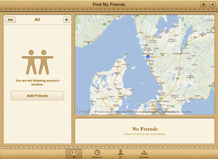
This may be true, but consider the purpose of this application. It is not about tracking friends, classmates or employees. It's about keeping in touch with friends. The interface looks, let's be honest, stupid. However, he is indescribably friendly. The functionality of the application is quite controversial and, having been framed differently as a serious application, it could be rightly perceived by the nasty.
Josh Clark writes in his book Tapworthy :
It is often said that design must be invisible. More importantly, design should enable. A difficult-to-use interface, which, however, is fun, involves the user and creates an experience that simplifies overcoming obstacles and thereby an experience in which the product is easier and more natural to use. Skeuomorphism used wisely can preserve the ease of use of the interface, while allowing users to act.
If you have comments not on the essence of the article, but on translation, or any other suggestions, do not forget that comments are created for discussion, and dialogue on third-party topics is carried out in personal correspondence.
Kinday :
Tayomi :
“I desperately ask everyone to stop giving the digital creations the appearance of real objects. The screen is not a shaded embossed board. ”
However, Apple and many other software developers continue to actively use this technique in some applications. Many are furious, not wondering “why.” Why do Apple and many others continue to walk along a slippery slope? They all lost a sense of quality design, that's for sure. Or not?
There are some advantages to the practicality of skeuomorphic design, which are often praised. In Aibuks, for example, Apple, using a book metaphor, makes it obvious that you need to turn pages with swipe. Elasticity - a cute, small effect when scrolling to the end of the list - is also largely a skeuomorphism, although this almost imperceptible effect is loved by many. But since these advantages of skeuomorphism are so good, let's talk about skeuomorphism, which makes people crazy, useless, pursuing exclusively design goals.
Paper is an iPad application. It was released recently and caused a certain resonance. Here is what you see first of all after launching the application:
Notepads, so that I fail! It's simplemust be the decision of a designer who likes to grind pixels and create photorealistic icons. Perhaps he just wanted to amuse his designer ego and send a couple of screenshots to Dribble . It has nothing to do with developing good software.
Well, maybe that's connected.
Let's take a look at the purpose of the Paper. This is how Fifti Three, who developed the application (founded by former Microsoft employees), presents it at Up Store (my emphasis):
“Paper” is the place where ideas are born . This is the easiest and most beautiful way to create on the iPad. Capture ideas as sketches , diagrams, illustrations, notes, or drawings and share them online. [...] Paper works the way you are used to, like a familiar notebook or diary . Keep all your ideas together, always with you. ”
It's all about collecting ideas. Quick and dirty. It is here to quickly sketch something. This is simply a notebook. A drawing application can be anything: something for prototyping and sketching, or a tool for professional artists . Be that as it may, Paper is not like that. The interface not only keeps in touch with its purpose, but also helps you plunge into a state in which you are not shy about expressing your ideas in an unbiased way. The interface tells the story and sets the tone for all experiences.
This is the start screen of the Brushis drawing application , used to create at least four New Yorker artwork:
The interface tells a completely different story. If I wish to spend an hour or two implementing one of my ideas, this interface will only spur me on. If I want to quickly make a couple of sketches, this interface can discourage such a desire. I do not want my ugly, quick-drawn sketches to be placed on the wall in a frame for public viewing. I will think twice before quickly sketching something in this application.
The functionality of Paper and Brushis is almost identical, but the pursued purpose is categorically different.
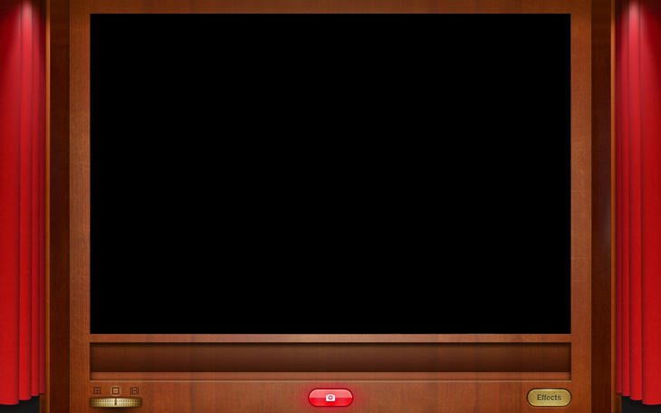
In “Snow Leopard” the “Photo Bus” application looks like this:
And later “Lion” appeared with its full-screen mode. The composition of skeuomorphism arrives on the first platform:
Bang bang! Curtains. Wooden panels. Metal buttons. Apple, is it?
Once again, let's take a look at the “Bus Photo” function: take pictures, record videos and apply various filters to them. The first version made it easy and simple. She, however, did not keep in touch with the purpose of the "Photo Bus": to fool around and have fun. Let me show you :
"Photo Bus" is a digital toy. The first version, albeit neat and functional, did not look like a toy. She was not funny, did not cause a desire to play with her. In the new full-screen version, Apple uses skeuomorphism to engage users in the game.
Skeuomorphism is actually about the connection with feelings and their consolidation, about bringing the application to the level of not just an instrument, but a memorable experience. It shows the purpose of the interface, not just the functions that it includes.
Making music should be fun, right? This is a reason enough for the tablet version of Garage Band to look like this:
But not like that:
And although this option can be more functional, neater and closer to the functions of the interface, it does not carry fun. With the same success, I can compose music in Excel. The “Garage Band” interface not only presents opportunities in a clean and understandable form, it gives a wonderful, fun and memorable experience.
Skeuomorphism is a powerful tool. No need to be afraid to use it, but you need to be careful. It, for example, is unlikely to work for a working application like Mail. Someone may say that Apple has crossed the borders with some applications, for example, with the version of the “Calendar” for “Leo” or with the application “Find My Friends” for iPhone and iPad.
This may be true, but consider the purpose of this application. It is not about tracking friends, classmates or employees. It's about keeping in touch with friends. The interface looks, let's be honest, stupid. However, he is indescribably friendly. The functionality of the application is quite controversial and, having been framed differently as a serious application, it could be rightly perceived by the nasty.
Josh Clark writes in his book Tapworthy :
“Do not dismiss this as tactile deception; emotional resonance is the basis of all marketing and storytelling; and don't be mistaken, your application is history. In a rather personal iPhone context, people perceive the application as content, and not as software, as experience, and not as a tool, as entertainment, and not as a task. The nature of your application sets the tone for this experience, and it should suit your audience and be at hand with it. Combining the aesthetics of a thing with both function and owner, you get something beautiful, functional and excellent. ”
It is often said that design must be invisible. More importantly, design should enable. A difficult-to-use interface, which, however, is fun, involves the user and creates an experience that simplifies overcoming obstacles and thereby an experience in which the product is easier and more natural to use. Skeuomorphism used wisely can preserve the ease of use of the interface, while allowing users to act.
From translator
Hello to everyone who was waiting for this translation. I hope he met expectations, both in meaning and in quality. I try to raise the bar and Tayomi helps me with this , for which many thanks to her. In our tandem, I deal directly with translation, and she is engaged in proofreading and editing.If you have comments not on the essence of the article, but on translation, or any other suggestions, do not forget that comments are created for discussion, and dialogue on third-party topics is carried out in personal correspondence.
Kinday :
- Email: petabyte@kinday.ru
- Skype: kinday_da_masta
Tayomi :
- Email: katriona@korotkevich.net
- Skype: tayomi88