New typography for the web. Microsoft demonstrates the capabilities of OpenType
Microsoft has published a demo page of advanced typography for the OpenType format. These are alternative glyphs, ligatures, kerning, fractions, small uppercase and minuscule digits . Effects are visible if you hover over the text with the mouse. The demo works well only in browsers with OpenType support, Microsoft itself recommends IE10 + and Firefox 8+. In other browsers, not all effects may appear, it still depends on the operating system. Alternative glyphs and small uppercase We
can agree with Microsoft - OpenType really takes web typography to a new level, close to typographic. The capabilities of this format are clearly superior to @ font-face.
A code snippet is provided for each effect, as implemented in OpenType.
The code
The code
The code
The code
The code
The code
Microsoft considers OpenType a revolutionary format and expects its widespread support by all browsers. It should be added that OpenType, a format developed by Microsoft and Adobe, is an improved version of the TrueType format, and the validity period of patents for TrueType has recently expired .
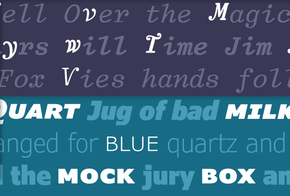
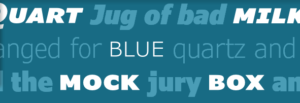
Small caps
Uppercase text immediately attracts attention, but it looks very poorly surrounded by plain text. In this case, you can use small caps.The code
/* use small-caps */
.smallcaps {
  -moz-font-feature-settings: "smcp=1";
  -ms-font-feature-settings: "smcp" 1;
}
/* both upper and lowercase to small caps */
.allsmallcaps {
  -moz-font-feature-settings: "c2sc=1, smcp=1";
  -ms-font-feature-settings: "c2sc" 1,"smcp" 1;
}
Ligatures
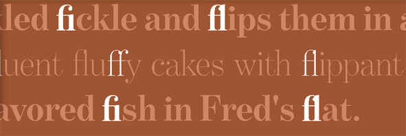
Ligature - a combination of two or more letters. In typography, they can be used to improve the readability and / or structure of the text, eliminate unnecessary gaps, save space.The code
/* use ligatures automatically */
.ligatures {
	text-rendering: optimizeLegibility;
	-moz-font-feature-settings: "liga=1";
	-ms-font-feature-settings: "liga" 1;
}
Figures
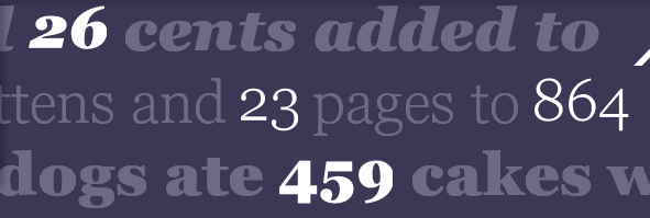
Ordinary mayuskulnye numbers are better suited for tabular typesetting, but minuscules can be used in the text for aesthetic purposes.The code
/* enable proportional figures and ordinals */
.figures {
  -moz-font-feature-settings: "pnum=1,onum=1";
  -ms-font-feature-settings: "pnum" 1,"onum" 1;
}
Kerning
Selectively changing the spacing between letters depending on their shape creates a more readable, balanced text.The code
/* enable kerning data */
.kerning {
text-rendering: optimizeLegibility;
-moz-font-feature-settings: "kern=1";
-ms-font-feature-settings: "kern" 1;
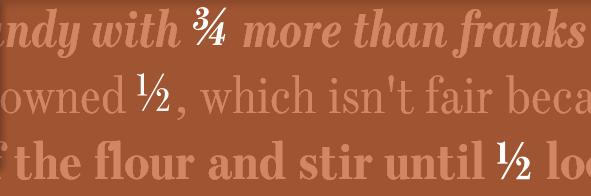
}Fraction
If you enable this option in the code, then all combinations of the "2/3" type will be automatically converted to the correct fraction.The code
/* enable OpenType fractions */
.fractions {
-moz-font-feature-settings: "frac=1";
-ms-font-feature-settings: "frac" 1;
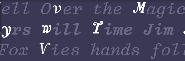
}Alternative glyphs
Additional glyphs can be used in the text in some situations for visual effect.The code
/* enable style set five */
.alternates {
  -moz-font-feature-settings: "ss05=1";
  -ms-font-feature-settings: "ss05" 1;
}
/* enable contextual and stylistic swashes */
.swashes {
  -moz-font-feature-settings: "swsh=1,cswh=1";
  -ms-font-feature-settings: "swsh" 1,"cswh" 1;
}
Microsoft considers OpenType a revolutionary format and expects its widespread support by all browsers. It should be added that OpenType, a format developed by Microsoft and Adobe, is an improved version of the TrueType format, and the validity period of patents for TrueType has recently expired .