iMakeCard. The history of the development of the New Year's program
 When December is outside, snow falls outside the window and my heart begins to beat harder in anticipation of the upcoming New Year holidays, you begin to think about what to give to a loved one, loved one, or just acquaintances who fill up countless friendlist in one or another social network. Of course, you can’t buy all the presents, but everyone wants to pay attention.
 So the idea of creating an “iMakeCard” application was born. In it, you can select any card you like and wish for the recipient, and then send it by e-mail, or post it on your Facebook page or on Twitter.
Idea
Orientation was chosen on the American market, respectively, “iMakeCard” has become English-speaking. Of course, we understood that there were many similar programs in the App Store and the main task was to find that “highlight” that would become our distinguishing feature. There were many such “highlights”, but since the development time was only 1 month and we wanted to place the application in the App Store before the holidays, we selected the most useful and interesting of them, and most importantly, none of the competitors offered this.
Firstly, animation and quality art. Of the variety of postcards that could be found in other applications, there were simple, ready-made pictures; beautiful but monotonous; those that you can collect yourself and even small videos (of course, without the possibility of any changes or additions). Upon reflection, we decided to bet on animated postcards with an author's design, which was performed by an experienced artist, all postcards are available for screens with a retina.
Secondly, a selection of ready-made New Year and Merry Christmas greetings. This innovation allows you to easily find your favorite wish in just a few seconds, which eliminates the need for long inventions of intricate phrases, or template texts. The presence of about thirty congratulations in the database makes it possible to find the right words for any relative, friend, or colleague. If, nevertheless, the user has a desire to write something on his own behalf, “iMakeCard” has the option of typing manually.
Thirdly, simplicity and usability. We all sometimes faced the fact that we liked an interesting and necessary program that turned out to be rather difficult to use, with a large number of functions, buttons, explanations for them. Our main goal was to simplify the use of the program as much as possible, so we left only 3 necessary steps: choosing a card, choosing text and “share with friends”.
Design
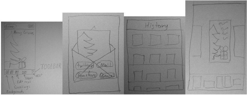
Design themselves invented, having gathered in the evening after work in one of the pizzerias. As my former boss said: “The design was developed by professional programmers.” We decided to arrange everything under the tree. Here are examples of how it all looked on paper:

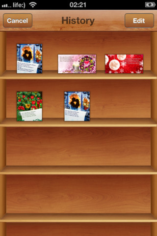
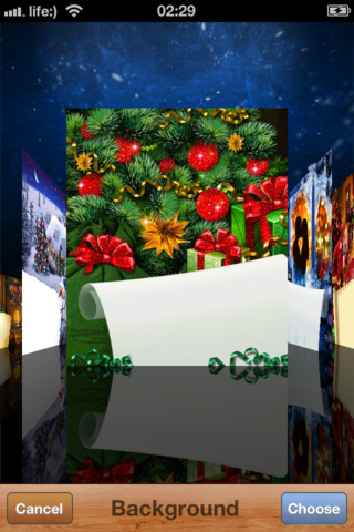
An artist for postcards and an interface designer who was supposed to give a beautiful picture from our doodles was found on freelance. This is how our drawings were transformed:


All this is accompanied by beautiful animations.
Development
We did not have any special problems with the development, there were 3 experienced iOS developers in the team, and I wrote on Objective-C even before the release of the first iPhone. The entire development of the software took about 2 weeks in my free time. Most of the time was spent on developing a beautiful interface. We always refused third-party libraries and decided to write everything ourselves, with the exception of the framework for sharing on social networks.
One of the most difficult tasks was importing into gif, standard methods allow you to save the gif file, but it turned out to be of gigantic size, we had to write the save ourselves. The fact is that the standard CGImageDestinationDoes not know how to save the difference between frames, and saves every cdr completely. In addition, to complete the creation of the animation, he allocates a very large amount of memory, sometimes the program even crashed in this place. We tried to use the ImageMagic library , but it turned out to be wasted time - saving took up to 2 minutes.
The second task was to upload the animation to twitter, but he does not allow this. A third-party service was chosen - twitpic. But here, too, everything turned out to be not easy, after the upload on the last frame terrible artifacts were noticeable. A letter to support, the answer, but the problem has not been resolved. Accidentally noticed that if you click on the full link for the downloaded file, then everything worked like a clock.
The program was developed without using ARC. The coverflow effect was implemented by the successor of UIScrollView , an additional line is created for reflection, which is placed with CATransfrom3D with a -1 scale on the Y axis. History is also implemented on the basis of UIScrollView from the interesting here mechanism for reusing cells as in UITableView and loading pictures in a separate stream. All interface animations, such as a picture to fly into an envelope or a departure from History, are implemented on the standard UIView animations mechanism.
Sales
Now a little about the bad. After iMakeCard was successfully registered in the App Store, a website was created with a brief description of the program and the ability to contact support and suggestions. A little later they shot a video and posted it on Youtube.
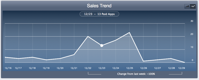
Already on December 13, the program was available in the AppStore. Immediately engaged in promotion, tweets were bought from popular sites, reviews were ordered. But this did not bring much success:

For the last two days the program has been distributed for free, we are going to distribute it further.
We look forward to hearing your feedback, questions and comments!
iMakeCard: itunes.apple.com/app/id486368622
