Application Styling Part Two

In the last lesson, we looked at the basic styling techniques. Go ahead and find out a little new about gradients and frame shapes.
Gradients
All good things get boring quickly, and we want to implement other types of gradients. Android supports three styles of gradients:
- Linear
- Radial
- Conical
With the linear we are already familiar, we go to the radial.
Radial gradient

In the radial gradient, a smooth transition from one color to another occurs.
Let's modify hbutton_normal.xml from the previous lesson and change the gradient to radial:
<gradientandroid:endColor="#00CC00"android:gradientRadius="40"android:startColor="#EE0000"android:type="radial" />We get at the output:

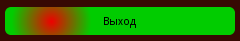
Hmm, but should we shift the gradient to the left?
<gradientandroid:centerX="0.2"android:endColor="#00CC00"android:gradientRadius="40"android:startColor="#EE0000"android:type="radial" />We
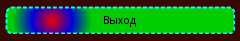
get : Let's say we want to add more colors. Android allows you to add another color to the center of the gradient:
<gradientandroid:centerColor="#0000DD"android:centerX="0.2"android:endColor="#00CC00"android:gradientRadius="40"android:startColor="#EE0000"android:type="radial" />Admire:

Conical gradient
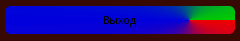
In general, I don’t quite understand why Android needs this gradient, but suddenly it will come in handy:
<gradientandroid:centerColor="#0000DD"android:centerX="0.8"android:endColor="#00CC00"android:gradientRadius="40"android:startColor="#EE0000"android:type="sweep" />We get:
Framework
Frames come in two forms - regular continuous and unusual strokes :)
Regular framework
Everything is quite simple - the color and thickness of the frame:
<strokeandroid:width="2dp"android:color="#00FFFF" />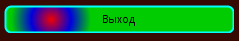
Strokes
Additionally, indicate the stroke width and the distance between them:
<strokeandroid:dashGap="3dp"android:dashWidth="5dp"android:width="2dp"android:color="#00FFFF" />We get: