Where did the CCP go?
The variety of modern mobile devices, it would seem, will allow everyone to find a device according to their needs. The development of the mobile industry leads to the appearance of more and more new devices. Once upon a time, you could be proud of a set of sensors like an accelerometer and an ambient light sensor, now even a budget phone can have both the above sensors and a gyroscope in addition. So, just in case. However, it will not be about innovations, but about the fact that they managed to lose modern mobile devices, following the trends and fashionable innovations.
Can modern devices based on Android, WP or iOS be called the term thatonce played a significant role in the market - PDAs? Let's try to compare the Pocket Personal Computer and a modern smartphone, for example, on Android.
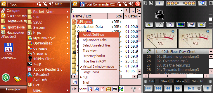
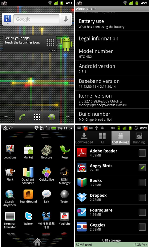
As an example, I took a few screenshots from the Glofiish X500 based on Windows Mobile 6.1 and a few from a hypotheticalandroid phone with a screen resolution, albeit a little larger than that of Glofiish.

Glofish X500

A certain Android device
Both devices have a touch screen. Suppose that there, and there it is resistive - in the case of the PDA, this is indeed so. However, a serious difference in the controls is immediately evident. Despite the fact that Android has a larger screen resolution, there are fewer active controls on it and they are larger in size. Obviously, the evolution of the “under the finger” interfaces has occurred due to the appearance of capacitive sensors. On phones with a new type of stylus sensor, as a rule, there is no stylus, all actions are performed with a finger, which entails a change in the interface elements in order to improve the notorious usability.
The capacitive sensor replaced the resistive one, butsome kind of resistive was required
It seems to be, so what, is everything big on the screen? But no. Periodically, when I seebig, big the device’s screen, on which a few letters are written in large letters with large indentation - let it be a menu - I recall those phones where one screen, one visible area possessed much more functionality and information. The universal desire to expand, to do “under the finger” can lead, in my opinion, to an unprecedented dullness of interfaces. Yes, I compare smartphones and PDAs - but only for the reason that there is nothing to compare.
So, with the departure of resistive sensors, unfortunately, compressed, capacious interfaces also go away. Now let's remember another disease of modern devices.
Why do I need
Recently, devices have been produced from hardware keys, excellent power and volume buttons, which havetwo or three . On Android smartphones, this is usually the Menu and Home keys, often the Search button, other platforms have even less, excluding qwerty devices . This is clearly not enough to designate a convenient arrangement of keys in the player, games and other programs. You can reassign the Search button ... And that’s it. The remaining buttons are really needed to control the phone.
Now let's see how it was in the CCP:

Not so stylish? Maybe. No onethin frames around the screen, indents had to be done a little more. But it pays off. A real key is more convenient than a screen one, because, for example, it does not disappear when the screen is off, it has an obvious advantage in the field of tactile sensations, it does not cover part of the image on the screen. 5-6 buttons - this is not old and ugly, this is normal. Let the phone not look like the same phone , but it will be really convenient to use. Not always the button on the screen or on the headset is able to replace the most ordinary "iron" button.
This post is a kind of memory of outgoing devices such as "PDA". For me personally, the functionality of the software forAndroid devices is almost more than enough compared to software on WM. But the above factors sometimes make you think about the future of phones and mobile devices. There is a certain simplification in their development that speaks not at all in their favor. Sooner or later, phones can turn into flat rectangles with a huge screen, one button, integration with social networks, a simple menu and a bunch of useless applications in the Market.
I do not blame Android, iOS and WP at all. In their niche, they look very harmonious and their capabilities are quite enough for both ordinary users and advanced ones.
PDA vs. smartphone
Can modern devices based on Android, WP or iOS be called the term that
As an example, I took a few screenshots from the Glofiish X500 based on Windows Mobile 6.1 and a few from a hypothetical

Glofish X500

A certain Android device
Both devices have a touch screen. Suppose that there, and there it is resistive - in the case of the PDA, this is indeed so. However, a serious difference in the controls is immediately evident. Despite the fact that Android has a larger screen resolution, there are fewer active controls on it and they are larger in size. Obviously, the evolution of the “under the finger” interfaces has occurred due to the appearance of capacitive sensors. On phones with a new type of stylus sensor, as a rule, there is no stylus, all actions are performed with a finger, which entails a change in the interface elements in order to improve the notorious usability.
The capacitive sensor replaced the resistive one, but
It seems to be, so what, is everything big on the screen? But no. Periodically, when I see
So, with the departure of resistive sensors, unfortunately, compressed, capacious interfaces also go away. Now let's remember another disease of modern devices.
Why do I need hardware keys ?
Recently, devices have been produced from hardware keys, excellent power and volume buttons, which have
Now let's see how it was in the CCP:

Not so stylish? Maybe. No onethin frames around the screen, indents had to be done a little more. But it pays off. A real key is more convenient than a screen one, because, for example, it does not disappear when the screen is off, it has an obvious advantage in the field of tactile sensations, it does not cover part of the image on the screen. 5-6 buttons - this is not old and ugly, this is normal. Let the phone not look like the same phone , but it will be really convenient to use. Not always the button on the screen or on the headset is able to replace the most ordinary "iron" button.
Why is this post needed?
This post is a kind of memory of outgoing devices such as "PDA". For me personally, the functionality of the software for
PS
I do not blame Android, iOS and WP at all. In their niche, they look very harmonious and their capabilities are quite enough for both ordinary users and advanced ones.
