Design principles for payment pages for online stores
- Transfer
- Tutorial
I present to you a translation of an article entitled " Fundamental Guidelines Of E-Commerce Checkout Design " by Christian Holst . Transferred to UXDepot specifically for Habrahabr users with the approval of the publication of Smashing Magazine .
Sad statistics of e-commerce systems - according to recent studies, at least 59.8% of potential buyers leave the site at the stage of placing an order and paying for it (different studies have different indicators - from 59.8% for MarketingSherpa to 83% for SeeWhy ).
The main question is why do users so often and massively leave their cart without completing an order? The reason lies in some fundamental mistake of designers creating online stores? And maybe there are some formal rules that complicate the lives of ordinary users and prevent them from buying products? Is there any way to improve the situation and increase the conversion of electronic stores?
That is what we tried to find out. In 2010, we hired a group of Internet users to conduct usability research, concentrating only on the stages from adding the product to the basket until the final checkout. The study was conducted using the concept of “think out loud” and documenting everything that happened on a computer screen. Then we analyzed the behavior of the subjects, carefully examining the recordings.
The study showed that usually the most difficult is to lead the user through the last stage of the purchase, when it remains only to fill in the credit card details.
We examined 15 sites: 1-800-Flowers, AllPosters, American Apparel, Amnesty, Apple, HobbyTron, Levi's, Newegg, Nordstrom, Oakley, Perfume.com, PetSmart, Thomann, Walmart and Zappos.
In general, we tested more than 500 usability solutions on users: from distracting animation to the illogical process of placing an order. Then we analyzed these solutions and wrote 63 usability principles when placing an order, in a report called “ E-Commerce Checkout Usability ”. In this article, we will share with you 11 fundamental principles from this report .
1. The checkout process must be completely linear
Fact: The presence of nested steps at the stage of placing an order is confusing and frightening the user, destroying his idea of the linearity of the process of buying goods.
The nonlinearity of the process of ordering goods is one of the most serious errors that we were able to identify during the study. Most sites studied have a linear ordering process (with the exception of Walmart and Zappos).
A typical way to “ accidentally ” get a non-linear process of placing an order is to create some steps inside others . This happens when, for example, on a separate page, the user must “ select the desired delivery address ” (Walmart) or “ create an account ” (Zappos), and then they redirect him to the previous step in filling out the application.
In the figure, you can see the checkout process at Walmart. Note that this process is non-linear, since selecting the desired delivery address redirects the user to the previous step. The non-linear checkout process at Wallmart. Want a big picture ? Fortunately, creating a linear process for ordering goods is easy enough. For example, to ensure linearity, creating a new account should not redirect the user to the previous step in the order process, but rather, should move the user one step further.
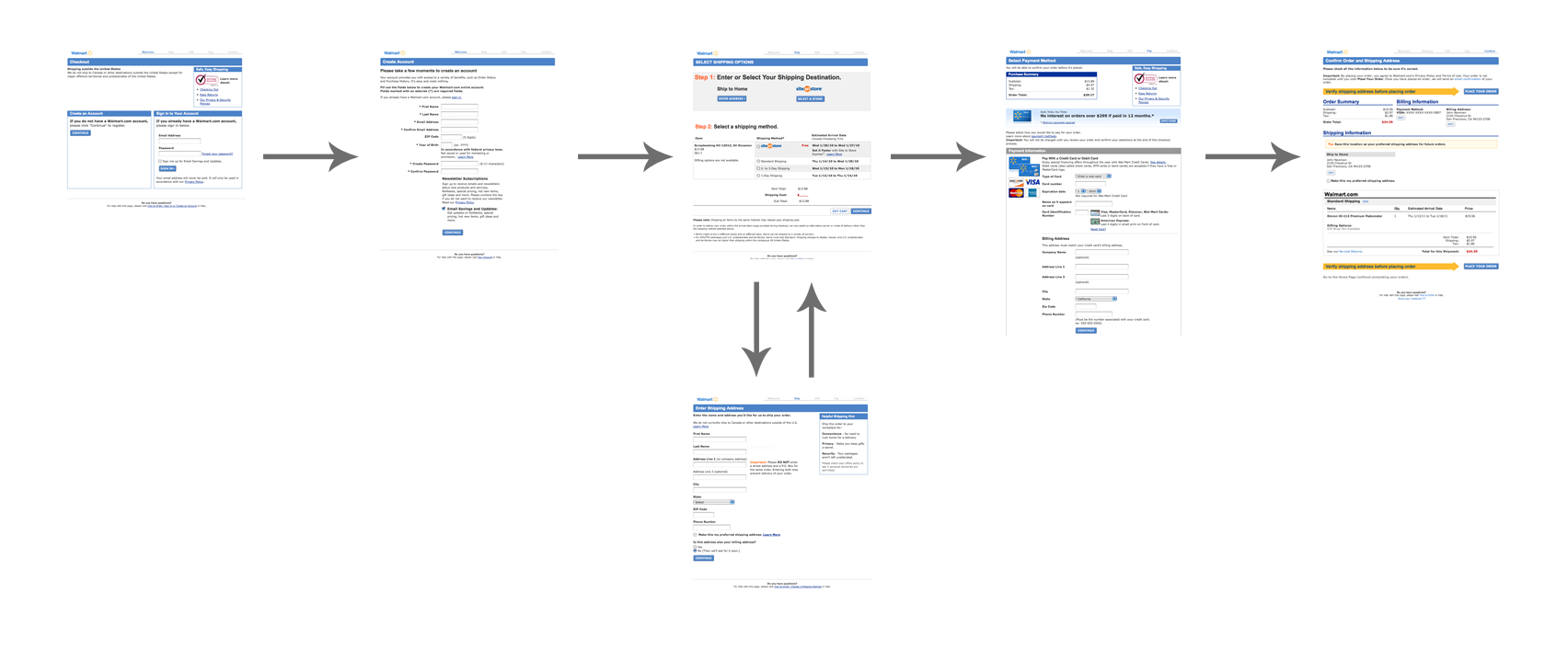
All this is very important, since all users have a mental model that the process of product registration is linear. Seeing the same page twice, most buyers will decide that an error has occurred on the site, because this is exactly what happens if the site has not received data from the user.
As one of our testers stated, “The fact that I saw the same page twice seems suspicious. Am I exactly the rule? ”
2. Add descriptions to the names of forms and fields
Fact: Without descriptions, many forms can be ambiguous.
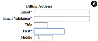
During the purchase, one of the testers mumbled: “ What does“ Address bar number 2 ”mean? "Some others feel embarrassed by the name of the form" Billing Address »(Billing address).
The vast majority of testers had problems understanding field names. In several cases, these problems were critical, and in one case, the tester girl completely refused further attempts to order, because she could not understand what she needed to enter in a specific field. In most cases, testers noted the need for further clarification of the purpose of each field.
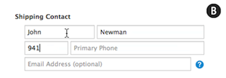
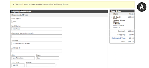
One form that confused many testers was on the HobbyTron website. Users had to guess what the “First” field means:
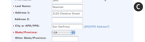
On the Apple website, most testers began to enter their zip code in the “Area code” field:
In the case when the form fields are unexplained, users do not always understand what information they want to get them. That is why you should add small descriptions and examples to the fields . Since not all users need help, you can hide the hints behind the links “ What is this? ”Or simply reduce the color contrast or font size of the tooltip text.
Here is an example of how the description of fields and forms helps users understand what and where to enter:
An exception to this rule can only be made for such obvious fields as an email input field. The name of the field itself is a clear description, but many users want to know why they need a mail address and how you are going to use it.
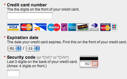
And users will be happy with hints and illustrations (for example, a visual representation of the place where the credit card has an expiration date).
3. Do not use ambiguous words (for example, "Continue")
Fact: Context-sensitive words (such as Continue) are confusing.
The “ Continue the purchase ”buttonin the basket can have two meanings:
- Continue to choose purchases (for example, the buyer has chosen jeans and wants to continue to choose a T-shirt for them).
- Proceed to the checkout process (the buyer has chosen everything he needs and only wants to pay for the goods).
“ Back ” is another example of such a word. Where is it back? Back to previous page? Back to the search results? What about the word " Next "? All these words depend on the context (the page on which the buyer is located) and the logic of the buyer.
HobbyTron.com is one of the sites on which users clicked on the “Continue” button, thinking that they would then proceed to checkout: The Continue button on the HobbyTron website . Great screenshot . One of the testers said: “ When I pressed the button, I didn’t think about continuing to choose products, I just wanted to draw up everything I’ve already selected
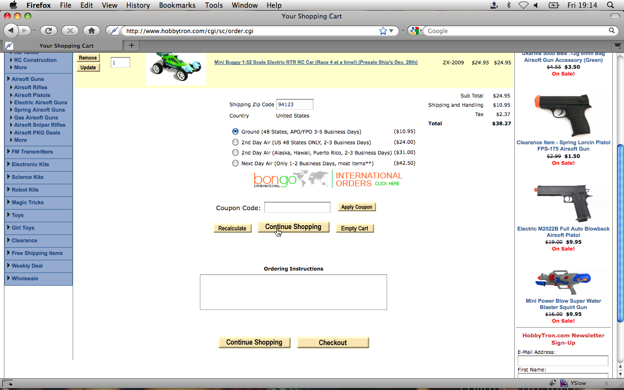
". This is a good example of how context-sensitive words can confuse the user. About half of all testers at least once clicked the wrong way because of such words.
In such cases, you should use words that are free from free interpretations - for example, "Buy now" or "Continue shopping."
4. Visually underline all important fields on the payment page
Fact: Users may wonder if the credit card entry page does not seem secure.
Many testers did not think about security until they had to enter their credit card information. Some testers talked about parts of the payment page using the words “safe” or “suspicious”.
Some fields with a security icon, lines of text, and other visual signs of reliability looked safer than fields lacking such elements. This is especially surprising when you consider that both fields were located on the same page and were in fact equally reliable. However, customers are not familiar with the principles of how forms work — all they know about your site is their impression .
One girl from the testers refused to buy the product, explaining that it does not seem safe enough for her. Her reaction was not related to the technical features of the page; she was frightened by the visual unreliability of the input fields.
In order to illustrate how to make the form visually safe, I created two layouts, the right of which looks more reliable (B). The security effect is created using the lock icon, the changed background color, as well as the GeoTrust icon : Sketch for visual pinning. Great screenshot . By adding visual safety signs (borders, background color and various icons) to the payment page with a bank card, you can significantly increase the impression of security of the page with buyers.

5. Do not use the Apply button on the pages
Fact: Buyers don’t understand what the Apply button does with various input fields.
More than half of the testers were embarrassed to see the Apply button on the payment pages (for example, in the delivery method selection section).
We found that these buttons either:
- Do not click at all, even if the corresponding input field is filled
- Click, confused with the main confirmation button.
Users simply did not understand what to do with the stand-alone Apply button.
On the Newegg.com payment page, only half of the testers, having entered their index, clicked on the Go button (see problem 1 above). Apply button on Newegg. Great screenshot . Due to the fact that buyers confuse the " Apply " button
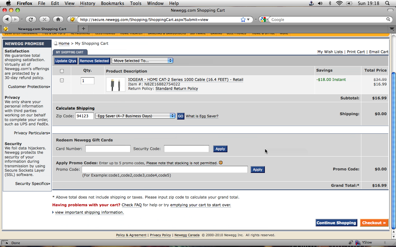
»With the main confirmation button, they are redirected to the same page so that the selection appears on the page. Buyers want to get to the next page, and when they return to the previous page, it seems to them that some kind of error has occurred (we talked about this in Chapter 1). This situation occurred with two testers, who could only guess what kind of error occurred, because the error message did not occur (since there was technically no error).
On AmericanApparel.com, testers confused the “ Apply ” button with the main confirmation button on the page (see issue 2 above) and could not complete the purchase process. Apply button on American Apparel website . Great screenshot .
Thus, if you really need to confirm the data in some fields before proceeding to the next step of the purchase, use AJAX or other similar tools and do not show the “Apply” button.
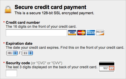
6. The format for the expiration date of the card should look exactly the same as it looks on the card itself
Fact: It can be difficult to decipher the form for entering the card’s expiration date, especially if it doesn’t look the same as on the card itself.
Some sites show this date as the name of the months, some as a combination of the names of the months and numbers, others only use numbers. Which of these options works best? The best and most logical way to present an expiration date for a card is to make it the way the buyer sees it on his card (that is, only in numbers). This helps to minimize misunderstanding and errors, as the buyer can easily verify the numbers in the form with the numbers on the card.
Below are some examples of how you don't need to submitformat for entering the card expiration date. In Example D, the month is substituted with text, and the year with numbers. This is the most unfortunate option of all. The correct way to represent the month is to suggest entering the month in numbers and entering a prefix for single-digit numbers (so that they appear as they are printed on the map - 3 turns into 03). The correct way to represent the year is to use a two-digit field to enter the year (for example, prompt the buyer to enter 14 for 2014). The testers did not have problems with entering the month, if the textual name of the month came after the digital designation (for example, 03 - March), but when everything was the other way around (March - 03), then this caused problems.
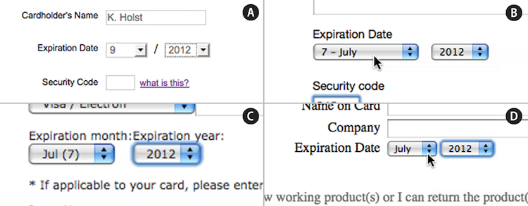
You should also use the slash (/) to separate the month from the year - so that the fields are similar to what the buyer sees on a credit card (03/14 to indicate March 2014).
7. Use only one column for input fields
Fact: If the form fields are arranged in two columns, then it is difficult for customers to see the relationship between them.
More than half of our testers experienced serious problems filling out forms that were laid out in two columns . In such cases, two scenarios occurred:
- Buyers forget to fill out one of the two columns. Users either considered them not important, or simply did not notice.
- Users filled in fields that did not need to be filled out, which led to errors.
Here, for example, is the login and registration form on Perfume.com : Different users interpreted this form in three ways:
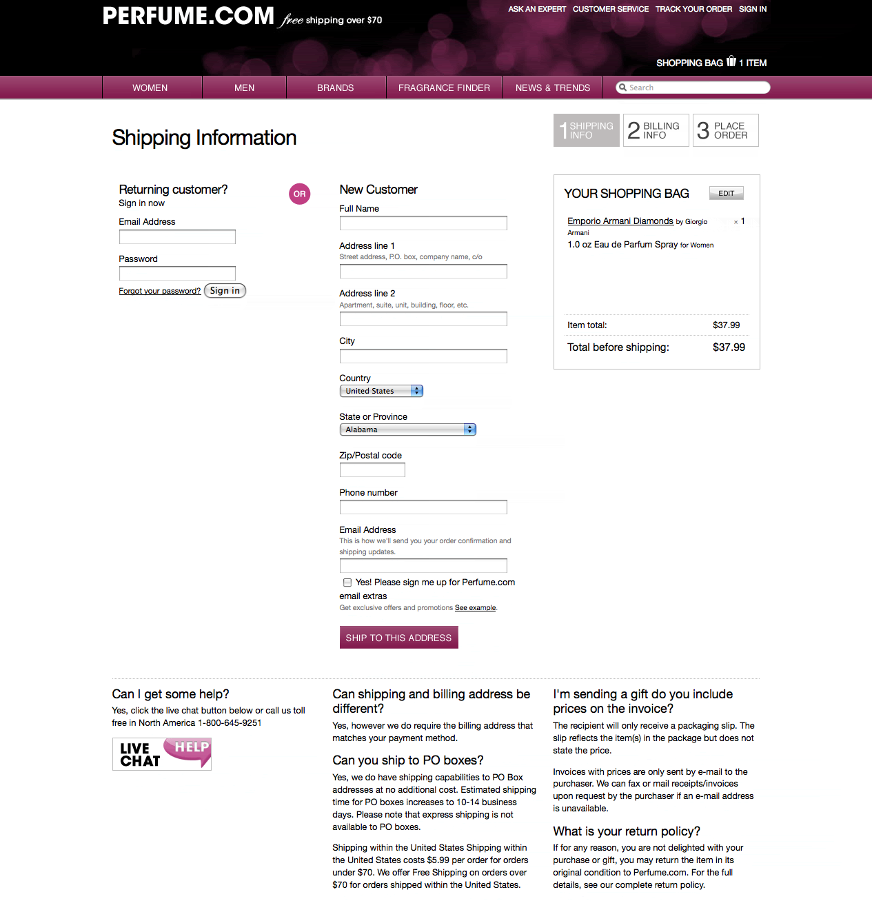
- In order to register on the site, you need to fill in all the fields.
- In order to fill out an application as a guest, you need to fill in the “E-mail” field and all the fields in the right column.
- You need to fill in either the right or left column.
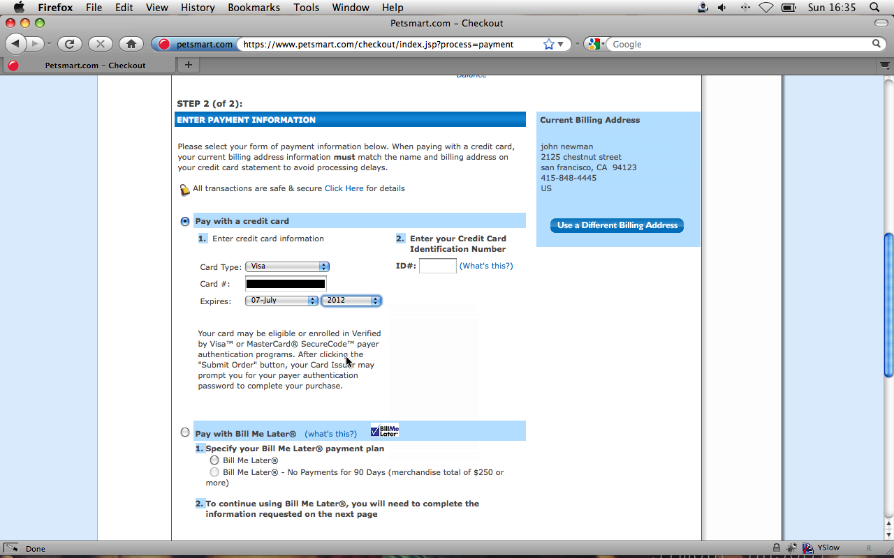
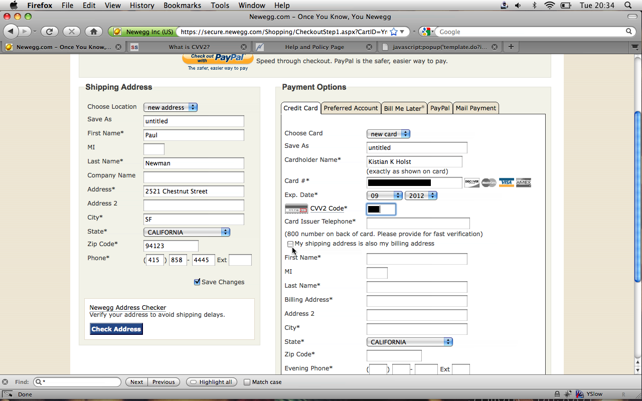
Another example is PetSmart . Most often, testers skipped field No. 2 in the second column (Enter your Credit Card Identification Number), which led to an error message. In two such cases, testers dropped the checkout process because they continued to enter incorrect data in the wrong columns. Our advice is to use only one column. In such cases, not a single tester encountered the problems described above.
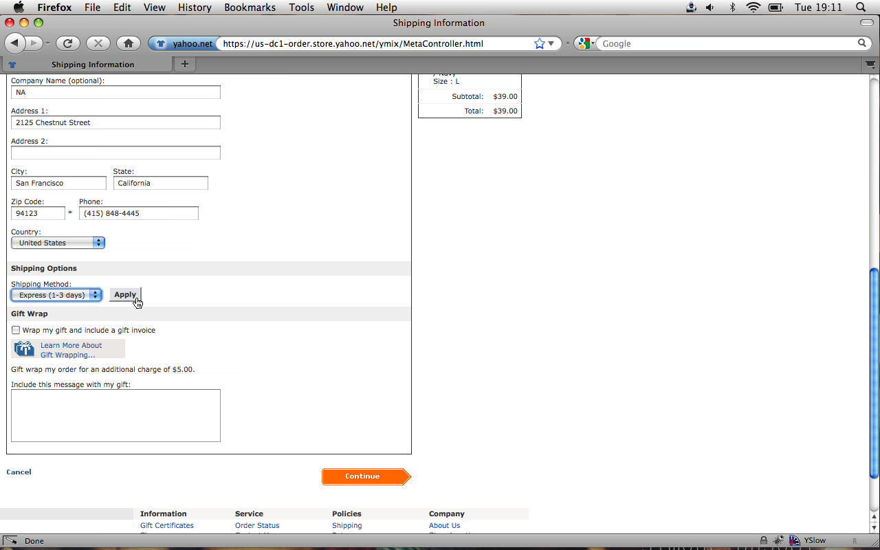
8. Use the default shipping address as your billing address
Fact: Most users order delivery of goods home, which means asking to enter both the delivery address and the registration address does not make sense.
By combining the addresses , you significantly reduce the number of fields that you need to fill out, making the purchase process less tiring. It also helps to reduce the likelihood of an error on the part of the buyer, as he fills the address only once. The buyer will not be in such a hurry when filling out the form, and if errors are found, he will have to correct them only once. Place an order on the NewEgg website. Great screenshot .
Moreover, you should generally hide the registration address fields. It will not be enough just to make them inactive - in our study this confused the testers and they tried to click on the fields in the hope of filling them.
Some sites have a button on the page that transfers data from the group of delivery address fields to the billing address fields. In this case, a significant problem arises - users copy the errors along with the addresses. Of course, after correcting the error in one of the field groups, the corrected values must be copied to another field group, however , without exception, the subjects forgot to do this. Transfer button on the website addresses Apple's . Great screenshot .
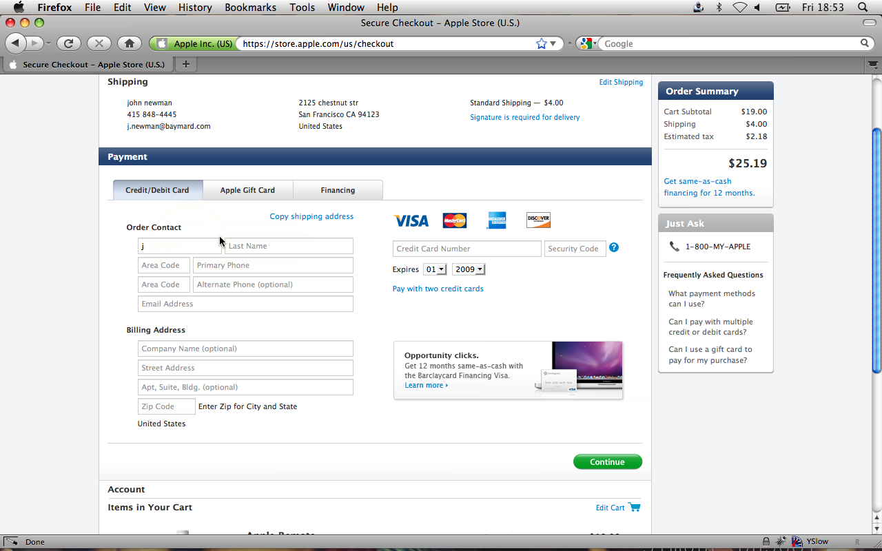
The button is sometimes difficult to notice - it depends on the design of the site. For example, on the Apple website, half of the users did not see it. As a result, they had to enter everything manually twice.
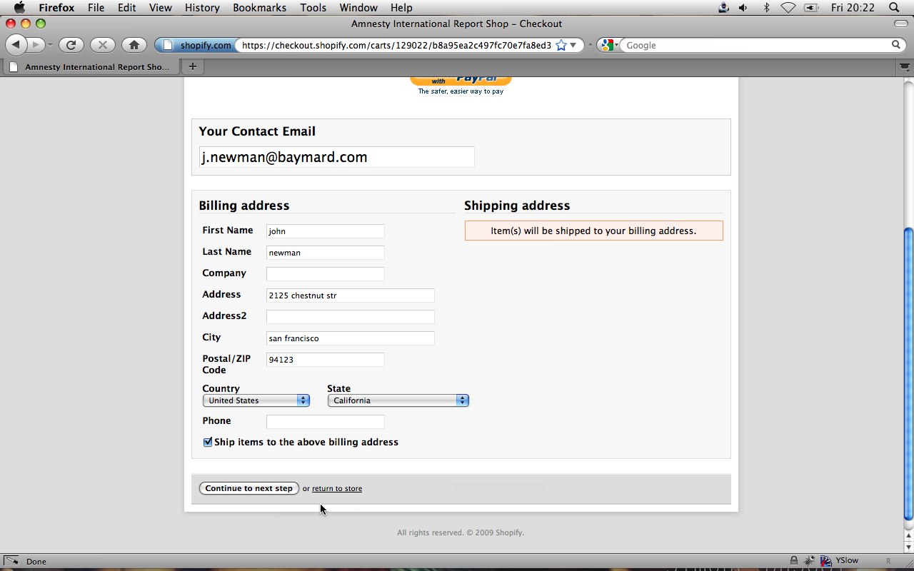
The best solution for such cases would be to use a checkbox (or something similar) that says the billing address and delivery address are the same. In this case, the errors need to be corrected only once. The Amnesty International website is a good example of using such a solution:
9. Use clear error messages
Fact: Customers often do not see error messages and therefore do not correct them
. Half of our testers had serious problems with error messages - they either did not see them or could not understand what they wanted from them.
If the buyer experiences problems filling out forms, this leads to a significant increase in the likelihood of a refusal to purchase. If the buyer sees the error message more than once, he leaves the site (it seems to him that the purchase is blocked or bugs have started on the site).
Here are four examples of insufficiently observable error messages:
On the American Apparel website,an error message appears in the yellow bar at the top (the message says that the buyer has incorrectly filled in the field with a phone number).
On the Walmart website, we see two small red arrows (to the right of Ship to home and Site-re-store). These are the error messages.

And on the PetSmart website, the red color of the State / Province field name is not an error, it is just the style of highlighting this header.
At Perfume.com, a red field indicates an error.

If the error messages were too farfrom the fields in which these errors were made, our testers did not notice them. Many sites display error messages only at the top of the page, and not next to the field. Because of this, such messages can be difficult to understand. Many testers, not seeing anything suspicious next to the fields in which they made mistakes, tried to press the confirmation button again and again, assuming that the page did not load correctly the first time. Of course, all that they saw in the end is the same page with the error message.
If the buyer does not notice or does not understand the warning, he will not be able to correct the error and continue the order process. In this case, he will only have to give up everything and leave the site. Therefore, you need to pay special attention to thinking out error messages and writing text for them .
Убедитесь в том, что ваши сообщения:
- Располагаются рядом с тем местом, где допущена ошибка (а не вверху страницы)
- Поняты и лаконичны
- Заметны покупателям (сделайте их контрастнее, используйте стрелочки или другие визуальные индикаторы)
10. Регистрация не должна быть обязательной
Fact: Buyers really don't like the need to register on a site.
Buyers don’t want to waste time setting up another account on another site. During our research , all testers lost their fuse when they were forced to register, and 30% of them eventually refused to buy.
This happens for several reasons.
First of all, any user of the network already has a hundred accounts and passwords for them, and they do not want to get another one just to just buy a couple of things in the online store.
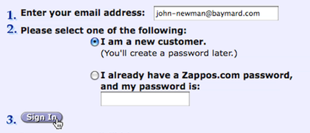
In addition, 40% of our testers said they were afraid of being spammed , even if they clearly refused to be sent out when placing an order.
Many buyers have the mental setting " Account = Newsletter " in their heads . One of the testers described it this way: "If I create an account now, they will spam me forever." Probably, they came to this opinion because of sites that, by default, subscribed users to the newsletter and hid the option to refuse it.
Also, visitors most likely believe that you will keep their information forever . And although companies store customer information in their databases, regardless of whether the customer has created an account on their website or not, most users do not understand this. This is a matter of perception, and some users simply do not like to think that the site retains their personal information.
In addition, registration takes time.. During registration, you need to go through more steps and fill in more fields. Another reason for users not to like registration.
Well, and finally - many buyers simply do not understand why they need to create an account if they just want to buy a product . According to one test taker, “Nobody asks me to start an account when I buy perfume in an ordinary store!”
Most buyers are normal about the opportunity to register, but they find it illogical that they are forced to do this. Several users said they would open an account if they bought on the site regularly.
If you want unobtrusivelyinvite your customers to register, you just need to ask them at the end of the checkout process (“Do you want to create an account? To do this, simply create a password and enter it here”) In this case, you can use the email address as a login and fill it out yourself All registration fields from the data that the buyer entered when placing the goods. In this case, no one forces the buyer to create a new account, but he has the ability to easily do this after the purchase. (Remember to explain to the buyer the benefits of having an account.)
11. Do not require information that, according to users, you do not need
Fact: When you ask buyers to give you information that they think you don’t need, buyers regard this as an invasion of their personal lives.
On the offer to inform his mobile phone number on one of the sites, our tester exclaimed: “ Hey, why do they need my mobile number? How will they use it? They do not need him! »On all the sites studied, one of the testers stated that the site requires too much personal information from him.
Trying to find out a phone number when the store knows email is surprising and annoying to customers. If the store already has one way to communicate with the buyer, why should he have one more?
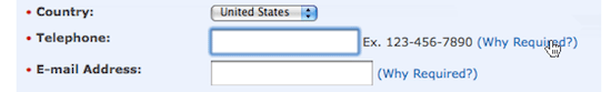
Checkout at Apple.
If the information is really necessary, then take the trouble to explain why . What is obvious to you is not always obvious to customers. They are used to expecting the worst when shopping online (spam e-mail and advertising calls to the phone).
Testers calmly entered all the information when the site explained why it was needed . Here's a tip for you: do not hide the explanations, write them right next to the information input field. In fact, the tester, the quote of which we quoted above, quietly entered his phone number on another site, as it was clearly explained there - this is necessary in order to solve delivery problems, if any.
The more expensive the purchase, the more information about yourself the user agrees to give. If the buyer orders a laptop, then he wants to be sure that the store will be able to contact him. However, this only takes place if such information is necessary to place an order. On sites where these fields were optional, buyers were wary of entering their phone number and left the field blank. It also means that the required and optional fields must be made clearly distinguishable.
Improving the user experience when ordering goods
When creating a good impression of placing an order, you need to take into account many details, but nevertheless, these 11 principles are of primary importance. And if you apply our principles, the buying process on your site will become much better.
In a study conducted more than 10 years ago, usability guru Jacob Nielsen wrote that large electronic stores flagrantly violate even the most basic usability principles . Since then, little has changed - just look at the sites of Walmart and AllPosters.
Many large sites take pride in such incredible opportunities as geo-targeting and auto-address, but they do not think of following the basic principles of usability, as a result of which they lose a lot in revenue .
With the latest advances in web technology and powerful modern browsers, the potential for creating a good user experience has grown many times. However, you should not focus on the latest technologies until the basic principles of usability are met . We introduce the coolest technologies because they are so new and cool and at the same time passively watch as 59.8% of customers leave the site during the process of placing an order.
A linear approach (chapter 1), good texts (chapters 2 and 3), simple and clear design of forms (4, 5, 5, 7, 8, 9), consideration of the problem of personal information (10 and 11) will help to create a really good design system order.
Provide a service to yourself and your customers - follow these principles. When you put in order the basics, then you can safely experience other advanced ways to influence user experiences.
PS from translators : I hope you enjoyed the article. We will be glad if you indicate to us errors in the translation, so that we can quickly correct them. Write to me in PM, please :)