Exposing Font Rasterization Algorithms (2/2)
- Transfer
(second part of the translation of the article Exposing Font Rasterization Algorithms )
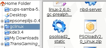
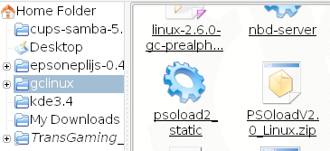
Windows rasterizes fonts poorly, Linux is even worse. All Linux systems I've seen use FreeType [10] by David Turner, Robert Wilhelm, and Werner Lemberg. This is an excellent library, but the method of its use, unfortunately, cannot be called successful. A typical Linux screenshot looks like this:
Here is the full screenshot:
link
Immediately noticeable problem - black spots in rounded corners, formed as a result of smoothing. In general, we can say that slanting strokes look heavier than vertical ones, which in the result gives the impression of “dirt”. You may argue that FreeType and Linux could use subpixel rasterization similar to ClearType, but for me this does not have any noticeable advantages.
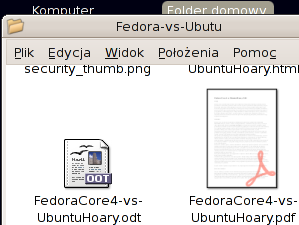
Look at “W”, “v” and “y” - the problem is essentially the same, the characters look dirty. You can slightly improve the situation in the corners, using gamma correction in the process of rasterization, but this still will not allow to achieve an ideal display.
Gamma correction works like this:
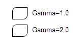
As you can see, rounded corners with smoothing look much better with gamma 2.0. Gamma correction is a separate non-trivial topic, and if you are interested, you can find comprehensive information in the Gamma FAQ by Charles Poynton [6].
In our case, we are not talking about the curves "source signal - result" in electronic circuits, rather, the specifics of human vision. The visual reaction is approximately proportional to the square root of the physical luminosity. In other words, if we have two white pixels on a black background, and one of them emits twice as many photons than the second, this does not mean that it will look twice as bright. In fact, somewhere 1.4 times. You can easily verify this:
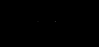
On the right are two pixels, and we can say with confidence that they emit twice as many photons per second than the pixel on the left. However, they do not look twice as bright. Four pixels will give about twice as much brightness, but not two.
Omitting unnecessary explanations, we can say that there are two main RGB color spaces: subjectively uniform, called sRGB, and physically uniform. In the latter, the value is proportional to the physical luminosity, in contrast to sRGB, in which the value is proportional to the subjective luminosity. Typically, a physically uniform color space is simply called linear RGB. When using anti-aliasing, color mixing should be done in linear space, but before displaying it is necessary to bring the colors to sRGB. In practice, this step is often ignored, and anti-aliasing is performed directly in sRGB. In many cases, this gives an acceptable result, but not for rasterizing the text, which can be demonstrated directly in Microsoft Word. The thing is that they use some kind of trick to highlight text, something like a trivial inversion, instead of redrawing from scratch. With the usual, black and white smoothing, the selected text looks dirty. With ClearType, it acquires a color border:
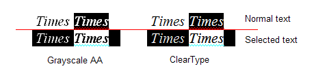
So we can conclude that the correct gamma correction is performed on Windows (but not for selected text), while Linux usually ignores it. FreeType can easily apply the desired gamma transform to the black and white smoothing mask that the rasterizer generates. But this will work the same as in Windows: color inversion will produce gamma inversion. In practice, this is useless, since the gamma should be applied separately to each color component before mixing (which in practice is equivalent to working in linear RGB). Therefore, gamma correction for a black and white mask will only help if you display black text on a white background. In this case, you can use the value in the region 2 for correction. But if you display white text on a black background, you need to invert the gamma value, that is, use something around 0.5. The problem is, that you don’t know the exact color of the text and background, the text can also be displayed over a gradient or image. So the “black and white” gamma correction will not work, and the “full color” gamma correction can be expensive and difficult to implement. The problem is that linear RGB needs more than 8 bits per channel, otherwise you will inevitably get color loss. For text, this may be valid, but you cannot claim this for the entire desktop! And working in linear RGB using 16 bits per channel is still an inadmissible luxury. otherwise, you will inevitably get color loss. For text, this may be valid, but you cannot claim this for the entire desktop! And working in linear RGB using 16 bits per channel is still an inadmissible luxury. otherwise, you will inevitably get color loss. For text, this may be valid, but you cannot claim this for the entire desktop! And working in linear RGB using 16 bits per channel is still an inadmissible luxury.
In fact, the situation is even worse. You can apply gamma correction with a value equal to 2 to a screenshot from Linux in the same Irfanview (Image-> Enhance colors ...) and look at the text. Please try not to pay attention to the fact that the icons look overexposed, focus on the text.
You like? I still don’t. When I was working on text rasterization in AGGI thought that correct gamma correction could solve all problems. Nothing like this! No matter how well it works, some elements look thicker and some are thinner than vertical and horizontal strokes. This is very noticeable on sans-serif fonts, and especially when the strokes are hard-aligned in pixels. The problem is that TrueType hinting was specifically designed for the normal black-and-white rasterizer without anti-aliasing! Using any anti-aliasing is formally incorrect, and most Linux systems do just that. The image below is the result of rasterization with anti-aliasing using both FreeType and GetGlyphOutline ().

The text looks lousy and it is very similar to what we see in most cases on Linux. No gamma correction will help here. For example, I got the best result with a gamma value of 1.5. It still looks bad:

In the process, you should have noticed that, starting from a certain size, the text begins to seem heavy. This is exactly what happens on Windows. If you turn off ClearType, it will be obvious (the text size is not saved exactly).
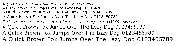
In general, you understood the idea. To make it more obvious, we can increase the vector image returned by the GetGlyphOutline () function from the Win32 API and see what happens.
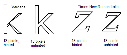
This is how patented aggressive hinting works for a nominal size of 13 pixels. That's why the strokes in “k” look so thin, almost invisible. Italics in Times New Roman are even worse: the oblique bar in “z” completely disappears. Distortion does not affect a regular rasterizer without smoothing, but the one that uses FreeType is sensitive to these things. It directly calculates the degree of coverage of the pixels, so that it honestly gets zero coverage for the oblique stroke “z”. That is, it turns out that there is no point in interpreting the TrueType bytecode for hinting (not to mention that you have to buy a license). Smoothing is good, but you shouldn't use it for your own sake. In any case, I would prefer text without smoothing if it is used in conjunction with inadequate hinting.
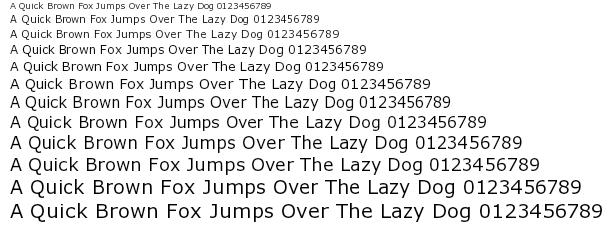
In FreeType version 2, David Turner introduced an auto-hinting mechanism. It works quite well, but, nevertheless, its direct application gives a result that is far from ideal. Look at the result of rasterizing the Verdana headset with gamma 1.5:
Compare with the example without hinting:
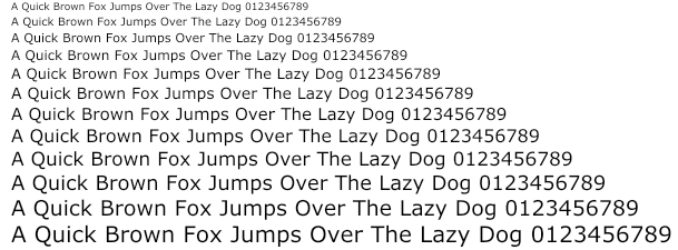
The version without hinting definitely looks more accurate, but also more blurry. There are three main differences:
Autohinter works better with more complex fonts, such as Times New Roman, but the same positioning problems still occur.
Looking forward, I will show you another example.
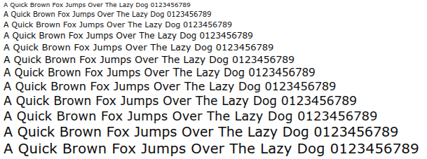
It’s still possible to find an acceptable solution! But first you need to agree that there is no way to use hinting of any kind and at the same time maintain the correct location of the text on any scale. Only text without hinting, with its natural blur. Nevertheless, we can improve rasterization, although we will have to sacrifice something not very important. Namely, we can afford a slight inaccuracy in the vertical positioning and height of the text. Among other things, TrueType hinting works the same way: lines of text with a height of, say, 12 and 13 pixels will have the same height on the screen, although they will look different.
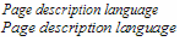
In short, for text that is pleasing to the eye while maintaining accurate horizontal positioning, we need the following:
A small gamma correction can improve the result, but this is not necessary. The text looks good even directly in sRGB, which means that there will be no problems in inverted color schemes.
You can easily achieve an acceptable result with FreeType and its auto-sinter. This means you don’t have to worry about licensing TrueType’s patented hinting. The same can be done using the GetGlyphOutline () function of the Win32 API. It's harder, but still possible.
You can find comprehensive guidance on using subpixel rasterization in RGB on the pages of Steve Gibson, “Subpixel Rasterization Technology” [2]. I also tried using this technology with 64-level smoothing bitmaps that GetGlyphOutline () can generate: Maxim Shimanarev, “How ClearType works in Windows Longhorn” [3] (UPD: link is bad, but you can read it here , here or here ) You can download the demo program for Windows with all the sources at this link:
antigrain.com/stuff/lcd_font.zip
In addition, I wrote a simple, "on my knee in the evening", rasterizer for AGG. It can be found in the demos that follow. At the moment, the code is unsafe and rather slow. This is normal for demos, but unacceptable in a real project, primarily because it uses a temporary buffer for no more than 2048 pixels in the stack.
In the simplest case, all we need is transparency values for each color channel. In this file, agg_pixfmt_rgb24_lcd.h. I also used the extra blur that Steve Gibson describes. It runs on the fly, although it can be done in advance using some kind of caching mechanism. In this case, it will work much faster, at least not slower than classical alpha blending.
To debug channel mixing, I used ZoomIn[9] Brian Freisen. I added "decoding" triples of colors at all scales that are multiples of three. You can download the executable file here: antigrain.com/stuff/ZoomInLcd.zip (in 2005 I lost the modified sources. In any case, these modifications are easy to do on my own). You can compare the increased results of regular black and white and subpixel RGB rasterization:
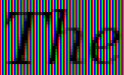
Black and white rasterization
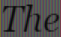
Subpixel RGB rasterization
To preserve vertical hinting, but to get rid of horizontal, we simply fool the hinter: we stretch the characters horizontally so that the hinter is forced to work with high precision. The problem is that the AGG font engine for FreeType uses inaccurate offset values, given hinting. Technically, the hinter must calculate the exact offset values for strongly stretched glyphs, but for some reason he does not. I had to modify it to use the original, “un-hinted” offsets. A modified version is also included in the demo programs. After the glyph curve is obtained, we use the affine transformation to compress it back. In the simplest case, this is all we need. The kerning table contains fairly accurate values.
So I want to turn to David Turner: maybe it makes sense to add an option to his autohinter that would allow hinting only along the Y axis, ignoring hinting along the X axis? Or you can make a separate 1-D hinter, much easier than the existing one. As you will see, text with subpixel RGB rasterization looks very similar to Adobe Acrobat Reader, and, in any case, much better than in any modern Linux system (the article was written in 2007 - approx. Transl. ). I believe this will help promote and increase the popularity of Linux based systems.
Using the Windows API is much more complicated. The GetGlyphOutline () function returns the offset value in integer pixels, which is too rude for us. Stretching does not save. There are also functions like GetCharABCWidthsFloat (), but they are useless since they calculate values for hinted glyphs and despite the fact that they contain floating point numbers, all the same, in fact, they are integers. So I did not find a simple way to get accurate offsets. As a result, I had to use two fonts simultaneously, one with a height of 1024 pixels, and the other of the size we needed, with hinting and a stretched affine matrix. I admit that I might have missed something, but I have no thoughts on how this can be implemented more correctly. Perhaps they use some undocumented features in Microsoft Word, which is completely dishonest in terms of competition. Of course, I cannot be completely sure of this, but the situation makes me think that Microsoft intentionally does not provide a good enough API for developing WYSIWYG document tools. This is a typical monopolist policy, which as a result leads to the inhibition of technological progress.
In fact, it’s even worse. The patented hinter does not work with a “stretched” matrix! At a minimum, I did not find a single scaling factor that would correctly handle glyphs. Only 1: 1 scale worked correctly, but as a result I got the same problems that forced me to use a black-and-white rasterizer without anti-aliasing:
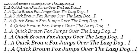
It looks scary, doesn't it? Any scaling led to severely corrupted glyphs. Here, for example, italics Times New Roman (16x horizontal stretch):

Or even so. Arial (100x horizontal stretching) - funny smudges, right? But it’s impossible to read:
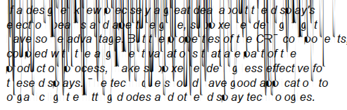
I think it makes no sense to say that the FreeType auto-sinter works correctly with any stretching.
It looks like the Microsoft API is just a bunch of unhealthy random solutions "on the knee" without any engineering culture and global idea behind all this. Generally, you can only use Microsoft software in one hard-coded way. A step to the right, a step to the left - and everything is gone. This may be good for their business, but at least not fair. Such a policy violates the conditions of equal competition and as a result slows down overall progress in the market. The antimonopoly committee should pay attention to this situation, instead of ridiculous requirements to remove Media Player or Internet Explorer from the system.
In the end, I found out that the value “16” is a lesser evil, it is suitable for most cases, but still does not work for Italic Times New Roman.
Here it is, a Windows program that uses TrueType:
www.antigrain.com/research/font_rasterization/truetype_test_02_ft.zip
And here is a version that uses the Windows API:
www.antigrain.com/research/font_rasterization/truetype_test_02_win.zip
FreeType version requires in the program directory of the following files: arial.ttf, ariali.ttf, georgia.ttf, georgiai.ttf, tahoma.ttf, times.ttf, timesi.ttf, verdana.ttf, verdanai.ttf. You can find them in the% WINDIR% \ Fonts folder.
If you want to compile it, download AGG version 2.4 or 2.5 and unzip the files somewhere like agg-2.4 \ research \ win32 \ trutype_lcd \ *. *. For the FreeType version, you will also need to build FreeType yourself, and possibly change the project settings.
The program can also be compiled for Linux / X11 or another system if you write an appropriate makefile similar to those used in the AGG examples .
Text in versions under FreeType and under WinAPI looks different due to different hinting algorithms.
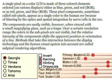
You see a large number of settings here. Firstly, we can change the fonts, as well as turn kerning, hinting and subpixel RGB rasterization on or off. In addition, you can invert the image to get white text on a black background.
The Font Scale slider allows you to smoothly change the font size. As you can see, when hinting is on, the lines are tied to pixels, but the width of the text continues to change smoothly. You can better see this effect by changing the interval. Without hinting, the layout of the text is perfectly preserved at any scale, but the text looks blurry. Vertical snap lines - the most reasonable compromise between the sharpness and accuracy of the text. I myself am shocked at how vertical hinting improves quality while maintaining the shape of the characters.
The interval, width, and italic imitation sliders, I think, do not need comments. For people familiar with computer graphics, it’s obvious that these are ordinary affine transformations. I would like to note only one fact: in the “black and white” and “subpixel RGB rasterization” modes, the “italic simulation” slider works a little differently. This is because I was too lazy to process its values correctly through arctangents. In any case, this is not significant.
The function that I am especially proud of is "imitation of bold". It works like this:

There is another simple trick. As part of the AGG there conv_contour utility that allows you to calculate the equidistant to the given polygon. But its direct use gives a too blurry result, and also significantly changes the shape of the signs (although this can be useful for glow and shadow effects):
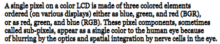
Blurring is easy to avoid. We stretch the glyphs vertically, say, 100 or 1000 times, calculate the equidistant polygon and compress it back. So, as a result, the coordinates along the Y axis almost do not change and the text remains clear. There is a faux_weight class in the demo program. Again, it's amazing how many opportunities free horizontal scaling gives. And no less amazing, how vertically snapping to pixels improves the visual result.
Another example (I love this freedom):

This is still the same Georgia headset, but only software-converted. Fully readable, crisp and smooth at the same time (yes, I agree, she wouldn’t be hurt by manual kerning).
Or the same for the Tahoma headset:
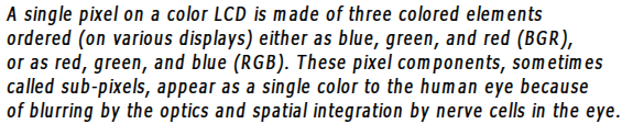
The gamma adjustment slider controls gamma correction (it is performed separately for each channel). Theoretically, you should apply the “direct gamut” to the original colors, and then, after rendering the scene, apply the “inverted gamut”. But, since the text in these examples is always white or black, there is no point in the first operation.
The primary weight slider controls energy distribution as described by Steve Gibson: www.grc.com/freeandclear.htm. It’s good enough to manage only the primary weight, and calculate the rest accordingly. By increasing the primary weight, you can make the text clearer, but a colored outline appears around the characters. It makes sense to use values up to 0.5, with large values the color "glow" becomes too noticeable. As for me, Windows ClearType also gives too noticeable color "glow."
The demo program is pretty slow. Partly because vector operations are performed on the fly, but primarily because of the WinAPI GetGlyphOutline () function, which in itself is terribly slow. On the other hand, such rasterization can be no less fast than any hardware accelerated rasterization of text. But first, you must agree that accelerating the rasterization of arbitrarily variable text while maintaining hinting, correct layout, and clear subpixel quality is, in principle, not an easy task. By arbitrary transformations, I mean really arbitrary ones, including perspective and any non-linear transformations.
Most of the time we have to deal with horizontal text, even when using East Asian languages. In addition, most glyphs use the same nominal size. It follows that a caching mechanism would come in handy here. A subpixel black and white mask for three RGB channels requires three times as much memory, but at the same time gives text positioning accuracy of up to 1/3 of a pixel. In most cases, this works quite well. Unless for theoretical “luxurious” rasterization, you can use two black-and-white masks per glyph, getting an accuracy of 1/6 pixel. Even software alpha mixing works quite fast - about 2-4 ms per glyph on modern Intel processors or PPC. Using a GPU, this can happen even faster if you load the appropriate textures. The only problem is that the GPU should allow alpha blending across channels, which, as far as I know, seems possible. At least David Brown mentions thisin his presentation [8]. But I could not find more information on this topic (how to get a 6-channel output from a pixel shader) and I would be grateful if you would offer me any links on this topic.
PS: The first part of the article in the web archive (with pictures). The second part of the article in the web archive (with pictures).
PPS: Some interesting links for those interested in the topic of screen typography:
Typeface: not so simple
Fonts on a budget monitor in Windows 8
High DPI values in Windows OS
For programmers
Linux
Inheriting the worst
Windows rasterizes fonts poorly, Linux is even worse. All Linux systems I've seen use FreeType [10] by David Turner, Robert Wilhelm, and Werner Lemberg. This is an excellent library, but the method of its use, unfortunately, cannot be called successful. A typical Linux screenshot looks like this:
Here is the full screenshot:
link
Immediately noticeable problem - black spots in rounded corners, formed as a result of smoothing. In general, we can say that slanting strokes look heavier than vertical ones, which in the result gives the impression of “dirt”. You may argue that FreeType and Linux could use subpixel rasterization similar to ClearType, but for me this does not have any noticeable advantages.
Look at “W”, “v” and “y” - the problem is essentially the same, the characters look dirty. You can slightly improve the situation in the corners, using gamma correction in the process of rasterization, but this still will not allow to achieve an ideal display.
Gamma correction
Gamma correction works like this:
As you can see, rounded corners with smoothing look much better with gamma 2.0. Gamma correction is a separate non-trivial topic, and if you are interested, you can find comprehensive information in the Gamma FAQ by Charles Poynton [6].
In our case, we are not talking about the curves "source signal - result" in electronic circuits, rather, the specifics of human vision. The visual reaction is approximately proportional to the square root of the physical luminosity. In other words, if we have two white pixels on a black background, and one of them emits twice as many photons than the second, this does not mean that it will look twice as bright. In fact, somewhere 1.4 times. You can easily verify this:
On the right are two pixels, and we can say with confidence that they emit twice as many photons per second than the pixel on the left. However, they do not look twice as bright. Four pixels will give about twice as much brightness, but not two.
Omitting unnecessary explanations, we can say that there are two main RGB color spaces: subjectively uniform, called sRGB, and physically uniform. In the latter, the value is proportional to the physical luminosity, in contrast to sRGB, in which the value is proportional to the subjective luminosity. Typically, a physically uniform color space is simply called linear RGB. When using anti-aliasing, color mixing should be done in linear space, but before displaying it is necessary to bring the colors to sRGB. In practice, this step is often ignored, and anti-aliasing is performed directly in sRGB. In many cases, this gives an acceptable result, but not for rasterizing the text, which can be demonstrated directly in Microsoft Word. The thing is that they use some kind of trick to highlight text, something like a trivial inversion, instead of redrawing from scratch. With the usual, black and white smoothing, the selected text looks dirty. With ClearType, it acquires a color border:
So we can conclude that the correct gamma correction is performed on Windows (but not for selected text), while Linux usually ignores it. FreeType can easily apply the desired gamma transform to the black and white smoothing mask that the rasterizer generates. But this will work the same as in Windows: color inversion will produce gamma inversion. In practice, this is useless, since the gamma should be applied separately to each color component before mixing (which in practice is equivalent to working in linear RGB). Therefore, gamma correction for a black and white mask will only help if you display black text on a white background. In this case, you can use the value in the region 2 for correction. But if you display white text on a black background, you need to invert the gamma value, that is, use something around 0.5. The problem is, that you don’t know the exact color of the text and background, the text can also be displayed over a gradient or image. So the “black and white” gamma correction will not work, and the “full color” gamma correction can be expensive and difficult to implement. The problem is that linear RGB needs more than 8 bits per channel, otherwise you will inevitably get color loss. For text, this may be valid, but you cannot claim this for the entire desktop! And working in linear RGB using 16 bits per channel is still an inadmissible luxury. otherwise, you will inevitably get color loss. For text, this may be valid, but you cannot claim this for the entire desktop! And working in linear RGB using 16 bits per channel is still an inadmissible luxury. otherwise, you will inevitably get color loss. For text, this may be valid, but you cannot claim this for the entire desktop! And working in linear RGB using 16 bits per channel is still an inadmissible luxury.
Gamma does not work
In fact, the situation is even worse. You can apply gamma correction with a value equal to 2 to a screenshot from Linux in the same Irfanview (Image-> Enhance colors ...) and look at the text. Please try not to pay attention to the fact that the icons look overexposed, focus on the text.
You like? I still don’t. When I was working on text rasterization in AGGI thought that correct gamma correction could solve all problems. Nothing like this! No matter how well it works, some elements look thicker and some are thinner than vertical and horizontal strokes. This is very noticeable on sans-serif fonts, and especially when the strokes are hard-aligned in pixels. The problem is that TrueType hinting was specifically designed for the normal black-and-white rasterizer without anti-aliasing! Using any anti-aliasing is formally incorrect, and most Linux systems do just that. The image below is the result of rasterization with anti-aliasing using both FreeType and GetGlyphOutline ().
The text looks lousy and it is very similar to what we see in most cases on Linux. No gamma correction will help here. For example, I got the best result with a gamma value of 1.5. It still looks bad:
In the process, you should have noticed that, starting from a certain size, the text begins to seem heavy. This is exactly what happens on Windows. If you turn off ClearType, it will be obvious (the text size is not saved exactly).
In general, you understood the idea. To make it more obvious, we can increase the vector image returned by the GetGlyphOutline () function from the Win32 API and see what happens.
This is how patented aggressive hinting works for a nominal size of 13 pixels. That's why the strokes in “k” look so thin, almost invisible. Italics in Times New Roman are even worse: the oblique bar in “z” completely disappears. Distortion does not affect a regular rasterizer without smoothing, but the one that uses FreeType is sensitive to these things. It directly calculates the degree of coverage of the pixels, so that it honestly gets zero coverage for the oblique stroke “z”. That is, it turns out that there is no point in interpreting the TrueType bytecode for hinting (not to mention that you have to buy a license). Smoothing is good, but you shouldn't use it for your own sake. In any case, I would prefer text without smoothing if it is used in conjunction with inadequate hinting.
Autohinter FreeType
In FreeType version 2, David Turner introduced an auto-hinting mechanism. It works quite well, but, nevertheless, its direct application gives a result that is far from ideal. Look at the result of rasterizing the Verdana headset with gamma 1.5:
Compare with the example without hinting:
The version without hinting definitely looks more accurate, but also more blurry. There are three main differences:
- Auto-hinting still gives errors in small rounded elements (the same visual difference in thickness between vertical and oblique strokes).
- Sometimes auto-hinting leads to incorrect kerning, as in “og” in the word “Dog” (in this example, a kerning table from the font was used).
- Auto-hinting leads to the same problem of accumulating errors throughout a line of text, as a result of which the right edge of the text becomes "notches."
Autohinter works better with more complex fonts, such as Times New Roman, but the same positioning problems still occur.
What to do?
Looking forward, I will show you another example.
It’s still possible to find an acceptable solution! But first you need to agree that there is no way to use hinting of any kind and at the same time maintain the correct location of the text on any scale. Only text without hinting, with its natural blur. Nevertheless, we can improve rasterization, although we will have to sacrifice something not very important. Namely, we can afford a slight inaccuracy in the vertical positioning and height of the text. Among other things, TrueType hinting works the same way: lines of text with a height of, say, 12 and 13 pixels will have the same height on the screen, although they will look different.
In short, for text that is pleasing to the eye while maintaining accurate horizontal positioning, we need the following:
- Use horizontal subpixel RGB smoothing on LCD monitors.
- Use only vertical hinting and completely abandon horizontal.
- Use accurate glyph offset values calculated at high resolution for non-hinted glyphs.
- Use accurate high resolution values from the kerning table.
A small gamma correction can improve the result, but this is not necessary. The text looks good even directly in sRGB, which means that there will be no problems in inverted color schemes.
You can easily achieve an acceptable result with FreeType and its auto-sinter. This means you don’t have to worry about licensing TrueType’s patented hinting. The same can be done using the GetGlyphOutline () function of the Win32 API. It's harder, but still possible.
Subpixel rasterization in RGB
You can find comprehensive guidance on using subpixel rasterization in RGB on the pages of Steve Gibson, “Subpixel Rasterization Technology” [2]. I also tried using this technology with 64-level smoothing bitmaps that GetGlyphOutline () can generate: Maxim Shimanarev, “How ClearType works in Windows Longhorn” [3] (UPD: link is bad, but you can read it here , here or here ) You can download the demo program for Windows with all the sources at this link:
antigrain.com/stuff/lcd_font.zip
In addition, I wrote a simple, "on my knee in the evening", rasterizer for AGG. It can be found in the demos that follow. At the moment, the code is unsafe and rather slow. This is normal for demos, but unacceptable in a real project, primarily because it uses a temporary buffer for no more than 2048 pixels in the stack.
In the simplest case, all we need is transparency values for each color channel. In this file, agg_pixfmt_rgb24_lcd.h. I also used the extra blur that Steve Gibson describes. It runs on the fly, although it can be done in advance using some kind of caching mechanism. In this case, it will work much faster, at least not slower than classical alpha blending.
To debug channel mixing, I used ZoomIn[9] Brian Freisen. I added "decoding" triples of colors at all scales that are multiples of three. You can download the executable file here: antigrain.com/stuff/ZoomInLcd.zip (in 2005 I lost the modified sources. In any case, these modifications are easy to do on my own). You can compare the increased results of regular black and white and subpixel RGB rasterization:
Black and white rasterization
Subpixel RGB rasterization
Other nuances
To preserve vertical hinting, but to get rid of horizontal, we simply fool the hinter: we stretch the characters horizontally so that the hinter is forced to work with high precision. The problem is that the AGG font engine for FreeType uses inaccurate offset values, given hinting. Technically, the hinter must calculate the exact offset values for strongly stretched glyphs, but for some reason he does not. I had to modify it to use the original, “un-hinted” offsets. A modified version is also included in the demo programs. After the glyph curve is obtained, we use the affine transformation to compress it back. In the simplest case, this is all we need. The kerning table contains fairly accurate values.
So I want to turn to David Turner: maybe it makes sense to add an option to his autohinter that would allow hinting only along the Y axis, ignoring hinting along the X axis? Or you can make a separate 1-D hinter, much easier than the existing one. As you will see, text with subpixel RGB rasterization looks very similar to Adobe Acrobat Reader, and, in any case, much better than in any modern Linux system (the article was written in 2007 - approx. Transl. ). I believe this will help promote and increase the popularity of Linux based systems.
Using the Windows API is much more complicated. The GetGlyphOutline () function returns the offset value in integer pixels, which is too rude for us. Stretching does not save. There are also functions like GetCharABCWidthsFloat (), but they are useless since they calculate values for hinted glyphs and despite the fact that they contain floating point numbers, all the same, in fact, they are integers. So I did not find a simple way to get accurate offsets. As a result, I had to use two fonts simultaneously, one with a height of 1024 pixels, and the other of the size we needed, with hinting and a stretched affine matrix. I admit that I might have missed something, but I have no thoughts on how this can be implemented more correctly. Perhaps they use some undocumented features in Microsoft Word, which is completely dishonest in terms of competition. Of course, I cannot be completely sure of this, but the situation makes me think that Microsoft intentionally does not provide a good enough API for developing WYSIWYG document tools. This is a typical monopolist policy, which as a result leads to the inhibition of technological progress.
In fact, it’s even worse. The patented hinter does not work with a “stretched” matrix! At a minimum, I did not find a single scaling factor that would correctly handle glyphs. Only 1: 1 scale worked correctly, but as a result I got the same problems that forced me to use a black-and-white rasterizer without anti-aliasing:
It looks scary, doesn't it? Any scaling led to severely corrupted glyphs. Here, for example, italics Times New Roman (16x horizontal stretch):
Or even so. Arial (100x horizontal stretching) - funny smudges, right? But it’s impossible to read:
I think it makes no sense to say that the FreeType auto-sinter works correctly with any stretching.
It looks like the Microsoft API is just a bunch of unhealthy random solutions "on the knee" without any engineering culture and global idea behind all this. Generally, you can only use Microsoft software in one hard-coded way. A step to the right, a step to the left - and everything is gone. This may be good for their business, but at least not fair. Such a policy violates the conditions of equal competition and as a result slows down overall progress in the market. The antimonopoly committee should pay attention to this situation, instead of ridiculous requirements to remove Media Player or Internet Explorer from the system.
In the end, I found out that the value “16” is a lesser evil, it is suitable for most cases, but still does not work for Italic Times New Roman.
Demo program
Here it is, a Windows program that uses TrueType:
www.antigrain.com/research/font_rasterization/truetype_test_02_ft.zip
And here is a version that uses the Windows API:
www.antigrain.com/research/font_rasterization/truetype_test_02_win.zip
FreeType version requires in the program directory of the following files: arial.ttf, ariali.ttf, georgia.ttf, georgiai.ttf, tahoma.ttf, times.ttf, timesi.ttf, verdana.ttf, verdanai.ttf. You can find them in the% WINDIR% \ Fonts folder.
If you want to compile it, download AGG version 2.4 or 2.5 and unzip the files somewhere like agg-2.4 \ research \ win32 \ trutype_lcd \ *. *. For the FreeType version, you will also need to build FreeType yourself, and possibly change the project settings.
The program can also be compiled for Linux / X11 or another system if you write an appropriate makefile similar to those used in the AGG examples .
Text in versions under FreeType and under WinAPI looks different due to different hinting algorithms.
You see a large number of settings here. Firstly, we can change the fonts, as well as turn kerning, hinting and subpixel RGB rasterization on or off. In addition, you can invert the image to get white text on a black background.
The Font Scale slider allows you to smoothly change the font size. As you can see, when hinting is on, the lines are tied to pixels, but the width of the text continues to change smoothly. You can better see this effect by changing the interval. Without hinting, the layout of the text is perfectly preserved at any scale, but the text looks blurry. Vertical snap lines - the most reasonable compromise between the sharpness and accuracy of the text. I myself am shocked at how vertical hinting improves quality while maintaining the shape of the characters.
The interval, width, and italic imitation sliders, I think, do not need comments. For people familiar with computer graphics, it’s obvious that these are ordinary affine transformations. I would like to note only one fact: in the “black and white” and “subpixel RGB rasterization” modes, the “italic simulation” slider works a little differently. This is because I was too lazy to process its values correctly through arctangents. In any case, this is not significant.
The function that I am especially proud of is "imitation of bold". It works like this:
There is another simple trick. As part of the AGG there conv_contour utility that allows you to calculate the equidistant to the given polygon. But its direct use gives a too blurry result, and also significantly changes the shape of the signs (although this can be useful for glow and shadow effects):
Blurring is easy to avoid. We stretch the glyphs vertically, say, 100 or 1000 times, calculate the equidistant polygon and compress it back. So, as a result, the coordinates along the Y axis almost do not change and the text remains clear. There is a faux_weight class in the demo program. Again, it's amazing how many opportunities free horizontal scaling gives. And no less amazing, how vertically snapping to pixels improves the visual result.
Another example (I love this freedom):
This is still the same Georgia headset, but only software-converted. Fully readable, crisp and smooth at the same time (yes, I agree, she wouldn’t be hurt by manual kerning).
Or the same for the Tahoma headset:
The gamma adjustment slider controls gamma correction (it is performed separately for each channel). Theoretically, you should apply the “direct gamut” to the original colors, and then, after rendering the scene, apply the “inverted gamut”. But, since the text in these examples is always white or black, there is no point in the first operation.
The primary weight slider controls energy distribution as described by Steve Gibson: www.grc.com/freeandclear.htm. It’s good enough to manage only the primary weight, and calculate the rest accordingly. By increasing the primary weight, you can make the text clearer, but a colored outline appears around the characters. It makes sense to use values up to 0.5, with large values the color "glow" becomes too noticeable. As for me, Windows ClearType also gives too noticeable color "glow."
Such rasterization can work quickly
The demo program is pretty slow. Partly because vector operations are performed on the fly, but primarily because of the WinAPI GetGlyphOutline () function, which in itself is terribly slow. On the other hand, such rasterization can be no less fast than any hardware accelerated rasterization of text. But first, you must agree that accelerating the rasterization of arbitrarily variable text while maintaining hinting, correct layout, and clear subpixel quality is, in principle, not an easy task. By arbitrary transformations, I mean really arbitrary ones, including perspective and any non-linear transformations.
Most of the time we have to deal with horizontal text, even when using East Asian languages. In addition, most glyphs use the same nominal size. It follows that a caching mechanism would come in handy here. A subpixel black and white mask for three RGB channels requires three times as much memory, but at the same time gives text positioning accuracy of up to 1/3 of a pixel. In most cases, this works quite well. Unless for theoretical “luxurious” rasterization, you can use two black-and-white masks per glyph, getting an accuracy of 1/6 pixel. Even software alpha mixing works quite fast - about 2-4 ms per glyph on modern Intel processors or PPC. Using a GPU, this can happen even faster if you load the appropriate textures. The only problem is that the GPU should allow alpha blending across channels, which, as far as I know, seems possible. At least David Brown mentions thisin his presentation [8]. But I could not find more information on this topic (how to get a 6-channel output from a pixel shader) and I would be grateful if you would offer me any links on this topic.
References
- Joel Spolsky, Font smoothing, anti-aliasing, and sub-pixel rendering.
www.joelonsoftware.com/items/2007/06/12.html - Steve Gibson, Sub-Pixel Font Rendering Technology.
www.grc.com/cleartype.htm - Maxim Shemanarev, Inside ClearType in Windows Longhorn.
www.byte.com/documents/s=9553/byt1113241694002/0411_shemanarev.html
(requires online registration.) - FontFocus white paper, artofcode.com/fontfocus
- Jeff Atwood, Font Rendering: Respecting the Pixel Grid.
www.codinghorror.com/blog/archives/000885.html - Charles Poynton, Frequently-Asked Questions about Gamma.
www.poynton.com/GammaFAQ.html - Dave Shea, A Subpixel Safari.
mezzoblue.com/archives/2007/06/12/a_subpixel_s - David Brown, Avalon Text. A PowerPoint presentation.
download.microsoft.com/download/1/8/f/18f8cee2-0b64-41f2-893d-a6f2295b40c8/TW04007_WINHEC2004.ppt - Brian Friesen, ZoomIn Program.
www.csc.calpoly.edu/~bfriesen/software/zoomin.shtml - David Turner and the others, FreeType font Library.
freetype.org - Jim Mathies, XP Style DPI Scaling.
www.mathies.com/weblog/?p=908 - Long Zheng, Windows Vista DPI scaling: my Vista is bigger than your Vista
www.istartedsomething.com/20061211/vista-dpi-scaling
PS: The first part of the article in the web archive (with pictures). The second part of the article in the web archive (with pictures).
PPS: Some interesting links for those interested in the topic of screen typography:
Typeface: not so simple
Fonts on a budget monitor in Windows 8
High DPI values in Windows OS
For programmers