My Website Design Approach
Prelude
 Probably everyone knows and everyone understands that the main part in working on a software product, whether it be a website or a desktop application, is not at all the process of writing code. By the word chief I do not mean the time that goes into the development stages, I mean the most important stage that determines the success of further work on a project. It will be difficult to get a car if the creation of a bicycle is already painted on paper!
 In this article, I will share my experience in designing sites of medium complexity. This approach has proven itself to be understood by both developers and customers. I am not going to discover America, the tools presented below are familiar to everyone. The essence of this article is precisely to demonstrate how simple it is to imagine quite complex tasks.
It all starts with ...
There are two options for starting work on a project: ideal and imperfect.
 1) The ideal option implies that the customer presents an office that knows what it wants to achieve and has prepared TK in its hands. Learning, making minor adjustments and safely implementing it is always much easier than pulling this information from the client.
2) The “non-ideal option” usually wants everything to fly, there are animated clocks in every corner, but at the same time it can’t decide what kind of information needs to be posted on the site. But we don’t really need the option that in the middle of the work we will suddenly find out that the detailed product catalog that we discussed and have already practically implemented technically will actually be a static page with price lists, and everything that the customer told us so hard - This is the internal structure of price lists, which we will never see! In order to avoid these frictions, we have to jointly develop technical specifications with such customers.
But the text is not the best way to present information, and most importantly not the most intuitive. Therefore, before documenting a future project in lines, it can be a good idea to illustrate and discuss it easily.
... And here they come to the rescue!
Mindmap, create a site structure
The main advantage of creating a site structure using memory cards is the simplicity and intuitiveness of this solution. Customers usually respond very positively to “image data”, especially if they are properly designed without the “tear my eyes out, mind me” technique.
Also, you should not limit yourself to the ability to use tree structures, you need to go a little further: use color coding, use clear forms, icons and other graphic elements that will simplify the perception.
Example 1:

This diagram shows the structure of a unique DevSite site, which differs from all in its uniqueness and innovative structure.
Description of the circuit:
- yellow elements are entities, physical sections of the site
- gray elements - conditional sections for grouping elements in it (section Users)
- black rectangles - functional elements of the page that carry some logic or action
- password recovery in the users section is a pop-up window or have you already guessed?
Example 2:
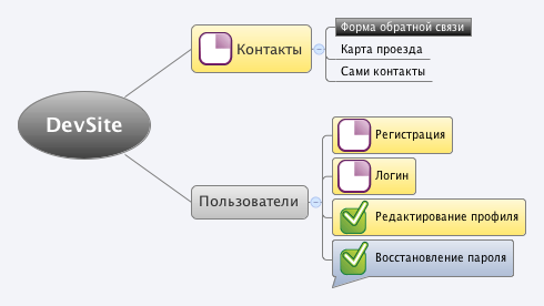
Using these icons is quite useful for displaying a slice, the current state of a project, or setting a task, displaying the current state of affairs.
By the way, for building maps, I use XMind, which provides all of the above buns, I recommend watching.
In addition to the above elements, you can depict auxiliary elements on the same map, such small sub-maps and organize the connections between them and the main circuit. It is sometimes useful to present some of the information in a table view.
Db
Designing a database is the stage where the customer does not rush, but this does not mean that it is worth referring to the stage with the words "we have done this 100 times, we are all clear." When you lead a project beautifully, working on it brings a lot more positive emotions and does not turn into a routine.
At the same time, I do not urge to re-do some standard elements, it is really often easier to take them from previous projects, or they already exist and have long been designed within the framework of the applied control system. As for the newly designed and created elements, the design phase of the database sometimes allows you to identify the parts of the developed system that were missed at the stage of creating the structure, it is better to recognize them and adjust its properties and relationships.
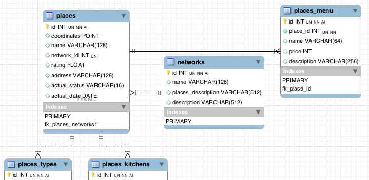
Well, of course, convenience plays an important role, personally I’m much nicer to create a database in a software such as MySQL Workbench and export the result to SQL, after putting down the links, property keys and visually checking the result. In any case, this is much more convenient than the most common way to populate a database in phpMyAdmin.
Screen table from MySQL Workbench
Prototyping, creating wireframes
This stage is quite superimposed and it is worth resorting to when it is really needed. It mainly makes sense on sites and communities with large amounts of information, as well as on pages with a large number of control elements. It often makes sense to resort to creating wireframs for individual elements of the system, such as a filtering system and flexible search, or vice versa for very general elements, such as the location of large blocks on a site (menus, content, columns, I think it’s clear).
But it should be borne in mind that a competently passed stage of prototyping and approval of these layouts at the customer’s place can save a lot of nerves for you and the designer working on a full-fledged design, and not a structure.
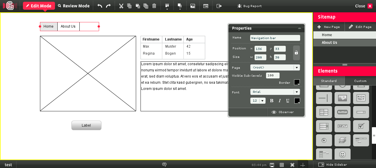
Screenshot from tarekshalaby.com on a tip from google image search
As a tool, I will not advise any specific one, since I myself have not yet finally decided. I personally had to work with a desktop application Balsamic Mockups and web service Hotgloo . Hotgloo is certainly interesting in that you can make layouts with links and parodies to actions such as “put the goods in the basket”, but I do not really like its pricing policy, and sometimes it’s just more convenient to use a desktop application.
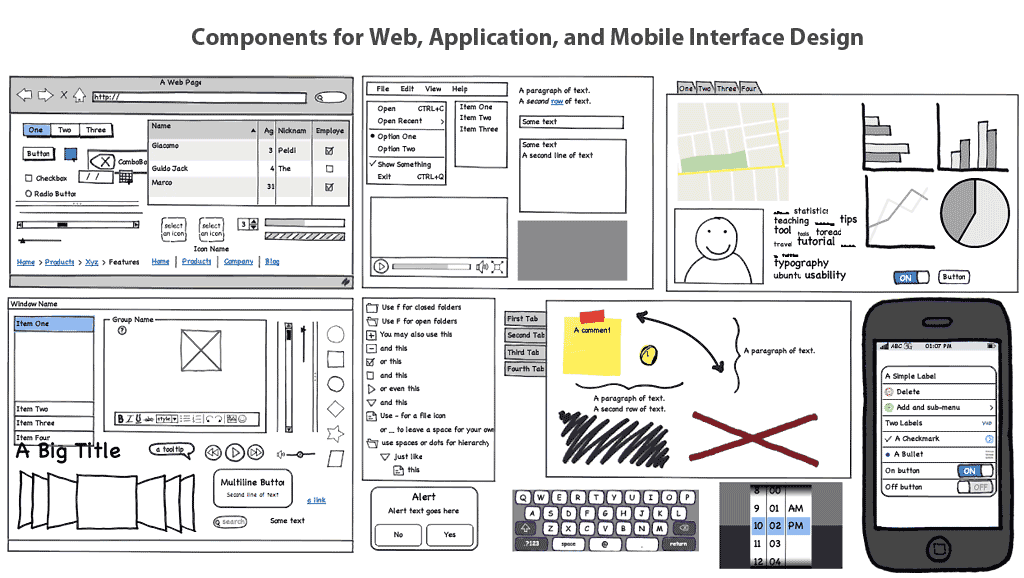
Screenshot from offsite Balsamic Mockups
Finally
This article is primarily aimed at small web studios, project managers and managers, individual freelancers involved in web development or participating in the development chain. As you can see, a simple approach using mindmaps allows not only to decompose the structure, but to make the problem statement more visible for its executors, reflecting both the current state and the properties presented in the entity structure. But, oddly enough, this standard software-embedded functionality often goes unnoticed and unclaimed. It's a shame!
Thank you for reading and wish you interesting and beautiful projects in 2011!
