Bad and good cyrillic
It is amazing how little designers in our country know about their own letters. In the West, any design education begins with the basics - font and typography. Mandatory teach calligraphy, font history and give good typographic training. I will not go into details why the ability to handle letters is so strongly reflected in the quality of the designer’s work, but believe me, the influence is impressive.
In our country, with the education of designers it is tight, but there is no font education at all. Ilya Ruderman’s only course in the BHSD is trying to somehow correct this sad picture.
Font dowry with us is not a gift. The young Cyrillic alphabet, which has not yet been fully formed and has suffered many cardinal changes in its history, requires centuries-old hone by professionals. Nevertheless, this is our story and you need to know it, take care and treat it with extreme caution.
Western designers do not feel our letters and sometimes make serious mistakes. They get Latin perfectly, but the accuracy of the outline is not enough for high-quality font work - you need to feel it. In my opinion, Luc (as) de Groot has the highest quality Western Cyrillic . Even large and eminent western agencies are releasing fonts with unfit Cyrillic letters on the market, which further shows the whole dramatic situation. I will selectively talk about what caught my eye.
Recently I noticed a new font in MTS advertising products. I don’t know what it is called and who its author is, but I suspect that it was made by Western typographers commissioned by Wolff Olins . The Cyrillic alphabet in it is simply monstrous.
The first thing that catches your eye is a terrible mistake - the opposite contrast in and . The connecting stroke in this letter, for some reason, is thicker than the main strokes, which can be achieved by trivial reflection of the Latin N and which is unacceptable in the Cyrillic alphabet. Anyway, the horizontal strokes in n , w , h , and all are different. Special attention deserves b, whose tail is chopped off almost half the letter, and the upper right side, for some reason, wrinkled. The quotation marks are crude and uncouth, or maybe just taken from another font.
Not so long ago I came across a new Frank font created by Newlyn, a company known for its identity work. Cyrillic appeared in this font, but it would be better if it were not there.
Lowercase p extremely narrow width almost n . The lowercase w is also narrow, but q , on the contrary, is quite wide - it was not enough to w . Strange tail b , ending earlier than expected and tapering in the place where it should expand. The left leg l also has an unfinished shape and, as it were, “pressed its foot”. Brief in th weak and too flown away from the letter.
Now in Russia, the most common font is Arial. We owe its popularity to Windows, in which Arial is the default. Back in '82, Monotype made it for Microsoft in exchange for the world-famous Helvetica font, for the use of which license fees were required. Arial, in essence, is secondary and fully replicates Helvetica, with the exception of a few points. The Latin of the Arial font is very good, but the Western type designers did the Cyrillic alphabet without feeling our features. There is, of course, nothing terrible and egregious, but the font that is most popular in the country and claims must be appropriate.
So, I will voice some subtleties:
The main errors in the proportions. Some letters are too narrow and some are very wide. Uppercase Kvery narrow, E - wide. L , like D, is also narrow and has too slight differences from P , which can complicate the perception or even turn out to be an error with poor printing. The bend of the left leg L should begin higher and go smoother, and not be a straight stick with a hook at the end. F is very small. Its middle stance should be moved a little up and down, and the oval should be increased.
Lowercase l , in contrast to uppercase, on the contrary, is too wide - with a width of n . And tail b , which is one of the most beautiful parts in the Cyrillic alphabet, is brutally chopped off and too straightforwardly arched.
All this seems to be trifles, but for the Cyrillic alphabet it is alien, ugly and, at times, interferes with reading.
These heroes are not something that the country, but at least domestic designers should know by sight, because many of them gave the years (and some decades) of their lives to such an extremely unpopular in our country, but very labor-intensive business, like font design. This business is absolutely unprofitable, but the designer plunged into it can no longer get out of this fascinating activity.
Head of the author's type shop in VASHGD. The author of Cyrillic versions of many fonts known to you, such as Officina , Swift , FreeSet and others. He made a lot of custom fonts, which we see in many magazines.
The head of the author's font workshop, a famous teacher. He is also the author of many cyrillizations and custom fonts. Of his works, I like Afisha Serif the most, who uses the Afisha publishing house to recruit his magazines.
Art Director of Paratype. The author of many fonts and cyrillizations, such as Charter , Newton or Kis . Well-known teacher and author of many articles about fonts. In particular, I used his article in the KAK magazine when describing the problems of the Arial font.
Owner of Letterhead Studio . The author of many commercial fonts and the famous “Books about letters from A to Z”. He actively maintains his diary and a column in the KAK magazine about fonts and his experiences with letters. Designed the font Artemius.
Probably the most famous Russian type designer in the West. The author of many commercial fonts. Often makes Cyrillic versions commissioned by eminent foreign type designers. Curator of the unique course in Russia, "Font and Typography."
Co-owner of Letterhead Studio. Well-known graphic and font designer. The author of many fonts. Lecturer of BVShD.
Former Lebedev Studio type designer who has released many vibrant fonts and is now working as a freelancer. Of her work, I like Direct the most .
Head of font design studio Paratype. The author of the famous PT Sans , many other fonts and the book "Live typography."
There are also specialists, but in fact, these are the only people in our country who are engaged in font design. I consider these people to be the only designers in the world who can draw a high-quality Cyrillic font. I mentioned them not for the sake of advertising, but to let the design community know who to contact for quality fonts and whose name next to the font name can guarantee a good Cyrillic alphabet.
In our country, with the education of designers it is tight, but there is no font education at all. Ilya Ruderman’s only course in the BHSD is trying to somehow correct this sad picture.
Font dowry with us is not a gift. The young Cyrillic alphabet, which has not yet been fully formed and has suffered many cardinal changes in its history, requires centuries-old hone by professionals. Nevertheless, this is our story and you need to know it, take care and treat it with extreme caution.
Western designers do not feel our letters and sometimes make serious mistakes. They get Latin perfectly, but the accuracy of the outline is not enough for high-quality font work - you need to feel it. In my opinion, Luc (as) de Groot has the highest quality Western Cyrillic . Even large and eminent western agencies are releasing fonts with unfit Cyrillic letters on the market, which further shows the whole dramatic situation. I will selectively talk about what caught my eye.
Font MTS
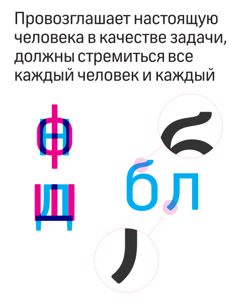
Recently I noticed a new font in MTS advertising products. I don’t know what it is called and who its author is, but I suspect that it was made by Western typographers commissioned by Wolff Olins . The Cyrillic alphabet in it is simply monstrous.
The first thing that catches your eye is a terrible mistake - the opposite contrast in and . The connecting stroke in this letter, for some reason, is thicker than the main strokes, which can be achieved by trivial reflection of the Latin N and which is unacceptable in the Cyrillic alphabet. Anyway, the horizontal strokes in n , w , h , and all are different. Special attention deserves b, whose tail is chopped off almost half the letter, and the upper right side, for some reason, wrinkled. The quotation marks are crude and uncouth, or maybe just taken from another font.
Font Frank by Newlyn
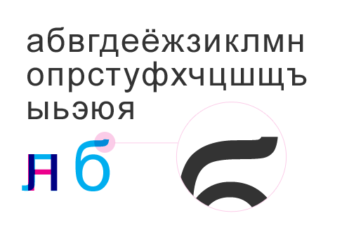
Not so long ago I came across a new Frank font created by Newlyn, a company known for its identity work. Cyrillic appeared in this font, but it would be better if it were not there.
Lowercase p extremely narrow width almost n . The lowercase w is also narrow, but q , on the contrary, is quite wide - it was not enough to w . Strange tail b , ending earlier than expected and tapering in the place where it should expand. The left leg l also has an unfinished shape and, as it were, “pressed its foot”. Brief in th weak and too flown away from the letter.
And of course, Arial
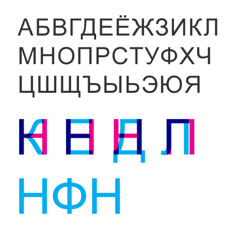
Now in Russia, the most common font is Arial. We owe its popularity to Windows, in which Arial is the default. Back in '82, Monotype made it for Microsoft in exchange for the world-famous Helvetica font, for the use of which license fees were required. Arial, in essence, is secondary and fully replicates Helvetica, with the exception of a few points. The Latin of the Arial font is very good, but the Western type designers did the Cyrillic alphabet without feeling our features. There is, of course, nothing terrible and egregious, but the font that is most popular in the country and claims must be appropriate.
So, I will voice some subtleties:
The main errors in the proportions. Some letters are too narrow and some are very wide. Uppercase Kvery narrow, E - wide. L , like D, is also narrow and has too slight differences from P , which can complicate the perception or even turn out to be an error with poor printing. The bend of the left leg L should begin higher and go smoother, and not be a straight stick with a hook at the end. F is very small. Its middle stance should be moved a little up and down, and the oval should be increased.
Lowercase l , in contrast to uppercase, on the contrary, is too wide - with a width of n . And tail b , which is one of the most beautiful parts in the Cyrillic alphabet, is brutally chopped off and too straightforwardly arched.
All this seems to be trifles, but for the Cyrillic alphabet it is alien, ugly and, at times, interferes with reading.
There are heroes in our country
These heroes are not something that the country, but at least domestic designers should know by sight, because many of them gave the years (and some decades) of their lives to such an extremely unpopular in our country, but very labor-intensive business, like font design. This business is absolutely unprofitable, but the designer plunged into it can no longer get out of this fascinating activity.
Tagir Safaev
Head of the author's type shop in VASHGD. The author of Cyrillic versions of many fonts known to you, such as Officina , Swift , FreeSet and others. He made a lot of custom fonts, which we see in many magazines.
Alexander Tarbeev
The head of the author's font workshop, a famous teacher. He is also the author of many cyrillizations and custom fonts. Of his works, I like Afisha Serif the most, who uses the Afisha publishing house to recruit his magazines.
Vladimir Efimov
Art Director of Paratype. The author of many fonts and cyrillizations, such as Charter , Newton or Kis . Well-known teacher and author of many articles about fonts. In particular, I used his article in the KAK magazine when describing the problems of the Arial font.
Yuri Gordon
Owner of Letterhead Studio . The author of many commercial fonts and the famous “Books about letters from A to Z”. He actively maintains his diary and a column in the KAK magazine about fonts and his experiences with letters. Designed the font Artemius.
Ilya Ruderman
Probably the most famous Russian type designer in the West. The author of many commercial fonts. Often makes Cyrillic versions commissioned by eminent foreign type designers. Curator of the unique course in Russia, "Font and Typography."
Valery Golyzhenkov
Co-owner of Letterhead Studio. Well-known graphic and font designer. The author of many fonts. Lecturer of BVShD.
Vera Evstafieva
Former Lebedev Studio type designer who has released many vibrant fonts and is now working as a freelancer. Of her work, I like Direct the most .
Alexandra Korolkova
Head of font design studio Paratype. The author of the famous PT Sans , many other fonts and the book "Live typography."
There are also specialists, but in fact, these are the only people in our country who are engaged in font design. I consider these people to be the only designers in the world who can draw a high-quality Cyrillic font. I mentioned them not for the sake of advertising, but to let the design community know who to contact for quality fonts and whose name next to the font name can guarantee a good Cyrillic alphabet.