New W3C / CSS proposal - Flexible Flow Module
Everyone who professionally works with CSS knows that the tool is poor in terms of layout management. For example, in modern CSS (2.1 and 3) it is technically impossible to reproduce all the features of HTML tables.
In Java / AWT / Swing, for example, from the very beginning, various Layout Managers were laid down . In CSS, this is not pure. The mess.
Actually, this was the reason for our proposal in W3C CSS WG.
The idea is simple “like doors”:
1) We introduce one CSS attribute 'flow' and
2) The unit of measure is flex.
'flow' takes values:
and describes different ways of placing blocks inside a container, that is, describes a layout manager.
flex units are the weights of the distribution of free space in the container. They are written as <number> '*', for example:
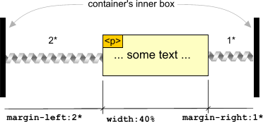
margin-left: 2 *. For clarity, flex length units can be represented as springs having a certain weight.
Here for clarity: The

paragraph in the picture is positioned with this style:
Those who know what we say means writing in HTML [frameset cols = "200, *, *"] I think they will immediately "enter" the idea of flexes.
Regarding the idea of the 'flow' attribute and its values, I recommend that you go over at least the illustrations in the text of the proposal itself: www.terrainformatica.com/w3/flex-layout/flex-layout.htm
These are the news from the fronts of CSS3 and HTML5
In Java / AWT / Swing, for example, from the very beginning, various Layout Managers were laid down . In CSS, this is not pure. The mess.
Actually, this was the reason for our proposal in W3C CSS WG.
The idea is simple “like doors”:
1) We introduce one CSS attribute 'flow' and
2) The unit of measure is flex.
'flow' takes values:
horizontal | vertical | horizontal-flow| vertical-flow| "template"and describes different ways of placing blocks inside a container, that is, describes a layout manager.
flex units are the weights of the distribution of free space in the container. They are written as <number> '*', for example:
margin-left: 2 *. For clarity, flex length units can be represented as springs having a certain weight.
Here for clarity: The

paragraph in the picture is positioned with this style:
p
{
  width: 40%; / * fixed width - 40% of width of the container * /
  margin-left: 2 *; / * left "spring" of power 2 * /
  margin-right: 1 *; / * right "spring" of power 1 * /
  border: 1px solid black; / * border of fixed width * /
}
Those who know what we say means writing in HTML [frameset cols = "200, *, *"] I think they will immediately "enter" the idea of flexes.
Regarding the idea of the 'flow' attribute and its values, I recommend that you go over at least the illustrations in the text of the proposal itself: www.terrainformatica.com/w3/flex-layout/flex-layout.htm
These are the news from the fronts of CSS3 and HTML5
