Philosophical geometry. Part 3. The root of the two and the perfect laptop
Not all spears have broken yet about an iPhone inscribed in an ancient sacred figure, as I have a sequel ready. Under the cut, I will show how still modern objects use the ideas of centuries ago.
This article is a continuation of the first two.
- At first there was a review where I spoke about how ancient geometers looked for the unchanging in all things and embodied this in works of art.
- Then there was an article where I showed how the number √3 was used in religious symbols and in the contemporary subject of design
At this, let's talk about the number √2. The root of the two is a symbol of natural growth. A visual representation of geometric progression shows how a tiny object can grow to gigantic proportions in a short time. The root of the two is that immutable that lies at the heart of this progression. In this growth is the strength of a given number.
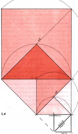
But what is growth? What is the creation process in general, and how can the insignificant evolve and become big? Let's imagine the point.

In itself is nothing. This entity is present in one dimension, but at the same time, it contains tremendous energy. Let's free her.

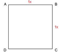
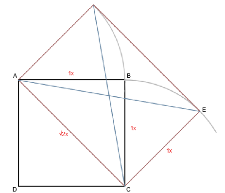
What's next? We need a breakthrough. Let's discover the second dimension. Build a square ABCD
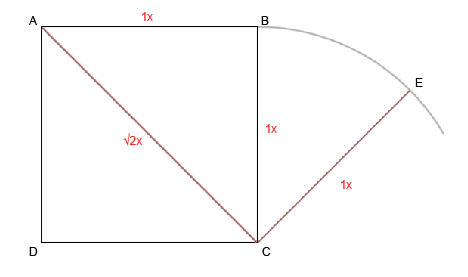
Now, open up new forms of movement. Centered at a point With radius CB, let's draw an arc.

Find new ways to move. Connect AC and CE. The length of AC is √2 - a factor that doubles the measurement.
What will this lead to? To an infinite number of things. But let's take a practical task. Under the cut, we will grow the perfect laptop. (You can have no doubt whose logo will be there :)
So, once you get to the kat, we will continue to create a laptop.
Let's draw the line AE.
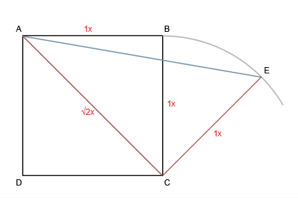
Now, we symmetrically reflect our latest constructions.
Now take a look at them in more detail.

Well, the form is born by itself.

But wait! Why do we need such difficulties? Nakoy was generally to drag organic matter, biology here, and what else did the author’s sick brain invent? In the end, enlarge A4 sheet - and here you have the whole philosophy.
But not everything is so simple as the task becomes more complicated. Let's open the laptop. Somehow we need to arrange a bunch of functional elements that it has. How to place them?
Very simple. We just drew a natural and beautiful grid, based on the powerful power of the symbol of growth. We use it.
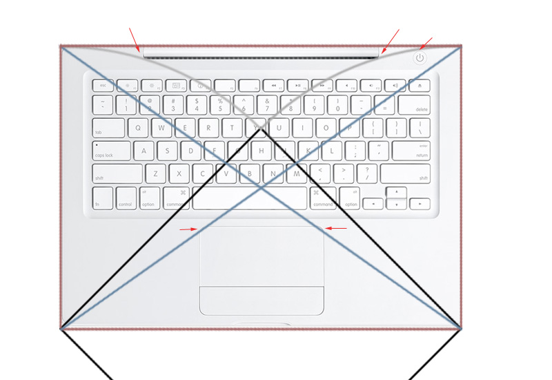
The MacBook is without a doubt a very beautiful piece of design art. Personally, I like the beauty of this element.
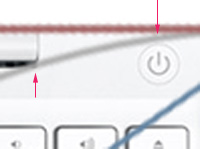
Of course, the grid layout of all the elements on the macbook is much more complicated, and we did not even try to go into the third dimension. However, the eye still captures some patterns.
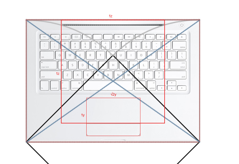
So, we saw how the philosophy of growth can be applied to industrial design. This is a very simple and natural philosophy. Actually, our brain works in a similar way. Having a certain starting point, he seeks in certain directions. Reflecting thought branches like the roots of a tree in different directions. When the roots of this tree reach water - this is the solution to the problem. When they form patterns, that is beauty.
Similar patterns enclosed in constructions are a science that has been studied in geometry for many centuries. Seeing this as coincidence, common laws, technical proportions, or God - is left to the discretion of each individual person. The important thing is that there seems to be something uniting nature, people and human creations.
From this thought follows the following. Nature has created a world that interacts wonderfully harmoniously with each other. Can a man do the same with his creations? And how to make a profit out of it?
As already noted, the dimensions of the MacBook are close to A4 sheet. The sides of such a sheet are referred to as √2 / 1. Proportionality can be checked geometrically by drawing a diagonal between the opposite corners of the object. If the second object stands on them, it is proportional to the first.
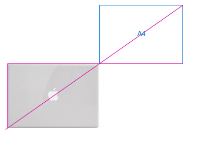
The proportionality of the company's products leads to the fact that it becomes easy to use them in promotional materials. Sitting in a row on an advertisement or in a shop window, they are in harmony with each other. Several products begin to seem to be one, one, included in one system.
Apple, by the way, did just that. And the new MacBook and the old white, and MacBook Air they have the same size. And the MacBook Pro is as close as possible to them in proportions, although not completely.

But what about the rest? In the end, the planet is full of brilliant designers. Let's take Sony Vaio - great popular beautiful laptops. How are they interacting with each other? Do they create a sense of the whole?
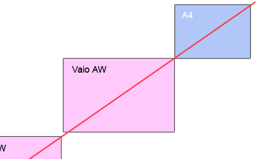

On such a scale, it is not very clearly visible, but considering the numerical values of the ratio of their sides, you can see that no, they are not proportional to each other.
Let's take other good laptops - Toshiba. I will draw two pieces here. This is enough for a general illustration of the situation.

This is just a proportionality test, but if we compare the sites of the three companies, the overall impression of them will be about the same. If Apple is solid and Sony is good, then Toshiba plunged me into a slight gloom.
When in one thing there is one thing unchanging, it produces a beautiful balanced system of many things. It can be used in design, advertising, marketing and other human activities. The very way of thinking of a person works in a similar way, and in two directions. At the beginning of the article I showed how nature can be built out of a negligible nature and man. At the end of the article, I showed how the products of these buildings can be perceived by a person at an unconscious level. If he finds in them the way back to the small, then maybe this means that he found beauty?
This article is a continuation of the first two.
- At first there was a review where I spoke about how ancient geometers looked for the unchanging in all things and embodied this in works of art.
- Then there was an article where I showed how the number √3 was used in religious symbols and in the contemporary subject of design
At this, let's talk about the number √2. The root of the two is a symbol of natural growth. A visual representation of geometric progression shows how a tiny object can grow to gigantic proportions in a short time. The root of the two is that immutable that lies at the heart of this progression. In this growth is the strength of a given number.

But what is growth? What is the creation process in general, and how can the insignificant evolve and become big? Let's imagine the point.

In itself is nothing. This entity is present in one dimension, but at the same time, it contains tremendous energy. Let's free her.

What's next? We need a breakthrough. Let's discover the second dimension. Build a square ABCD

Now, open up new forms of movement. Centered at a point With radius CB, let's draw an arc.

Find new ways to move. Connect AC and CE. The length of AC is √2 - a factor that doubles the measurement.

What will this lead to? To an infinite number of things. But let's take a practical task. Under the cut, we will grow the perfect laptop. (You can have no doubt whose logo will be there :)
So, once you get to the kat, we will continue to create a laptop.
Let's draw the line AE.

Now, we symmetrically reflect our latest constructions.

Now take a look at them in more detail.

Well, the form is born by itself.

But wait! Why do we need such difficulties? Nakoy was generally to drag organic matter, biology here, and what else did the author’s sick brain invent? In the end, enlarge A4 sheet - and here you have the whole philosophy.
But not everything is so simple as the task becomes more complicated. Let's open the laptop. Somehow we need to arrange a bunch of functional elements that it has. How to place them?
Very simple. We just drew a natural and beautiful grid, based on the powerful power of the symbol of growth. We use it.

The MacBook is without a doubt a very beautiful piece of design art. Personally, I like the beauty of this element.

Of course, the grid layout of all the elements on the macbook is much more complicated, and we did not even try to go into the third dimension. However, the eye still captures some patterns.

So, we saw how the philosophy of growth can be applied to industrial design. This is a very simple and natural philosophy. Actually, our brain works in a similar way. Having a certain starting point, he seeks in certain directions. Reflecting thought branches like the roots of a tree in different directions. When the roots of this tree reach water - this is the solution to the problem. When they form patterns, that is beauty.
Similar patterns enclosed in constructions are a science that has been studied in geometry for many centuries. Seeing this as coincidence, common laws, technical proportions, or God - is left to the discretion of each individual person. The important thing is that there seems to be something uniting nature, people and human creations.
From this thought follows the following. Nature has created a world that interacts wonderfully harmoniously with each other. Can a man do the same with his creations? And how to make a profit out of it?
As already noted, the dimensions of the MacBook are close to A4 sheet. The sides of such a sheet are referred to as √2 / 1. Proportionality can be checked geometrically by drawing a diagonal between the opposite corners of the object. If the second object stands on them, it is proportional to the first.

The proportionality of the company's products leads to the fact that it becomes easy to use them in promotional materials. Sitting in a row on an advertisement or in a shop window, they are in harmony with each other. Several products begin to seem to be one, one, included in one system.
Apple, by the way, did just that. And the new MacBook and the old white, and MacBook Air they have the same size. And the MacBook Pro is as close as possible to them in proportions, although not completely.

But what about the rest? In the end, the planet is full of brilliant designers. Let's take Sony Vaio - great popular beautiful laptops. How are they interacting with each other? Do they create a sense of the whole?


On such a scale, it is not very clearly visible, but considering the numerical values of the ratio of their sides, you can see that no, they are not proportional to each other.
Let's take other good laptops - Toshiba. I will draw two pieces here. This is enough for a general illustration of the situation.

This is just a proportionality test, but if we compare the sites of the three companies, the overall impression of them will be about the same. If Apple is solid and Sony is good, then Toshiba plunged me into a slight gloom.
When in one thing there is one thing unchanging, it produces a beautiful balanced system of many things. It can be used in design, advertising, marketing and other human activities. The very way of thinking of a person works in a similar way, and in two directions. At the beginning of the article I showed how nature can be built out of a negligible nature and man. At the end of the article, I showed how the products of these buildings can be perceived by a person at an unconscious level. If he finds in them the way back to the small, then maybe this means that he found beauty?
