How to choose a color for your work
Edward Tufty in Envisioning Information mentions one way to select a color palette for decoration. He says that it is very good to use the colors of the world around us. A person should be pleased with those color combinations that surround him in a natural pleasant atmosphere on a sunny day.
Having decided to practice, I took some of my soap-filled photographs, poked them with a pipette and painted the resulting flowers with a small, meaningless template.
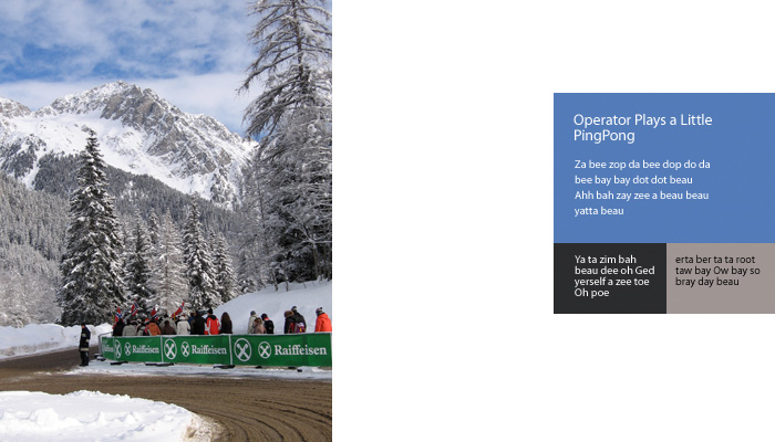
Here is a nice winter landscape.
There are still photos under the cut, and if you are interested in Tafti, I have links to his books and examples from them on my site.
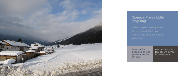
Here is a slightly gloomy alpine village.
Cold cracking glacier.

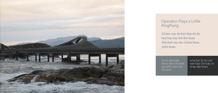
And here is a beautiful sunset over the harsh North Sea.
The most common Russian summer.

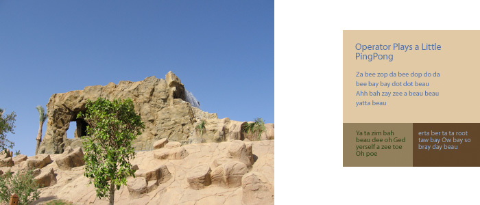
And sandy despondency.
Something turns out like this, so as an idea - it’ll come down. Any graphic designer, it seems to me, will be able to choose a beautiful palette with the right mood.
Having decided to practice, I took some of my soap-filled photographs, poked them with a pipette and painted the resulting flowers with a small, meaningless template.
Here is a nice winter landscape.
There are still photos under the cut, and if you are interested in Tafti, I have links to his books and examples from them on my site.
Here is a slightly gloomy alpine village.
Cold cracking glacier.
And here is a beautiful sunset over the harsh North Sea.
The most common Russian summer.
And sandy despondency.
Something turns out like this, so as an idea - it’ll come down. Any graphic designer, it seems to me, will be able to choose a beautiful palette with the right mood.